
Downloads
Download full report
PDF | 1.48 MB
Key findings
Living standards and inequality
1. Average (median) disposable household income before deducting housing costs rose by 0.5% in 2021–22, but remained 1.2% lower than its pre-pandemic level. The relatively muted increase in 2021–22 reflected a 4.8% rebound in nominal incomes being largely offset by a sharp rise in inflation. A fall in housing costs over the pandemic means that average incomes measured after deducting housing costs were 0.2% higher in 2021–22 than in 2019–20.
2. Income growth was stronger among poorer households, with those in the bottom third of the distribution seeing a rise between 2019–20 and 2021–22 of 1.5% before deducting housing costs and 2.7% after deducting housing costs. Large falls in employment income among this group were more than offset by a rise in benefit incomes (in particular the temporary £20 uplift to universal credit) and a fall in housing costs, both of which affected low-income households more than households further up the income distribution.
3. The increase in benefit incomes among low-income households did not simply reflect a fall in employment income. Average benefit receipt in 2021–22 was higher than in 2019–20 at every level of earnings, due to the £20 universal credit uplift that persisted until October 2021 and the increased generosity of universal credit for in-work households from November 2021. The share of households in the bottom third of incomes that received disability benefits rose by 26%, from 12% in 2019–20 to 15% in 2021–22, driven entirely by an increase among working-age households.
4. Individuals aged 50–70 who moved from employment into economic inactivity in 2020–21 were more likely to end up in poverty (in the year of exit) than those who became inactive in previous years. This is despite poverty rates falling among 50- to 70-year-olds who had been inactive for more than a year (that is, it does not reflect an overall fall in living standards among inactive individuals in the age group). Measures of self-reported well-being also declined more for recently inactive individuals in 2020 than for those who had been inactive for longer. For people who became inactive in 2021–22, outcomes were much more similar to those seen among people who became inactive pre-pandemic, suggesting that there is particular cause for concern for the 2020–21 cohort.
5. This decline in living standards and well-being challenges the perception that exits into inactivity over the pandemic were driven by wealthy individuals who could afford to retire in comfort. Instead, many of those who left the workforce in 2020–21 may have been ‘forced’ into early retirement, with an associated hit to their living standards and well-being. People who become inactive at older ages often never re-enter the workforce, so it is likely that many in this cohort will experience persistently low living standards. In contrast, those who became inactive in 2021–22, when the labour market disruption and health risk had largely subsided, are more likely to have done so out of choice.
Poverty
1. The overall absolute poverty rate fell in the first year of the pandemic (2020–21) and was little changed in 2021–22, leaving it nearly 1 percentage point (ppt) or 480,000 people lower than its pre-pandemic level. This is largely due to changes in benefits policy, in particular the (temporary) £20 universal credit uplift and (permanent) changes to the universal credit taper rate and work allowances, which allow workers to keep more of the benefit as their earnings rise.
2. The £20 uplift reduced absolute poverty rates by 0.3ppts during the six months it was in place in 2021–22, or by 0.6ppts in annualised terms (379,000 people). The changes to work allowances and the taper rate that succeeded it had a much more muted impact on poverty. Their annualised effect is only 0.2ppts (133,000 people) – a third of the impact of the uplift. Even on a per-pound basis, the £20 uplift had a 40% larger effect on poverty. This is because changes to work allowances and the taper rate mainly benefit somewhat higher-earning households further up the income distribution and do not affect out-of-work households at all.
3. The first instalment of the cost of living payments to households receiving means-tested benefits – £326 paid in July 2022 – substantially boosted spending. Discretionary spending was £33 a week (12%) higher for recipient households on average in the four weeks after the payment than in the four weeks before, and remained somewhat elevated up to 15 weeks after the initial payment. The rise in discretionary spending was driven by an increase in cash withdrawals, spending on groceries, and spending on entertainment (e.g. restaurants, streaming services), which accounted for 17%, 15% and 28% of the total increase in discretionary spending respectively. That recipients responded strongly to the payment suggests that, prior to the payment, many had limited savings or means of borrowing available to them, and wanted to spend more than they were able to. That a substantial fraction of the cost of living payment went on basic goods such as groceries, but also on more discretionary goods such as entertainment, indicates a variety of levels of ‘need’ among recipient households.
4. Recipients with lower earnings increased their spending by more immediately after receiving the cost of living payment, which may indicate higher cash constraints in the lead-up to the payment. However, the distribution of extra spending across categories (groceries, entertainment etc.) was similar across recipients with different levels of earnings.
Housing quality and affordability for lower-income households
1. Facing higher housing costs, renters are considerably more likely than owner-occupiers to have low living standards on a variety of measures. Social and private renters have poverty rates of 46% and 34% respectively, compared with 12% for owner-occupiers. And they are also far more likely to be materially deprived or to live in food insecurity.
2. A steadily growing fraction of low-income households are in the private rented sector, while the share in social housing has declined, as has (in more recent years) the share who own their own home. Younger generations of low-income individuals are now especially likely to be renting privately. For low-income adults born in the 1960s or before, private renting rates ranged from 5% to 20% at almost every age. But for those born in the 1970s it has persistently been in the 25–30% region, and for those born in the 1980s around 40–50%, as social renting and owner-occupation have declined. These patterns suggest that private renting will become even more common among low-income families going forward. This matters because those in the private rented sector have higher housing costs than both social renters and those owning with a mortgage, as well as having less security of tenure.
3. As well as the private sector having higher costs for tenants, the quality of homes, at least for low-income families, is worse. Among lower-income families, those in the private rented sector are more likely than social renters or owner-occupiers to be living in a home that is unsafe, in disrepair, difficult to adequately heat or lacking modern facilities. 25% of their homes would therefore fail the Decent Homes Standard required of social housing, compared with 18% of owner-occupied homes and 12% of social rented homes. Private rented homes are also more likely to have poor energy efficiency, be insecure or be damp, while rented homes in both sectors are more likely to be overcrowded and in areas of poor upkeep and appearance.
4. In the wake of the pandemic, the local housing allowance (LHA) rates which cap maximum housing benefit entitlements were increased to the 30th percentile of local rents. At that point, 23% of private rental properties listed on Zoopla were affordable for housing benefit recipients, which we define as having rents that can be completely covered by housing benefit. Since then, LHA rates have been frozen in cash terms and rents for new lets have risen by over a fifth on average. As a result, in 2023Q1 just 5% of private rental properties were affordable for housing benefit recipients. The rapid decline in affordability has been seen across all parts of the country.
5. A declining share of properties being affordable to housing benefit recipients affects the relative quality of those that are affordable. Relative to the nation as a whole, affordable properties in 2023Q1 were 15% more likely to have an energy rating of D or below, and had 19% higher heating and hot water costs. These gaps have increased as the number of affordable properties has declined in the past few years. This shift is especially pertinent given recent increases to energy costs. Affordable properties are also generally more likely to be in low-employment and high-crime areas, though have slightly better access to local services such as post offices, supermarkets and GPs.
1. Introduction
This report explores how material living standards have changed since the beginning of the pandemic, based on household incomes as well as other indicators. We use the latest official data, covering years up to 2021–22, to describe the effect of the pandemic and subsequent response on household incomes in the UK, looking in detail at living standards of those individuals who became inactive during the pandemic. We study the impact of various benefit policies implemented during these years, considering their implications for poverty. And we examine the quality and affordability of the private rental sector, which has become especially important for analysing the living standards of people on lower incomes in recent years.
The analysis in this report is chiefly based on data from the Family Resources Survey (FRS), a survey of around 20,000 households a year, which contains detailed information on different sources of household incomes. We use household income variables derived from the FRS by the UK government’s Department for Work and Pensions (DWP). These measures of incomes underlie DWP’s annual statistics on the distribution of income, known as ‘Households Below Average Income’ (HBAI). The FRS/HBAI data are available for the years from 1994–95 to 2021–22. They are supplemented by HBAI data derived from the Family Expenditure Survey (FES) for the years from 1961 to 1993.
In addition, Chapter 2 draws on data from Understanding Society: the UK Household Longitudinal Study (UKHLS) and the Annual Population Survey (APS) to explore changes in the living standards of recently inactive individuals. Chapter 3 makes use of bank transaction data from ClearScore to study the effects of cost of living payments. Chapter 4 uses data from the English Housing Survey and Zoopla microdata to investigate changes in housing.
Measures of household income are the key outcomes used in this report. We use the measure of income that is used in the HBAI statistics, or construct a measure as similar as possible when using other data sources. Further details regarding the methodology of HBAI can be found in Appendix A, but it is worth noting that when we refer to household income, we specifically mean ‘net equivalised household income’. ‘Net’ indicates that we are looking at incomes measured after direct taxes (including council tax) are paid, and after benefits and tax credits are received. ‘Equivalised’ means that incomes are rescaled to account for the fact that households of different sizes and compositions have different needs. ‘Household income’ means that we add up the income (from all sources) of each person in the household. We sometimes term this measure of income ‘disposable income’. Although we measure household incomes, we conduct our analysis at the individual level, meaning that we look at poverty, inequality and differences in living standards between individuals, not between households.
All cash figures for incomes are presented in 2021–22 prices and all income growth rates are given after accounting for inflation. We adjust for inflation using measures of inflation based on the Consumer Prices Index, which are the same measures as are used by DWP in the government’s official HBAI statistics.
Throughout this report, many statistics will be presented for the whole of the UK; however, for those series looking at longer-term trends, we present statistics for Great Britain (GB) only, as Northern Ireland has only been included in the HBAI data since 2002–03.
The rest of this report proceeds as follows.
Chapter 2 examines trends in households’ living standards, focusing particularly on the two years since the beginning of the pandemic. This chapter shows how average incomes have changed, and how that has varied for households at different points in the income distribution. We go on to explore the implications of these changes for income inequality. We then look at the role played by different income sources in driving these trends, contrasting with households’ experiences between 2011–12 and 2019–20. Finally, we focus on the living standards of individuals aged 50–70 who became economically inactive during the pandemic, looking at measures of income as well as subjective well-being.
Chapter 3 explores changes in poverty, considering particularly the importance of reforms to the benefit system in driving these. We start by describing changes in absolute and relative poverty for different groups of the population that have occurred since the start of the pandemic. We then use microsimulation to estimate the effects on poverty of two key reforms to the benefit system – the £20 per week uplift to universal credit (UC) and changes to the UC taper rate and work allowances. This is followed by analysis of changes in spending in response to the latest policy, cost of living payments for recipients of mean-tested benefits. This makes use of bank transaction data to explore how quickly individuals spent these payments, and the types of goods and services they spent them on.
Chapter 4 looks at the quality and affordability of the private rental sector. We first note the increasing importance of the private rented sector for the living standards of lower-income people, with the sector filling the gap left by a shrinking social rented sector and, more recently, lower rates of owner-occupation. We then move on to examine the quality of private rented homes, noting that lower-income private renters are more likely to live in homes that are hazardous, difficult to heat and in a poor state of repair, compared with their social-renting and owner-occupying counterparts. Finally, we show a significant decline in the affordability of private rented housing in the last two years, as the local housing allowances which cap housing benefit have remained frozen while rents have increased dramatically. And we show that the shrinking pool of affordable properties are of lower quality than average.Living standards and inequality.
2. Living standards and inequality
Key findings
1. Average (median) disposable household income before deducting housing costs rose by 0.5% in 2021–22, but remained 1.2% lower than its pre-pandemic level. The relatively muted increase in 2021–22 reflected a 4.8% rebound in nominal incomes being largely offset by a sharp rise in inflation. A fall in housing costs over the pandemic means that average incomes measured after deducting housing costs were 0.2% higher in 2021–22 than in 2019–20.
2. Income growth was stronger among poorer households, with those in the bottom third of the distribution seeing a rise between 2019–20 and 2021–22 of 1.5% before deducting housing costs and 2.7% after deducting housing costs. Large falls in employment income among this group were more than offset by a rise in benefit incomes (in particular the temporary £20 uplift to universal credit) and a fall in housing costs, both of which affected low-income households more than households further up the income distribution.
3. The increase in benefit incomes among low-income households did not simply reflect a fall in employment income. Average benefit receipt in 2021–22 was higher than in 2019–20 at every level of earnings, due to the £20 universal credit uplift that persisted until October 2021 and the increased generosity of universal credit for in-work households from November 2021. The share of households in the bottom third of incomes that received disability benefits rose by 26%, from 12% in 2019–20 to 15% in 2021–22, driven entirely by an increase among working-age households.
4. Individuals aged 50–70 who moved from employment into economic inactivity in 2020–21 were more likely to end up in poverty (in the year of exit) than those who became inactive in previous years. This is despite poverty rates falling among 50- to 70-year-olds who had been inactive for more than a year (that is, it does not reflect an overall fall in living standards among inactive individuals in the age group). Measures of self-reported well-being also declined more for recently inactive individuals in 2020 than for those who had been inactive for longer. For people who became inactive in 2021–22, outcomes were much more similar to those seen among people who became inactive pre-pandemic, suggesting that there is particular cause for concern for the 2020–21 cohort.
5. This decline in living standards and well-being challenges the perception that exits into inactivity over the pandemic were driven by wealthy individuals who could afford to retire in comfort. Instead, many of those who left the workforce in 2020–21 may have been ‘forced’ into early retirement, with an associated hit to their living standards and well-being. People who become inactive at older ages often never re-enter the workforce, so it is likely that many in this cohort will experience persistently low living standards. In contrast, those who became inactive in 2021–22, when the labour market disruption and health risk had largely subsided, are more likely to have done so out of choice.
This chapter examines recent trends in and drivers of households’ living standards, with a particular focus on the impact of the COVID-19 pandemic in 2020–21 and 2021–22. We begin by reviewing trends in household incomes across the income distribution, documenting the effects of the onset of the pandemic and subsequent recovery and discussing their implications for income inequality. We then examine the sources of changes to household incomes in more detail, focusing on changes in income from employment and benefits across the income distribution, and setting post-pandemic trends in their recent historical context. Finally, we examine how the recent rise in economic inactivity among older individuals has affected their living standards and well-being.
We primarily rely on the Households Below Average Income (HBAI) statistics. To examine the living standards of recently inactive individuals, we also corroborate results using the HBAI data with data from Understanding Society: The UK Household Longitudinal Study (UKHLS), a panel survey that samples households at annual intervals. We also draw on the Annual Population Survey (APS) to track self-reported well-being measures among those who recently entered economic inactivity.
2.1 Trends in household incomes
Figure 2.1 shows recent trends in average (median) household income, adjusted for inflation and household size and expressed as the equivalent income for a childless couple in 2021–22. When measured before deducting housing costs (BHC), median household income grew by 0.87% a year on average in the years before the pandemic, from 2002–03 to 2019–20. Median household income fell by 1.7% in the first year of the pandemic, a relatively small change given the disruption to the economy, which reflects the huge government interventions to mitigate falls in income, including the Coronavirus Job Retention Scheme (or furlough scheme, which cost around £60 billion in 2020–21) and the £20 a week uplift to universal credit. Between 2020–21 and 2021–22, median income rebounded slightly, but at £29,495 remained £350 (1.2%) below its pre-pandemic level. A fall in housing costs since the start of the pandemic means that the initial fall in median income after deducting housing costs (AHC) was slightly smaller, at 1.4%, and by 2021–22 median AHC income was 0.2% higher than its pre-pandemic level.
Figure 2.1. Median disposable household income
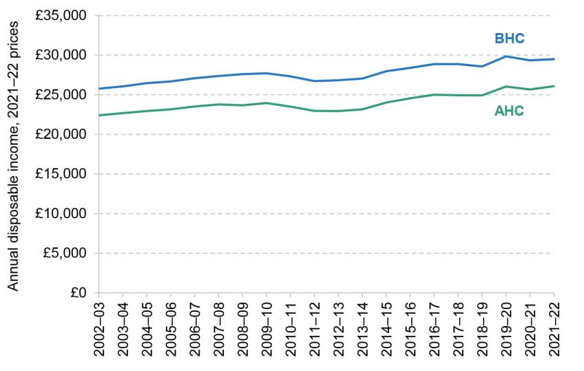
Note: Incomes have been measured net of taxes and benefits, and are expressed in 2021–22 prices. All incomes have been equivalised using the modified OECD equivalence scale and are expressed in terms of equivalent amounts for a childless couple.
Source: Authors’ calculations using the Family Resources Survey, 2002–03 to 2021–22.
The recovery in household incomes in 2021–22 was substantially moderated by a sharp rise in inflation over the year, from 0.4% in 2020–21 to 4.2% in 2021–22. Figure 2.2 shows that in cash terms (not adjusted for inflation), median household income grew by 4.8% in 2021–22, a high growth rate by historical standards. However, this recovery was eroded by rising price levels, which increased by 4.0% that year. As a result, real household incomes (adjusted for inflation) increased by only 0.5%. It is worth noting that this is before the very high rates of inflation seen recently: between April 2022 and April 2023, inflation has averaged about 9%.
Figure 2.2. Median household income growth compared with BHC inflation
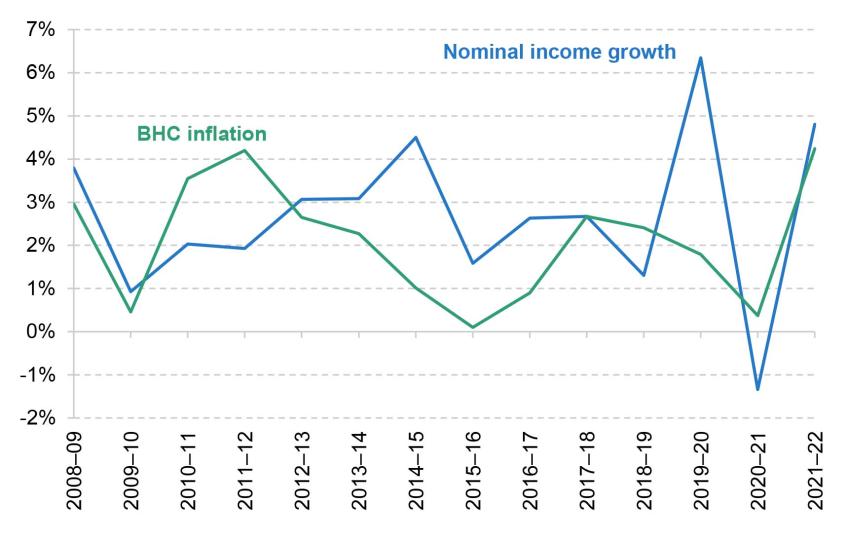
Note: Incomes have been measured net of taxes and benefits and before housing costs have been deducted. All incomes have been equivalised using the modified OECD equivalence scale.
Source: Authors’ calculations using the Family Resources Survey, 2008–09 to 2021–22.
The stagnation in real median household incomes since 2019–20 masks significant differences across the income distribution. These are shown in Figure 2.3, which plots the average annual growth in BHC household incomes at each percentile of the distribution. A line sloping downwards indicates that poorer households have seen higher income growth than richer households, whereas a line sloping upwards indicates that richer households enjoyed higher income growth.
Figure 2.3. Average disposable household income growth (BHC), by income percentile
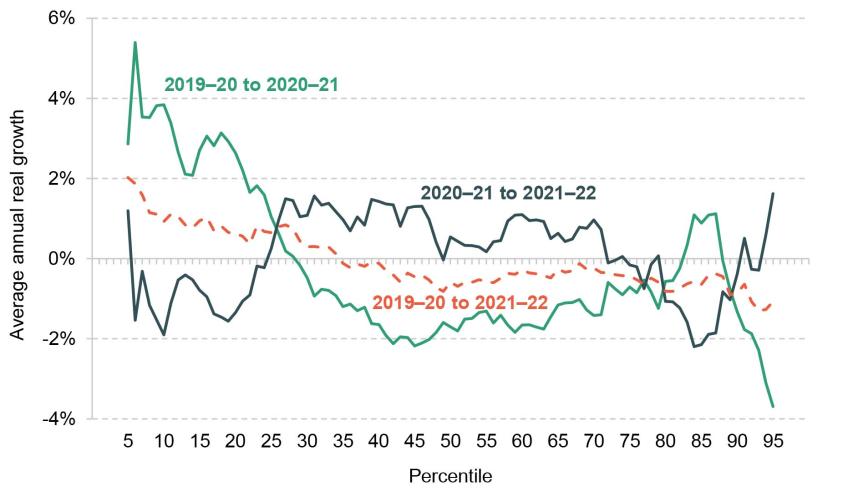
Note: Incomes have been measured net of taxes and benefits and before housing costs have been deducted, and are expressed in 2021–22 prices. All incomes have been equivalised using the modified OECD equivalence scale.
Source: Authors’ calculations using the Family Resources Survey, 2019–20 to 2021–22.
Focusing on the first year of the pandemic (the green line), we see that whilst incomes fell across most of the distribution between 2019–20 and 2020–21, households in the bottom quarter of the income distribution actually saw their incomes increase. As we discuss in more detail in Section 2.2, this is because low-income households were more affected by benefit increases during this period, in particular the £20 per week uplift to universal credit. In addition, low-income households receive less of their income from employment, so the labour market disruption over the pandemic had a smaller effect on them.
This pattern was partly reversed in the second year of the pandemic, between 2020–21 and 2021–22 (the black line). Households at the bottom of the income distribution saw modest declines in their income, as the £20 uplift was withdrawn, while households around the middle saw a modest increase in their income as the labour market rebounded.
The dashed red line brings the other two together and shows annualised income growth between 2019–20 and 2021–22. Growth in household incomes over this period was generally progressive, with households at the lower end of the income distribution seeing modest increases in income and those at the higher end slight falls. The pattern of growth is similar to that seen in the four years after the Great Recession, between 2007–08 and 2011–12, as documented in Cribb et al. (2022).
Implications for income inequality
We now turn to the headline measures of income inequality that come out of the changes examined above. Figure 2.4 plots the 90:50 ratio, which gives the ratio between the 90th and 50th percentiles of the income distribution, and the 50:10 ratio, which is defined correspondingly. There has been little change in the 90:50 ratio since the start of the pandemic. In contrast, the 50:10 ratio fell rapidly from 2.07 in 2019–20 to 1.96 in 2020–21, as household incomes increased at the bottom of the income distribution whilst falling in the middle. It then rebounded to 2.01 in 2021–22, below its level immediately before the pandemic, reflecting the overall progressive pattern of income growth since the start of the pandemic shown in Figure 2.3.
Figure 2.4. 90:50 and 50:10 ratios for disposable household income (BHC)

Note: Incomes have been measured net of taxes and benefits and before housing costs have been deducted. All incomes have been equivalised using the modified OECD equivalence scale.
Source: Authors’ calculations using the Family Resources Survey, 1994–95 to 2021–22.
Taking a longer view, both ratios have hovered around 2 since the mid 1990s (meaning that households at the 90th percentile have about double the incomes of those at the middle, and those at the middle have double the incomes of those at the 10th percentile). The 90:50 modestly declined in the decade leading up to the pandemic and the 50:10 modestly increased.
Figure 2.5 plots the Gini coefficient, a measure of inequality that takes the entire distribution of incomes into account. A higher score implies greater inequality, with 1 indicating one person having all the income and 0 indicating all individuals having equal income. Since the beginning of the pandemic, there has been a slight fall in the Gini coefficient, from 0.35 to 0.34. This continues the pattern seen since the early 1990s, during which time the Gini coefficient has changed very little indeed, following a substantial increase in the 1980s.
Figure 2.5. Gini coefficient
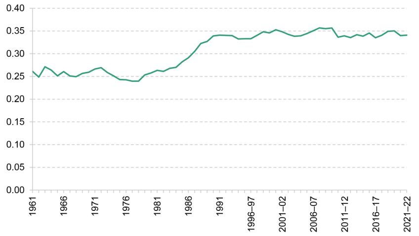
Note: Incomes have been measured net of taxes and benefits and before housing costs have been deducted. All incomes have been equivalised using the modified OECD equivalence scale.
Source: Authors’ calculations using the Family Resources Survey, 1994–95 to 2021–22, and the Family Expenditure Survey, 1961 to 1993.
2.2 Contributions to household income trends
In this section, we examine the changes in household incomes since the pandemic in more detail, and set them in their recent historical context. To do this, we separate out different components of households’ income, showing the contributions of employment income, benefits, income from investment, savings and private pensions, and housing costs to overall AHC income growth. We consider income growth across all households, as well as across the income distribution, splitting households into three equally sized income groups or ‘tertiles’. We distinguish between benefits for pensioner households (households with at least one pensioner in them) and benefits for working-age households, further splitting the latter into disability benefits and benefits unrelated to disability.
To contextualise changes over the pandemic, we start by showing the role played by the various income sources in driving household income growth between 2011–12 and 2019–20 – in other words, between the recovery from the Great Recession and the pandemic. The first black diamond in Figure 2.6 shows that total household incomes grew by 10.5% between 2011–12 and 2019–20, an average of 1.25% a year. By far the most important contributor was growth in employment incomes, which more than accounts for total income growth over this period. Employment incomes increased faster at the bottom of the income distribution than at the top, contributing 18.9% among the lowest-income households, 14.5% among middle-income households and 7.0% among the highest-income households. However, this was partly offset by reductions in working-age benefits, which overwhelmingly affected households in the bottom third of the income distribution. There was also an increase in other income for households in the middle and top tertiles, largely a consequence of higher incomes from private pensions. Taken together, growth in total incomes was similar across the income distribution, and slightly higher for middle-income households.
Figure 2.6. Contributions to net household income growth (AHC), 2011–12 to 2019–20, by AHC income tertile
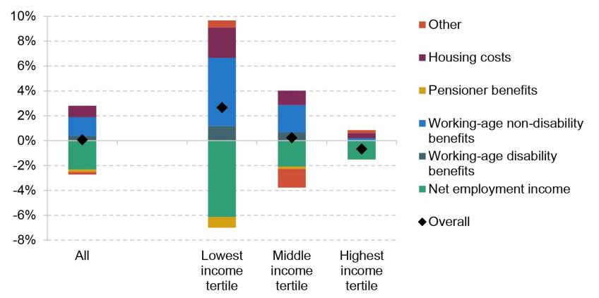
Note: Incomes have been measured net of taxes and benefits and after housing costs have been deducted. All incomes have been equivalised using the modified OECD equivalence scale. Very-high-income households and those with negative incomes are excluded. ‘Other’ income contains mostly pension income, investment income and payments such as student loan repayments, but also includes private benefits and child income.
Source: Authors’ calculations using the Family Resources Survey, 2011–12 and 2019–20.
Patterns of income growth were very different in the two years since the pandemic, as shown in Figure 2.7. Employment incomes fell across the income distribution, and more so at the bottom, in a reversal of pre-pandemic trends. This reflects the labour market disruption at the start of the pandemic, which was only partly offset by the furlough scheme and its self-employment equivalent, as well as earnings not keeping up with inflation in 2021–22.
Figure 2.7. Contributions to net household income growth (AHC), 2019–20 to 2021–22, by AHC income tertile

Note: Incomes have been measured net of taxes and benefits and after housing costs have been deducted. All incomes have been equivalised using the modified OECD equivalence scale. Very-high-income households and those with negative incomes are excluded. ‘Other’ income contains mostly pension income, investment income and payments such as student loan repayments, but also includes private benefits and child income.
Source: Authors’ calculations using the Family Resources Survey, 2019–20 and 2021–22.
However, these falls in employment income were offset by an increase in working-age benefits, which particularly benefited lower-income households. Again, this represents a reversal of pre-pandemic trends. Two key policies were the £20 per week uplift to universal credit, which lasted from the start of the pandemic until October 2021, and the increases in work allowances and reduction in the taper rate for universal credit from the end of November 2021. In addition, local housing allowance rates, which govern the maximum amount of housing support private renters can receive and which had been frozen for four years, were significantly increased at the start of the pandemic. There was also a rise in disability benefits, which contributed 1.2% to total income growth among the lowest-income households. A progressive fall in housing costs further pushed up AHC incomes among lower-income households. Taken together, total incomes increased by 2.7% among the lowest-income third of households, remained roughly constant at the middle (0.2%) and fell slightly (–0.7%) among the highest-income households between 2019–20 and 2021–22.
In the rest of this section, we discuss the key changes in income sources since the beginning of the pandemic in more detail: the fall in employment incomes which was concentrated among lower-income households; the rise in benefit incomes; and in particular the rise in disability benefits among working-age households.
Employment incomes
The decline in net employment income between 2019–20 and 2021–22, especially among lower-income households, was a notable departure from pre-pandemic trends. This has been caused by both a fall in the proportion of households in work and a fall in earnings for those in work.
Figure 2.8 shows the share of workless households in each income tertile, split by whether the household contains at least one pensioner or only working-age adults. The fraction of low-income households with no one in paid work rose by 2.9 percentage points, driven by working-age households. The changes for households in the middle and upper tertiles were much more modest (0.4 and 0.8 percentage points respectively). Part of this rise in worklessness reflects an increase in exits from employment into economic inactivity among people aged 50 and over, documented by Boileau and Cribb (2022) and discussed in more detail in Section 2.3.
Figure 2.8. Share of households out of work, by AHC income tertile
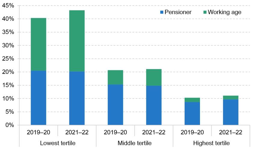
Note: Incomes have been measured net of taxes and benefits and after housing costs have been deducted. All incomes have been equivalised using the modified OECD equivalence scale. Very-high-income households and those with negative incomes are excluded.
Source: Authors’ calculations using the Family Resources Survey, 2019–20 and 2021–22.
As well as more households out of work, Figure 2.9 shows that those who remained in work saw a decline in their net earnings. The fall was biggest for the middle tertile, where employment income of in-work households fell by more than 4%. Among high-income households, the fall was 0.7% For the lowest-income households, those in work saw their employment income fall by 1.7%, on top of the changes in worklessness discussed above. The combination of these two trends led to the particularly stark decline in employment income for the poorest households.
Figure 2.9. Average weekly net employment income for in-work households, by AHC income tertile
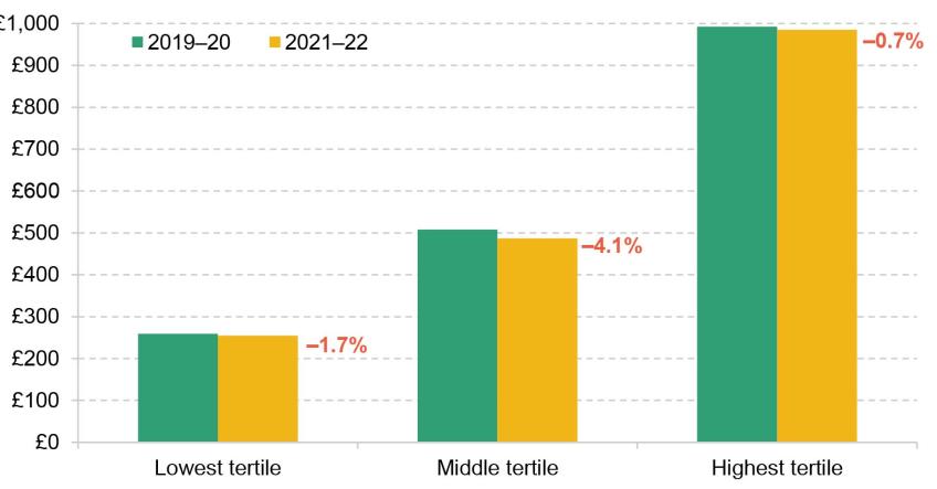
Note: Incomes have been measured net of taxes and benefits and after housing costs have been deducted, and are expressed in 2021–22 prices. All incomes have been equivalised using the modified OECD equivalence scale. Very-high-income households and those with negative incomes are excluded.
Source: Authors’ calculations using the Family Resources Survey, 2019–20 and 2021–22.
Benefit incomes
Changes to employment incomes have direct consequences for benefit incomes: in broad terms, as earnings fall, households’ benefit entitlements rise.1 However, the rise in benefit incomes shown in Figure 2.7 was not only the result of falling employment incomes. Instead, it reflects a number of policy changes, in particular the £20 per week uplift to universal credit rates between March 2020 and September 2021, and changes to the universal credit work allowances and taper rate from the end of November 2021.
Figure 2.10 plots the average weekly benefit income (adjusted for inflation and household size) for households by their pre-tax weekly earnings. We restrict to households not receiving disability benefits to strip out changes caused by increased numbers of disability benefit claimants, discussed below. First, we can see that for non-disabled households earning up to £400 a week, average benefit incomes were higher in 2021–22 than in 2019–20. This is driven by the £20 uplift to universal credit, which was in place for the first six months of the financial year, and the changes to the taper rate and work allowances, which were in place for the last four months of the year. Second, average benefit incomes for households earning less than £400 per week were lower in 2021–22 than in 2020–21, whilst the reverse is true for slightly higher-earning households (between £400 and £800 per week). This reflects the fact that the changes to the taper rate and work allowances more than compensated for the removal of the £20 uplift for higher-earning households on low incomes, but not for lower-earning households.
Figure 2.10. Household benefit income by gross earnings level, 2019–20 to 2021–22
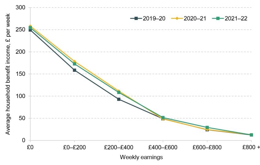
Note: Earnings and benefits have been equivalised using the modified OECD equivalence scale, and are expressed in 2021–22 prices.
Source: Authors’ calculations using the Family Resources Survey, 2019–20 to 2021–22.
Perhaps surprisingly, the increase in benefit levels is smaller for out-of-work households than for those on low earnings, with benefit incomes for this group rising by only £5 per week between 2019–20 and 2021–22, compared with £14–£15 for those earning £0–£200 and £200–£400 per week. This may partly reflect a change in composition of workless benefit claimants following the start of the pandemic. An increase in out-of-work single individuals making claims will tend to pull down the average benefit amount, since they have lower entitlements to universal credit.2 Another contributing factor could be the fact that workless households may be subject to the benefit cap, which limits the total amount of income a household can get from certain benefits. The benefit cap was not raised between 2019–20 and 2021–22, and so if a household was already capped before the uplift it would not have benefited from the £20 uplift.
Disability benefits
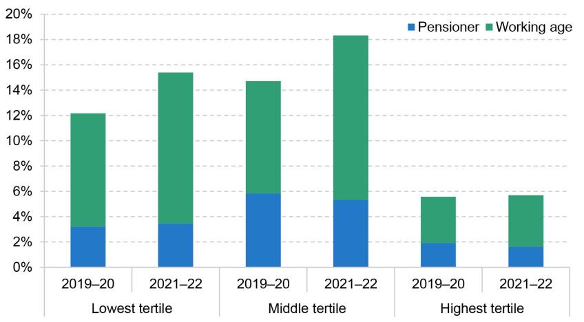
Another notable difference between the pre- and post-pandemic periods is the increased importance of working-age disability benefits, which accounted for more than 1% of income growth for the bottom income tertile between 2019–20 and 2021–22. This is consistent with other work that has shown large increases in the number of new disability benefit claimants across the UK (Joyce, Ray-Chaudhuri and Waters, 2022). It is worth noting that, although increases in disability benefit receipt lead to higher incomes for households, these may not translate into higher living standards due to the higher costs associated with disability – indeed, it is precisely these costs that disability benefits are supposed to compensate for.
The higher receipt of disability benefit among the working-age population is a consequence of a higher number of claimants rather than increases to the rates paid to existing claimants. Figure 2.11 plots the share of households receiving disability benefits by income level both before the pandemic and in the latest year of data. For the bottom income tertile, the share of households receiving disability benefits rose by 3 percentage points between 2019–20 and 2021¬–22, from 12% to 15%, driven entirely by an increase among working-age households. For households in the middle of the income distribution, the change was similar (rising from 15% to 18%). In proportional terms, a given rise in disability benefit receipt will have a bigger impact on the incomes of poorer households, leading to its bigger contribution for them in Figure 2.7.
Figure 2.11. Share of households receiving disability benefit, by AHC income tertile
Note: Incomes have been measured net of taxes and benefits and after housing costs have been deducted. All incomes have been equivalised using the modified OECD equivalence scale.
Source: Authors’ calculations using the Family Resources Survey, 2019–20 and 2021–22.
2.3 Living standards of the recently inactive
One of the most widely discussed economic legacies of the pandemic has been a rise in economic inactivity. This has been driven by older individuals close to the state pension age, with flows from employment into inactivity mostly driven by early retirements (Boileau and Cribb, 2022). As Figure 2.12 shows, labour market exits of people aged 50–64 peaked in the first year of the pandemic and remained well above pre-pandemic levels in 2021–22. This section examines the implications of this wave of exits into inactivity for individuals’ living standards and well-being.
Figure 2.12. Flows from employment into inactivity among 50- to 64-year-olds
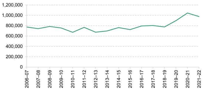
Note: Financial year 2006–07 includes data from 2006Q2 to 2007Q1.
Source: Authors’ calculations using the two-quarter Labour Force Survey, April–June 2006 to January–March 2022.
To understand how exits into inactivity have affected living standards, we start by examining how the living standards of recently inactive individuals have changed over time. Figure 2.13 plots various measures of living standards for individuals aged 50–70 who entered economic inactivity from employment one year ago or less, using data from the Family Resources Survey. For comparison, it also plots the same measures for economically inactive individuals who last worked more than one year ago. Note that the individuals represented by the yellow dots are not the same over time: those who are in the ‘Last worked 0-1 years ago’ series in one year will not be in it in the subsequent year. Figure 2A.1 in the appendix plots the same outcomes, breaking down inactive individuals by whether they last worked two years ago or less, or more than two years ago.
Figure 2.13. Living standards of inactive individuals aged 50–70, by when last worked
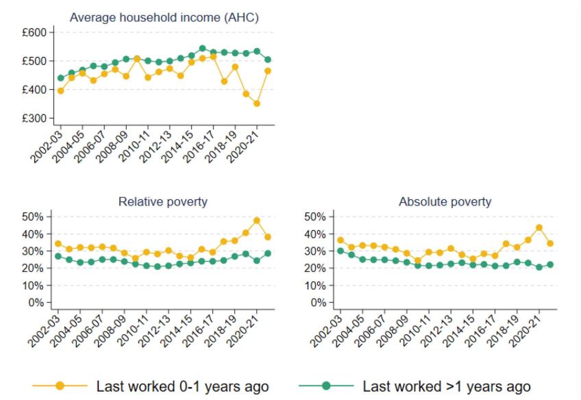
Note: Absolute poverty is defined as having income below 60% of median income in 2010–11. Average (mean) household incomes are measured net of taxes and benefits and after housing costs have been deducted, and have been equivalised using the modified OECD equivalence scale. Individuals who have never worked are included in the ‘Last worked >1 years ago’ category.
Source: Authors’ calculations using the Family Resources Survey, 2002–03 to 2021–22.
We first focus on those who became inactive during 2020–21 – the penultimate yellow dot in each of the panels in Figure 2.13. The first panel shows that average household income among the recently inactive was low by historical standards in 2020–21, though the data are noisy and incomes were not that much lower than for the equivalent group who became inactive the year before. Measures of low living standards, however, clearly show an increase in the incidence of poverty among those who became inactive in the first year of the pandemic. The share of recently inactive 50- to 70-year-olds who were in relative poverty increased by 7 percentage points (18%) between 2019–20 and 2020–21, a large increase at a time when relative poverty fell among inactive individuals as a whole (due to the fall in employment incomes among middle-income households discussed in Section 2.2). The share of recently inactive individuals in absolute poverty also increased by 7 percentage points in the first year of the pandemic.
Turning to those who became inactive in the second year of the pandemic (the last yellow dot – those who last worked a year ago or less in 2021–22), living standards look notably better: average income, relative poverty and absolute poverty among this group were all similar to those among the cohort who became inactive immediately before the pandemic. This suggests that it is the 2020–21 cohort of people who became inactive who are a particular cause for concern.
The increase in poverty among the 2020–21 cohort reflects the fact that individuals who moved from employment into economic inactivity in that year were less likely to have access to the state pension and private pensions than those who moved into inactivity in previous years. As shown in Figure 2.14, those who became inactive in 2020–21 were 8 percentage points less likely to be above the state pension age, and 5 percentage points less likely to have a private pension, than those who became inactive in 2019–20. Nearly half (49%) of the 2020–21 cohort did not have access to either private or state pensions, compared with 43% of the 2019–20 cohort.
Figure 2.14. Pension status of inactive individuals aged 50–70, by when last worked
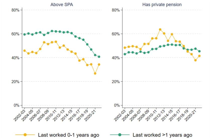
Note: SPA refers to state pension age.
Source: Authors’ calculations using the Family Resources Survey, 2002–03 to 2021–22.
In contrast, whilst the number of flows into inactivity in 2021–22 remained higher than pre-pandemic, recently inactive individuals in that year had similar access to the state pension and private pensions to those who became inactive before the pandemic. This suggests that there was something different about the 2020–21 cohort, who were perhaps more likely to have been ‘forced’ into leaving work because of labour market disruptions or health concerns. In contrast, by 2021–22 the labour market had largely recovered and the vaccine had been rolled out,3 so those who became inactive in that year are more likely to have done so out of choice.
The fall in living standards among those who became inactive at the start of the pandemic is corroborated by data from Understanding Society, a panel survey that interviews the same individuals year after year. The survey is conducted in overlapping waves of two calendar years each (Wave 10 spans 2019 and 2020, Wave 11 spans 2020 and 2021, and so on), so the timing of the data does not map precisely onto the financial years discussed above. Because we follow the same individuals, here we focus on the change in various outcomes they experience between one wave and the next.
The Understanding Society data suggest that older individuals (aged 50–70) who have exited the labour market since the pandemic began experienced larger deteriorations in their living standards than previous cohorts, based on a number of measures in Figure 2.15. For example, the average weekly food expenditure among those who became inactive in 2020–2021 fell by around £60 on average compared with the year before they became inactive, and 20% of this group entered relative poverty upon exiting the labour market, up from 16% the previous wave. These changes were much larger than among individuals who became inactive more than a year ago, which means that they do not simply reflect wider declines in living standards among the older inactive population over the pandemic. In addition, the fact that the data track the same individuals over time shows that the trends in Figure 2.13 are not simply due to a selection effect. That we see consistent patterns, even when following the same individuals, suggests that the trends are not because those who became inactive in 2020–21 already had low living standards. Instead, the results indicate that those who became inactive during that year experienced a deterioration in their living standards.
Figure 2.15. Change in living standards of inactive individuals aged 50–70, by when last worked
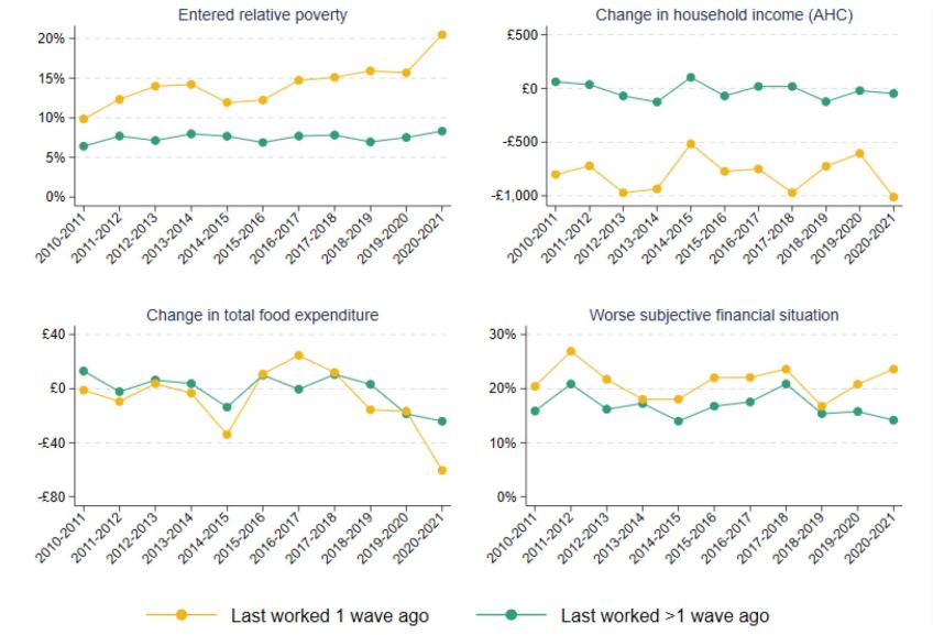
Note: Average household incomes are measured net of taxes and benefits and after housing costs have been deducted, and have been equivalised using the modified OECD equivalence scale. Food expenditure includes expenditure on groceries, food outside the home and alcohol. Household income is measured at the monthly level. Subjective financial situation is coded on a 1–5 scale, ranging from ‘finding it very difficult’ to ‘living comfortably’; in a given wave, an individual is coded as being in a worse subjective financial situation if their self-reported score is worse than their score in the previous wave. Individuals who have never worked are included in the ‘Last worked >1 wave ago’ category.
Source: Authors’ calculations using Understanding Society, Waves 2–12.
Finally, we turn to self-reported well-being in Figure 2.16, which uses data from the Annual Population Survey. Levels of anxiety, happiness, life satisfaction and the perception of life being worthwhile all deteriorated in 2020, but the deterioration was much larger among those who had become inactive one year ago or less than among those who became inactive more than a year ago. In particular, in 2020, the percentage increase in anxiety among the cohort who became inactive that year was more than double the increase among those who had been inactive for longer, and the percentage fall in the perception of life being worthwhile was 60% larger. As with measures of living standards shown in Figure 2.13, self-reported well-being largely rebounded among those who were recently inactive in 2021 and 2022.
Figure 2.16. Well-being of inactive individuals aged 50–70, by when last worked
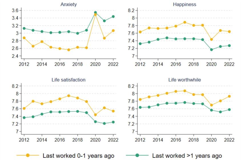
Note: All outcomes are scored on a 0–10 scale. Individuals who have never worked are included in the ‘Last worked >1 years ago’ category.
Source: Authors’ calculations using the Annual Population Survey, January–December 2012 to January–December 2022.
This analysis challenges the perception that all exits into inactivity over the pandemic were driven by wealthy individuals who could afford to retire in comfort. Existing research shows that the rise in inactivity is mainly a lower-middle-income phenomenon, concentrated in sectors that were hit hard by the pandemic and not amenable to working from home (Carrillo-Tudela, Clymo and Zentler-Munro, 2022). Consistent with this, our analysis suggests that many of those who became inactive in the first year of the pandemic may have been ‘forced’ into early retirement, to the detriment of their living standards and well-being. Conversely, those who became inactive in 2021–22 – when the labour market turmoil had largely dissipated and the vaccine had been rolled out – are more likely to have done so out of choice.
The fact that those who became inactive more recently have better living standards does not mean that this is an issue of only historical interest. People do not usually experience much change in their incomes after retirement, and so – unless they are able to get back into work – it is likely that many of the 2020–21 cohort will experience persistent low living standards. This is especially true for those who retired many years before their state pension age.
2.4 Conclusion
The recovery in household incomes in 2021–22 was stifled by a sharp rise in inflation. As result, average (median) household income was 1.2% below the pre-pandemic peak, and just back to pre-pandemic levels when measured after deducting housing costs. However, low-income households saw modest increases in their incomes in the two years since the pandemic started, implying a fall in income inequality at the bottom of the distribution.
This rise in incomes among low-income households was seen despite large falls in their incomes from employment. This is because lower employment rates and earnings were offset by lower housing costs and higher benefit incomes. The changes to benefit policy over this period – in particular the £20 uplift to universal credit, which persisted until October 2021, and changes in the universal credit work allowances and taper rate from November 2021 – increased benefit entitlements at any given level of earnings, and the share of low-income households receiving disability benefits also rose substantially over this period.
Looking beyond 2021–22, important changes in benefits policy will shape patterns in incomes. While six months of 2021–22 had the £20 uplift to universal credit, going forward that uplift has been withdrawn and replaced with an increase to work allowances and a reduction in the taper rate. Those reforms are worth about half the £20 uplift to claimants on average, and are targeted towards households slightly higher up the income distribution (Waters and Wernham, 2021a and 2021b). Local housing allowances – which had been increased in the pandemic – have once again been frozen in nominal terms, further pushing down real incomes at the bottom of the income distribution (Ray-Chaudhuri and Waters, 2023). Pushing in the other direction is the £37 billion support package implemented in response to the cost of living crisis which will have substantially bolstered incomes at the bottom of the distribution. At the same time, earnings have not kept pace with inflation, reducing real incomes across the board but especially among middle- and higher-income households. Taken together, it is likely that income inequality will have continued to fall in the period since 2021–22, largely due to the temporary cost of living support. How living standards and inequality evolve into the future will depend, among other things, on the path of earnings growth across the distribution and the government’s tax and benefit policies.
A key legacy of the pandemic has been the rise in economic activity among older adults. Data on living standards and well-being suggest that the cohort of 50- to 70-year-olds who left the labour market in the first year of the pandemic experienced higher rates of poverty than previous cohorts, and suffered worse declines in self-reported well-being. This did not simply reflect a general deterioration in living standards and well-being among the older inactive population. Our analysis challenges the perception that exits into inactivity over the pandemic were driven by wealthy individuals who could afford to retire in comfort, and suggests that many individuals were ‘forced’ into early retirement at the start of the pandemic. Further analysis using the English Longitudinal Study of Ageing (ELSA) will be important to identify which groups saw the largest declines in living standards upon leaving the labour market, and to what extent they are continuing to experience low living standards.
3. Poverty
Key findings
1. The overall absolute poverty rate fell in the first year of the pandemic (2020–21) and was little changed in 2021–22, leaving it nearly 1 percentage point (ppt) or 480,000 people lower than its pre-pandemic level. This is largely due to changes in benefits policy, in particular the (temporary) £20 universal credit uplift and (permanent) changes to the universal credit taper rate and work allowances, which allow workers to keep more of the benefit as their earnings rise.
2. The £20 uplift reduced absolute poverty rates by 0.3ppts during the six months it was in place in 2021–22, or by 0.6ppts in annualised terms (379,000 people). The changes to work allowances and the taper rate that succeeded it had a much more muted impact on poverty. Their annualised effect is only 0.2ppts (133,000 people) – a third of the impact of the uplift. Even on a per-pound basis, the £20 uplift had a 40% larger effect on poverty. This is because changes to work allowances and the taper rate mainly benefit somewhat higher-earning households further up the income distribution and do not affect out-of-work households at all.
3. The first instalment of the cost of living payments to households receiving means-tested benefits – £326 paid in July 2022 – substantially boosted spending. Discretionary spending was £33 a week (12%) higher for recipient households on average in the four weeks after the payment than in the four weeks before, and remained somewhat elevated up to 15 weeks after the initial payment. The rise in discretionary spending was driven by an increase in cash withdrawals, spending on groceries, and spending on entertainment (e.g. restaurants, streaming services), which accounted for 17%, 15% and 28% of the total increase in discretionary spending respectively. That recipients responded strongly to the payment suggests that, prior to the payment, many had limited savings or means of borrowing available to them, and wanted to spend more than they were able to. That a substantial fraction of the cost of living payment went on basic goods such as groceries, but also on more discretionary goods such as entertainment, indicates a variety of levels of ‘need’ among recipient households.
4. Recipients with lower earnings increased their spending by more immediately after receiving the cost of living payment, which may indicate higher cash constraints in the lead-up to the payment. However, the distribution of extra spending across categories (groceries, entertainment etc.) was similar across recipients with different levels of earnings.
This chapter examines trends in household poverty, particularly looking at changes since the beginning of the COVID-19 pandemic in March 2020.
We start by describing trends in poverty rates in the UK for the latest two years of data, for the whole population as well as subgroups including children and pensioners, to assess the extent to which the pandemic and the policy response affected the number of households on low incomes. We then estimate the effects on poverty of two key reforms introduced during the pandemic: the £20 per week uplift to universal credit (UC) and the reduction in the UC taper rate. Finally, we use bank transaction data to look at how the cost of living payment in July 2022 affected spending patterns for recipients, to examine how beneficiaries spent this payment and how important it might have been in poverty alleviation.
The majority of analysis in this chapter is based on the Households Below Average Income data. When we refer to household income, the measure we use is net equivalised household income – income after taxes and benefits and adjusted for household composition – expressed as the equivalent for a childless couple. We measure household incomes after deducting housing costs (AHC). While there is clearly an element of choice in many people’s spending on housing, variation in housing costs may not reflect differences in housing quality, especially for low-income households. Further, incomes before housing costs include housing benefit as income. An increase in rent covered by housing benefit therefore shows up as an increase in ‘before-housing-costs’ income, which makes households appear better off even though their disposable income (after housing costs) remains unchanged.
Section 3.3 uses bank transaction data from ClearScore. We offer a full description of those data at the beginning of that section.
3.1 Poverty rate trends
We begin by documenting changes in poverty rates, focusing on the period since the beginning of the pandemic. Figure 3.1 shows absolute poverty rates for various groups since 2002–03, defined as the share of individuals whose household income (adjusted for inflation) is below 60% of the median income in 2010–11. During the first year of the pandemic, 2020–21, absolute poverty among the whole population fell by around 1 percentage point (ppt) from 17.9% to 16.8%. In 2021–22, it rose back slightly, but at 17.1% it was still 0.7ppts (479,000 people) below the pre-pandemic level. As we show later, a key driver in this change was the increased generosity of benefits – in particular, the £20 per week uplift to UC entitlements and the changes to the UC work allowances and taper.
Figure 3.1. Absolute poverty (AHC), overall and for different groups
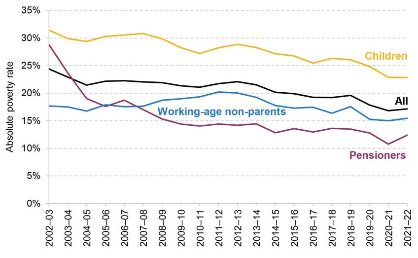
Note: Incomes have been measured net of taxes and benefits, with housing costs deducted. All incomes have been equivalised using the modified OECD equivalence scale. The absolute poverty measure gives the percentage living in a household with less than 60% of the 2010–11 median income, adjusted for inflation.
Source: Authors’ calculations using the Family Resources Survey, 2002–03 to 2021–22.
The fall in absolute poverty over the two latest years has been driven by a decline in the proportion of children living in poverty. Prior to the pandemic, 25% of children were living in a household with income below the absolute poverty line. This fell to 23% in 2020–21, and remained at that level in 2021–22. This is consistent with the fact that families with children are more likely to be receiving UC than pensioners or those without children, and so their outcomes are more sensitive to UC policy.
Figure 3.2 shows the evolution of relative poverty rates. These compare household incomes with a poverty line that changes over time, equal to 60% of the contemporaneous median income in each year. A consequence of this is that relative poverty rates are affected by changes in the middle of the income of the distribution: all else equal, an increase in median income would lead to a rise in relative poverty.
Figure 3.2. Relative poverty (AHC), overall and for different groups
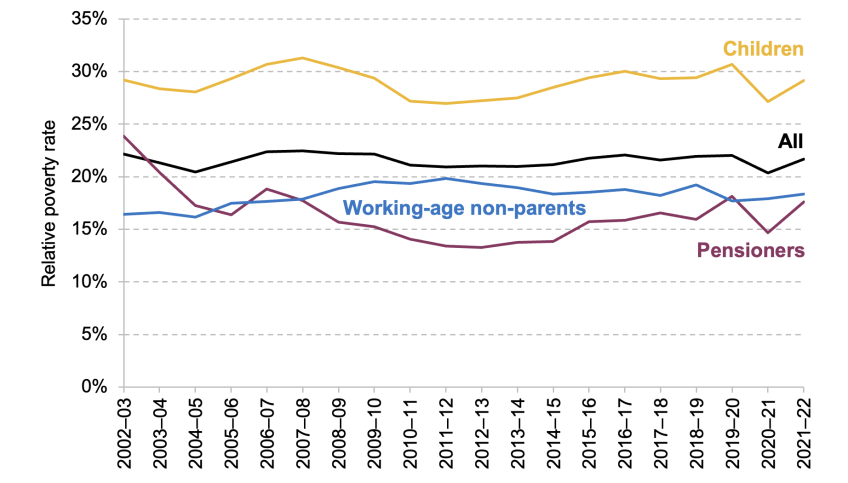
Note: Incomes have been measured net of taxes and benefits, with housing costs deducted. All incomes have been equivalised using the modified OECD equivalence scale. The relative poverty measure gives the percentage living in a household with less than 60% of the contemporaneous median income.
Source: Authors’ calculations using the Family Resources Survey, 2002–03 to 2021–22.
Across the population, relative poverty fell by 1.7ppts between 2019–20 and 2020–21. This was larger than the decline in absolute poverty, as the labour market disruption at the start of the pandemic caused median income to fall. The subsequent recovery meant that median income rebounded, and as such relative poverty rates returned to close to their pre-pandemic level in 2021–22.
3.2 Effects of reforms to the benefit system
We now investigate the role of reforms to the benefit system in changes to absolute poverty since the pandemic. As discussed in the pre-released chapter on living standards (Ray-Chaudhuri and Xu, 2023), low-income households saw larger declines in their employment incomes between 2019–20 and 2021–22, but these were more than offset by increases in working-age benefit incomes. In particular, two key policies introduced since the beginning of the pandemic bolstered the incomes of low-income households. First, a £20 a week uplift to UC was introduced in March 2020 – meaning that the vast majority of UC recipients saw an increase in entitlement of that amount.4, 5 This remained in place until October 2021 (covering six months of the 2021–22 financial year). Second, work allowances in UC – the earnings thresholds above which benefit entitlements are gradually reduced – were raised by £500 a year, and the rate at which benefits are reduced above this point (the ‘taper rate’) was reduced from 63% to 55%. This change took place towards the end of November 2021, so was in place for the last four months of the 2021–22 financial year.
In this section, we estimate the impact of these two policies on absolute poverty using TAXBEN, the IFS tax and benefit microsimulation model. For brevity, we refer to the combined change in the UC work allowances and taper rate as the ‘taper rate reduction’. We present both the annualised impact of each policy – the effect if each policy were in place for a full year or if they were made permanent – and the impact in 2021–22, taking into account the number of months the policies were actually in place (six months in the case of the £20 uplift and four months in the case of the taper rate reduction).6 Table 3.1 shows the estimated effects of the two key reforms on absolute poverty rates for various groups, against a baseline without either reform. We assume no behavioural response such as a change in labour supply or take-up of benefits.
Table 3.1. Effects of benefit policy reforms on absolute poverty rates
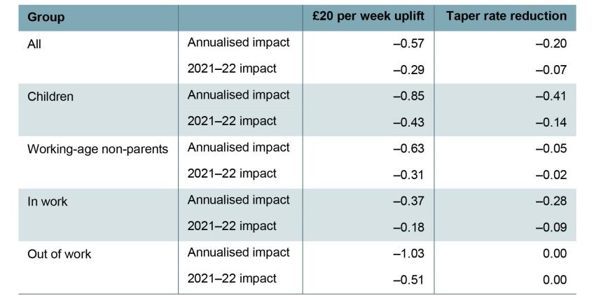
Note: Shows percentage point change in absolute poverty rate, measured after housing costs are deducted.
Source: Authors’ calculations using TAXBEN, the IFS tax and benefit microsimulation model, and Family Resources Survey 2021–22.
Given that both policies increase support for low-income families, unsurprisingly both reduce poverty. However, our analysis shows that the £20 uplift had a much larger effect on overall poverty rates than the taper rate reduction. The impact of the uplift being in place for six months of 2021–22 was to reduce absolute poverty among the whole population by 0.3ppts, equivalent to 0.6ppts on an annualised basis (379,000 individuals), a result that is comparable to other simulation exercises based on pre-pandemic data.7 The taper rate reduction had a more muted effect, reducing poverty by 0.1ppts across 2021–22, equivalent to 0.2ppts (133,000 individuals) on an annualised basis.
This is partly due to who the two policies target. The taper rate reduction only benefits working households on UC, with bigger impacts for those with higher levels of earnings. These households tend to be further up the income distribution and often already above the poverty line. In contrast, the £20 uplift applied equally to all UC recipients (except those who were subject to the benefit cap) – therefore boosting incomes for those who were near the poverty line. Another reason that the £20 uplift had a bigger impact on poverty was simply that it was a larger policy, costing around £6 billion for a full year, compared with £3 billion for the taper rate reduction (HM Treasury, 2020 and 2021).8 Nonetheless, on a per-pound basis, the uplift had a roughly 40% larger impact on poverty than the taper rate reduction.
The two policies also affect different groups quite differently. The annualised impact of the uplift on child poverty is twice that of the taper rate reduction. The poverty rate of working-age non-parents is almost entirely insensitive to the taper rate, reflecting the fact that the nature of the means-tested benefit system results in few non-parents being entitled to benefits if they are working, and the fact that claimants without children are not eligible for work allowances (unless they also have a disability). Those in out-of-work families see a 1ppt fall in poverty from the uplift, and of course are not affected at all by the taper. Even for in-work families, the uplift has a bigger annualised impact on poverty than the taper rate reduction (though not on a per-pound spent basis).
These results suggest that the total impact of the two policies in 2021–22 on poverty was around 0.4ppts. They therefore explain about half the decline in overall poverty between 2019–20 and 2021–22. Looking forward, the taper rate reduction was a permanent reform, while the uplift has expired. We would therefore expect the absolute poverty rate to be 0.16ppts (106,000 people) higher in 2022–23 than in 2021–22 as a result of changes in these two policies.9
3.3 Cost of living payments
Benefits are uprated each April using a lagged measure of inflation from the previous September. This leads to temporary, but large, falls in the real value of benefits when inflation is rising quickly. For example, in the first quarter of 2023, real benefit entitlements for out-of-work households were more than 10% below their pre-pandemic value. Indeed, benefits are not set to return to pre-pandemic levels until April 2025 (Cribb et al., 2023).
To protect low-income households from the rising cost of living, in 2022 the government introduced two cost of living payments totalling £650 for households receiving means-tested benefits. The amounts paid – £326 in July and £324 in November – were the same irrespective of a household’s circumstances or the amount of benefits it usually received.
In this section, we use transaction-level data to investigate how the first cost of living payment affected the spending of individuals who received them. In particular, we assess how quickly they spent the cash from this payment, and what type of goods or services they spent it on. The way in which households spent the payment is also informative of their living standards prior to the payment coming through. For example, if households quickly spent the payment on necessities such as groceries or rent, this suggests that households were highly cash-constrained prior to receiving the payment. On the other hand, more spending on luxuries such as eating out could imply that they had enough income to cover their essentials. We also look at whether the timing and categories of spending differed across types of households, differentiating by age and income.
Data and methodology
To conduct this analysis, we use the Exact.One Transactional Dataset, containing bank transaction data from ClearScore, a free credit rating app. Users of the app link in their bank accounts and credit cards to provide information about their financial circumstances, which may help improve the deals on credit products they are offered. ClearScore retrieves the historical transactions associated with these accounts, generally up to the previous three years. These data are then completely anonymised to construct the Exact.One dataset. For each transaction, we see the date it occurred, the amount, and usually the firm it was paid to or from and the category of spending (e.g. groceries, fuel). The spending category is automatically assigned by ClearScore based on the firm to which a payment is made. This means it is an imperfect measure: for example, if an individual bought clothes from a supermarket, the spending would be classed as groceries because it shows up on the bank statement simply as spending at the supermarket. The sample we use contains transactions for more than 900,000 users from the beginning of 2022 until the end of October 2022. To ensure that we have a consistent view of users’ accounts, we keep only users for whom we observe a transaction from all their linked accounts both before and after our window of analysis (20 weeks before to 10 weeks after), leaving us with a sample of just over 500,000 users. Within this, there are 98,000 users who received a cost of living payment in July 2022.
The sample is limited to people who have signed up to ClearScore, and as such may not be representative of the general population of benefit claimants. Figure 3A.1 in the appendix plots the distribution of monthly universal credit receipts among ClearScore users receiving the benefit – who are therefore entitled to cost of living payments – against the distribution of payments in the administrative data. It shows that the Exact.One data somewhat over-represent individuals getting very low benefit amounts (particularly those getting under £300 per month) and under-represent those getting very high amounts (particularly those getting £1,500 or more a month), but are reasonably representative between those points. This may be due to ClearScore users being more likely to be in work or being younger than the population of universal credit recipients. However, we would not expect this to significantly bias our results, as we do not find large differences in estimated spending responses to the cost of living payment by monthly benefit receipt. In particular, we find no systematic differences in the composition of spending across categories by monthly benefit receipt, as shown in Table 3A.3 in the appendix.
As an additional representativeness check, Table 3A.4 in the appendix compares spending prior to the cost of living payment among recipients in the Exact.One data with the spending of households entitled to universal credit in the Living Costs and Food Survey (LCFS).10 Despite coming from very different sources, average spending in the two datasets line up remarkably well.
We can identify those users who receive a cost of living payment since it is a very specific amount paid within a short time window. All users who receive a payment of exactly £326 into one of their accounts between 14 and 31 July are classified as a recipient. While it is possible that this method could misclassify a user if they happened to receive another payment of that amount at that time, the chances of this seem slim and so misclassification is unlikely to have a meaningful impact on our results. This can be seen in Figure 3A.2 in the appendix, which shows that almost no users receive payments of £326 into their accounts in the other weeks in our sample, while there is a huge spike around the time of the payments.11
Our analysis involves looking into the types of spending done by individuals in response to the cost of living payments. We start by considering spending across two broad categories: bills and discretionary spending, where the latter is defined as spending on anything other than bills. We also consider effects on debt repayments. These categories are mutually exclusive, and cover all expenditures except for bank charges, insurance premiums, business expenses, and transactions that ClearScore was unable to categorise automatically. We further break down discretionary spending into spending on groceries, entertainment (such as dining out or streaming services), consumer durables (such as home appliances and furniture) and other categories. A full list of spending categories can be found in Table 3A.1 in the appendix. We list the most important types of spending in each category in Table 3A.2.
For the following results, we show the evolution of various types of spending around the time that individuals received cost of living payments. While this is informative, it is useful to get a sense of how the spending of these individuals might have changed had they not received a cost of living payment. General trends such as inflation could lead to higher spending on items such as bills and groceries, and there may be seasonal trends in spending over the year – for example, on entertainment over school holidays. To help account for these trends, we also show how spending evolved for a ‘control group’ of similar individuals who did not receive a cost of living payment.12 We select these individuals by matching each individual who received a cost of living payment to another individual who did not receive a cost of living payment but who had similar spending for the category in question and across all discretionary items between April and June.
Broad spending categories
Figure 3.3 shows how spending on discretionary items and bills evolved for individuals around the time they received the cost of living payment, relative to a control group. The left panel shows weekly discretionary spending, smoothed using a backward-looking four-week moving average. The right panel shows spending on bills each month (comprised of mortgage and rent payments, utilities, council tax and childcare costs). To facilitate comparison, the vertical axes use the same scale.
Figure 3.3. Broad spending categories
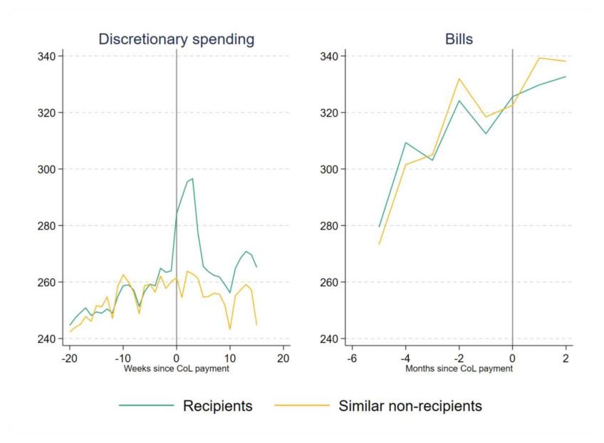
Note: Backward-looking four-week moving average shown for discretionary spending. CoL is short for cost of living.
Source: Authors’ calculations using the Exact.One Transactional Dataset.
We observe that upon receiving the cost of living payment, individuals substantially increased their discretionary spending. Average discretionary spending in the four weeks after the payment was £33 higher than in the four weeks before, an increase of 12%, and there are signs of small anticipatory increases in spending in the weeks leading up to the payment.13 For non-recipients, we do not see any big jumps in spending, which implies that the effect is driven by the extra income from the cost of living payment. By contrast, there was very little change in spending on bills in July for recipients compared with non-recipients (notice, though, that the amount spent on bills was rising substantially during the period of our sample). These patterns suggest that, before receiving the payment, individuals were limiting their discretionary spending, but not necessarily falling behind on bills.14
That overall spending responded strongly to the cost of living payment suggests that, prior to the payment, many recipients had limited savings or means of borrowing available to them, restricting their capacity to spend (i.e. they were ‘credit-constrained’). The cost of living payment (partially) relaxed those constraints, allowing higher levels of expenditure.
The increase in discretionary spending fell away quickly after the initial jump. Still, 10–14 weeks after the payment, recipients were spending an average of £11 per week more than non-recipients. Adding up the total amount extra spent by recipients compared with non-recipients gives an additional £246 spent over 15 weeks. This indicates that individuals on average had exhausted most, but not all, of the cost of living payment before they received the second instalment in November 2022.
Figure 3.4 investigates the impact of the cost of living payment on debt repayments, a category that includes repayments for personal loans, including high-cost payday loans.15 Even though 45% of recipients in our sample had made some debt repayments in the few months in advance of the payment, we do not find evidence of any significant increase as a result of the cost of living payment. In fact, recipients appear to make fewer repayments than similar non-recipients after the payment, although this result is difficult to interpret since repayments appear to be increasing among non-recipients shortly before the cost of living payments were sent out. Nonetheless, focusing simply on the trends in the recipient group, we see that repayments remain remarkably stable at around £10 per week throughout our analysis window with very little change when or shortly after the cost of living payment arrives. It is worth noting that since we do not include credit card repayments, we cannot rule out that households responded by paying off credit card debt.
Figure 3.4. Spending on debt repayments
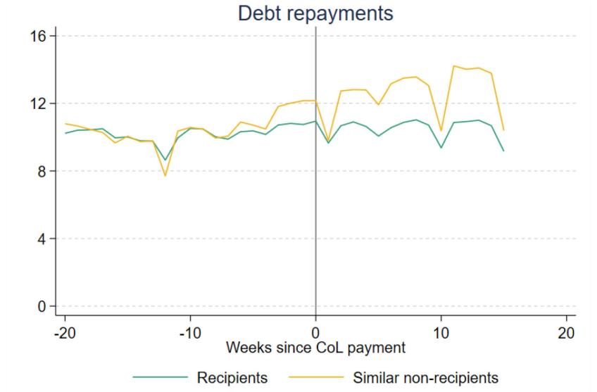
Note: Backward-looking four-week moving average. Does not include repayments to ‘buy now pay later’ firms, nor credit card repayments. CoL is short for cost of living.
Source: Authors’ calculations using the Exact.One Transactional Dataset.
Discretionary spending categories
We now break down the changes in discretionary spending in Figure 3.3 into changes across eight narrower categories, to understand the type of goods or services that individuals choose to spend the payments on. Figure 3.5 shows the distribution of weekly spending across these eight categories in the 9–12 weeks before the cost of living payment. Before receiving the cost of living payments, around a quarter (24%) of recipients’ total discretionary spending went on groceries, and around a quarter (24%) on entertainment, a category that includes eating out, streaming services, and other leisure activities. Clothing (and appearance), transport, and durables (which include white goods such as washing machines and fridges) accounted for much smaller shares of discretionary spending – between 4% and 9% each.16
Figure 3.5. Share of spending by category, among cost of living payment recipients
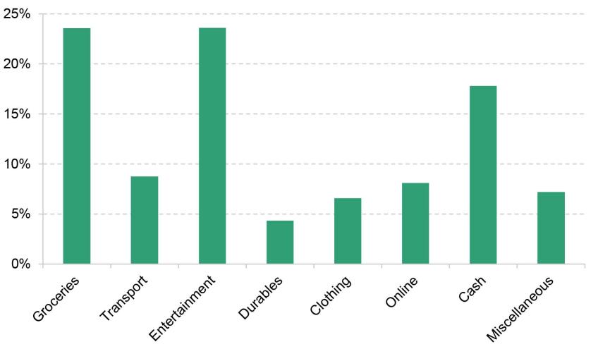
Note: Average of spending between 9 and 12 weeks before the July cost of living payment.
Source: Authors’ calculations using the Exact.One Transactional Dataset.
Just under a fifth (18%) of discretionary spending was taken out as cash. We show this as a separate category, as we cannot tell what types of goods or services the cash was spent on. Similarly, we show online spending (PayPal, Amazon and eBay) as a separate category.
The evolution of spending across these categories, before and after the cost of living payment, is shown in Figure 3.6. For ease of comparison between the categories, each tick point on the vertical axes represents an increase of £5. We see that the biggest increases in spending were on groceries, entertainment and cash. Recipients’ spending on these categories in the four weeks after receiving the payment, relative to the four weeks before, increased by £4.80, £9.10 and £5.60 respectively (8%, 16% and 13% in percentage terms), accounting for 15%, 28% and 17% of the total increase in discretionary spending. Comparing recipients with similar non-recipients, we can also see some evidence of small anticipatory increases in this spending in the weeks immediately before the payment. Recipients continued to spend more on these categories than the control group 15 weeks after the initial payment.
Figure 3.6. Narrow discretionary spending categories
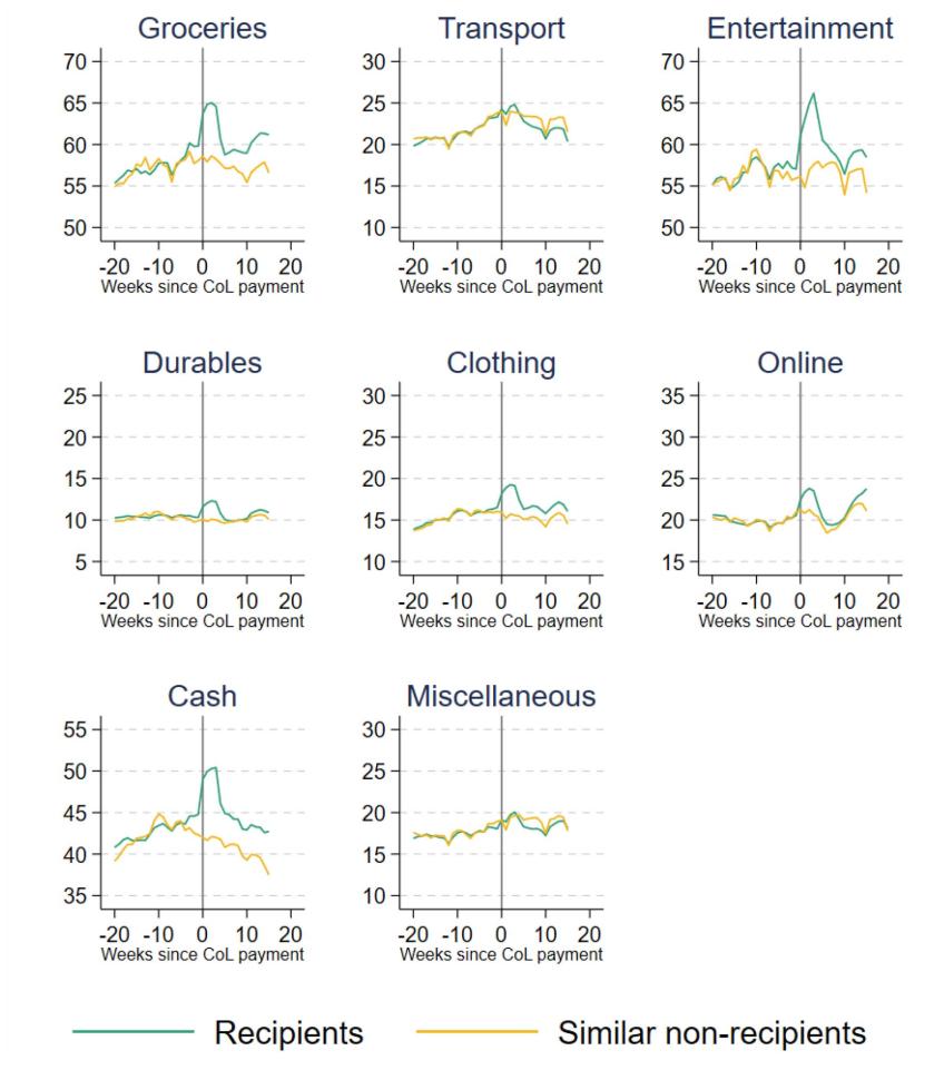
Note: Backward-looking four-week moving average.
Source: Authors’ calculations using the Exact.One Transactional Dataset.
There were smaller increases in spending on clothing, online and on durables, although the percentage increases in these types of spending were still substantial. Transport and miscellaneous items are the only categories where recipients’ spending did not go up after the payment.
Higher spending on groceries persisted beyond the initial increase: 15 weeks after the cost of living payment was made, recipients still spent £3 more a week on average than similar individuals who did not receive the payment. Cash withdrawals and spending on entertainment and clothing also remained elevated for recipients long after the initial payment.
That a substantial fraction of the cost of living payment was spent on basic goods such as groceries, but also on more discretionary goods such as entertainment, indicates a variety of levels of ‘need’ among recipient households. The large response in entertainment spending may also come from how households were behaving prior to receiving the payment. While facing hardship, it seems likely that households would largely cut back on more discretionary spending to preserve levels of essentials. Thus, when receiving a cash increase from the payment, they spend substantially on these more discretionary items as well as essentials in order to restore (or move back towards) their preferred spending composition.
The spike in spending immediately after payment could reflect a number of factors. Standard economic theory would predict that a credit-constrained household would be more likely to purchase durable goods straight after payment, as those goods provide a flow of services for some time into the future. For items that are immediately consumed – which would be true of most entertainment goods and services, for example – it is harder to find a standard economic justification for a rapid, temporary increase in spending straight after payment. This sort of ‘payday’ effect has been found in other settings studying benefit payments (e.g. Stephens, 2003; Mastrobuoni and Weinberg, 2009), perhaps reflecting difficulties in budgeting. Such effects are generally not good for the welfare of recipients, and point to a disadvantage of using occasional large lump sums rather than regular smaller payments (such as the UC uplift).
Differences by individual characteristics
So far, we have considered how average spending changes across all recipients of the cost of living payment. This could conceal differences in spending changes across different types of individuals, who may vary in their preferences and spending needs. In this subsection, we look at how responses differ by age group and self-reported salary.
To summarise the data, we compare each group’s average weekly discretionary spending for the final four weeks before the payment and the first four weeks after. We do not use the control group here, so these differences may be partly driven by wider economic trends or seasonal fluctuations. But assuming that these trends affect all our groups in the same way, we can still compare across groups to understand how changes in spending in response to the cost of living payment differed across groups.
We start by looking at responses for individuals of different ages, which are shown in Table 3.2. We see that young people tended to increase their discretionary spending by more in the first four weeks after the payment: on average, 18- to 24-year-olds increased their spending by £37 a week (20%), compared with £25 (11%) for those aged 60 and over. The initial increase in spending, in both cash and percentage terms, declines with age, which could indicate greater cash constraints among younger low-income individuals. However, the table also shows that younger people spent a higher share of the initial increase in spending on entertainment (the increase was also larger in cash terms). This is likely to reflect differences in preferences across age groups.
Table 3.2. Responses to cost of living payment, by age group
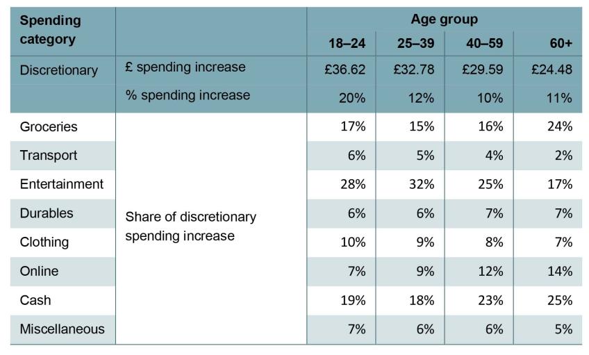
Note: Compares the first four weeks after the cost of living payment with the final four weeks before. Share of recipients in each group: 18–24, 14%; 25–39, 60%; 40–59, 24%; 60+, 2%.
Source: Authors’ calculations using the Exact.One Transactional Dataset.
Table 3.3 shows how changes in spending differed by individuals’ self-reported salary (which ClearScore users give when they sign up to the app). The increase in spending immediately after the cost of living payment was larger for low-paid individuals – £36 a week on average for those paid below £10,000 a year, compared with £28 a week for those paid over £30,000 – likely reflecting higher cash constraints for low earners prior to the payment coming through. The composition of the increase in discretionary spending across categories is similar across salary groups.
Table 3.3. Responses to cost of living payment, by self-reported salary
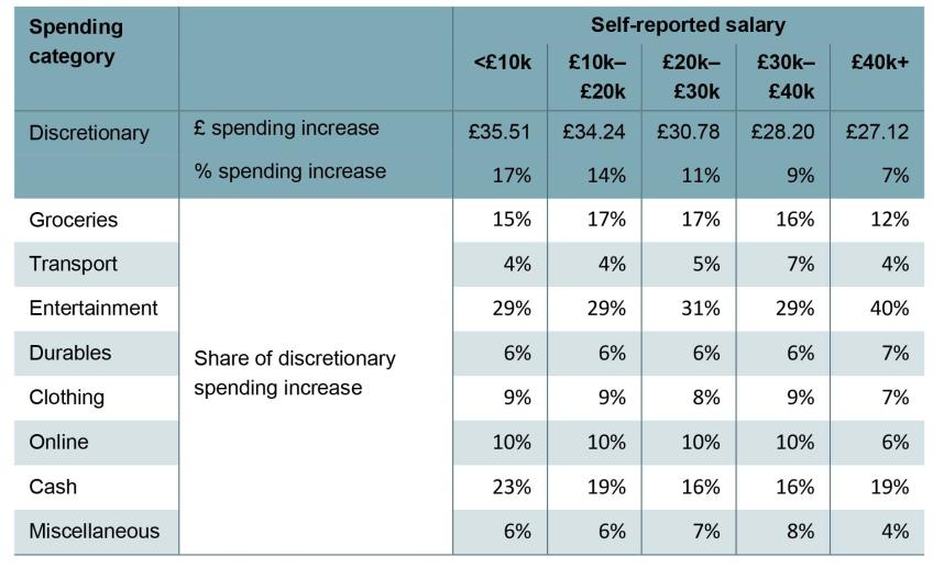
Note: Compares the first four weeks after the cost of living payment with the final four weeks before. Share of recipients in each group: <£10k, 15%; £10k–£20k, 34%; £20k–£30k, 33%; £30k–£40k, 12%; £40k+, 6%.
Source: Authors’ calculations using the Exact.One Transactional Dataset.
3.4 Conclusion
In this chapter, we have focused on changes in household poverty since the beginning of the pandemic. Absolute poverty in the UK population fell from 17.9% to 17.1% between 2019–20 and 2021–22, mainly as a result of a fall in child poverty. This is in stark contrast to the Great Recession, when absolute poverty increased. The fact that this did not happen during the pandemic reflects the extraordinary policy response, which shielded the incomes of the poorest households.
We use microsimulation methods to estimate the effects of the two key benefit reforms: the £20 per week uplift to universal credit entitlements, and the changes to the universal credit work allowances and taper rate. We find that the £20 uplift reduced absolute poverty rates by 0.3 percentage points in 2021–22, or by 0.6 percentage points in annualised terms (had it been in place for the entire year, rather than just the first six months). The changes to work allowances and the taper rate after the withdrawal of the £20 uplift in late 2021 also helped to reduce poverty, but by far less – the annualised effect is only 0.2 percentage points, a third of the effect of the uplift. This is because the taper rate changes mostly benefited low-income households with higher earnings, who tend to be above the poverty line, and because it was a smaller increase in benefit spending.
Since 2022, benefit values have not kept up with inflation. Rather than changing the way in which benefits are uprated or returning to something like the £20 uplift, the government brought in a series of cost of living payments in 2022 and 2023. Using bank transaction data, we show that spending responded strongly to the first cost of living payment immediately after its receipt in July 2022, suggesting that many households were credit-constrained. Spending increased on a range of services, from more basic ones such as groceries to more discretionary ones such as entertainment. This suggests a range of levels of need among recipient households – perhaps not entirely surprising, given that the payments were of equal size for all households on universal credit, regardless of their other circumstances. That we see a temporary spike then fall in spending on immediately consumed goods and services such as entertainment may point to recipients having difficulties in budgeting. In either case, such an effect highlights the downsides of using one-off lump sums rather than simply raising basic benefit amounts as the UC uplift and taper rate reforms did. Another point, which we have not studied here, is how these different approaches to support affect work incentives. Households can become eligible for the Cost of Living Payments by reducing their income in a single qualifying month. Cribb et al. (2023) find that more than 800,000 people could become better off by reducing their income to qualify for one of the 2023–24 lump-sum payments. In addition, even if people do not respond in this way, occasional one-off grants dependent upon UC receipt in certain months introduce an arbitrary unfairness – those who happen to claim UC in the ‘right’ month get the payment, whereas those who become eligible for UC just too ‘late’ do not get it. Such horizontal inequity would not arise if basic UC rates were simply increased.
The outlook for poverty as it stands is complicated. The £20 uplift has now been withdrawn, and the changes to work allowances and the taper rate that succeeded it have a smaller effect on poverty reduction. Inflation remains high and continues to outpace earnings. Local housing allowances, which were raised during the pandemic, are once again frozen in cash terms even as private rents continue to rise (as discussed in the pre-released chapter on housing – Waters and Wernham (2023)), and mortgage payments are sharply increasing. On the other hand, the cost of living payments are sizeable, and will go at least some way to offset these effects, albeit with some of the downsides discussed above.
Of course, those payments are temporary, with three planned in 2023–24 but no more after that. Beyond 2023, the latest forecasts from the Bank of England are for real earnings to rise modestly, reducing absolute poverty. However, housing costs are likely to continue to increase as mortgagors come to the end of their fixed terms and renters the end of their contracts. Without any offsetting benefit support planned, these trends are likely to continue to put upward pressure on poverty rates.
4. Housing quality and affordability for lower-income households
Key findings
1. Facing higher housing costs, renters are considerably more likely than owner-occupiers to have low living standards on a variety of measures. Social and private renters have poverty rates of 46% and 34% respectively, compared with 12% for owner-occupiers. And they are also far more likely to be materially deprived or to live in food insecurity.
2. A steadily growing fraction of low-income households are in the private rented sector, while the share in social housing has declined, as has (in more recent years) the share who own their own home. Younger generations of low-income individuals are now especially likely to be renting privately. For low-income adults born in the 1960s or before, private renting rates ranged from 5% to 20% at almost every age. But for those born in the 1970s it has persistently been in the 25–30% region, and for those born in the 1980s around 40–50%, as social renting and owner-occupation have declined. These patterns suggest that private renting will become even more common among low-income families going forward. This matters because those in the private rented sector have higher housing costs than both social renters and those owning with a mortgage, as well as having less security of tenure.
3. As well as the private sector having higher costs for tenants, the quality of homes, at least for low-income families, is worse. Among lower-income families, those in the private rented sector are more likely than social renters or owner-occupiers to be living in a home that is unsafe, in disrepair, difficult to adequately heat or lacking modern facilities. 25% of their homes would therefore fail the Decent Homes Standard required of social housing, compared with 18% of owner-occupied homes and 12% of social rented homes. Private rented homes are also more likely to have poor energy efficiency, be insecure or be damp, while rented homes in both sectors are more likely to be overcrowded and in areas of poor upkeep and appearance.
4. In the wake of the pandemic, the local housing allowance (LHA) rates which cap maximum housing benefit entitlements were increased to the 30th percentile of local rents. At that point, 23% of private rental properties listed on Zoopla were affordable for housing benefit recipients, which we define as having rents that can be completely covered by housing benefit. Since then, LHA rates have been frozen in cash terms and rents for new lets have risen by over a fifth on average. As a result, in 2023Q1 just 5% of private rental properties were affordable for housing benefit recipients. The rapid decline in affordability has been seen across all parts of the country.
5. A declining share of properties being affordable to housing benefit recipients affects the relative quality of those that are affordable. Relative to the nation as a whole, affordable properties in 2023Q1 were 15% more likely to have an energy rating of D or below, and had 19% higher heating and hot water costs. These gaps have increased as the number of affordable properties has declined in the past few years. This shift is especially pertinent given recent increases to energy costs. Affordable properties are also generally more likely to be in low-employment and high-crime areas, though have slightly better access to local services such as post offices, supermarkets and GPs.
On average, housing costs amount to 11.4% of UK households’ incomes. Housing tenure is strongly predictive of living standards: social renters have a poverty rate based on incomes after deducting housing costs (AHC) of 46%, private renters 34%, mortgagors 11%, and those who own their home outright 15% (Figure 4.1). A large part of this is due to housing costs, especially for private renters, as shown by the fact that renters’ poverty rates are so much higher on an AHC basis than when total income is used (BHC). Similar patterns are seen in rates of material deprivation and food insecurity. Any serious attempt to boost living standards, and particularly to tackle poverty, is likely going to have to grapple with housing costs.
Figure 4.1. Relative poverty and deprivation by housing tenure, 2019–20
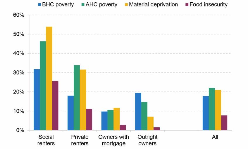
Note: Tenure is defined at the household level. Material deprivation measures the percentage of people who are in either child, pensioner or working-age material deprivation. The material deprivation and food insecurity rates follow the methodology of DWP’s HBAI publication (though the deprivation measure is not combined with low income).
Source: Family Resources Survey 2019–20.
Over the past two years, rapidly rising rents and mortgage interest payments have brought renewed attention towards housing policy. In this chapter, we study trends in housing tenure, costs and quality, with a particular focus on low-income families. We then turn to studying how the – indefinite, on current policy – freeze in the maximum support the benefit system makes available for private rents is affecting the number and quality of properties that benefit claimants can afford.
4.1 How has housing tenure changed over time?
We begin by examining how housing tenure has changed over time and across the generations. We study how patterns have changed for richer and poorer households. To do this, we use incomes measured after deducting housing costs (AHC). We adopt this approach because our focus is on low-income families and, as argued in Appendix A, AHC income provides a better guide to living standards for these households. Naturally, this means that trends in housing tenure and cost will themselves change who is defined as being richer or poorer. Nonetheless, defining income this way is useful because it tells us about the kinds of characteristics those on lower incomes have, which is critical for understanding what kinds of challenges they face and what kinds of policies are best suited to helping them.
How has housing tenure changed across the income distribution?
Figure 4.2 shows the tenure make-up of each fifth (quintile) of the (after housing cost, or AHC) income distribution from 1968 to 2020–21. Several trends stand out. First, across all income groups social renting fell in frequency from around 1980 to 2000 – due in significant part to right-to-buy. The fall was more significant among higher income groups, meaning that social housing has become more concentrated among poorer families: for example, in the 1960s and 1970s, about 20% of the richest quintile lived in social housing, whereas now only a tiny minority do so. This decline in social renting was accounted for by a switch to both homeownership and private renting. Second, at least for the poorest two quintiles, homeownership with or without a mortgage (the sum of the green areas) hit its peak in the mid 2000s for the poorer two quintiles, and since has gone into decline. That gap has entirely been filled by private renting. Third, there has been a slow but steady increase in homeownership without a mortgage in all but the poorest quintile – at least partly a consequence of an ageing population. The appendix to this chapter shows the same figure but by BHC income quintile, which shows similar trends, but with private renters constituting a smaller proportion of the poorest quintile.
Figure 4.2. Tenure shares by AHC income quintile
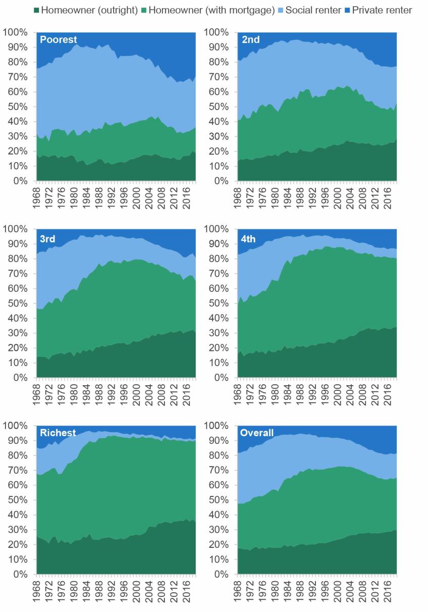
Note: Tenure defined at the household level. Other tenures, such as shared-ownership or government-owned accommodation, are excluded.
Source: Family Expenditure Survey up to 1993; Family Resources Survey from 1994.
These trends matter because different tenures have very different housing costs, as shown in Figure 4.3. On average, private renters have the highest costs, then social renters, then homeowners with a mortgage (here we only include interest payments in their costs, not repayment of the principal), while homeowners without a mortgage have close to zero housing costs.17 Renters are also the most likely to have very high housing costs. The shift towards private renting for poorer families therefore implies not only less security of tenure but also lower (AHC) incomes; conversely, the shift towards homeownership, and particularly homeownership without a mortgage, for richer families tends to lower their costs.
Figure 4.3. Median, 10th and 90th percentile of monthly housing costs, by housing tenure, 2019–20
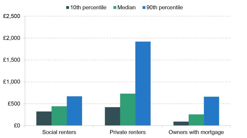
Note: Tenure defined at the household level. Mortgagors’ housing costs include interest payments but not payment of the principal.
Source: Family Resources Survey 2019–20.
How has housing tenure among poorer families changed between the generations?
Housing tenure tends to be a fairly persistent, or at least predictable, state. Individuals often start adult life as a renter, before progressing to homeownership; homeowners rarely go back to being renters, and typically the only tenure change they experience is to move from being a mortgagor to owning their home outright. At the same time, social renters often stay in the social sector for many years or decades. The trends in tenure over time discussed above reflect the passing through of generations and their tenure trajectories, mixed together with wider changes in the economy and policy environment (such as right-to-buy). Thus, these overall trends can obscure rather different experiences of different generations. Understanding how generations are faring is important, as the persistence of housing tenure means it gives us a guide to what we might expect in the future.
This is the issue to which we now turn, zeroing in on the patterns among poorer households. Figures 4.4, 4.5 and 4.6 show the tenure composition of those in the bottom 40% of the AHC household income distribution from age 25, split by their decadal birth cohort (private renting in Figure 4.4, social renting in Figure 4.5 and homeowning in Figure 4.6). Because our data run from 1968 to 2020–21, for those born in the 1910s we only have information from their mid 50s onwards and for those born in the 1980s we only have information up to their mid 30s.
Figure 4.4. Percentage who are private renters, amongst those in the bottom 40% of the AHC household income distribution, by age and cohort
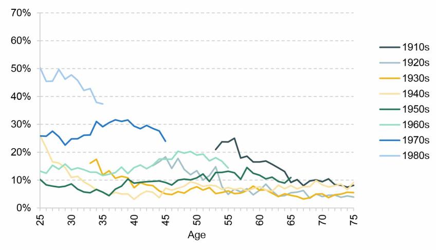
Note: Tenure defined at the household level.
Source: Family Expenditure Survey up to 1993; Family Resources Survey from 1994.
Figure 4.5. Percentage who are social renters, amongst those in the bottom 40% of the AHC household income distribution, by age and cohort
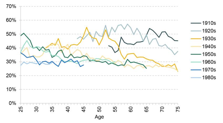
Note: Tenure defined at the household level.
Source: Family Expenditure Survey up to 1993; Family Resources Survey from 1994.
Figure 4.6. Percentage who are homeowners, amongst those in the bottom 40% of the AHC household income distribution, by age and cohort
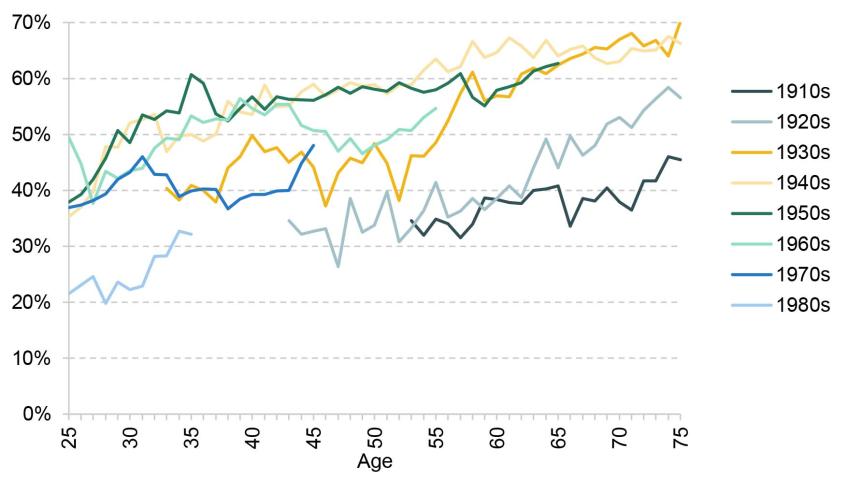
Note: Tenure defined at the household level.
Source: Family Expenditure Survey up to 1993; Family Resources Survey from 1994.
Each cohort from the 1910s to 1950s had homeownership rates at least as high as the previous cohort for a given age – and, in general, lower rates of both social and private renting. But for low-income individuals born since the 1960s, homeownership has become steadily less common. For example, by age 35, low-income individuals born in the 1950s had a homeownership rate of 61%. This fell to 53% for those born in the 1960s, 40% for those born in the 1970s and 32% for those born in the 1980s. Over that same period, social renting has also become less common, meaning that private renting has filled the gap. For low-income adults born in the 1960s or before, private renting rates ranged from 5% to 20% at almost every age and every cohort. But for those born in the 1970s it has persistently been in the 25–30% region, and for those born in the 1980s around 40–50%.
These changes are very important for two key reasons. First, as already discussed, private renters have the highest costs, and so these trends tend to mean that low-income individuals have a larger share of their disposable income taken up by housing costs. Second, as we will come to in Section 4.3, the support provided by the housing benefit system for private renters has rapidly diminished since April 2020 and, on current policy, will continue to do so. This means that if these trends for low-income individuals in younger generations continue, the amount that poorer families have to pay out-of-pocket for their housing will tend to rise.
Figure 4.7 shows an example of how the tenure composition for one age group – those in their 30s – has changed over 30 years from the period 1987–89 to the period 2017–19, as a result of the above trends, splitting this out by income tertiles (thirds). We can see a significant collapse in homeownership for the poorest third, from 52% to 28%, and a decrease in social renting, from 41% to 29%, with private renting filling the gap.
Figure 4.7. Tenure by income tertile for those in their 30s, 1987–89 and 2017–19
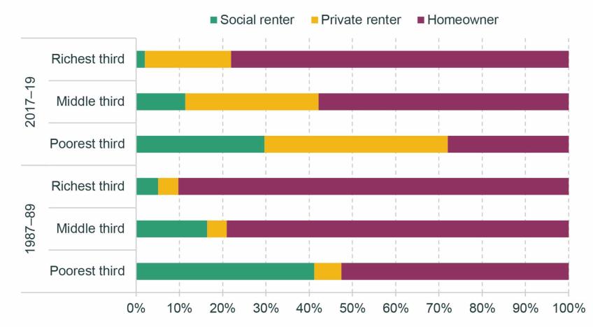
Note: Tenure defined at the household level. 2017–19 refers to financial years 2017–18 to 2019–20. Income tertiles are defined based on AHC income.
Source: Family Expenditure Survey up to 1993; Family Resources Survey from 1994.
4.2 What is the relationship between housing tenure and housing quality?
So far, our focus has been on housing costs. But, of course, the way that housing contributes to a family’s material living standards is a function of its quality as well. In this section, we investigate housing quality across tenures using data from the English Housing Survey, a survey of 6,000–7,000 households per year. The survey collects information on both the characteristics of their homes and of the members of the household themselves, including their household income. We use a variety of measures, explained Box 4.1, which are aimed at identifying houses, and local areas, of poor quality. Once again, we focus on the poorest 40% of households in terms of AHC income.
Box 4.1. Property and local area characteristics data
Decent Homes Standard
The English Housing Survey (EHS) inspects properties and assess them against the Decent Homes Standard, a standard that the social rented sector is legally required to meet. There are four criteria on which a property can fail the Decent Homes Standard:
- hazards – a property can fail if it contains any of a list of hazards, which include electrical safety and fire risks, excess dampness and mould, and lack of sanitation and drainage;
- state of repair – a property can fail if it is in a poor state of repair;
- thermal comfort – a property can fail if it cannot be adequately heated by the heating system in place;
- modern facilities – a property can fail if its facilities are not sufficiently modern, meaning for example reasonably new kitchen facilities and an appropriately located bathroom.
Other property characteristics
We also examine some other property characteristics measured in the EHS. These include:
- energy efficiency rating – the grading corresponds to that used in Energy Performance Certificates, required for all properties to be rented and sold; we identify properties that are E or below;
- no double-glazing – properties that are not fully double-glazed;
- damp problems – dampness problems in one or more rooms, including serious condensation, penetrating and rising damp;
- not secure – properties that do not have secure windows and doors;
- not enough bedrooms – properties that are deemed by EHS inspectors to be overcrowded based on the number and ages of the inhabitants.
Area characteristics
- The EHS also examines the local areas in which the property is situated and identifies:
- poor upkeep – areas containing buildings and public spaces that are poorly maintained and/or misused;
- traffic problems – areas with high road traffic or affected by noise or air quality issues from other forms of transport;
- unused or misused buildings – e.g. boarded up vacant properties, non-residential use of residential buildings;
- poor area appearance – as judged by the EHS inspector.
Figure 4.8 shows the average performance of properties against each of our measures, for each tenure, for the poorest 40% of households. All of the measures are binary, and if a property or its local area satisfies the measure this is an indication of poor quality.
Figure 4.8. Property and area characteristics, by tenure, for poorest 40% of households, 2018–19
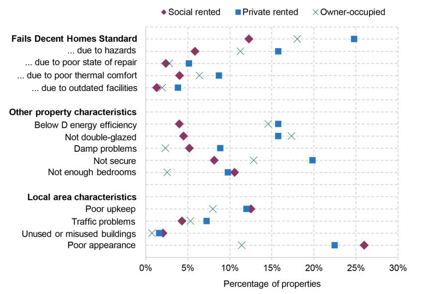
Source: English Housing Survey 2018–19.
The first cluster of measures gives the share of properties failing the Decent Homes Standard, then splits out the reasons for which they fail (a property can fail for multiple reasons). It is immediately apparent that the private rented sector performs worst both overall and on each of the four sub-components. A quarter of low-income households in the private rented sector live in a property that is classified as ‘not decent’, with the most common reason for failure being the presence of hazards in the property, which is the case for 16% of private rented properties. The problem is faced not just by low-income households, with 23% of all private rented homes failing the standard.
By contrast, 18% of owner-occupied homes and only 12% of social rented homes fail the Decent Homes Standard, among low-income households. Social rented homes are required to meet the standard, explaining why on this measure, and the sub-measure, the social rented sector is the best-performing sector. The government consulted last year on requiring private rented homes to meet the same standard. But our results show that a large proportion of private rented homes are failing to meet it so far. Research by the Department for Levelling Up, Housing and Communities (2023) shows that older properties, flats and terraced houses, and less-energy-efficient properties, are more likely to fail the Decent Homes Standard.
On the other property measures, the private rented sector also generally performs poorly, though social rented and owner-occupied properties also perform poorly on some of these measures. 16% of homes in the private rented sector and 15% of the owner-occupied homes have an energy efficiency rating of grade E or below. By contrast, only 4% of homes in the social rented sector have low energy efficiency. Private rented and owner-occupied homes are also less likely to be double-glazed than homes in the social rented sector. So among low-income people, private renters are likely to have been affected more than their social-renting counterparts by increased energy costs.
The private rented sector performs relatively poorly in terms of insecure windows and doors, damp problems and overcrowding (though in the last case the social rented sector performs slightly worse – it is generally difficult to move to a larger social rented home when one is needed). In terms of area characteristics, there are generally fewer differences between the tenures, but in general rented properties (social and private) are more likely to be in areas with poor upkeep and general appearance.
Some good news can be found in Figure 4.9, which plots these measures just for lower-income private-renting households in both 2018–19 and 2008–09. On the majority of our measures, there has been an improvement in quality over this decade. The most dramatic improvements appear to be more widespread energy efficiency and a significant fall in homes failing the Decent Homes Standard. Some of this change could reflect compositional change as the stock of private rented homes increased, but there has also been a general improvement in many of these indicators across the stock of properties.
Figure 4.9. Property and area characteristics, for private rented homes of poorest 40% of households, 2008–09 and 2018–19
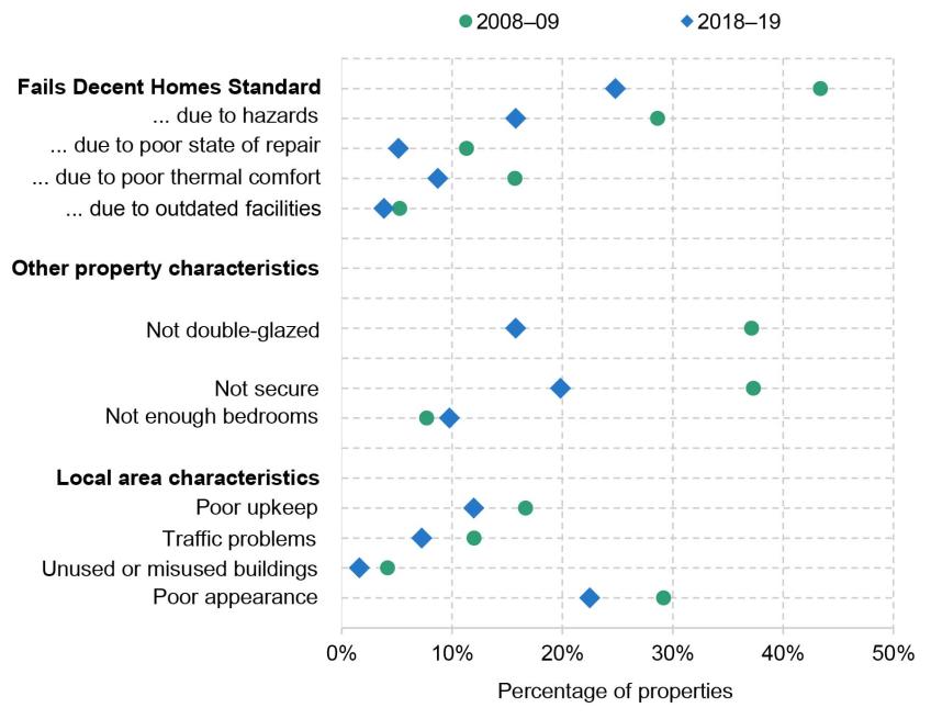
Note: In 2008–09, comparable variables on damp and energy efficiency were not collected, so these are omitted from this figure.
Source: English Housing Survey 2008–09 and 2018–19.
Nonetheless, it is clear that the private rented sector still has greater prevalence of problems with property safety, state of repair and energy efficiency overall than other sectors, in particular when compared with the social rented sector. Thus, while social tenants have among the worst living standards on many different measures, in terms of housing quality specifically, lower-income private tenants, who may have limited ability to change their circumstances, are a group of particular concern.
4.3 How have changes to local housing allowance rates affected affordability of private rented accommodation for those on benefits?
As we have shown, low-income households are increasingly private renters, and are renting relatively low-quality homes. Many of these families are in receipt of housing benefit or the equivalent in universal credit (for brevity, we henceforth refer simply to ‘housing benefit’). Indeed, in 2019–20 the total number of claimants stood at around 2 million, or 38% of private renters (Ray-Chaudhuri and Waters, 2023). In this section, we investigate how housing benefit policy is affecting the number and kinds of properties that poorer private renters can afford.
If a family’s income and assets are low enough to make them eligible for housing benefit, the maximum amount they can claim is determined by the ‘local housing allowance’ (LHA) that applies to them. Their LHA rate is determined by two factors: first, where they live, with the country being divided up into around 200 ‘broad rental market areas’ (BRMAs); and second, the size and composition of the family, which determines how many bedrooms the government thinks the family needs – their ‘bedroom entitlement’.
Prior to 2011, LHA rates were equal to the median rent in the local area among homes with a given number of bedrooms, excluding homes rented by housing benefit recipients. Each year, the median rent would be calculated using a sample of rents from the previous September. In 2011, LHA rates were cut to the 30th percentile of local rents. But from 2013–14, rather than maintaining the 30th percentile, LHA rates were uprated by CPI inflation, 1% or frozen. So by 2019–20, LHA rates were based upon rents in the local area in September 2011. This meant that those who lived in fast-growing areas in terms of rents tended to lose out, and it had bizarre distributional consequences: claimants in some more expensive areas were entitled to less support than those in some cheaper ones. In the wake of the pandemic, the government reset all LHA levels to the 30th percentile (of September 2019 rents). But then the same process has begun again, with LHA rates all being frozen in cash terms since. Indeed, current policy is for LHA rates to be indefinitely frozen, forever related to local rents in 2019.
This means that the support available for private rents is steadily declining in real terms – something that is especially important at the moment as rents are rising very rapidly. Figure 4.10 shows annual rent growth among the stock of private rental properties and among new lets advertised on Zoopla. After several years of increasing by 1–2.5% per year, private rent growth among the stock of privately rented properties started to increase in late 2021 (as wider inflation also took off). In April 2023, rent growth was 4.8% a year. But the stock of rents responds slowly to market conditions, as rents do not change within a rental contract, and often rent growth is more modest for those who re-sign for the same property at the end of a contract. New lets are a leading indicator – they can change much more quickly, and the two series cannot diverge for ever as eventually all contracts come to an end and all renters turn over. The new lets series shows rapid increases, exceeding 10% a year for each month from February 2022 to January 2023. Indeed, since September 2019 – the month that LHA rates are still based upon – new let rents have increased by over a fifth.
Figure 4.10. Year-on-year growth in private rents

Source: ONS Index of Private Housing Rental Prices, UK: April 2023; ONS, private rental growth measures, a UK comparison: January to December 2022 (draws on Zoopla); Zoopla Rental Market Report March 2023.
We use Zoopla microdata to calculate the share of advertised properties that are ‘affordable’ for housing benefit claimants over time.18 We define a property to be affordable if the rent is below the LHA rate for the corresponding BRMA and number of bedrooms.19 A renter with no private source of income who rents a property that is more expensive than their LHA rate will have to pay the difference out of other benefits. Two points are worth noting. First, because rents are generally higher for new lets than for the stock of rented properties, the share of new lets that are ‘affordable’ is likely less than the share of all properties that are affordable. Our analysis should be thought of as most representative for a family looking to rent a new property – though again, in the long run, the stock of rents and new lets must converge. Second, in the Zoopla data, we only observe advertised rent. In reality, negotiations between landlord and tenant mean that rents can be higher or lower than that. Anecdotally, there has been an increase in hopeful tenants paying above the advertised rent.20
Figure 4.11 shows the share of properties on Zoopla that are affordable to housing benefit claimants over time. At the start of 2013, 22% of advertised properties were affordable.21 This figure steadily fell over the rest of the decade as LHA rates did not keep pace with rents. By 2020Q1, just 11% of properties were affordable. The resetting of LHA rates in 2020Q2 to the 30th percentile had a big impact, with the share of affordable properties jumping up to 23% – undoing the entirety of the real-terms decline in LHA rates since the beginning of the series. However, the rise in new let rents since then has rapidly eroded the share of properties that are affordable. In the first quarter of 2023, just 5% of properties were affordable – less than half the share affordable before the pandemic, and less than a quarter the share affordable back in 2013.
Figure 4.11. Percentage of private rental properties on Zoopla affordable on housing benefit
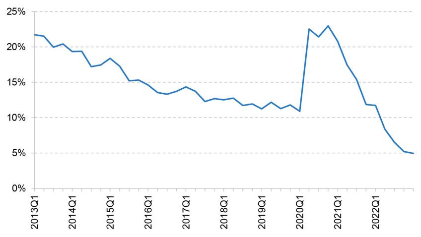
Source: Zoopla data, made available by the Urban Big Data Centre.
At least to start with, this had very different effects across areas. Figure 4.12 splits properties according to how much rent had grown in their BRMA between 2019 (the period on which LHA rates are based) and the quarter in question. Throughout 2020 and 2021, fewer properties were affordable in faster-rent-growth areas – a natural consequence of freezing LHA rates. By the start of 2023, however, significant rent growth had become so widespread that there had been substantial convergence of affordability rates in all but the slowest-growing fifth.
Figure 4.12. Percentage of private rental properties on Zoopla affordable on housing benefit, by quintile of 30th percentile rent growth since 2019
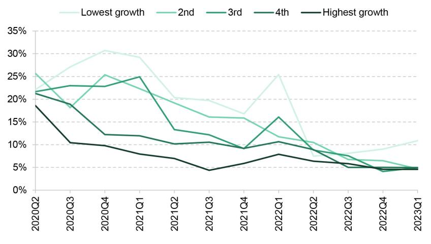
Note: Rent growth quintile defined contemporaneously with respect to 2019.
Source: Zoopla data, made available by the Urban Big Data Centre.
Figure 4.13 shows the share of properties that are affordable across Britain’s nations and regions both immediately before the resetting of LHA rates and in the latest data. While prior to the resetting there was substantial variation in affordability, the decline in affordability since has been very widespread. In 2023Q1, affordability rates ranged from 2.5% in Wales to 6.9% in the North East.
Figure 4.13. Percentage of private rental properties on Zoopla affordable on housing benefit, by region
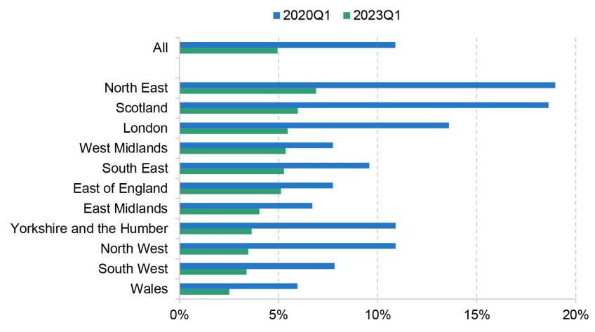
Source: Zoopla data, made available by the Urban Big Data Centre.
We now augment the Zoopla data with additional information about the local area using published indices of multiple deprivation (IMD) from 2019 for England at the LSOA level, and about the property from the database of Energy Performance Certificates (EPC). From the IMD data, we focus on three components of the score:
- employment deprivation domain – areas with high unemployment; we label the top 10% of properties in terms of their area’s score ‘low employment’;
- crime domain – areas with high rates of violence, burglary, theft and criminal damage; we label the top 10% of properties in terms of their area’s score ‘high crime’;
- geographical barriers (barriers to housing and services domain) – areas with poor access to local services such as post office, supermarket and GP; we label the top 10% of properties in terms of their area’s score ‘poor access to services’.
From the EPC data, we look at the energy rating from A (most efficient) to G (least efficient), with E being the minimum permitted by law for private rented properties. We identify properties below grade C. We also take an estimate of annual heating and hot water bills, and calculate the premium on bills for affordable properties relative to the average from all properties.
All of these measures are relative to the average for properties available on Zoopla, to show more clearly the difference between properties generally available and the properties available to housing benefit claimants. This is because these measures can change over time for marketed rental properties as a whole, due to changes in the composition of properties available in general or on Zoopla or, in the case of the energy measures, due to physical changes to the properties.
Figures 4.14 and 4.15 show how characteristics of affordable properties have changed relative to all properties (we provide more detail on the precise methodology in the appendix D).22 The area characteristics show surprisingly little sensitivity to the sharp increase in LHA rates in 2020Q2, or the sharp decline in affordability since. Affordable properties tend to be in lower-employment, higher-crime areas, but these differences are all closing over time at a fairly steady rate. Where we do see a clearer impact of LHA rates is on the energy efficiency of affordable properties. Prior to the pandemic, as the number of affordable properties dwindled, the set of those that remained affordable became increasingly tilted towards those with higher energy costs and a higher likelihood of having a poor energy efficiency rating, with the energy cost premium increasing from 5% in 2013 to 19% at the start of 2020. The resetting of LHA rates to the 30th percentile undid much (though not all) of these trends, as more properties with higher energy efficiency became affordable. Since then, the rapid increase in rents has meant once again that the typical affordable property is energy-inefficient, with the energy cost premium at around 20%. Of course, with energy prices at all-time highs, these differences are especially important for the costs that low-income families face. And the high correlation between energy efficiency and meeting the Decent Homes Standard noted by Department for Levelling Up, Housing and Communities (2023) suggests affordable properties may be increasingly less likely to meet this standard.
Figure 4.14. Relative probability of holding area characteristics for affordable properties, relative to average
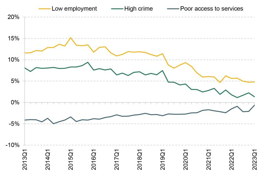
Source: Zoopla data, made available by the Urban Big Data Centre; Ministry of Housing, Communities and Local Government, Index of Multiple Deprivation for England.
Figure 4.15. Relative risk of low energy efficiency and premium on energy costs for affordable properties, relative to average
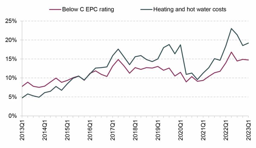
Note: Heating and hot water costs are as estimated as part of the EPC investigation.
Source: Zoopla data, made available by the Urban Big Data Centre; EPC data, made available by Open Data Communities and the Scottish Government.
4.4 Conclusion
Housing costs are a first-order issue for poverty. Costs make up a substantial fraction of income, and vary substantially between tenures. Over time, low-income families have become increasingly likely to be private renters – and thus face higher costs – as the social sector has shrunk. We can expect these trends to continue, as younger low-income individuals are even more likely to be private renters than those in older generations were at the same age.
This is especially important as privately rented homes are, on many dimensions, worse in quality than social rented or owner-occupied properties – for example, they are more likely to have dangerous hazards and be hard to heat. Moreover, the shift towards low-income households privately renting has raised the importance of housing benefit policy. The current policy of indefinitely freezing local housing allowance rates means that the support that poorer private renters can get to help with their rent falls over time – and all the more so when rents are rising quickly. Only about 5% of available properties are now affordable (able to be completely paid for by housing benefit) for those on housing benefit – down from more than 20% just three years ago. Those properties that are affordable are increasingly tilted towards energy-inefficient properties, raising their true cost (i.e. including energy bills).
How much support the government should provide private renters through the benefit system is, to a significant extent, a political question. But given the increasing prevalence of private renters among low-income families, it is an increasingly important question, and one where the existing policy looks decidedly odd. As things stand, the support provided by the housing benefit system shrinks over time, with the extent of support in a particular area at a particular moment in time depending on how much local rents have grown since September 2019. It is difficult to think of any justification for pursuing this policy.
Appendix A. Households Below Average Income (HBAI)
Income as a measure of living standards
Most people would consider that well-being consists of more than a simple measure of material circumstances. However, even if we wanted to, it would be extremely hard to define an objective index of well-being, let alone to measure it. The main approach to measuring living standards taken in the government’s HBAI document is to focus solely on material circumstances and to use household income as a proxy for those.
Even as a measure of material living standards, the HBAI income measure has some important limitations. There is some evidence of under-reporting of income in the HBAI data, particularly among those households with extremely low reported incomes.23 Even for those households whose income is measured correctly, HBAI provides a ‘snapshot’ measure – reflecting actual, or in some cases ‘usual’, income at around the time of the Family Resources Survey interview. Measuring income in this way means the HBAI income statistics capture both temporary and permanent variation in income between individuals, but the latter would generally be regarded as a better measure of their relative welfare. For example, having a temporarily low income is unlikely to have severe consequences for current material living standards if individuals are able to draw on previously accumulated wealth. Statistics based upon current incomes will attribute the same level of welfare to people with the same current income, regardless of how much savings or other assets they have, or how much they spend. Consumption would arguably make a better measure of material well-being, but reliable data can be harder and more expensive to collect. Using consumption as the measure of well-being can change our interpretation of who is ‘poor’ and how rates of poverty have changed over time.24
The treatment of housing costs
The government’s HBAI publication provides information on two measures of income. One measure captures income before housing costs are deducted (BHC) and the other is a measure after housing costs have been deducted (AHC). The key housing costs captured in the HBAI data are rent payments and mortgage interest payments, but they also include water rates, community water charges, council water charges, structural insurance premiums for owner-occupiers, and ground rents and service charges. Mortgage capital repayments are not included, on the basis that these represent the accumulation of an asset (they increase net housing wealth) and are therefore better thought of as a form of saving than as a cost of housing. Costs such as maintenance, repairs and contents insurance are also not included.
When looking at changes in average living standards across the population as a whole, there is usually a strong case for focusing on income measured BHC. This is because most individuals exercise a considerable degree of choice over housing cost and quality, at least in the medium and long term, and for those individuals housing should be treated as a consumption good like any other (i.e. the amount that households choose to spend on it should not be deducted from income). For instance, consider two households with the same BHC income, one of which decides to spend a larger fraction of that income on a larger house in a better neighbourhood, while the other has different preferences and chooses to spend the difference on other things. On an AHC basis, the former household would be considered poorer, but their living standards may be comparable.
There are, however, a number of reasons to focus on income measured AHC in certain circumstances.
First, income measured AHC may provide a better indicator of the living standards of those who do not face genuine choices over their housing, particularly if housing cost differentials do not accurately reflect differences in housing quality. This is likely to be the case for many in the social rented sector, where individuals tend to have little choice over their housing and where rents have often been set with little reference to housing quality or the prevailing market rents.
Second, the existence of housing benefit means that measuring income AHC has an advantage over BHC as a measure of living standards for housing benefit recipients. This is because housing benefit reimburses individuals specifically for their rent. Consider a household with no private income whose rent increases by £10 per week. This might trigger a £10 increase in housing benefit entitlement to cover the rent increase. Hence, AHC income would remain unchanged but BHC income would increase by £10 per week. Therefore, where rent changes do not reflect changes in housing quality – for example, when they simply reflect changes in the rules governing social rents – the subsequent changes in BHC (but not AHC) income can give a misleading impression of the change in living standards of households on housing benefit.
Third, measuring income AHC may be more appropriate than BHC when comparing households that own their home outright (and so pay no rent or mortgage interest costs) with those that do not. On a BHC basis, an individual who owns their house outright will be treated as being as well off as an otherwise-identical individual who is still paying off a mortgage; an AHC measure, though, would indicate that the former was better off.25 This is particularly important when comparing incomes across age groups – pensioners are much more likely to own their homes outright than working-age adults.
Fourth, comparing changes in AHC incomes may provide better information about relative changes in living standards when some households have seen large changes in their housing costs that are unrelated to changes in housing quality. This is particularly relevant when looking at the period between 2007–08 and 2009–10, as rapid falls in mortgage interest rates reduced the housing costs of those with a mortgage significantly, while the housing costs of those who rent their homes (or own them outright) were not directly affected. When incomes are measured BHC, changes over time in the incomes of all households are adjusted for inflation using a price index that accounts only for average housing costs. This will understate the effect of falling housing costs on living standards for those with a mortgage and overstate it for those without a mortgage. Changes in income measured AHC do not suffer from this issue, since changes in housing costs are accounted for by subtracting each household’s actual housing costs from its income. This difference is important to bear in mind when looking at changes in poverty and inequality. Those towards the bottom of the income distribution (around the poverty line), as well as the youngest and oldest adults, are less likely than average to have a mortgage.
Income sharing
To the extent that income sharing takes place within households, the welfare of any one individual in a household will depend not only on their own income, but also on the incomes of other household members. By measuring income at the household level, the HBAI statistics implicitly assume that all individuals within the household are equally well off and therefore occupy the same position in the income distribution. For many households, this assumption provides a reasonable approximation – for example, many couples benefit roughly equally from income coming into the household, no matter who the income is paid to. For others, it is unlikely to be appropriate. Students sharing a house are one probable example. Perfect income sharing is by no means the only ‘reasonable’ assumption that one could make: for example, one could effectively assume that there is complete income sharing within the different benefit units26 of a household but not between them, by measuring incomes at the benefit unit level rather than at the household level (and making an assumption about how housing costs are split across benefit units). However, given the data available, perfect income sharing is one of the least arbitrary and most transparent assumptions that could be made.
Comparing incomes across households
Controlling for household size and structure is important when comparing living standards across households. If two households, one composed of a single adult and the other composed of a couple with two children, both have the same total income, the living standard of the couple with children will usually be significantly lower than that of the single adult, as the larger household normally has a greater need for material resources. Therefore, if household income is to reflect the standard of living that household members experience, and if we are to compare these incomes across different household types, then some method is required to adjust incomes for the different needs that different households face.
The official HBAI income statistics currently use the modified OECD equivalence scale for BHC incomes, and an AHC variant from the Department for Work and Pensions (DWP), shown in Table A.1. These equivalence scales are used to adjust incomes on the basis of household size and composition. For example, when income is measured before housing costs, the OECD scale implies that a single person would require 67% of the income that a childless couple would require to attain the same standard of living. So, to get the equivalent income of that single person, we divide their actual income by 0.67. This process is referred to as ‘income equivalisation’. Having equivalised household incomes, cash income figures are expressed as the equivalents for a childless couple, i.e. a household’s income is expressed as the amount that a childless couple would require to enjoy the same standard of living as that household.
Table A.1. Modified OECD equivalence scales

The modified OECD scale only takes into account the ages and number of individuals in the household, but there may be other characteristics affecting a household’s needs. An important example of these would be the disability or health status of household members. The conventional methodology in HBAI would place a household receiving disability benefits higher up the income distribution than an otherwise-equivalent household without such benefits. But if this higher level of income only compensates the household for the greater needs it has or the extra costs it faces, then the standard of living of this household may be no higher.27
Sample weighting, and adjusting the incomes of the ‘very rich’
The incomes analysed in Chapters 2 and 3 of this report are mostly derived from the Family Resources Survey (FRS) and, prior to 1994–95, the Family Expenditure Survey (FES). These surveys are designed to provide a broadly representative sample of households in Great Britain until 2001–02 (i.e. not including Northern Ireland) and in the whole United Kingdom from 2002–03 onwards. However, because they are voluntary surveys, there is inevitably a problem of households not answering them, and such non-response may differ according to family type and according to income. This ‘non-response bias’ is dealt with in two ways. First, weights are applied to the data to ensure that the composition of the sample (in terms of age, sex, partnership status, region and a number of other variables) reflects the true UK population.28 For example, if there are proportionately fewer lone parents in the sample than there are in the population, then relatively more weight must be placed upon the data from those lone parents who actually do respond.
Second, a special adjustment is applied to correct for the particular problems in obtaining high response rates from individuals with very high incomes and for the volatility in their reported incomes. This adjustment uses projected data from HMRC’s Survey of Personal Incomes (SPI) – a more reliable source of data for the richest individuals based on income tax returns.29 Individuals with an income above a very high threshold are assigned an income level derived from the SPI, which is an estimate of the average income for people above that threshold in the population (the threshold and the replacement income value are set separately for pensioners and non-pensioners). Note that this procedure will therefore not capture the inequality within the very richest section of the population. The weights referred to above are also adjusted to ensure that the number of households containing very-high-income individuals in the weighted data is correct. There is no corresponding correction for non-response, or for misreporting of incomes, at the lower end of the income distribution, meaning caution should be used when considering people with the very lowest incomes.
Adjusting for inflation
All of the description of the HBAI methodology so far sets out how we, following the government’s HBAI methodology, measure living standards in any one year. However, because of inflation, the same cash incomes do not bring the same purchasing power over time. It is therefore necessary to adjust for inflation and express all figures in real terms, which we do in the prices of the latest year of data (2021–22 in this report unless otherwise stated).
We account for inflation using variants of the Consumer Prices Index (CPI). For comparing BHC measures of income over time, we use a variant of the standard CPI that includes owner-occupiers’ housing costs (mortgage interest payments, and insurance and ground rent for owner-occupiers); for AHC measures, we use a variant of the CPI that excludes all housing costs (including rent and water costs, which are part of the standard CPI). These variants are available from the Office for National Statistics (ONS) back to 1996 and 2000 respectively. Before that, we use an approximation to those indices generated by combining RPI-based indices that are available back to 1961 with an estimate of the historical ‘formula effect’ (the amount by which the Retail Prices Index overstates inflation).30
The income measure summarised
In the analysis in Chapters 2 and 3, our main measure of living standards is equivalised household income after deducting taxes and adding benefits and tax credits, expressed as the equivalent income for a couple with no dependent children and in average 2021–22 prices. For brevity, we often use this term interchangeably with ‘income’.
Appendix B. Additional figure for Chapter 2
Figure 2A.1. Living standards of inactive individuals aged 50–70, by when last worked
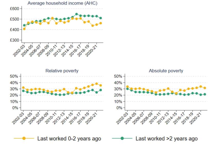
Note: Absolute poverty is defined as having income below 60% of median income in 2010–11. Average (mean) household incomes are measured net of taxes and benefits and after housing costs have been deducted, and have been equivalised using the modified OECD equivalence scale. Individuals who have never worked are included in the ‘Last worked >2 years ago’ category. The category ‘Last worked 0-2 years ago’ includes those who retired less than a year ago; because of routeing issues in the data, it may not capture all individuals who retired 1–2 years ago.
Source: Authors’ calculations using the Family Resources Survey, 2002–03 to 2021–22.
Appendix C. Additional figures and tables for Chapter 3
Figure 3A.1. Universal credit receipt in Exact.One versus administrative data
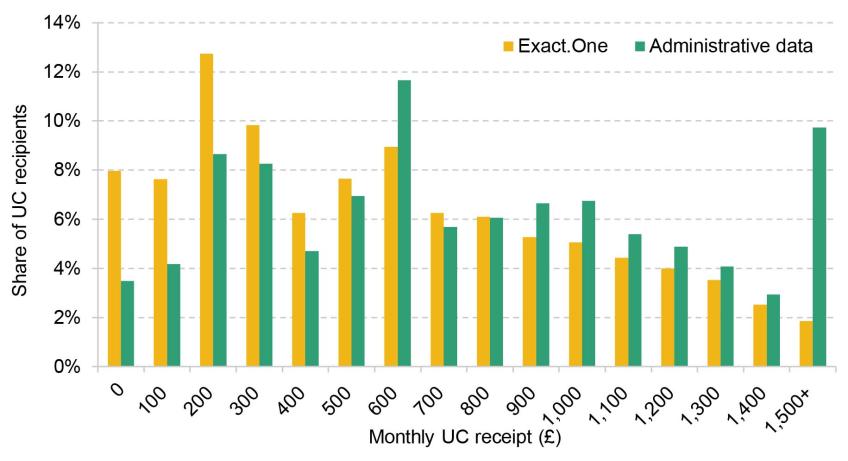
Note: Numbers on the horizontal axis show the bottom of £100 bins.
Source: Authors’ calculations using the Exact.One Transactional Dataset and Stat-Xplore.
Figure 3A.2. Number of payments of £326 by week of the year
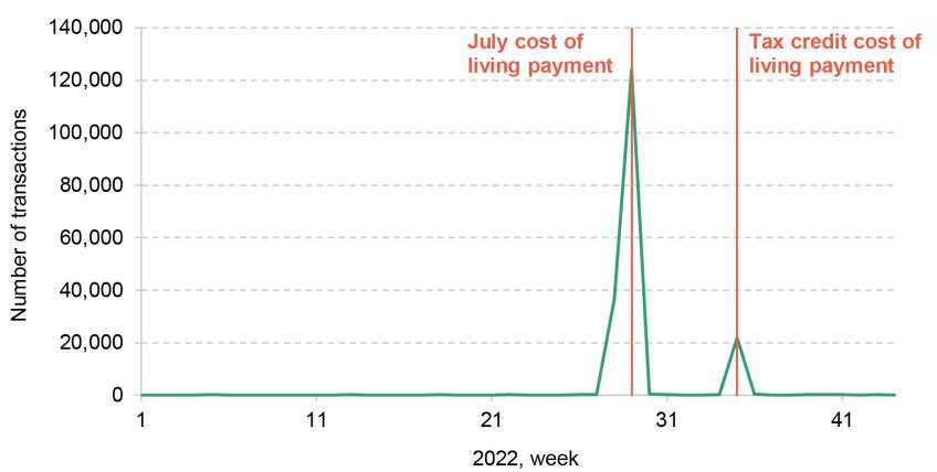
Note: Counts payments into bank accounts only. The second, smaller spike is the week in which recipients of tax credits were given a cost of living payment. We consider only the first payment in our analysis.
Source: Authors’ calculations using the Exact.One Transactional Dataset.
Table 3A.1. Fine spending categories
Note: These categories are based on the automatic categorisation in the Exact.One Transactional Dataset, determined by the recipient of the spending.
Table 3A.2. Types of spending in each category
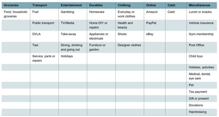
Note: Includes spending types that account for at least 3% of total spending in a category among Exact.One users.
Source: Authors’ calculations using Exact.One Transactional Dataset.
Table 3A.3. Responses to cost of living payment, by UC receipt
Note: Based on last observed UC payment before the cost of living payment. Compares the first four weeks after the cost of living payment with the final four weeks before. Share of recipients in each group: £0–£249, 13%; £250–£499, 17%; £500–£749, 16%; £750–£999, 13%; £1,000–£1,249, 10%; £1,250–£1,499, 7%; £1,500+: 24%.
Source: Authors’ calculations using the Exact.One Transactional Dataset.
Table 3A.4. Comparison of spending patterns among benefit-receiving households, Exact.One and LCFS
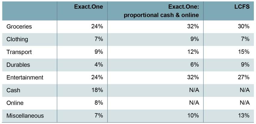
Note: In the Exact.One columns, the sample is those who received the Cost of Living Payment. In the LCFS column, the sample is households entitled to universal credit. For the Exact.One columns, categorisation is based on the automatic categorisation in the Exact.One Transactional Dataset, determined by the recipient of the spending. The “proportional cash & online” column shows what spending patterns would be if cash and online spending was spread across the other categories in proportional to their prevalence.
Source: Authors’ calculations using the Exact.One Transactional Dataset and the Living Costs and Food Survey, 2019–20.
Appendix D. Methodology and additional figure for Chapter 4
Methodology for estimating relative characteristics of affordable properties
To analyse the difference between affordable properties under LHA rates and average properties, one approach would simply be to report the average characteristics for each group. However, this approach would be misleading if, for example, one of these characteristics were in general more prevalent in properties of a certain size, and properties of that size were becoming less affordable. In that case, even if within BRMAs, for any given number of bedrooms, there were no differences in the relative characteristics of affordable and unaffordable properties over time, we would still see a change because of differential affordability changes between property sizes.
To get round this, we regress the outcome variables we are interested in against affordability, number of bedrooms, and BRMA, i.e. we run the regression:
Tenure by income quintile (BHC)
Figure 4A.1. Tenure shares by BHC income quintile
Note: Tenure defined at the household level. Other tenures, such as shared-ownership or government-owned accommodation, are excluded.
Source: Family Expenditure Survey up to 1993; Family Resources Survey from 1994.
Endnotes
Authors

Sam Ray-Chaudhuri
Sam joined the IFS in 2022 and works as a research economist in the Income, Work and Welfare sector.

Tom Waters
Tom is an Associate Director at the IFS and Head of the Income, Work and Welfare sector.

Tom Wernham
Tom's main research areas are living standards and poverty, the benefits system, and its interactions with the labour market.

Xiaowei Xu
Xiaowei joined the IFS in 2018 and works in the Income, Work and Welfare sector.
More from IFS
Understand this issue


Policy analysis


Academic research


