
Downloads
Download the report as a PDF here
PDF | 565.26 KB
Key findings
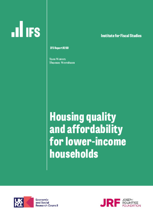
1. Facing higher housing costs, renters are considerably more likely than owner-occupiers to have low living standards on a variety of measures. Social and private renters have poverty rates of 46% and 34% respectively, compared with 12% for owner-occupiers. And they are also far more likely to be materially deprived or to live in food insecurity.
2. A steadily growing fraction of low-income households are in the private rented sector, while the share in social housing has declined, as has (in more recent years) the share who own their own home. Younger generations of low-income individuals are now especially likely to be renting privately. For low-income adults born in the 1960s or before, private renting rates ranged from 5% to 20% at almost every age. But for those born in the 1970s it has persistently been in the 25–30% region, and for those born in the 1980s around 40–50%, as social renting and owner-occupation have declined. These patterns suggest that private renting will become even more common among low-income families going forward. This matters because those in the private rented sector have higher housing costs than both social renters and those owning with a mortgage, as well as having less security of tenure.
3. As well as the private sector having higher costs for tenants, the quality of homes, at least for low-income families, is worse. Among lower-income families, those in the private rented sector are more likely than social renters or owner-occupiers to be living in a home that is unsafe, in disrepair, difficult to adequately heat or lacking modern facilities. 25% of their homes would therefore fail the Decent Homes Standard required of social housing, compared with 18% of owner-occupied homes and 12% of social rented homes. Private rented homes are also more likely to have poor energy efficiency, be insecure or be damp, while rented homes in both sectors are more likely to be overcrowded and in areas of poor upkeep and appearance.
4. In the wake of the pandemic, the local housing allowance (LHA) rates which cap maximum housing benefit entitlements were increased to the 30th percentile of local rents. At that point, 23% of private rental properties listed on Zoopla were affordable for housing benefit recipients, which we define as having rents that can be completely covered by housing benefit. Since then, LHA rates have been frozen in cash terms and rents for new lets have risen by over a fifth on average. As a result, in 2023Q1 just 5% of private rental properties were affordable for housing benefit recipients. The rapid decline in affordability has been seen across all parts of the country.
5. A declining share of properties being affordable to housing benefit recipients affects the relative quality of those that are affordable. Relative to the nation as a whole, affordable properties in 2023Q1 were 15% more likely to have an energy rating of D or below, and had 19% higher heating and hot water costs. These gaps have increased as the number of affordable properties has declined in the past few years. This shift is especially pertinent given recent increases to energy costs. Affordable properties are also generally more likely to be in low-employment and high-crime areas, though have slightly better access to local services such as post offices, supermarkets and GPs.
On average, housing costs amount to 11.4% of UK households’ incomes. Housing tenure is strongly predictive of living standards: social renters have a poverty rate based on incomes after deducting housing costs (AHC) of 46%, private renters 34%, mortgagors 11%, and those who own their home outright 15% (Figure 4.1). A large part of this is due to housing costs, especially for private renters, as shown by the fact that renters’ poverty rates are so much higher on an AHC basis than when total income is used (BHC). Similar patterns are seen in rates of material deprivation and food insecurity. Any serious attempt to boost living standards, and particularly to tackle poverty, is likely going to have to grapple with housing costs.
Figure 4.1. Relative poverty and deprivation by housing tenure, 2019–20
Note: Tenure is defined at the household level. Material deprivation measures the percentage of people who are in either child, pensioner or working-age material deprivation. The material deprivation and food insecurity rates follow the methodology of DWP’s HBAI publication (though the deprivation measure is not combined with low income).
Source: Family Resources Survey 2019–20.
Over the past two years, rapidly rising rents and mortgage interest payments have brought renewed attention towards housing policy. In this chapter, we study trends in housing tenure, costs and quality, with a particular focus on low-income families. We then turn to studying how the – indefinite, on current policy – freeze in the maximum support the benefit system makes available for private rents is affecting the number and quality of properties that benefit claimants can afford.
4.1 How has housing tenure changed over time?
We begin by examining how housing tenure has changed over time and across the generations. We study how patterns have changed for richer and poorer households. To do this, we use incomes measured after deducting housing costs (AHC). We adopt this approach because our focus is on low-income families and, as argued in Appendix A, AHC income provides a better guide to living standards for these households. Naturally, this means that trends in housing tenure and cost will themselves change who is defined as being richer or poorer. Nonetheless, defining income this way is useful because it tells us about the kinds of characteristics those on lower incomes have, which is critical for understanding what kinds of challenges they face and what kinds of policies are best suited to helping them.
How has housing tenure changed across the income distribution?
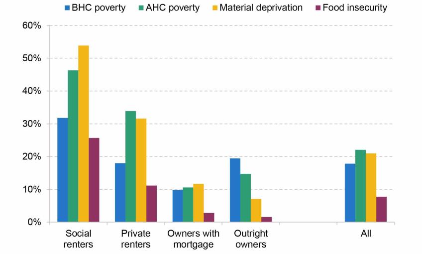
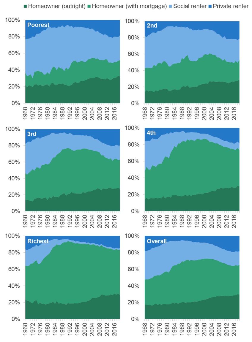
Figure 4.2 shows the tenure make-up of each fifth (quintile) of the (after housing cost, or AHC) income distribution from 1968 to 2020–21. Several trends stand out. First, across all income groups social renting fell in frequency from around 1980 to 2000 – due in significant part to right-to-buy. The fall was more significant among higher income groups, meaning that social housing has become more concentrated among poorer families: for example, in the 1960s and 1970s, about 20% of the richest quintile lived in social housing, whereas now only a tiny minority do so. This decline in social renting was accounted for by a switch to both homeownership and private renting. Second, at least for the poorest two quintiles, homeownership with or without a mortgage (the sum of the green areas) hit its peak in the mid 2000s for the poorer two quintiles, and since has gone into decline. That gap has entirely been filled by private renting. Third, there has been a slow but steady increase in homeownership without a mortgage in all but the poorest quintile – at least partly a consequence of an ageing population. The appendix to this chapter shows the same figure but by BHC income quintile, which shows similar trends, but with private renters constituting a smaller proportion of the poorest quintile.
Figure 4.2. Tenure shares by AHC income quintile
Note: Tenure defined at the household level. Other tenures, such as shared-ownership or government-owned accommodation, are excluded.
Source: Family Expenditure Survey up to 1993; Family Resources Survey from 1994.
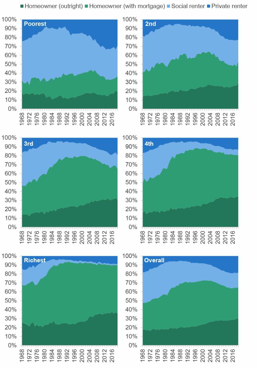
These trends matter because different tenures have very different housing costs, as shown in Figure 4.3. On average, private renters have the highest costs, then social renters, then homeowners with a mortgage (here we only include interest payments in their costs, not repayment of the principal), while homeowners without a mortgage have close to zero housing costs.1 Renters are also the most likely to have very high housing costs. The shift towards private renting for poorer families therefore implies not only less security of tenure but also lower (AHC) incomes; conversely, the shift towards homeownership, and particularly homeownership without a mortgage, for richer families tends to lower their costs.
Figure 4.3. Median, 10th and 90th percentile of monthly housing costs, by housing tenure, 2019–20
Note: Tenure defined at the household level. Mortgagors’ housing costs include interest payments but not payment of the principal.
Source: Family Resources Survey 2019–20.
How has housing tenure among poorer families changed between the generations?
Housing tenure tends to be a fairly persistent, or at least predictable, state. Individuals often start adult life as a renter, before progressing to homeownership; homeowners rarely go back to being renters, and typically the only tenure change they experience is to move from being a mortgagor to owning their home outright. At the same time, social renters often stay in the social sector for many years or decades. The trends in tenure over time discussed above reflect the passing through of generations and their tenure trajectories, mixed together with wider changes in the economy and policy environment (such as right-to-buy). Thus, these overall trends can obscure rather different experiences of different generations. Understanding how generations are faring is important, as the persistence of housing tenure means it gives us a guide to what we might expect in the future.
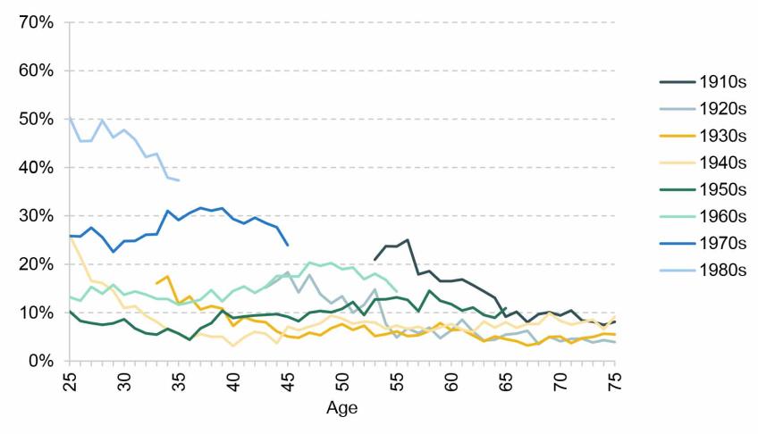
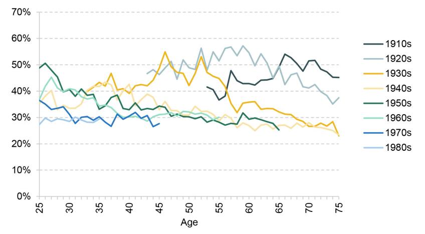
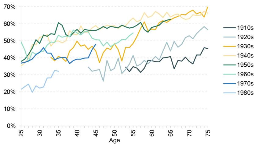
This is the issue to which we now turn, zeroing in on the patterns among poorer households. Figures 4.4, 4.5 and 4.6 show the tenure composition of those in the bottom 40% of the AHC household income distribution from age 25, split by their decadal birth cohort (private renting in Figure 4.4, social renting in Figure 4.5 and homeowning in Figure 4.6). Because our data run from 1968 to 2020–21, for those born in the 1910s we only have information from their mid 50s onwards and for those born in the 1980s we only have information up to their mid 30s.
Figure 4.4. Percentage who are private renters, amongst those in the bottom 40% of the AHC household income distribution, by age and cohort
Note: Tenure defined at the household level.
Source: Family Expenditure Survey up to 1993; Family Resources Survey from 1994.
Figure 4.5. Percentage who are social renters, amongst those in the bottom 40% of the AHC household income distribution, by age and cohort
Note: Tenure defined at the household level.
Source: Family Expenditure Survey up to 1993; Family Resources Survey from 1994.
Figure 4.6. Percentage who are homeowners, amongst those in the bottom 40% of the AHC household income distribution, by age and cohort
Note: Tenure defined at the household level.
Source: Family Expenditure Survey up to 1993; Family Resources Survey from 1994.
Each cohort from the 1910s to 1950s had homeownership rates at least as high as the previous cohort for a given age – and, in general, lower rates of both social and private renting. But for low-income individuals born since the 1960s, homeownership has become steadily less common. For example, by age 35, low-income individuals born in the 1950s had a homeownership rate of 61%. This fell to 53% for those born in the 1960s, 40% for those born in the 1970s and 32% for those born in the 1980s. Over that same period, social renting has also become less common, meaning that private renting has filled the gap. For low-income adults born in the 1960s or before, private renting rates ranged from 5% to 20% at almost every age and every cohort. But for those born in the 1970s it has persistently been in the 25–30% region, and for those born in the 1980s around 40–50%.
These changes are very important for two key reasons. First, as already discussed, private renters have the highest costs, and so these trends tend to mean that low-income individuals have a larger share of their disposable income taken up by housing costs. Second, as we will come to in Section 4.3, the support provided by the housing benefit system for private renters has rapidly diminished since April 2020 and, on current policy, will continue to do so. This means that if these trends for low-income individuals in younger generations continue, the amount that poorer families have to pay out-of-pocket for their housing will tend to rise.
Figure 4.7 shows an example of how the tenure composition for one age group – those in their 30s – has changed over 30 years from the period 1987–89 to the period 2017–19, as a result of the above trends, splitting this out by income tertiles (thirds). We can see a significant collapse in homeownership for the poorest third, from 52% to 28%, and a decrease in social renting, from 41% to 29%, with private renting filling the gap.
Figure 4.7. Tenure by income tertile for those in their 30s, 1987–89 and 2017–19
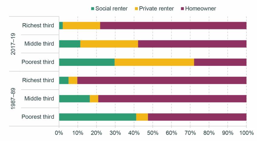
Note: Tenure defined at the household level. 2017–19 refers to financial years 2017–18 to 2019–20. Income tertiles are defined based on AHC income.
Source: Family Expenditure Survey up to 1993; Family Resources Survey from 1994.
4.2 What is the relationship between housing tenure and housing quality?
So far, our focus has been on housing costs. But, of course, the way that housing contributes to a family’s material living standards is a function of its quality as well. In this section, we investigate housing quality across tenures using data from the English Housing Survey, a survey of 6,000–7,000 households per year. The survey collects information on both the characteristics of their homes and of the members of the household themselves, including their household income. We use a variety of measures, explained Box 4.1, which are aimed at identifying houses, and local areas, of poor quality. Once again, we focus on the poorest 40% of households in terms of AHC income.
Box 4.1. Property and local area characteristics data
Decent Homes Standard
The English Housing Survey (EHS) inspects properties and assess them against the Decent Homes Standard, a standard that the social rented sector is legally required to meet. There are four criteria on which a property can fail the Decent Homes Standard:
- hazards – a property can fail if it contains any of a list of hazards, which include electrical safety and fire risks, excess dampness and mould, and lack of sanitation and drainage;
- state of repair – a property can fail if it is in a poor state of repair;
- thermal comfort – a property can fail if it cannot be adequately heated by the heating system in place;
- modern facilities – a property can fail if its facilities are not sufficiently modern, meaning for example reasonably new kitchen facilities and an appropriately located bathroom.
Other property characteristics
We also examine some other property characteristics measured in the EHS. These include:
- energy efficiency rating – the grading corresponds to that used in Energy Performance Certificates, required for all properties to be rented and sold; we identify properties that are E or below;
- no double-glazing – properties that are not fully double-glazed;
- damp problems – dampness problems in one or more rooms, including serious condensation, penetrating and rising damp;
- not secure – properties that do not have secure windows and doors;
- not enough bedrooms – properties that are deemed by EHS inspectors to be overcrowded based on the number and ages of the inhabitants.
Area characteristics
- The EHS also examines the local areas in which the property is situated and identifies:
- poor upkeep – areas containing buildings and public spaces that are poorly maintained and/or misused;
- traffic problems – areas with high road traffic or affected by noise or air quality issues from other forms of transport;
- unused or misused buildings – e.g. boarded up vacant properties, non-residential use of residential buildings;
- poor area appearance – as judged by the EHS inspector.
Figure 4.8 shows the average performance of properties against each of our measures, for each tenure, for the poorest 40% of households. All of the measures are binary, and if a property or its local area satisfies the measure this is an indication of poor quality.
Figure 4.8. Property and area characteristics, by tenure, for poorest 40% of households, 2018–19
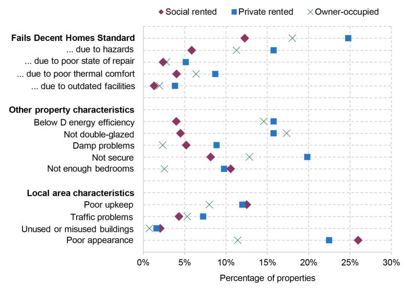
Source: English Housing Survey 2018–19.
The first cluster of measures gives the share of properties failing the Decent Homes Standard, then splits out the reasons for which they fail (a property can fail for multiple reasons). It is immediately apparent that the private rented sector performs worst both overall and on each of the four sub-components. A quarter of low-income households in the private rented sector live in a property that is classified as ‘not decent’, with the most common reason for failure being the presence of hazards in the property, which is the case for 16% of private rented properties. The problem is faced not just by low-income households, with 23% of all private rented homes failing the standard.
By contrast, 18% of owner-occupied homes and only 12% of social rented homes fail the Decent Homes Standard, among low-income households. Social rented homes are required to meet the standard, explaining why on this measure, and the sub-measure, the social rented sector is the best-performing sector. The government consulted last year on requiring private rented homes to meet the same standard. But our results show that a large proportion of private rented homes are failing to meet it so far. Research by the Department for Levelling Up, Housing and Communities (2023) shows that older properties, flats and terraced houses, and less-energy-efficient properties, are more likely to fail the Decent Homes Standard.
On the other property measures, the private rented sector also generally performs poorly, though social rented and owner-occupied properties also perform poorly on some of these measures. 16% of homes in the private rented sector and 15% of the owner-occupied homes have an energy efficiency rating of grade E or below. By contrast, only 4% of homes in the social rented sector have low energy efficiency. Private rented and owner-occupied homes are also less likely to be double-glazed than homes in the social rented sector. So among low-income people, private renters are likely to have been affected more than their social-renting counterparts by increased energy costs.
The private rented sector performs relatively poorly in terms of insecure windows and doors, damp problems and overcrowding (though in the last case the social rented sector performs slightly worse – it is generally difficult to move to a larger social rented home when one is needed). In terms of area characteristics, there are generally fewer differences between the tenures, but in general rented properties (social and private) are more likely to be in areas with poor upkeep and general appearance.
Some good news can be found in Figure 4.9, which plots these measures just for lower-income private-renting households in both 2018–19 and 2008–09. On the majority of our measures, there has been an improvement in quality over this decade. The most dramatic improvements appear to be more widespread energy efficiency and a significant fall in homes failing the Decent Homes Standard. Some of this change could reflect compositional change as the stock of private rented homes increased, but there has also been a general improvement in many of these indicators across the stock of properties.
Figure 4.9. Property and area characteristics, for private rented homes of poorest 40% of households, 2008–09 and 2018–19
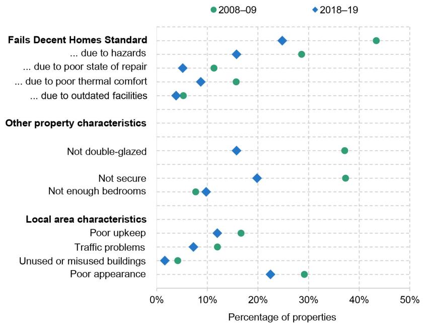
Note: In 2008–09, comparable variables on damp and energy efficiency were not collected, so these are omitted from this figure.
Source: English Housing Survey 2008–09 and 2018–19.
Nonetheless, it is clear that the private rented sector still has greater prevalence of problems with property safety, state of repair and energy efficiency overall than other sectors, in particular when compared with the social rented sector. Thus, while social tenants have among the worst living standards on many different measures, in terms of housing quality specifically, lower-income private tenants, who may have limited ability to change their circumstances, are a group of particular concern.
4.3 How have changes to local housing allowance rates affected affordability of private rented accommodation for those on benefits?
As we have shown, low-income households are increasingly private renters, and are renting relatively low-quality homes. Many of these families are in receipt of housing benefit or the equivalent in universal credit (for brevity, we henceforth refer simply to ‘housing benefit’). Indeed, in 2019–20 the total number of claimants stood at around 2 million, or 38% of private renters (Ray-Chaudhuri and Waters, 2023). In this section, we investigate how housing benefit policy is affecting the number and kinds of properties that poorer private renters can afford.
If a family’s income and assets are low enough to make them eligible for housing benefit, the maximum amount they can claim is determined by the ‘local housing allowance’ (LHA) that applies to them. Their LHA rate is determined by two factors: first, where they live, with the country being divided up into around 200 ‘broad rental market areas’ (BRMAs); and second, the size and composition of the family, which determines how many bedrooms the government thinks the family needs – their ‘bedroom entitlement’.
Prior to 2011, LHA rates were equal to the median rent in the local area among homes with a given number of bedrooms, excluding homes rented by housing benefit recipients. Each year, the median rent would be calculated using a sample of rents from the previous September. In 2011, LHA rates were cut to the 30th percentile of local rents. But from 2013–14, rather than maintaining the 30th percentile, LHA rates were uprated by CPI inflation, 1% or frozen. So by 2019–20, LHA rates were based upon rents in the local area in September 2011. This meant that those who lived in fast-growing areas in terms of rents tended to lose out, and it had bizarre distributional consequences: claimants in some more expensive areas were entitled to less support than those in some cheaper ones. In the wake of the pandemic, the government reset all LHA levels to the 30th percentile (of September 2019 rents). But then the same process has begun again, with LHA rates all being frozen in cash terms since. Indeed, current policy is for LHA rates to be indefinitely frozen, forever related to local rents in 2019.
This means that the support available for private rents is steadily declining in real terms – something that is especially important at the moment as rents are rising very rapidly. Figure 4.10 shows annual rent growth among the stock of private rental properties and among new lets advertised on Zoopla. After several years of increasing by 1–2.5% per year, private rent growth among the stock of privately rented properties started to increase in late 2021 (as wider inflation also took off). In April 2023, rent growth was 4.8% a year. But the stock of rents responds slowly to market conditions, as rents do not change within a rental contract, and often rent growth is more modest for those who re-sign for the same property at the end of a contract. New lets are a leading indicator – they can change much more quickly, and the two series cannot diverge for ever as eventually all contracts come to an end and all renters turn over. The new lets series shows rapid increases, exceeding 10% a year for each month from February 2022 to January 2023. Indeed, since September 2019 – the month that LHA rates are still based upon – new let rents have increased by over a fifth.
Figure 4.10. Year-on-year growth in private rents

Source: ONS Index of Private Housing Rental Prices, UK: April 2023; ONS, private rental growth measures, a UK comparison: January to December 2022 (draws on Zoopla); Zoopla Rental Market Report March 2023.
We use Zoopla microdata to calculate the share of advertised properties that are ‘affordable’ for housing benefit claimants over time.2 We define a property to be affordable if the rent is below the LHA rate for the corresponding BRMA and number of bedrooms.3 A renter with no private source of income who rents a property that is more expensive than their LHA rate will have to pay the difference out of other benefits. Two points are worth noting. First, because rents are generally higher for new lets than for the stock of rented properties, the share of new lets that are ‘affordable’ is likely less than the share of all properties that are affordable. Our analysis should be thought of as most representative for a family looking to rent a new property – though again, in the long run, the stock of rents and new lets must converge. Second, in the Zoopla data, we only observe advertised rent. In reality, negotiations between landlord and tenant mean that rents can be higher or lower than that. Anecdotally, there has been an increase in hopeful tenants paying above the advertised rent.4
Figure 4.11 shows the share of properties on Zoopla that are affordable to housing benefit claimants over time. At the start of 2013, 22% of advertised properties were affordable.5 This figure steadily fell over the rest of the decade as LHA rates did not keep pace with rents. By 2020Q1, just 11% of properties were affordable. The resetting of LHA rates in 2020Q2 to the 30th percentile had a big impact, with the share of affordable properties jumping up to 23% – undoing the entirety of the real-terms decline in LHA rates since the beginning of the series. However, the rise in new let rents since then has rapidly eroded the share of properties that are affordable. In the first quarter of 2023, just 5% of properties were affordable – less than half the share affordable before the pandemic, and less than a quarter the share affordable back in 2013.
Figure 4.11. Percentage of private rental properties on Zoopla affordable on housing benefit
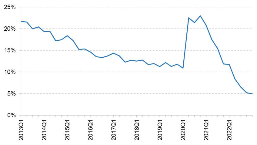
Source: Zoopla data, made available by the Urban Big Data Centre.
At least to start with, this had very different effects across areas. Figure 4.12 splits properties according to how much rent had grown in their BRMA between 2019 (the period on which LHA rates are based) and the quarter in question. Throughout 2020 and 2021, fewer properties were affordable in faster-rent-growth areas – a natural consequence of freezing LHA rates. By the start of 2023, however, significant rent growth had become so widespread that there had been substantial convergence of affordability rates in all but the slowest-growing fifth.
Figure 4.12. Percentage of private rental properties on Zoopla affordable on housing benefit, by quintile of 30th percentile rent growth since 2019
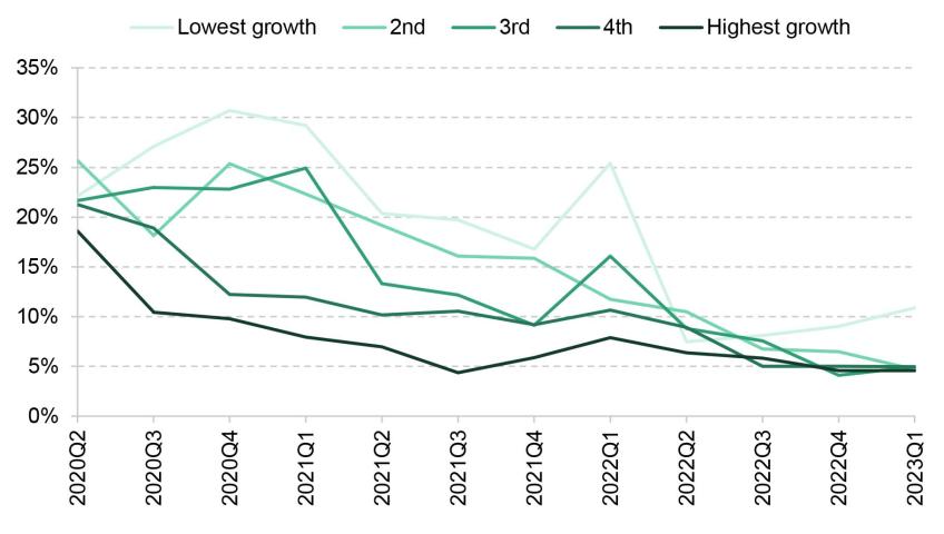
Note: Rent growth quintile defined contemporaneously with respect to 2019.
Source: Zoopla data, made available by the Urban Big Data Centre.
Figure 4.13 shows the share of properties that are affordable across Britain’s nations and regions both immediately before the resetting of LHA rates and in the latest data. While prior to the resetting there was substantial variation in affordability, the decline in affordability since has been very widespread. In 2023Q1, affordability rates ranged from 2.5% in Wales to 6.9% in the North East.
Figure 4.13. Percentage of private rental properties on Zoopla affordable on housing benefit, by region
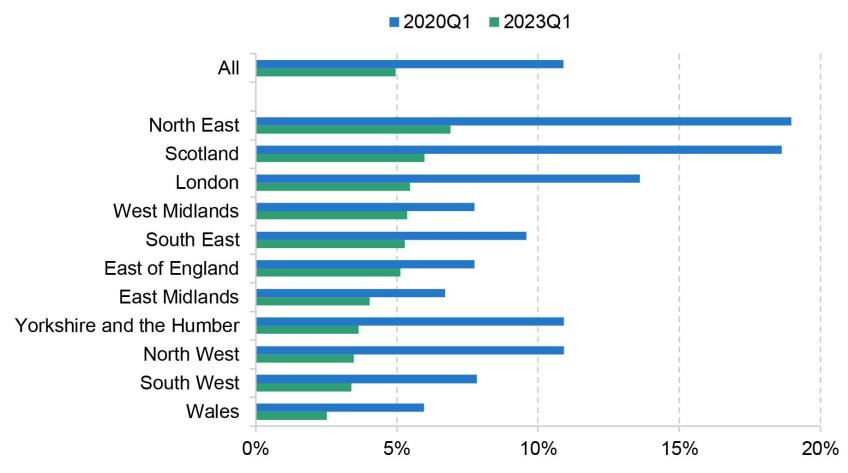
Source: Zoopla data, made available by the Urban Big Data Centre.
We now augment the Zoopla data with additional information about the local area using published indices of multiple deprivation (IMD) from 2019 for England at the LSOA level, and about the property from the database of Energy Performance Certificates (EPC). From the IMD data, we focus on three components of the score:
- employment deprivation domain – areas with high unemployment; we label the top 10% of properties in terms of their area’s score ‘low employment’;
- crime domain – areas with high rates of violence, burglary, theft and criminal damage; we label the top 10% of properties in terms of their area’s score ‘high crime’;
- geographical barriers (barriers to housing and services domain) – areas with poor access to local services such as post office, supermarket and GP; we label the top 10% of properties in terms of their area’s score ‘poor access to services’.
From the EPC data, we look at the energy rating from A (most efficient) to G (least efficient), with E being the minimum permitted by law for private rented properties. We identify properties below grade C. We also take an estimate of annual heating and hot water bills, and calculate the premium on bills for affordable properties relative to the average from all properties.
All of these measures are relative to the average for properties available on Zoopla, to show more clearly the difference between properties generally available and the properties available to housing benefit claimants. This is because these measures can change over time for marketed rental properties as a whole, due to changes in the composition of properties available in general or on Zoopla or, in the case of the energy measures, due to physical changes to the properties.
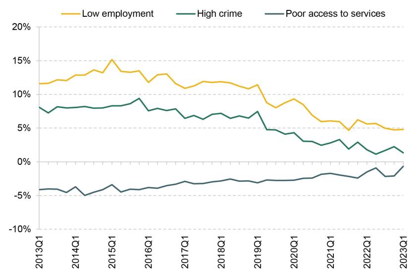
Figures 4.14 and 4.15 show how characteristics of affordable properties have changed relative to all properties (we provide more detail on the precise methodology in the appendix to this chapter).6 The area characteristics show surprisingly little sensitivity to the sharp increase in LHA rates in 2020Q2, or the sharp decline in affordability since. Affordable properties tend to be in lower-employment, higher-crime areas, but these differences are all closing over time at a fairly steady rate. Where we do see a clearer impact of LHA rates is on the energy efficiency of affordable properties. Prior to the pandemic, as the number of affordable properties dwindled, the set of those that remained affordable became increasingly tilted towards those with higher energy costs and a higher likelihood of having a poor energy efficiency rating, with the energy cost premium increasing from 5% in 2013 to 19% at the start of 2020. The resetting of LHA rates to the 30th percentile undid much (though not all) of these trends, as more properties with higher energy efficiency became affordable. Since then, the rapid increase in rents has meant once again that the typical affordable property is energy-inefficient, with the energy cost premium at around 20%. Of course, with energy prices at all-time highs, these differences are especially important for the costs that low-income families face. And the high correlation between energy efficiency and meeting the Decent Homes Standard noted by Department for Levelling Up, Housing and Communities (2023) suggests affordable properties may be increasingly less likely to meet this standard.
Figure 4.14. Relative probability of holding area characteristics for affordable properties, relative to average
Source: Zoopla data, made available by the Urban Big Data Centre; Ministry of Housing, Communities and Local Government, Index of Multiple Deprivation for England.
Figure 4.15. Relative risk of low energy efficiency and premium on energy costs for affordable properties, relative to average
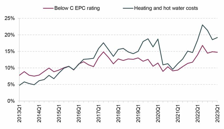
Note: Heating and hot water costs are as estimated as part of the EPC investigation.
Source: Zoopla data, made available by the Urban Big Data Centre; EPC data, made available by Open Data Communities and the Scottish Government.
4.4 Conclusion
Housing costs are a first-order issue for poverty. Costs make up a substantial fraction of income, and vary substantially between tenures. Over time, low-income families have become increasingly likely to be private renters – and thus face higher costs – as the social sector has shrunk. We can expect these trends to continue, as younger low-income individuals are even more likely to be private renters than those in older generations were at the same age.
This is especially important as privately rented homes are, on many dimensions, worse in quality than social rented or owner-occupied properties – for example, they are more likely to have dangerous hazards and be hard to heat. Moreover, the shift towards low-income households privately renting has raised the importance of housing benefit policy. The current policy of indefinitely freezing local housing allowance rates means that the support that poorer private renters can get to help with their rent falls over time – and all the more so when rents are rising quickly. Only about 5% of available properties are now affordable (able to be completely paid for by housing benefit) for those on housing benefit – down from more than 20% just three years ago. Those properties that are affordable are increasingly tilted towards energy-inefficient properties, raising their true cost (i.e. including energy bills).
How much support the government should provide private renters through the benefit system is, to a significant extent, a political question. But given the increasing prevalence of private renters among low-income families, it is an increasingly important question, and one where the existing policy looks decidedly odd. As things stand, the support provided by the housing benefit system shrinks over time, with the extent of support in a particular area at a particular moment in time depending on how much local rents have grown since September 2019. It is difficult to think of any justification for pursuing this policy.
Appendix 4A
Methodology for estimating relative characteristics of affordable properties
To analyse the difference between affordable properties under LHA rates and average properties, one approach would simply be to report the average characteristics for each group. However, this approach would be misleading if, for example, one of these characteristics were in general more prevalent in properties of a certain size, and properties of that size were becoming less affordable. In that case, even if within BRMAs, for any given number of bedrooms, there were no differences in the relative characteristics of affordable and unaffordable properties over time, we would still see a change because of differential affordability changes between property sizes.
To get round this, we regress the outcome variables we are interested in against affordability, number of bedrooms, and BRMA, i.e. we run the regression:
Tenure by income quintile (BHC)
Figure 4A.1. Tenure shares by BHC income quintile
Note: Tenure defined at the household level. Other tenures, such as shared-ownership or government-owned accommodation, are excluded.
Source: Family Expenditure Survey up to 1993; Family Resources Survey from 1994.
Data
Department for Levelling Up, Housing and Communities, Energy Performance of Buildings Data England and Wales, 2023, licenced under Open Government Licence v3 and Ordnance Survey
Department for Work and Pensions, NatCen Social Research. (2021). Family Resources Survey. [data series]. 4th Release. UK Data Service. SN: 200017, DOI: http://doi.org/10.5255/UKDA-Series-200017
Ministry of Housing, Communities and Local Government. (2023). English Housing Survey. [data series]. 5th Release. UK Data Service. SN: 200010, DOI: http://doi.org/10.5255/UKDA-Series-200010
Office for National Statistics. (2019). Family Expenditure Survey. [data series]. 3rd Release. UK Data Service. SN: 200016, DOI: http://doi.org/10.5255/UKDA-Series-200016
Scottish Government, Domestic Energy Performance Certificates - Dataset to Q1 2023, 2023, licenced under Open Government Licence v3 and Ordnance Survey
Zoopla Limited. Economic and Social Research Council. Zoopla Property Data, 2022 [data collection]. University of Glasgow - Urban Big Data Centre
Endnotes
Authors

Tom Waters
Tom is an Associate Director at the IFS and Head of the Income, Work and Welfare sector.

Tom Wernham
Tom's main research areas are living standards and poverty, the benefits system, and its interactions with the labour market.
More from IFS
Understand this issue


Policy analysis


Academic research


