
Downloads

Download the report as a PDF
PDF | 1.18 MB
Key findings
What has happened to living standards since the pandemic?
1. Between 2021–22 and 2022–23, median household income before housing costs (BHC) fell by 0.5%. As a result, median income in 2022–23 was 1.6% lower than in 2019–20. This is equivalent to a fall of 0.6% per year, the same rate of change as seen between 2007–08 and 2011–12, following the global financial crisis.
2. During the pandemic and cost-of-living crisis (2019–20 to 2022–23), poorer households’ incomes stagnated while middle- and high-income households saw small falls. This is the net effect of faster income growth for poorer households between 2019–20 and 2021–22, followed by larger falls for them between 2021–22 and 2022–23.
3. The global financial crisis and its immediate aftermath (2007–08 to 2011–12) was more inequality-reducing than the pandemic / cost-of-living crisis period, with poorer households seeing rises in income (rather than stagnation). By contrast, the recovery period from 2011–12 to 2019–20 was inequality-increasing as incomes rose by more among middle- and high-income households than among low-income households. When taken together, households across the income distribution have experienced similar, weak growth in their incomes since 2007–08.
4. In both periods of crisis, declines in income from employment were the main factor pushing down incomes. Similarly, both periods saw the government respond by introducing additional benefit support which served to – on average – stop poorer households’ incomes from falling. However, in 2022–23 that support was temporary, in the form of cost-of-living payments and the energy rebate. Those payments have since ended, which will tend to reduce poorer households’ incomes going forward.
Poverty and deprivation
1. Despite the significant challenges posed first by the pandemic and then the cost-of-living crisis, poverty rates changed very little between 2019–20 and 2022–23. The overall rate of absolute poverty rose slightly to 18% in 2022–23, the same level as seen in 2019–20. The relative poverty rate fell slightly to 21%, just below the rate in 2019–20. Rates of child and pensioner absolute poverty were also similar to pre-pandemic levels, at 25% and 12% respectively. This comes after a decade of historically slow falls in absolute poverty.
2. In contrast, rates of material deprivation rose substantially between 2019–20 and 2022–23, as more households reported being unable to afford all sorts of essentials. For example, the share of working-age adults that report being unable to adequately heat their home rose from 4% to 11% (1.8 million to 4.6 million), while the share who reported being unable to keep up with bills rose from 5% to 6% (2.1 million to 2.5 million). Increases were seen across all age groups and at all income levels. Part (though unlikely all) of the reason material deprivation has risen much more than poverty may be that the way poverty is measured ignores two factors: differences in inflation and differences in mortgage interest rates faced by different households.
3. In the latest year of income data (2022–23), the average inflation rate – used for the headline poverty statistics – was 10.7%. However, the inflation rates faced by the poorest and richest fifths of households were 12.6% and 10.0%, respectively. Official statistics – which do not take account of variation in inflation faced by households – show absolute poverty rose by 0.8 percentage points (520,000) between 2021–22 and 2022–23 (to 17.9%). Accounting for differences in inflation increases the growth in poverty by another 210,000 (meaning 1.1ppts or 730,000 growth).
4. Headline poverty statistics are adjusted to account for households’ housing costs, including mortgage interest payments. But these are calculated on the assumption that all households have the same interest rate, ignoring the significant (and growing) variation in rates between households. In 2022–23, the average mortgage rate was around 2.3%, translating to interest payments of £240 per month for a household with a typical outstanding mortgage. But a tenth of households faced a mortgage interest rate of at least 4.7%, equivalent to £490 per month. Accounting for variation in mortgage interest rates shows that absolute poverty among mortgagors, officially 7.9% in 2022–23, is persistently underestimated by around 0.3ppts, or 70,000 people. As around a third of households are mortgagors, the impact on the headline poverty rate is only around 0.1ppts.
5. Increases in interest rates between December 2021 and December 2023 are likely to have pushed mortgagor poverty rates up by 1.4ppts (320,000 more people), when measured accounting for variation in mortgage interest rates. But official poverty statistics, which apply a single average interest rate to all households, will only capture 1.0ppts (230,000) of this.
6. Despite having only a modest impact on aggregate statistics, mismeasurement of interest rates still means individual households’ mortgage interest payments are in some cases severely mismeasured, limiting our ability to understand how recent shocks have affected financial hardship and other outcomes. The majority of mortgagor households’ (after-housing-cost) incomes are mismeasured by at least £500 per year due to the assumption of a single mortgage interest rate. Other data suggest that adults who have seen a substantial rise in interest rates since the pandemic were 2ppts more likely to be behind on bills than those who had not. This implies an additional 370,000 adults behind on bills once all households have remortgaged at higher interest rates.
How have pensioner incomes and poverty changed in recent years?
Average pensioner incomes and pensioner poverty
1. Before, and during, the Great Recession, average pensioner incomes were catching up with working-age incomes. Between 2002–03 and 2011–12, median pensioner incomes grew by 22% (after adjusting for inflation), whereas incomes of working-age adults fell by 3%, due to slow growth prior to 2007 and big falls in incomes during the Great Recession. Poorer pensioners’ incomes were growing at a similar rate to average pensioner incomes prior to 2011, leading to relative pensioner poverty falling from 25% in 2002–03 to 13% in 2011–12.
2. Since 2011, average pensioner incomes have been growing at a similar rate to working-age incomes. Average incomes for pensioners – which are now very similar to average incomes below state pension age – grew by 12% from 2011–12 to 2022–23, driven by higher state and private pension incomes. This growth was almost identical to the growth in average working-age incomes of 13% over the same period – driven up by rising incomes from employment.
3. However, since 2011, income growth for poor pensioners has lagged behind the population as a whole. From 2011–12 to 2022–23, incomes for poor pensioners (at the 10th percentile of the pensioner income distribution) rose by only 5% (after adjusting for inflation). This is in part because poor pensioners have benefited from neither the rises in employment income nor the rises in private pension income that pushed up incomes for people on middle incomes.
4. This slow income growth for poorer pensioners means that relative pensioner poverty rose from 13% in 2011–12 to 16% in 2022–23, equivalent to an increase of 300,000 pensioners. A key reason for low income growth for poor pensioners has been that growth in state pension incomes has been offset in large part by falling levels of other benefits – higher state pensions increase pensioner incomes, making them increasingly ineligible for further means-tested state support. Indeed, for the poorest third of pensioners, state pensions rose by 6% between 2011–12 and 2022–23 but total benefit incomes (including state pensions) only rose by 1%. In other words, the support that poor pensioners get from the state increasingly comes from the state pension, rather than the means-tested benefit system.
5. In the years since the onset of the pandemic (2019–20 to 2022–23), lower-income pensioners experienced higher income growth than higher-income pensioners, as they received more state support during the cost-of-living crisis and have benefited more from falling (real-terms) housing costs. Indeed, relative income poverty among pensioners fell from 18% to 16% between 2019–20 and 2022–23.
6. However, these income poverty statistics understate the financial difficulties faced by poorer pensioners, as they do not account for the fact that poorer households are more exposed to sharp rises in gas, electricity and food prices. Pensioner material deprivation – a measure of the household’s inability to afford key essentials – rose from 6% (700,000 pensioners) in 2019–20 to 8% (1 million pensioners) in 2022–23. For example, the fraction of pensioners who could not afford to keep their home warm rose from 2% to 5% (230,000 to 570,000 pensioners).
Trends in different sources of pensioner incomes
7. Before the pandemic, the average incomes of pensioners were pushed up in part by rising state pension incomes. This was due to a combination of triple-lock indexation of the basic state pension since 2011, the introduction of the new state pension in 2016, successive generations of women having spent more years in paid work, and both men and women having accumulated higher earnings-related pensions. Reforms in 2010 and 2016 also substantially boosted the state pension incomes of many women (notably by comprehensive ‘crediting’ for those who spent long periods out of paid work looking after children). As a result, the gender gap in state pension incomes has all but disappeared for those born after 1950.
8. Despite large increases in state pension incomes for women born since 1950 (and higher average household incomes among pensioners), these changes have not led to large falls in relative income poverty for these women compared with previous generations at the same age (in their late 60s and early 70s). In part this is because the reforms of 2010 and 2016 were designed to boost the incomes of (generally) women with low state pension incomes, rather than boosting the incomes of pensioners with low household incomes. It is also due to higher state pensions leading to falls in eligibility to other benefits for low-income families.
9. Rising incomes from private pensions have been the largest single contributor to growth in average pensioner incomes over the last two decades. This is a result of both gradually increasing coverage (54% of pensioners received income from private pensions in 2019–20 compared with 50% in 2002–03) and increasing amounts received (the average private pension income among those with positive incomes rose from £4,700 to £7,600 a year over this period).
10. Average income from employment (including self-employment) among those aged 66–74 has also been rising gradually over time. This is mainly due to rising employment rates but is also due to rising average earnings among those in paid work. While employment income is not the key income source in older age nor is it the key driver of changes over time, on average it makes up just over half of total household income for working households in their late 60s and early 70s.
1. Introduction
This report explores how material living standards in the UK have evolved over the past few years. We use the latest official data, covering the years up to 2022–23, to describe key trends in incomes, poverty and deprivation during the pandemic and the cost-of-living crisis. We compare recent changes in household incomes with those seen during the immediate aftermath and subsequent recovery from the global financial crisis. We also describe two issues affecting measurement of poverty during the cost-of-living crisis and estimate their impact on official poverty statistics. Finally, we look at recent trends in pensioner incomes and inequality in the context of the past 20 years.
The analysis in this report is chiefly based on data from the Family Resources Survey (FRS), a survey of around 20,000 households a year, which contains detailed information on different sources of household incomes. We use household income variables derived from the FRS by the UK government’s Department for Work and Pensions (DWP). These measures of incomes underlie DWP’s annual statistics on the distribution of income, known as ‘Households Below Average Income’ (HBAI). The FRS/HBAI data are available for the years from 1994–95 to 2022–23. They are supplemented by HBAI data derived from the Family Expenditure Survey (FES) for the years from 1961 to 1993–94.
In addition, in Chapter 3 we draw on data from the Living Costs and Food Survey (LCFS) to estimate household-specific inflation rates and we use mortgage interest rate data from the Financial Conduct Authority (FCA) to estimate mortgage costs. We also use Understanding Society: the UK Household Longitudinal Study (UKHLS) to explore outcomes of adults who recently remortgaged.
Measures of household income are the key outcomes used in this report. We use the measure that is used in the HBAI statistics, or construct a measure as similar as possible when using other data sources. Further details regarding the methodology of HBAI can be found in Appendix A, but it is worth noting that when we refer to household income, we specifically mean ‘net equivalised household income’. ‘Net’ indicates that we are looking at incomes measured after direct taxes (including council tax) are paid, and after benefits and tax credits are received. ‘Equivalised’ means that incomes are rescaled to account for the fact that households of different sizes and compositions have different needs. ‘Household income’ means that we add up the income (from all sources) of each person in the household. We sometimes term this measure of income ‘disposable income’. Although we measure household incomes, we conduct our analysis at the individual level, meaning that we look at poverty, inequality and differences in living standards between individuals, not between households.
All cash figures are presented in 2022–23 prices and all income growth rates are given after accounting for inflation. Unless otherwise stated, we adjust for inflation using measures of inflation based on the Consumer Prices Index (CPI), which are the same measures as are used by DWP in the government’s official HBAI statistics.
Throughout this report, many statistics are presented for the whole of the UK; however, for those series looking at longer-term trends, we present statistics for Great Britain only, as Northern Ireland has only been included in the HBAI data since 2002–03.
The rest of this report proceeds as follows.
Chapter 2 examines trends in households’ living standards, focusing particularly on the recent period including the pandemic and the cost-of-living crisis. This chapter shows how average incomes have changed, and how income changes have varied for households at different points in the income distribution. We compare the direction and scale of these changes with those seen after the global financial crisis in 2007–08. We then examine the contributions of different types of income, such as employment income or benefits, to changes in living standards during these two turbulent economic periods.
Chapter 3 explores changes in poverty and deprivation, in particular focusing on two challenges in the measurement of poverty during the cost-of-living crisis. We start by outlining trends in absolute and relative poverty, before highlighting recent rises in measures of material deprivation. Then we estimate the implications for official poverty measures of two measurement assumptions: the assumption of the same inflation rate among all households and the assumption of a single mortgage interest rate among all households. We also explore the potential impact of continued rises in mortgage interest rates on poverty, and make use of alternative data to present some evidence on the effects of increases in mortgage interest rates on outcomes for those who recently remortgaged.
Chapter 4 looks at trends in pensioner incomes and inequality over the past two decades, focusing particularly on how these have evolved in recent years and how this has fed through to income poverty and material deprivation among pensioners. We put these trends into context by comparing pensioners with working-age individuals and looking at differences between pensioners at different parts of the income distribution. Next, we dig into more detail on how income from state pensions and benefits has changed over time for pensioners, splitting out changes in state pension incomes from changes in income from other state benefits. Finally, we consider the importance of private sources of income for pensioners, both private pensions and employment.
2. What has happened to living standards since the pandemic?
This chapter considers recent trends in households’ living standards, up to March 2023. The past few years have been tumultuous, with big shocks in the form of the pandemic and the cost-of-living crisis. We examine how incomes have changed for households across the income distribution, before discussing the key sources of these income changes. We then contextualise our findings by comparing with the last substantial economic shock: the 2008 global financial crisis.
Key findings from Chapter 2
1. Between 2021–22 and 2022–23, median household income before housing costs (BHC) fell by 0.5%. As a result, median income in 2022–23 was 1.6% lower than in 2019–20. This is equivalent to a fall of 0.6% per year, the same rate of change as seen between 2007–08 and 2011–12, following the global financial crisis.
2. During the pandemic and cost-of-living crisis (2019–20 to 2022–23), poorer households’ incomes stagnated while middle- and high-income households saw small falls. This is the net effect of faster income growth for poorer households between 2019–20 and 2021–22, followed by larger falls for them between 2021–22 and 2022–23.
3. The global financial crisis and its immediate aftermath (2007–08 to 2011–12) was more inequality-reducing than the pandemic / cost-of-living crisis period, with poorer households seeing rises in income (rather than stagnation). By contrast, the recovery period from 2011–12 to 2019–20 was inequality-increasing as incomes rose by more among middle- and high-income households than among low-income households. When taken together, households across the income distribution have experienced similar, weak growth in their incomes since 2007–08.
4. In both periods of crisis, declines in income from employment were the main factor pushing down incomes. Similarly, both periods saw the government respond by introducing additional benefit support which served to – on average – stop poorer households’ incomes from falling. However, in 2022–23 that support was temporary, in the form of cost-of-living payments and the energy rebate. Those payments have since ended, which will tend to reduce poorer households’ incomes going forward.
2.1 What has happened to household incomes?
We begin by exploring trends in average household income. Figure 2.1 plots median (middle) household disposable income since 2002–03, adjusted for inflation and household size and expressed as the equivalent income for a childless couple in 2022–23. Between 2021–22 and 2022–23, median income measured before housing costs are deducted (BHC) fell by 0.5% from £32,500 to £32,300. Combined with the previous two years, this means that since 2019–20 median household income has fallen by 1.6% – equivalent to 0.6% per year. This type of fall over a three-year period is rare historically, as household incomes have tended to grow over time. It is similar to the fall seen following the 2008 financial crisis. Between 2007–08 and 2011–12, median household income fell by 2.4% – also equivalent to 0.6% per year. Putting these two declines together with rather meagre growth in the intervening period, average household disposable income has grown by less than 0.5% per year on average since 2007–08.
Figure 2.1. Median disposable household income
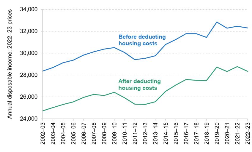
Note: Incomes have been measured net of taxes and benefits, and are expressed in 2022–23 prices. All incomes have been equivalised using the modified OECD equivalence scale and are expressed in terms of equivalent amounts for a childless couple.
Source: Authors’ calculations using the Family Resources Survey, 2002–03 to 2022–23.
This rate of growth is slow by historical standards. Figure 2.2 shows, for each year since 1976, the annualised growth in median household income over the previous 15 years up to that year. Until 2010–11, growth generally fluctuated around 2% per year. Since then it has fallen substantially and over the last 15 years it has been the lowest since comparable records began. Prior to the global financial crisis, the slowest period for growth in average income was 1967–82, with an average of 1.2% per year. But such has been the slowdown in growth in recent years that that rate was still more than twice as fast as the growth witnessed between 2007–08 and 2022–23.
Figure 2.2. Annualised growth in median household income over previous 15 years, 1976 to 2022–23
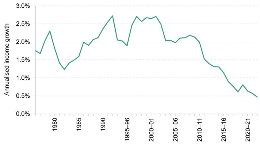
Note: Incomes have been measured net of taxes and benefits, and before housing costs are deducted. All incomes have been equivalised using the modified OECD equivalence scale.
Source: Authors’ calculations using the Family Expenditure Survey, 1961 to 1993–94, and the Family Resources Survey, 1994–95 to 2022–23.
One of the main challenges for living standards between 2021–22 and 2022–23 has been the rapid rise in inflation. Large increases in the prices of goods and services mean that significant rises in nominal income are required for households to maintain their standard of living. Figure 2.3 plots growth in nominal income and the inflation rate since 2003–04. The rate of inflation between 2021–22 and 2022–23 was more than 10%, far higher than anything seen this century. But nominal incomes largely kept up with prices, also rising by around 10%, which is why real incomes only fell modestly. The larger real-terms fall in incomes occurred during the first year of the pandemic, from which households had still not recovered in 2022–23.
Figure 2.3. Median nominal household income growth compared with inflation (before deducting housing costs)
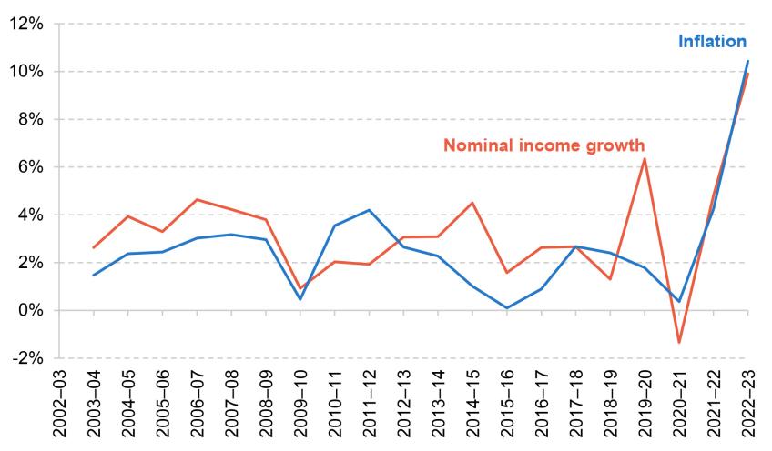
Note: Incomes have been measured net of taxes and benefits. All incomes have been equivalised using the modified OECD equivalence scale.
Source: Authors’ calculations using the Family Resources Survey, 2002–03 to 2022–23.
Thus far we have concentrated on changes in average household income, but income growth has differed across the distribution. Figure 2.4 shows how incomes have changed between 2019–20 and 2022–23 at each percentile of the income distribution in real terms (here we make the usual assumption that all households face the same inflation rate; in Chapter 3, we relax this assumption and allow households to have different inflation rates).
Figure 2.4. Average disposable income growth (before deducting housing costs), by income percentile, 2019–20 to 2022–23
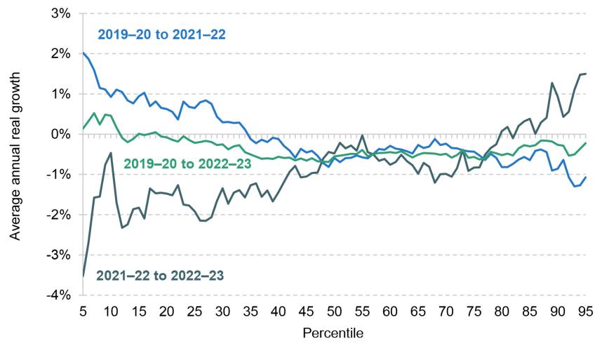
Note: Incomes have been measured net of taxes and benefits. All incomes have been equivalised using the modified OECD equivalence scale.
Source: Authors’ calculations using the Family Resources Survey, 2019–20, 2021–22 and 2022–23.
Changes in household incomes between 2021–22 and 2022–23 were broadly regressive, i.e. households towards the bottom of the income distribution saw their incomes fall by more than households closer to the top. But this follows two years where changes were broadly progressive. Between 2019–20 and 2021–22, households at the bottom of the income distribution benefited from modest rises in household income, whereas incomes among the top two-thirds of the income distribution fell slightly. This was a result of significant temporary support provided to households in response to the pandemic. In particular, the £20 per week uplift to universal credit had a strong poverty-reducing effect. Ray-Chaudhuri, Waters and Xu (2023) estimate that the uplift reduced the poverty rate by 0.6 percentage points. But in the same way that the introduction of these policies had a progressive impact on incomes across the distribution, the impact of their withdrawal between 2021–22 and 2022–23 was regressive. When we take all of the changes since the pandemic into account by comparing incomes between 2019–20 and 2022–23, we see that the growth in incomes was similar across the entire income distribution. There has been stagnation in incomes towards the bottom of the income distribution, while incomes further up the distribution have fallen slightly since 2019–20.
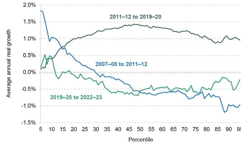
How does the impact of the pandemic compare with that of the global financial crisis? In Figure 2.5, we split the period since 2007–08 into three. The first, 2007–08 to 2011–12, covers the recession and its immediate aftermath. The second, 2011–12 to 2019–20, covers the recovery up to the pandemic, while the third covers the pandemic and its aftermath. At a very broad level, changes in household income following the financial crisis were similar to those following the pandemic, with poorer households seeing income growth and middle- and high-income households seeing similar income declines. But the years following the financial crisis were more inequality-reducing than the changes since 2019–20, with income gains among the bottom third or so of the distribution (rather than only the bottom tenth). By contrast, changes in household incomes during the recovery led to an increase in inequality. Households in the middle and upper parts of the income distribution saw the biggest rises in income between 2011–12 and 2019–20. Cuts to benefits were a key contributor to more sluggish income growth at the bottom of the distribution.
Figure 2.5. Average disposable income growth (before deducting housing costs), by income percentile, 2007–08 to 2022–23
Note: Incomes have been measured net of taxes and benefits. All incomes have been equivalised using the modified OECD equivalence scale.
Source: Authors’ calculations using the Family Resources Survey, 2007–08, 2011–12, 2019–20 and 2022–23.
Even though the distributional impacts of the business cycle since 2007–08 have varied throughout the different periods, there is no part of the income distribution that has enjoyed strong growth in incomes over the period as a whole. We pointed out in Figure 2.2 that long-run growth in median household income has slowed significantly over recent years, but the reality of slow income growth is one shared across the entirety of the income distribution. The combined effect of the financial crisis, a slow recovery, and then the pandemic and a cost-of-living crisis has left households across the distribution seeing growth rates considerably below those seen in decades prior.
Because changes in household income have been broadly similar across the income distribution, there has been little change in measures of income inequality between 2019–20 and 2022–23. Figure B.1 in Appendix B shows income percentile ratios (comparing income at the 90th percentile with income at the 50th percentile, for example). Figure B.2 plots the Gini coefficient, a summary measure of inequality that takes account of the entire income distribution. On both metrics, we see little change since 2019–20 or since 2007–08, despite the very significant shocks to the economy. Overall, income growth was slightly higher towards the bottom of the income distribution during these periods, leading to a slight decline in inequality, but these changes are minimal compared with those seen during the 1980s.
2.2 What factors have driven changes in household incomes?
What has driven the changes in household incomes we have described so far? We study this by examining the contribution of changes in different components of household income, such as employment income and benefits, splitting households into tertiles (thirds).
Panel A of Figure 2.6 shows the contributions of employment income, benefits, cost-of-living support and other income to growth in overall household incomes between 2019–20 and 2022–23. The main driver pushing down incomes during this period was a decline in real net earnings from employment, a result of falls in employment rates and lower average earnings. While there was significant disruption to the economy following the pandemic, earnings recovered reasonably quickly. But since then, rising economic inactivity and the failure of earnings to keep pace with inflation have both led to falls in households’ earnings. Frozen personal tax thresholds also increased individuals’ personal tax liabilities in 2022–23. Although the average fall in employment income across the whole population was relatively modest, there was a large fall among the lowest income tertile and an even bigger fall among the middle tertile. By contrast, there was a slight rise in employment income among the top tertile.
Figure 2.6. Contributions to net household income growth (after deducting housing costs), by income third
Panel A. 2019–20 to 2022–23

Panel B. 2007–08 to 2011–12

Note: Incomes have been measured net of taxes and benefits, and after housing costs have been deducted. All incomes have been equivalised using the modified OECD equivalence scale. Includes individuals between the 5th and 95th percentiles of the household income distribution. ‘Cost-of-living support’ includes means-tested and disability- and age-based cost-of-living payments, the £150 council tax rebate for properties in Bands A–D, the universal energy rebate (£400), the warm home discount scheme and the Welsh fuel support scheme. ‘Other income’ includes savings and private pension income, and deductions for council tax, among other things.
Source: Authors’ calculations using the Family Resources Survey, 2007–08, 2011–12, 2019–20 and 2022–23.
A number of changes affected benefit income. First, benefits are uprated with a lag, meaning that they went up by 3.1% in 2022–23 despite inflation in that year standing at 10.4%, implying a large real-terms cut. Second, some households benefited from increases in universal credit and in the maximum support available to private renters. Third, there has been a significant rise in the number of households receiving health-related benefits since 2019–20 (Ray-Chaudhuri and Waters, 2024). The net effect of these changes was to reduce benefit income in the bottom income tertile, and to increase it in the middle (with half of that rise explained by increasing disability benefits).
For the bottom and middle income tertiles, the key positive contributor to income growth was temporary support schemes. Major aspects of these were two £325 payments for those on means-tested benefits in 2022–23 (note there were further payments in 2023–24), and a universal £400 energy rebate. For the lowest income tertile, cost-of-living support was sufficient to offset declines in employment income and benefits, leaving income in 2022–23 roughly unchanged compared with 2019–20.
Panel B of Figure 2.6 decomposes changes in income between 2007–08 and 2011–12. Similar to the 2019–20 to 2022–23 period, these years were characterised by substantial falls in employment income. The scale of these falls was even larger though, and they materialised further up the income distribution. Cribb et al. (2013) show that almost all of the fall occurred between 2009–10 and 2011–12, and was driven by falling real earnings among the employed rather than by a general rise in worklessness. These employment income falls were significant for households in the top two-thirds of the income distribution, but there was a slight rise in employment income for households in the lowest income tertile. This group saw a rise in employment rates between 2007–08 and 2011–12. One reason for this is a compositional shift: pensioners – usually not in work – were largely shielded from the effects of the financial crisis, meaning that some moved from the lowest income tertile to the middle one. Another reason was the roll-out of the lone parent obligation, which required single parents to look for work in order to receive out-of-work benefits, increasing employment (Codreanu and Waters, 2023).
These sizeable falls in earnings were only partially offset by increases in benefits. A key driver of the rise in benefit income was higher rates of entitlement due to higher levels of unemployment and lower earnings. But, just as in the wake of the cost-of-living crisis, the government also increased transfers to households, with the child element of child tax credit – the amount low-income families received per child – rising by almost 40% over this period (from £1,845 to £2,555 per year). While these giveaways were smaller than the cost-of-living support provided in recent years, the financial crisis reforms were implemented on a permanent basis. By contrast, cost-of-living payments were temporary. Although there were benefit cuts that reduced benefits during the 2010s, these required explicit policy decisions whereas the cost-of-living support has now expired by default. As a result, further recovery in incomes at the bottom of the distribution will rely on increases in income from employment or new benefit reforms.
2.3 Conclusion
This chapter has described changes in households’ living standards between 2019–20 and 2022–23. By historical standards, it has been a very poor few years for household incomes. Across the income distribution, there has been no growth or even a slight fall in household incomes. Importantly, this has followed an extended period of low growth – average household income growth over the 15 years to 2022–23 was the slowest since comparable records began. Perhaps this should not be surprising, given that the successive impacts of the global financial crisis, the COVID-19 pandemic and the cost-of-living crisis have made for a turbulent few years. Indeed, one might argue that the fact that incomes did not fall further between 2019–20 and 2022–23 represents an achievement in itself. But it does not change the fact that, over recent years, households have not experienced the improvement in material living standards that they enjoyed in previous decades.
During the recovery from the global financial crisis and the years since the onset of the pandemic, declines in income from employment were the key factor pushing down on household incomes. In both instances, the government responded by providing additional support to households. In 2022–23 this took the form of temporary support such as cost-of-living payments and energy grants, whereas following the global financial crisis the government offered some permanent benefit giveaways through tax credits. Incomes were better protected between 2019–20 and 2022–23 than between 2007–08 and 2011–12 as cost-of-living support was more significant than benefit changes, but that may no longer hold in the coming years as temporary support is withdrawn.
Perhaps surprisingly, there has not been much change in income inequality in the UK despite the economic upheaval. Incomes performed slightly better in the bottom third of the income distribution than in the top two-thirds between 2019–20 and 2022–23, making it a slightly inequality-reducing period. The 2007–08 to 2011–12 period following the global financial crisis saw a bigger reduction in inequality, but the subsequent recovery was inequality-increasing. Overall, inequality has remained effectively unchanged; any fluctuations are dwarfed by the seismic changes seen during the 1980s.
Looking forward, there are some reasons to think that material living standards may have improved in 2023–24 and beyond. Inflation has fallen significantly, and there has been growth in real earnings. Benefits and the state pension were uprated by 10.1% in April 2023, well above inflation (though only undoing part of the real-terms fall in benefits seen in the previous year), and further cost-of-living payments have now been paid. But mortgage interest rates and rents have risen, and remain high. Moreover, until the cuts to National Insurance starting in January 2023, many workers were paying more in direct taxes because of freezes to tax thresholds. These trends mean we are unlikely to see substantial increases in income in the 2023–24 or 2024–25 data.
3. Poverty and deprivation
Between the middle of 2021 and the end of 2022, inflation in the UK rose dramatically, peaking at 11.1%, before falling to 2% by May 2024. This headline measure is of course just an average: households that spend more of their budget on food and energy – typically poorer households – have seen considerably larger rises in the prices they face than those – typically richer – households that allocate less to these things. Alongside the rise and fall in inflation has been a rapid rise, but more modest fall, in mortgage interest rates. Again, households’ experiences here differ markedly: those who happened to take out a fixed-rate mortgage product in late 2021 have been comparatively sheltered from the rate rises, while those whose fixed deal ended in 2022 will almost certainly have seen a substantial increase in the amount they must pay.
While average inflation and average mortgage interest rates are captured in the official measures of poverty and inequality, the variation faced by households is not. But, especially in current conditions, both have important consequences for households’ living standards. In this chapter, we investigate the implication of these two aspects of mismeasurement for headline poverty measures.
Key findings from Chapter 3
1. Despite the significant challenges posed first by the pandemic and then the cost-of-living crisis, poverty rates changed very little between 2019–20 and 2022–23. The overall rate of absolute poverty rose slightly to 18% in 2022–23, the same level as seen in 2019–20. The relative poverty rate fell slightly to 21%, just below the rate in 2019–20. Rates of child and pensioner absolute poverty were also similar to pre-pandemic levels, at 25% and 12% respectively. This comes after a decade of historically slow falls in absolute poverty.
2. In contrast, rates of material deprivation rose substantially between 2019–20 and 2022–23, as more households reported being unable to afford all sorts of essentials. For example, the share of working-age adults that report being unable to adequately heat their home rose from 4% to 11% (1.8 million to 4.6 million), while the share who reported being unable to keep up with bills rose from 5% to 6% (2.1 million to 2.5 million). Increases were seen across all age groups and at all income levels. Part (though unlikely all) of the reason material deprivation has risen much more than poverty may be that the way poverty is measured ignores two factors: differences in inflation and differences in mortgage interest rates faced by different households.
3. In the latest year of income data (2022–23), the average inflation rate – used for the headline poverty statistics – was 10.7%. However, the inflation rates faced by the poorest and richest fifths of households were 12.6% and 10.0%, respectively. Official statistics – which do not take account of variation in inflation faced by households – show absolute poverty rose by 0.8 percentage points (520,000) between 2021–22 and 2022–23 (to 17.9%). Accounting for differences in inflation increases the growth in poverty by another 210,000 (meaning 1.1ppts or 730,000 growth).
4. Headline poverty statistics are adjusted to account for households’ housing costs, including mortgage interest payments. But these are calculated on the assumption that all households have the same interest rate, ignoring the significant (and growing) variation in rates between households. In 2022–23, the average mortgage rate was around 2.3%, translating to interest payments of £240 per month for a household with a typical outstanding mortgage. But a tenth of households faced a mortgage interest rate of at least 4.7%, equivalent to £490 per month. Accounting for variation in mortgage interest rates shows that absolute poverty among mortgagors, officially 7.9% in 2022–23, is persistently underestimated by around 0.3ppts, or 70,000 people. As around a third of households are mortgagors, the impact on the headline poverty rate is only around 0.1ppts.
5. Increases in interest rates between December 2021 and December 2023 are likely to have pushed mortgagor poverty rates up by 1.4ppts (320,000 more people), when measured accounting for variation in mortgage interest rates. But official poverty statistics, which apply a single average interest rate to all households, will only capture 1.0ppts (230,000) of this.
6. Despite having only a modest impact on aggregate statistics, mismeasurement of interest rates still means individual households’ mortgage interest payments are in some cases severely mismeasured, limiting our ability to understand how recent shocks have affected financial hardship and other outcomes. The majority of mortgagor households’ (after-housing-cost) incomes are mismeasured by at least £500 per year due to the assumption of a single mortgage interest rate. Other data suggest that adults who have seen a substantial rise in interest rates since the pandemic were 2ppts more likely to be behind on bills than those who had not. This implies an additional 370,000 adults behind on bills once all households have remortgaged at higher interest rates.
3.1 Trends in poverty and deprivation statistics
To begin, we plot trends in absolute and relative income poverty. Absolute poverty, defined as the proportion of individuals with household income below a fixed poverty line,1 returned to 18% in 2022–23, the same level as in 2019–20. This is because poorer households’ incomes were broadly flat when adjusting for average inflation. Relative poverty, defined as the proportion of individuals with household income below 60% of contemporaneous median income, fell slightly from 22% to 21% over this period, reflecting the fact that income falls for middle-income households closed the gap between them and poorer households. Ray-Chaudhuri, Waters and Wernham (2024) discuss developments in poverty over the course of the pandemic and the cost-of-living crisis in more detail.
In the longer run, relative poverty has been little changed for over 20 years, whereas absolute poverty has fallen gradually as incomes have grown. But there have been differences between demographic groups. Children and pensioners have seen their relative poverty rates increase by about 3 percentage points from 2011–12 (the beginning of the recovery from the 2008 financial crisis) to 2022–23. Pensioners remain less likely to be in poverty than average, and children significantly more likely. The introduction of the two-child limit in universal credit will have played a role in the increase in child poverty, although it is difficult to quantify exactly how much. Its impact grows as the roll-out continues; currently 2.0 million children are affected by the policy, but when fully rolled out that figure will have risen to 2.8 million (Latimer and Waters, 2024).
Figure 3.1. Absolute income poverty (after deducting housing costs)
Note: Incomes have been measured net of taxes and benefits, and after housing costs are deducted. All incomes have been equivalised using the modified OECD equivalence scale. The ‘In-work’ series includes non-pensioner individuals in households with at least one member in work.
Source: Authors’ calculations using the Family Resources Survey, 2002–03 to 2022–23.
Figure 3.2. Relative income poverty (after deducting housing costs)
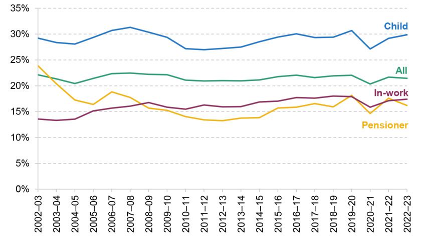
Note: Incomes have been measured net of taxes and benefits, and after housing costs are deducted. All incomes have been equivalised using the modified OECD equivalence scale. The ‘In-work’ series includes non-pensioner individuals in households with at least one member in work.
Source: Authors’ calculations using the Family Resources Survey, 2002–03 to 2022–23.
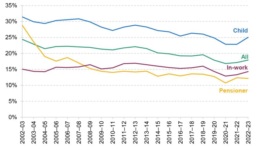
An alternative measure of low living standards is material deprivation, which feeds into statistics reported in DWP’s HBAI publication. This measures the proportion of people unable to afford a number of essential goods, such as fresh fruit and vegetables or the ability to adequately heat their home.2 Different measures are produced for working-age adults, children and pensioners, and these are reported in Figure 3.3.
Figure 3.3. Rates of material deprivation
Note: Rates in 2020–21 and 2021–22 are dashed because material deprivation statistics were impacted by legal restrictions during the COVID-19 pandemic (see footnote 3). Material deprivation is defined as in DWP’s HBAI publication, except it is not combined with low income.
Source: Authors’ calculations using the Family Resources Survey, 2010–11 to 2022–23.
Rates of material deprivation fell for all three age groups over the course of the 2010s. Whilst this is likely to be explained partly by income growth, Cribb et al. (2022) find that child material deprivation was also decreasing at any given income level. The reasons behind this are unclear but may include falling real prices of some essential items, such as gas, or increases in savings among lower-income households. Between 2019–20 and 2022–23, however, there were sharp increases in rates of material deprivation among all three age groups.3 This is despite only a 2% drop in average real income, and no increase in absolute poverty. In fact, the rate of material deprivation for each group was similar to the rate seen in 2014–15, when average real income was 5% lower and the rate of absolute poverty was more than 2 percentage points higher. Income statistics and material deprivation rates seemingly give very different accounts of how financial hardship changed over this period.
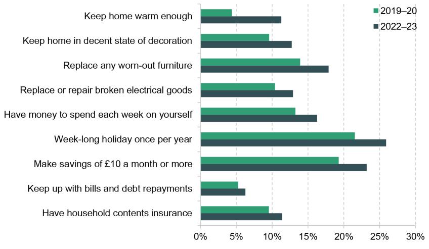
Material deprivation is a complex measure which can behave unintuitively when there are widespread changes in both general affordability and relative affordability of items, due to weighting changes, making results hard to interpret (Cribb et al., 2013). But the rise in material deprivation to 2022–23 was driven by a widespread fall in the reported affordability of essential items. Figure 3.4 shows the proportion of working-age adults unable to afford each item in the working-age deprivation measure. For all items, there was a decrease in affordability from 2019–20 to 2022–23. The increase in food insecurity observed over this period corroborates this finding (Ray-Chaudhuri, Waters and Wernham, 2024).
Figure 3.4. Share of working-age adults unable to afford each item
Note: Figure includes working-age adults only.
Source: Authors’ calculations using the Family Resources Survey, 2019–20 and 2022–23.
The item that saw by far the largest decline in affordability was the ability to adequately heat one’s home. The proportion of working-age adults reporting this increased from 4% to 11%. Children and pensioners saw similarly stark increases on this measure (Ray-Chaudhuri, Waters and Wernham, 2024). This is consistent with the very substantial rises in energy costs over this period, which was the main factor influencing high inflation.
Figure 3.5 breaks down rates of material deprivation by income decile. Increases in material deprivation were seen across the board, but were largest among individuals in the lower-middle part of the income distribution, with just over half of the increase in material deprivation coming from the third to fifth income deciles. Moreover, in proportional terms, there were large increases in material deprivation among higher-income households; the number of households counted as materially deprived in the top half of the income distribution rose by almost two-thirds. We return to this phenomenon later.
Figure 3.5. Material deprivation rates by income decile (after deducting housing costs), 2019–20 and 2022–23

Note: Material deprivation is defined as in DWP’s HBAI publication, except it is not combined with low income. Income deciles are based on income after housing costs have been deducted.
Source: Authors’ calculations using the Family Resources Survey, 2019–20 and 2022–23.
3.2 Issues in poverty measurement and the cost-of-living crisis
In this section, we consider two measurement issues in the HBAI data that limit our ability to analyse changes in poverty and deprivation and what drives them. The first is the use of aggregate, rather than household-specific, inflation measures when calculating real household incomes, and the second is mismeasurement of households’ mortgage interest rates. Both of these affect the HBAI data every year but, as we will show, have recently been exacerbated due to the specific factors associated with the cost-of-living crisis. We estimate the impact of each of these issues on measured incomes and poverty in 2022–23. They both have a modest effect on headline poverty rates, meaning that they are likely to explain some, but not all, of the disconnect between poverty rates and deprivation measures.
Measurement of inflation
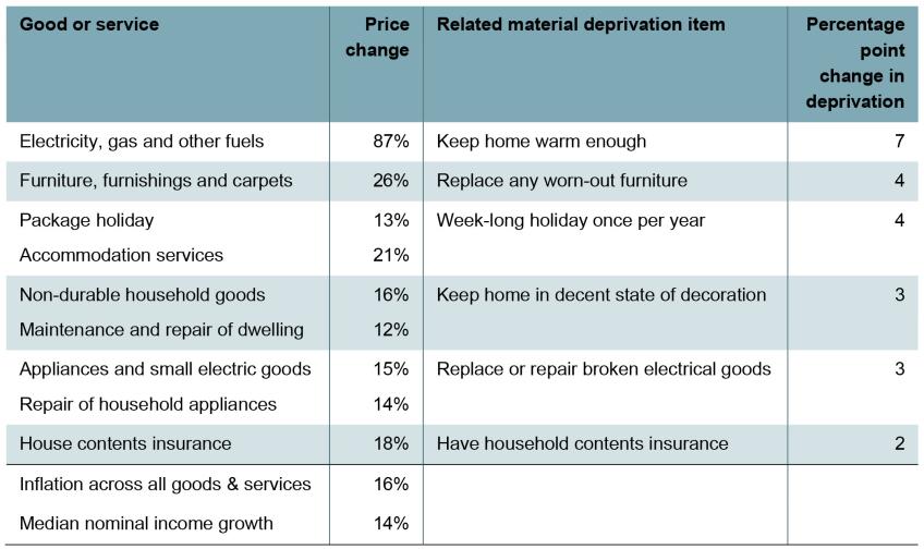
Table 3.1 shows how the prices of various items, closely related to material deprivation items, increased between 2019–20 and 2022–23 and includes numbers for overall inflation and overall nominal income growth. Energy bills stand out as growing in cost far more than average inflation and average income growth. There are significant increases in deprivation even for items that have not seen price changes far above average income growth. This could reflect the fact that big increases in the costs of energy and food mean households have less to spend on other categories (an ‘income effect’), so deprivation of other goods and services rises as well.
Table 3.1. Price changes of selected goods and services between 2019–20 and 2022–23
Source: Authors’ calculations using ONS CPI tables.
When inflation among some goods – in particular energy – far outpaces inflation among others, people experience very different inflation rates. This is because headline inflation rates measure the change in the price of a representative basket of goods, based on aggregate consumption patterns. Spending on energy was 4% of spending on the total basket in 2022–23 (excluding housing costs). But energy was a significantly larger proportion of overall expenditure for some groups, including pensioners (5%) and lower-income households (7% for the poorest fifth). Large increases in energy prices have much more profound impacts on the budgets of these groups than for the average household, meaning that these groups require bigger increases in expenditure to maintain the same standard of living.
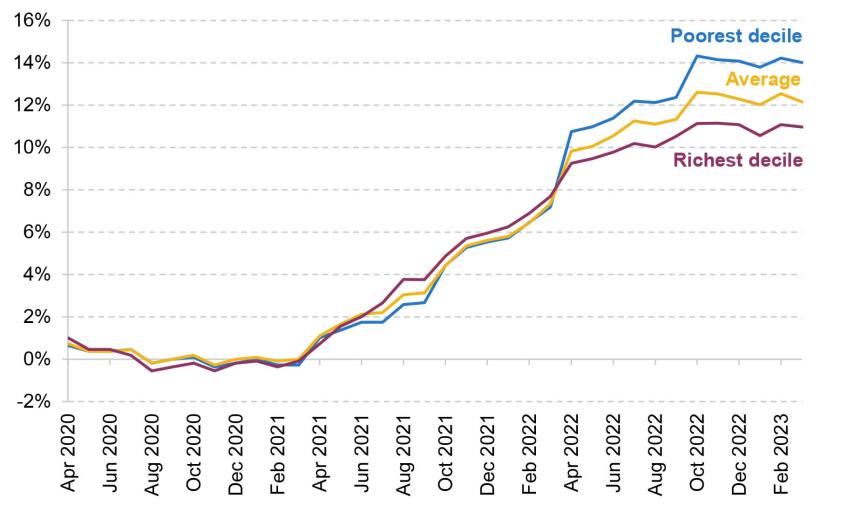
Figure 3.6 shows series from ONS’s Household Costs Indices, an alternative measure to headline inflation which the Office for National Statistics also produces for different parts of the income distribution. The graph shows that while previously inflation was similar among lower- and higher-income households, during the cost-of-living crisis lower-income households faced higher inflation than the average and higher-income households lower.
Figure 3.6. Household Costs Indices
Source: Office for National Statistics, 2024.
The standard approach – which is taken in the official income statistics and which we have followed in this report so far – is to use average inflation to account for price growth, so that a given amount of real income could buy the same representative basket of goods in different periods. In more normal times, this is likely to be adequate for estimating changes in real incomes across the distribution. But when inflation varies widely between different households, stable ‘real’ incomes calculated in this way might mask the fact that some households have seen their purchasing power eroded.
In order to account for this, we can construct an alternative ‘real’ income measure taking account of differential inflation between 2021–22 and 2022–23. We allow inflation to vary by income decile, housing tenure, pensioner status and number of families in the household. See Box 3.1 for more detail. This inflation series is slightly different from the series in Figure 3.6, and is produced only for the most recent data year, in a way that aligns more closely with how after-housing-costs poverty statistics are measured.
Box 3.1. Accounting for differential inflation
To account for differential inflation between 2021–22 and 2022–23, we use the Living Costs and Food Survey (LCFS) from 2019–20 to estimate a specific inflation rate for each household based on its own expenditure. To account for the out-of-date data, and differences between LCFS and ONS data, we rescale the inflation weights to match the ONS aggregate weights in 2022–23. We then estimate a linear model for inflation based on observable characteristics. These include:
- household income decile (before deducting housing costs);
- housing tenure (social renter, private renter or owner-occupier);
- presence of pensioners in the household;
- whether the household contains multiple benefit units (families).
Using this model, we are able to estimate the inflation faced by each household in the Family Resources Survey between 2021–22 and 2022–23, and restate its real household income in 2021–22 prices using this measure instead of average inflation.
Following this creation of an alternative ‘real income’ measure accounting for household-specific inflation, we can calculate income changes, poverty and inequality statistics in the usual way. For absolute poverty, we compare with the same poverty line as usual. For relative poverty, we recalculate the relative poverty line based on this alternative real income measure.
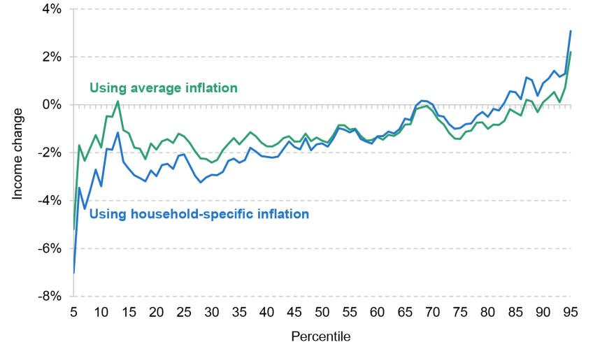
Figure 3.7 compares income changes from 2021–22 to 2022–23 using average inflation and using household-specific inflation. We show incomes after deducting housing costs since this is what we use to calculate the poverty rate. Incorporating household-specific inflation makes the year-on-year income change more regressive, with the poorest half of households seeing bigger falls in their real income. Amongst the top 30%, real incomes grew by more (or fell by less) than official statistics suggest.4 These results imply that the incomes of households around the poverty line fell by 3% rather than 2% between 2021–22 and 2022–23.
Figure 3.7. Real median income change by income percentile, 2021–22 to 2022–23 (after deducting housing costs)
Note: Incomes have been measured net of taxes and benefits, and after housing costs are deducted. All incomes have been equivalised using the modified OECD equivalence scale.
Source: Authors’ calculations using the Family Resources Survey, 2021–22 and 2022–23.
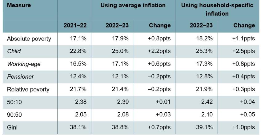
The distributional pattern of real income growth under this alternative approach also has implications for poverty and inequality statistics. Table 3.2 compares the change from 2021–22 to 2022–23 in some of these statistics when measured in the usual way – deflating incomes with average inflation – and when accounting for household-specific inflation. We use 2021–22 prices as a reference point, so only produce alternative poverty and inequality measures for the latest year of data.
Table 3.2. Poverty and inequality statistics (after deducting housing costs), using average and household-specific inflation
Note: Prices are deflated using the HBAI deflator for incomes after deducting housing costs for the standard HBAI results. For household-specific inflation results, we follow the approach outlined in Box 3.1.
Source: Authors’ calculations using Family Resources Survey, 2021–22 and 2022–23.
Accounting for household-specific inflation makes the increase in poverty larger than the official statistics suggest – to a small but not negligible extent. Absolute poverty rose 0.8 percentage points (520,000 people) to 17.9% when measured the standard way, but 1.1ppts (730,000 people) to 18.2% when accounting for differential inflation – a difference of 210,000 people in absolute poverty. The difference for relative poverty is slightly larger, with differential inflation adding 340,000 to the number in poverty. Incorporating differential inflation increases the growth in poverty for all age groups, but the largest difference is for pensioners. On the official measure, their absolute poverty rate fell 0.2ppts in the year to 2022–23, as poorer pensioners’ nominal incomes grew with average inflation. But accounting for the inflation they actually faced, their real incomes fell, and their absolute poverty rate increased by 0.4ppts. This corresponds to an extra 80,000 pensioners in poverty compared with official statistics.
Given the data demands and conceptual challenges of conducting this exercise (e.g. it requires a ‘reference’ year to measure households’ consumption baskets), and the fact that inflation is usually fairly similar across the distribution, it is not clear that this approach should be routinely adopted in income statistics. But the unusually unequal impact of inflation this year, and in particular the fact that it was driven by very large price increases in certain items, mean differential inflation has had a meaningful effect, causing the increase in poverty to be understated. This likely goes part of the way to explaining the disconnect between poverty and material deprivation trends. But differential inflation is not the only measurement issue that has become more pertinent during the cost-of-living crisis, so we now turn to explore the impact of another.
Measurement of mortgage interest payments
As well as high inflation, large increases in mortgage interest rates have been another feature of the cost-of-living crisis exerting pressure on households’ incomes. In order to try to curb inflation, the Bank of England has raised its interest rate, leading banks to increase the interest rates they charge to consumers. Because most households have fixed-rate mortgages, this interest rate rise generates substantial variation in the interest rates households face. This creates difficulties with the standard approach used when measuring poverty. This subsection explains the measurement issue and assesses its significance for understanding changes in living standards.
Figure 3.8 shows mortgage interest rates offered for new mortgages over time since June 2015, as well as some percentiles of the distribution of mortgage interest rates paid by households. Most households fix their mortgage rates for two to five years. When market rates go up, they are not affected immediately, but instead only when their fixed term comes to an end. As a result, the average interest rate paid by all mortgagors will only increase slowly after a jump in market rates. This creates variation in interest rates, as those who remortgage pay much higher interest rates than those who do not. This is what we have seen following the sharp rise in market interest rates beginning in Autumn 2022. Between June 2022 and June 2023, the 75th percentile of the interest rate distribution (the rate that 75% of mortgage holders have an interest rate less than) rose by more than a half from 2.8% to 4.3%. Over the same period, the median interest rate rose by one-fifth from 2.1% to 2.5%, and the 25th percentile from 1.7% to 1.8%.
Figure 3.8. New mortgage interest rates and percentiles of the mortgage interest rate distribution
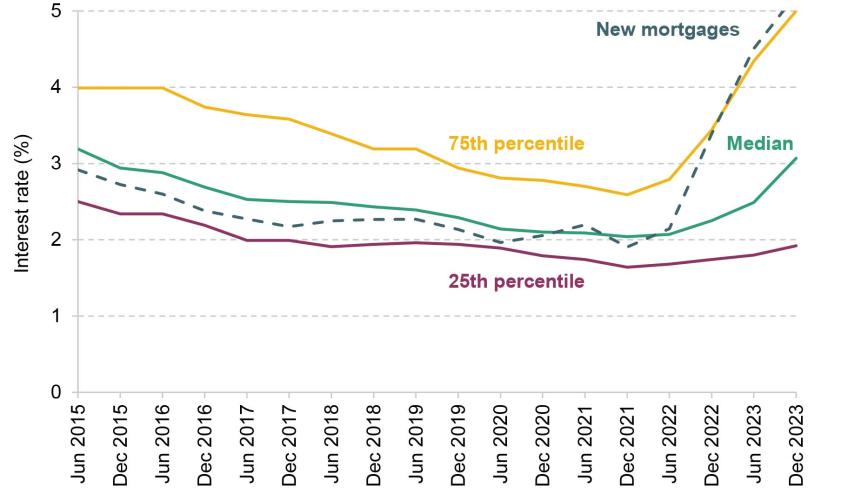
Note: ‘New mortgages’ shows weighted average interest rates on new loans. Interest rate percentiles are based on data on the stock of repayment mortgages. The graph presents snapshots at the end of June and December, from 2015 to 2023.
Source: Authors’ calculations using Financial Conduct Authority (2024a) and Freedom of Information request to FCA FOI11359.
The consequence of this is that even if the average interest rate paid by households only increases slowly, some households will experience significant shocks to their disposable income. For example, suppose a family needs to remortgage at a time when interest rates have risen. Previously they took out their mortgage when interest rates were low and had a fixed rate of 2%. Now they need to remortgage with £200,000 remaining on their mortgage and 20 years left. If they re-fixed at a rate of 6% then their payments would jump by £5,000 per year (from £12,000 to £17,000). Around 1.2 million fixed-rate mortgages were up for renewal in 2022–23 (Office for National Statistics, 2023a).
When measuring poverty, we tend to use incomes with housing costs deducted,5 and when housing costs are rising rapidly for some households, examining incomes after housing costs can be informative for understanding living standards across the distribution. For households with mortgages, mortgage interest payments are included in housing costs, although mortgage capital repayments are not since these represent the accumulation of an asset. If mortgage interest payments were measured accurately in the data, then a rise in a household’s interest rate would increase its mortgage interest payment and thus lower its after-housing-cost income. But the data underlying the official statistics do not have a measure of each household’s mortgage interest payment for households with repayment mortgages, the most common type of mortgage.6 Nor are households asked their mortgage interest rate. Instead, households’ mortgage interest payments are imputed assuming all households sampled in the same month pay the same, average interest rate on their repayment mortgage. We refer to this average interest rate as the ‘HBAI interest rate’, as it is the rate used in the HBAI data that form the basis for this analysis. The HBAI interest rate is multiplied by the household’s reported outstanding capital on the mortgage to derive the mortgage interest payment. Since mortgage interest rates were rising during 2022–23, the gap between the HBAI interest rate and households’ true interest rate has widened. The HBAI interest rate has risen only modestly, averaging 2.3% over the year (translating to £240 per month for a household with a typical mortgage), but some households’ interest rates have risen very significantly. One-tenth of mortgagors had a mortgage interest rate of at least 4.7% (translating to £490 per month) in 2022–23, but more than half had a rate below the HBAI interest rate. Understating the variation in interest payments implies an understatement of the variation in AHC income, which in turn has implications for poverty and inequality statistics.
To understand how important this is, we empirically assess the impact of estimating interest payments using a single interest rate. To do this, we would ideally have a measure of each household’s actual interest payments and use those instead of the imputed payment. Unfortunately, the data do not contain any information on households’ mortgage interest rates or payments; we are also unable to produce sensible estimates of interest rates using other information in the FRS survey. In Box 3.2, we show that the interest rate distribution implied by households’ responses to questions on monthly payments, outstanding mortgage capital and years remaining is drastically different from the actual distribution. This implies that at least one of these questions is being answered with substantial error. This could be having its own impact on measured interest payments.
Box 3.2. The quality of FRS mortgage data
The official poverty statistics (HBAI) are based on data from the Family Resources Survey (FRS). The FRS contains three key pieces of mortgage information – total monthly mortgage payment, years remaining and outstanding capital – that can be used to infer the mortgage interest rate. Figure 3.9 shows that the distribution of inferred mortgage interest rates from the 2022–23 FRS data (in green) looks very different from the actual distribution of mortgage interest rates as of December 2022 (yellow). FRS-based estimates imply that 40% of mortgagors have an interest rate below 1% or above 7%, but in reality this figure is just 2%.
Figure 3.9. Percentile of inferred mortgage interest rate distribution compared with actual distribution
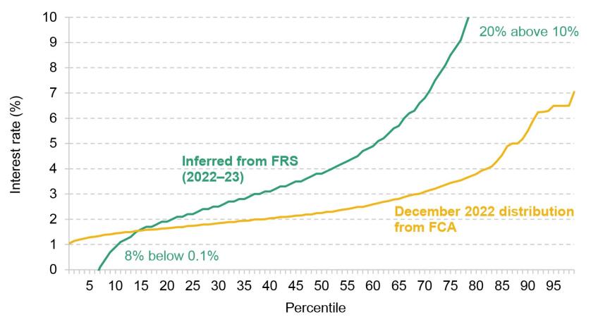
Note: FRS estimates based on a sample of mortgage holders with at least three years remaining on their mortgage, with non-missing responses to questions on capital remaining and monthly payments.
Source: Authors’ calculations using Family Resources Survey 2022–23 and Freedom of Information request to FCA FOI11359.
This implies that some or all of the three key pieces of data that we used to infer mortgage interest rates must be unreliable. Our suspicion is that there might be a significant amount of error in outstanding capital – it changes every month and is rarely seen by mortgagors. If so, this could be introducing additional error in the income statistics, since it is used in conjunction with interest rates to calculate a household’s mortgage interest payment. Unfortunately, we are not aware of any data that would allow us to confidently validate these figures.
Our approach is to approximate the impact of using households’ actual interest rates by imposing the true mortgage interest rate distribution on the data. For each month, we randomly assign households a mortgage interest rate so that the distribution of interest rates in the data matches the actual distribution of mortgage interest rates in that month.7 We then compare the poverty rate under this assumption and the official poverty rate.
One limitation of this approach is that random assignment does not allow for potential correlation between households’ mortgage interest rates and other characteristics. For example, mortgages with a higher loan-to-value ratio (LTV) have higher interest rates on average than those with a lower LTV. Those with high assets may therefore benefit from lower interest rates, while those buying for the first time may face much higher rates. This additional element of mismeasurement will of course also be present in official statistics since they assume all households have the same mortgage interest rate, but remains unquantifiable without better data on households’ actual mortgage interest rates.
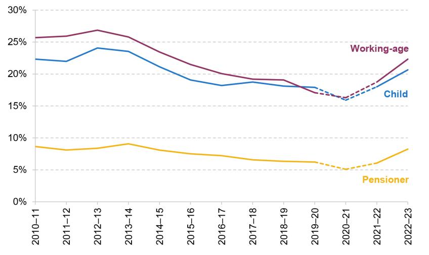
Consequences for measurement of poverty and inequality
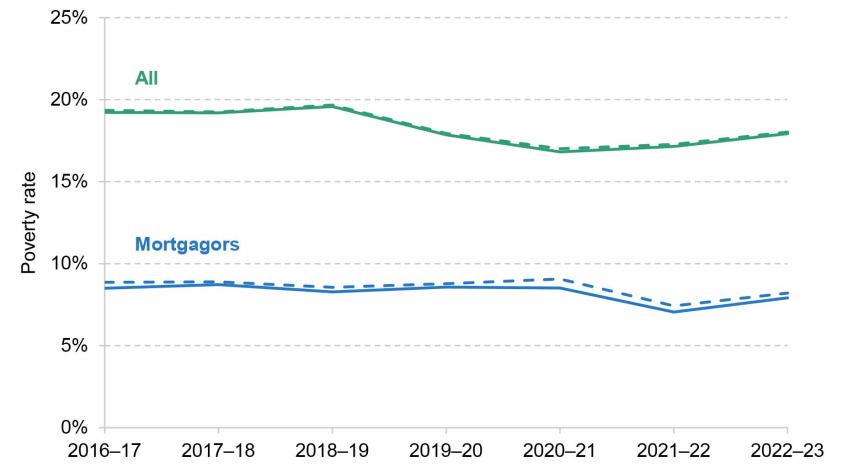
Figure 3.10 shows the impact of accounting for variation in mortgage interest rates on AHC poverty. For mortgagors, accounting for this variation raises poverty rates by around 0.3 percentage points (from 7.9% to 8.2%) in the latest year of the data, equivalent to 70,000 people. Similar numbers are seen in earlier years. Since about a third of households are mortgagors, the impact on overall poverty is quite modest, at around 0.1ppts.
Figure 3.10. Absolute poverty rate (after deducting housing costs): official statistics (solid) and after accounting for variation in mortgage interest rates (dashed)
Note: Solid lines show official statistics and dashed lines show figures after accounting for variation in mortgage interest rates. Incomes measured net of taxes and benefits, and after housing costs are deducted. All incomes have been equivalised using the modified OECD equivalence scale.
Source: Authors’ calculations using the Family Resources Survey, 2016–17 to 2022–23, and Freedom of Information request to FCA FOI11359.
Given the scale of interest rate rises over the past couple of years, it is perhaps surprising that allowing for variation in mortgage interest rates makes relatively little difference to poverty rates. But, even though higher interest rates can mean significant increases in housing costs, mortgagors tend to have high incomes (2022–23 average was £40,000 for mortgagors compared with £29,000 among other tenure types) and so require large income falls to move them below the poverty line. Moreover, the size of changes in interest payments depends on the size of the mortgage, and those making higher mortgage payments tend to have even higher incomes, making them less likely to fall into poverty. Therefore, although failing to account for variation in interest rates does mean understating variation in AHC incomes, the impact is modest.
Mortgage interest rates really began to take off in the middle of the 2022–23 financial year, and, as discussed above, the nature of fixed-rate mortgages means that more and more households are affected over time. To give a more up-to-date view of how continuing increases in the mortgage rates people pay are likely to affect poverty, we simulate poverty rates using the interest rates observed in December 2021 and in December 2023 (the last date for which we have information on the mortgage interest rate distribution). Table 3.3 presents estimates of absolute poverty rates for mortgagors in 2022–23 under contemporaneous 2022–23 interest rates (as in Figure 3.10) and with alternative interest rates. It does so using the average interest rate (as is used in the HBAI data) and taking into account the variation in interest rates as above. Table C.1 in Appendix C shows the impact of these approaches on other poverty statistics.
Table 3.3. Absolute poverty rates in 2022–23, under alternative interest rate assumptions
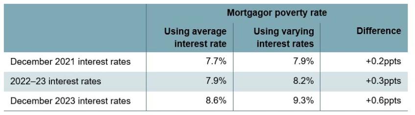
Note: Poverty rates based on incomes measured after housing costs are deducted.
Source: Authors’ calculations using the Family Resources Survey 2022–23, Freedom of Information request to FCA FOI11359 and Bank of England series CFMHSDE.
There are two things to note about the tables. First, even if one measures interest rates using the average, the increase in rates between December 2021 and December 2023 is set to increase absolute poverty among mortgagors by 1.0ppts or 230,000 people (equivalent to a 0.3ppt rise in poverty across the population as a whole). Second, the extent to which using average interest rates – rather than taking account of the variation – understates mortgagor poverty is set to rise, from 0.2ppts to 0.6ppts (an additional 90,000 people). This is because there is increasing variation in interest rates paid over time as more people come off their fixed-rate mortgage (Figure 3.8), meaning that the assumption of a single interest rate for all households performs less well. This means that, all else equal, we would expect the change in poverty rates observed in next year’s 2023–24 data to understate the true rise in poverty (or overstate the fall).
It is important to note that this measurement issue extends beyond headline statistics. The large variation in interest rates means that we are substantially mismeasuring some households’ mortgage interest payments, as shown in Table 3.4. To some extent, these differences cancel each other out when summary statistics are calculated, but the mismeasurement matters despite this. It limits our ability to carry out further analysis – for example, to understand the relationship between changing housing costs and other outcomes, such as material deprivation.8
Table 3.4. Over- or under-estimate of mortgage interest payments from using average interest rate versus varying interest rate, among mortgagors in 2022–23

Note: Absolute differences between mortgage interest payment calculated using varying interest rate assumption compared with average interest rate assumption.
Source: Authors’ calculations using the Family Resources Survey 2022–23 and Freedom of Information request to FCA FOI11359.
How have mortgage interest rate rises affected households’ financial and mental well-being?
We have shown that the mortgagor poverty rate rises modestly when accounting for mortgage interest rate variation. But even for those who are not pushed below the poverty line because of mismeasurement in interest rates, there might still be a significant impact on their income which is being missed due to mismeasurement of individual households’ AHC income.
Even for those with higher incomes, shocks to interest rates can lead to increases in hardship for mortgagors. Many households will budget to spend most of their income. Some of their consumption decisions are likely to be fixed or difficult to adjust – for example, childcare, transport to work and indeed housing itself. In the event of a large shock to housing costs, households might find themselves in financial distress due to an inability to significantly cut back their expenditure in response, at least in the short term. And many households have faced exactly such a shock due to mortgage interest rates increasing.
Ray-Chaudhuri, Waters and Wernham (2024) show that the number of mortgagors in material deprivation rose by more in percentage terms than the number of renters in material deprivation.9 Regrettably, we cannot test how much of this is driven by remortgaging households because the HBAI data lack information on households’ mortgage interest rates. But Figure 3.11 provides some evidence that increases in mortgage interest rates may have important implications for households’ financial situations. Each panel shows outcomes for mortgagors in the 2020–21 and 2021–22 waves of Understanding Society, split by whether they remortgaged during that time or not. There is no direct data on having remortgaged, so we use a proxy based on increases in mortgage payments among adults who did not change address.
Figure 3.11. Deprivation measures by whether household remortgaged between 2020–21 and 2021–22
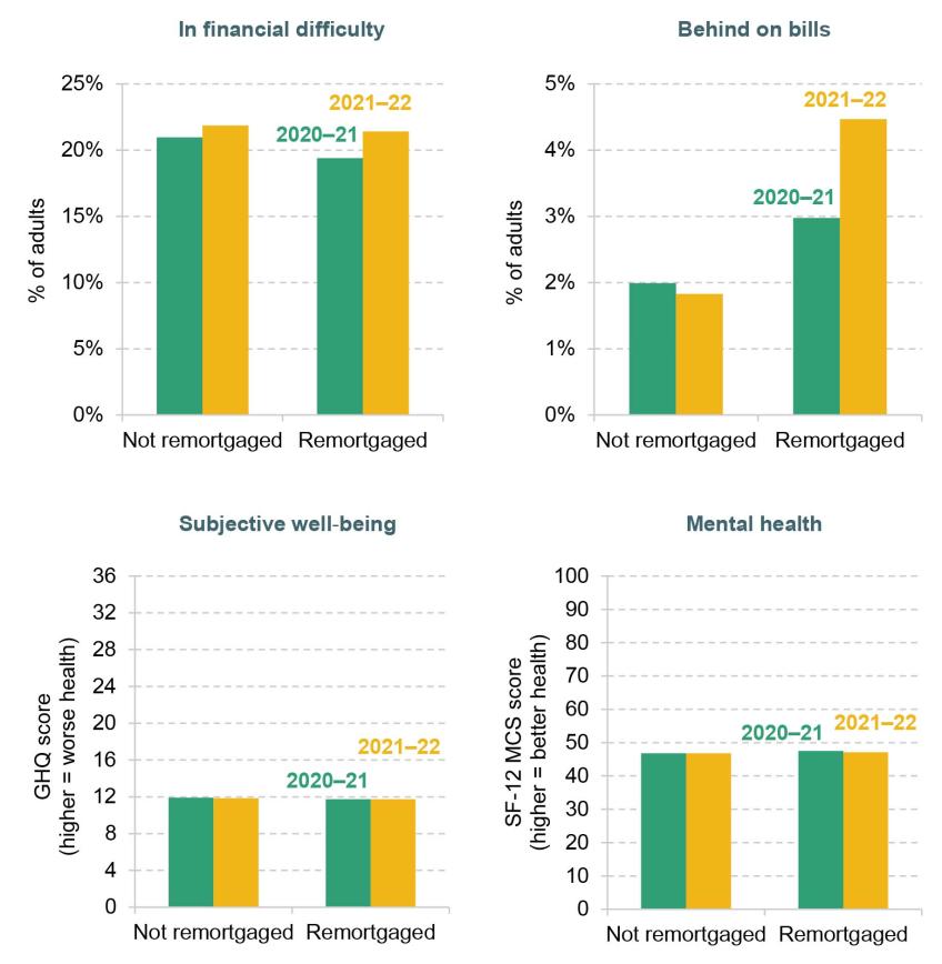
Note: Remortgaging households defined as those whose mortgage payments rose by more than 15% compared with when asked in the 2020–21 wave and who have not changed address. Sample based on individuals in mortgage-holding households in the current and previous wave. ‘In financial difficulty’ counts adults reporting ‘just about getting by’ or worse with regards to their financial situation. ‘Behind on bills’ counts adults reporting being behind on some or all bills. ‘Subjective well-being’ based on responses to General Health Questionnaire (GHQ) using Likert scoring on a scale from 0 to 36. ‘Mental health’ based on Mental Component Summary of the 12-Item Short Form Survey (SF-12 MCS) on a scale from 0 to 100.
Source: Authors’ calculations using Understanding Society, Waves 12–13.
Adults who remortgaged saw bigger increases in the likelihood of reporting being in financial difficulty or behind on bills than those who did not. Only the latter difference is statistically significant though: conditional on previously being behind on bills, those remortgaging were 2 percentage points more likely to be behind on bills in the latest wave. This implies an additional 370,000 adults behind on bills once all households have remortgaged at higher interest rates. We do not see any differences when comparing average scores for subjective well-being and mental health. Overall, there is tentative evidence that interest rate rises lead to issues with budgeting for households with mortgages. But it is challenging to say much more without data on which households are remortgaging and what their interest rates are.
Committed consumption and mortgage interest rate rises may help explain why there have been marked rises in material deprivation among households further up the income distribution than we might expect, and hence perhaps may help explain why material deprivation has risen faster than poverty in recent years.
Another explanation for differences between poverty and material deprivation measures could be changes in how individuals answer the survey questions that material deprivation measures are based on. The material deprivation measure we consider here relies on households reporting that they are unable to afford certain items. The cost-of-living crisis was a widespread and high-profile event. It might be the case, that in a high-profile economic crisis known to be affecting living standards, people with a given level of purchasing power are more likely to report being unable to afford things. For example, if the stigma surrounding admitting an inability to afford items has been reduced, that might mean some of the increase in material deprivation represents a correction to previous under-reporting, rather than a genuine increase. Alternatively, there may have been a shift in how people think about being unable to afford an item. More affluent individuals who have made changes to their expenditure, such as taking steps to save energy, may consider that they are unable to afford to adequately heat their home, even though their experience may still differ markedly from that of poorer individuals. These sorts of issues with reporting highlight an inevitable downside to measuring deprivation based on self-reported judgements.
3.3 Conclusion
This chapter has discussed two issues in poverty measurement that have been exacerbated during the cost-of-living crisis. We find that official poverty statistics modestly understate true poverty rates in 2022–23 because they do not account for differences in the inflation rate and mortgage interest rates faced by different households. Moreover, we demonstrate that there is large mismeasurement of mortgagors’ income which limits our ability to understand changes in income and deprivation over recent years.
The key trends in poverty and deprivation between 2019–20 and 2022–23 are tough to reconcile. The official poverty rate is almost unchanged, but self-reported material deprivation measures imply sharp rises in deprivation. Based on our analysis here, issues in poverty measurement are likely to explain some, but – given their magnitude – not all this difference. Shocks to after-housing-cost incomes, through rising mortgage interest rates, could play an additional role – the income poverty measures are based on current income, but even a household above the poverty line that has just experienced a shock might experience deprivation, at least temporarily. We find some evidence of households that recently remortgaged being more likely to be behind on bills, but we lack the data to assess this hypothesis more precisely.
Looking ahead, persistent high mortgage interest rates are likely to push up both true and measured poverty rates in 2023–24, as more households see their fixed-rate periods come to an end and their interest rates rise. But average incomes are likely to have recovered to pre-pandemic levels in the current financial year, which might ease rates of deprivation from their current high levels (Cribb and Waters, 2024). Additionally, benefits and pensions have seen above-inflation uprating (undoing the previous below-inflation uprating), and lower energy prices will have relieved some of the stress on households’ budgets. The overall impact of these factors on poverty and (especially) material deprivation rates is difficult to predict. Making policy decisions is not easy when faced with contrasting narratives around households’ living standards. Improved measurement of household incomes is necessary if we are to gain a clearer picture of what has happened to poverty and deprivation over the past few years, so government can avoid making policy in the dark.
4. How have pensioner incomes and poverty changed in recent years?
Key findings from Chapter 4
Average pensioner incomes and pensioner poverty
1. Before, and during, the Great Recession, average pensioner incomes were catching up with working-age incomes. Between 2002–03 and 2011–12, median pensioner incomes grew by 22% (after adjusting for inflation), whereas incomes of working-age adults fell by 3%, due to slow growth prior to 2007 and big falls in incomes during the Great Recession. Poorer pensioners’ incomes were growing at a similar rate to average pensioner incomes prior to 2011, leading to relative pensioner poverty falling from 25% in 2002–03 to 13% in 2011–12.
2. Since 2011, average pensioner incomes have been growing at a similar rate to working-age incomes. Average incomes for pensioners – which are now very similar to average incomes below state pension age – grew by 12% from 2011–12 to 2022–23, driven by higher state and private pension incomes. This growth was almost identical to the growth in average working-age incomes of 13% over the same period – driven up by rising incomes from employment.
3. However, since 2011, income growth for poor pensioners has lagged behind the population as a whole. From 2011–12 to 2022–23, incomes for poor pensioners (at the 10th percentile of the pensioner income distribution) rose by only 5% (after adjusting for inflation). This is in part because poor pensioners have benefited from neither the rises in employment income nor the rises in private pension income that pushed up incomes for people on middle incomes.
4. This slow income growth for poorer pensioners means that relative pensioner poverty rose from 13% in 2011–12 to 16% in 2022–23, equivalent to an increase of 300,000 pensioners. A key reason for low income growth for poor pensioners has been that growth in state pension incomes has been offset in large part by falling levels of other benefits – higher state pensions increase pensioner incomes, making them increasingly ineligible for further means-tested state support. Indeed, for the poorest third of pensioners, state pensions rose by 6% between 2011–12 and 2022–23 but total benefit incomes (including state pensions) only rose by 1%. In other words, the support that poor pensioners get from the state increasingly comes from the state pension, rather than the means-tested benefit system.
5. In the years since the onset of the pandemic (2019–20 to 2022–23), lower-income pensioners experienced higher income growth than higher-income pensioners, as they received more state support during the cost-of-living crisis and have benefited more from falling (real-terms) housing costs. Indeed, relative income poverty among pensioners fell from 18% to 16% between 2019–20 and 2022–23.
6. However, these income poverty statistics understate the financial difficulties faced by poorer pensioners, as they do not account for the fact that poorer households are more exposed to sharp rises in gas, electricity and food prices. Pensioner material deprivation – a measure of the household’s inability to afford key essentials – rose from 6% (700,000 pensioners) in 2019–20 to 8% (1 million pensioners) in 2022–23. For example, the fraction of pensioners who could not afford to keep their home warm rose from 2% to 5% (230,000 to 570,000 pensioners).
Trends in different sources of pensioner incomes
7. Before the pandemic, the average incomes of pensioners were pushed up in part by rising state pension incomes. This was due to a combination of triple-lock indexation of the basic state pension since 2011, the introduction of the new state pension in 2016, successive generations of women having spent more years in paid work, and both men and women having accumulated higher earnings-related pensions. Reforms in 2010 and 2016 also substantially boosted the state pension incomes of many women (notably by comprehensive ‘crediting’ for those who spent long periods out of paid work looking after children). As a result, the gender gap in state pension incomes has all but disappeared for those born after 1950.
8. Despite large increases in state pension incomes for women born since 1950 (and higher average household incomes among pensioners), these changes have not led to large falls in relative income poverty for these women compared with previous generations at the same age (in their late 60s and early 70s). In part this is because the reforms of 2010 and 2016 were designed to boost the incomes of (generally) women with low state pension incomes, rather than boosting the incomes of pensioners with low household incomes. It is also due to higher state pensions leading to falls in eligibility to other benefits for low-income families.
9. Rising incomes from private pensions have been the largest single contributor to growth in average pensioner incomes over the last two decades. This is a result of both gradually increasing coverage (54% of pensioners received income from private pensions in 2019–20 compared with 50% in 2002–03) and increasing amounts received (the average private pension income among those with positive incomes rose from £4,700 to £7,600 a year over this period).
10. Average income from employment (including self-employment) among those aged 66–74 has also been rising gradually over time. This is mainly due to rising employment rates but is also due to rising average earnings among those in paid work. While employment income is not the key income source in older age nor is it the key driver of changes over time, on average it makes up just over half of total household income for working households in their late 60s and early 70s.
4.1 Introduction
Pensioners – the population above the state pension age, currently 66 – make up about a quarter of the adult population in the UK. Given the size of this group, trends in pensioner incomes play an important role in determining trends in the distribution of living standards in the population as a whole. The composition of pensioner incomes, and the factors driving changes to them, are markedly different from those for the rest of the population. Most working-age households receive most of their income from employment, meaning that trends in earned incomes are the key determinant of their incomes. However, only a small minority of pensioners receive significant income from employment.
Pensions – received from either the state or from private sources – make up the majority of income for most pensioners. Pension incomes are driven by a combination of factors such as policy reforms, past employment patterns and the types of pensions offered by employers. State pension entitlements in particular have been subject to substantial reform since the mid 1970s.
Pensioners in low-income households also face a considerably more generous benefit system than working-age households (Cribb and O’Brien, 2022), albeit one where there remain serious challenges around take-up – DWP estimates show that only six out of ten of those entitled to pension credit claimed the benefit in 2021–22 (Department for Work and Pensions, 2024a). Finally, patterns in housing tenure among current generations of pensioners are in stark contrast to the patterns among those under state pension age. Around 74% of pensioner households in 2022–23 owned their home without a mortgage, while 4% owned with a mortgage; 17% of pensioners were social renters and only 5% private renters. By comparison, 23% of working-age households are owner-occupiers without a mortgage and 35% with, while 17% are social renters and 23% private renters. This means that average housing costs among pensioners are generally low, and few pensioners are exposed to changes in either mortgage rates or the private rental market compared with working-age households.
Despite the importance of pensioner incomes in their own right, and the implications for the population as a whole, there has been relatively little work in recent years taking a broad perspective on how pensioner incomes have changed in recent decades. This chapter seeks to remedy that, focusing on three key areas.
First, we provide new evidence on trends in average pensioner incomes, how unequal pensioner incomes are, how that has changed in recent years, and how these trends have fed through to measures of income poverty and material deprivation among pensioners. While the focus of our research is on recent trends, we put these changes in the context of the last 20 years. As incomes measured before and after housing costs are generally similar for pensioners (as housing costs are, on average, low), we mostly illustrate overall incomes after deducting housing costs in order to ease comparability with trends for working-age people, most of whom face significant housing costs.
Second, we dig into more detail on how income from state pensions and benefits has changed over time for pensioners, splitting out changes in state pension incomes from changes in income from other benefits (such as means-tested or disability-related state support). In particular, we show how state pension incomes have changed among recently retired pensioners, and how those changes compare with changes in income from other state benefits.
Finally, we consider the importance of private sources of income for pensioners, both income from private pensions and employment income. These sources of income are more important, on average, for higher-income pensioner households, and the importance of private sources of income has grown in recent decades. This increase is driven by increasing rates of employment among pensioners, as well as higher private pension participation rates meaning that more people are approaching pension age with a private pension.
Before we proceed to the analysis, it is worth noting that our definition of pensioners focuses on people aged 66 (the current state pension age) and over. This means that the changes in average income among our definition of pensioners are not affected by state pension age increases.10 Previous analysis has shown the effects of increasing the state pension age on household incomes (notably, Cribb and Emmerson (2019) and Cribb and O’Brien (2022)), finding that increases in the state pension age substantially reduced average incomes and pushed up income poverty rates.
4.2 Pensioner incomes and living standards over the last 20 years
Trends in pensioner incomes
We start this section by analysing median household incomes of pensioners and how they compare with those of working-age households, as shown in Figure 4.1. As in the rest of this report, incomes are equivalised using the modified OECD equivalence scale and expressed in terms of equivalent amounts for a childless couple.11 While equivalisation could affect the long-run trends in incomes if the composition of households changes over time, the overall trends in unequivalised incomes are similar to what we show in this report (see Department for Work and Pensions (2024b) for analysis of unequivalised incomes). The incomes shown are measured as net incomes (after direct taxes and other transfers), in 2022–23 prices. The graph shows incomes both after deducting housing costs (AHC) and before deducting housing costs (BHC).
Figure 4.1. Real median household income over time, pensioners and working-age adults, before and after adjusting for housing costs
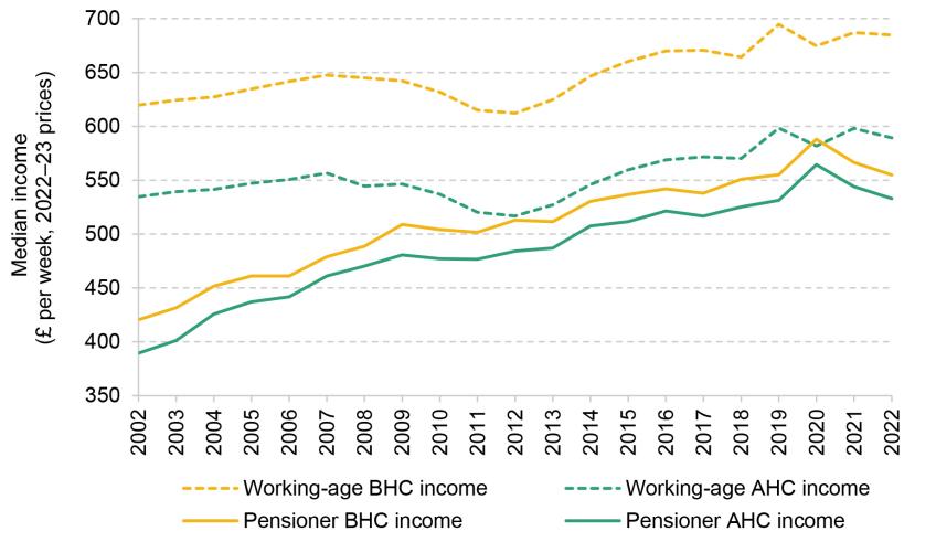
Note: ‘Pensioners’ refers to those above the age of 66. ‘Working-age adults’ refers to men aged under 65 and women aged under 60. All incomes are equivalised and expressed as equivalent for a childless couple. Years refer to financial years.
Source: Authors’ calculations using the Family Resources Survey, 2002–03 to 2022–23.
Figure 4.1 shows that the median pensioner income in 2022–23, after deducting housing costs, was £533 per week, compared with £589 per week among working-age individuals – a gap of roughly 10%. Both of these figures are essentially unchanged since 2019. However, that overall effect over three years reflects pensioners first doing better during the pandemic lockdowns than working-age individuals (as they were less affected by labour market disruptions), but then seeing slightly bigger income falls during the subsequent cost-of-living crisis, compared with working-age adults.12
This relatively small gap in incomes reflects a substantial narrowing over time. Pensioner incomes (AHC) grew at a rate of 3.4% per year from 2002–03 through to the Great Recession (2007–08), compared with an annual average growth rate of just 0.8% among the working-age population. Following the financial crisis, working-age individuals fared even worse, with real incomes falling. This means that overall from 2002–03 to 2011–12, median working-age incomes fell by 3% while median pensioner incomes grew by 22%. Since 2011, income growth among working-age adults has picked up once again and followed a relatively similar trend to pensioner incomes,13 with median income growth for both groups at 12–13% between 2011–12 and 2022–23.
It is worth noting that even though the growth in pensioner incomes after the Great Recession was stronger than income growth among working-age households, pensioners still experienced a slowdown relative to the kind of growth seen before the Great Recession. If real incomes had continued to grow at the rate they did between 2002–03 and 2007–08, pensioner AHC income would be 43% higher in 2022–23 than what it actually was.
In order to understand the drivers of trends in pensioner incomes over time, we examine the components of pensioner household income and their evolution. Figure 4.2 shows the various components of pensioner income since 2002–03. The state pension is the most important source of income amongst pensioners, followed closely by private pensions and savings. The relative share of these components has been growing over time compared with other components of income.
Figure 4.2. Components of mean household income for pensioners over time, including deductions (housing costs and council tax)
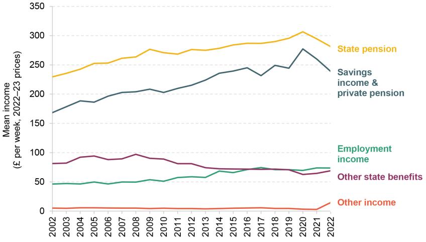
Note: All incomes are equivalised and expressed as the equivalent for a childless couple. ‘Employment income’ includes income from employee jobs and self-employment earnings. ‘Other income’ includes private benefits, child income, the universal energy rebate, the warm home discount scheme and the Welsh fuel support scheme. As total household AHC income also includes council tax and housing costs, these are deducted from the sum of the other components in ‘Other income’. Years refer to financial years.
Source: Authors’ calculations using the Family Resources Survey, 2002–03 to 2022–23.
Notably, the fall in pensioners’ real median household incomes between 2020–21 and 2022–23 can be attributed to the real-terms falls in state pension and in private pension and savings income. Average state pension income fell in real terms over this period mainly due to the way in which state pensions are indexed each year. In particular, in April 2022, state pensions were increased by 3.1%, which was the inflation measure from the previous September, while CPI inflation in April 2022 had risen to 9.0%. Therefore, the real-terms fall in state pension income was a result of rising inflation and state pensions that only rise with lagged measures of inflation or earnings. The latter also means that this fall will be reversed in coming years – state pensions were increased by 10.1% in April 2023 and by 8.5% in April 2024 in cash terms, both of which are real-terms increases as inflation was falling back towards target.
Pensioners’ average incomes from private pensions and savings have also fallen in real terms since the start of the pandemic. For defined benefit (DB) pension schemes, there is a statutory requirement to increase pension payments each year in line with prices. However, in the private sector, this requirement is generally capped at either 2.5% or 5%.14 With the average rate of inflation around 9% in 2022, these increases were below the rate of inflation, meaning private pension incomes from DB schemes fell over this period.
For those with defined contribution (DC) pensions – who make up an increasingly large share of pensioners – the situation is rather different. These schemes do not provide a guaranteed pension, but rather they provide a pot of money which can be used in retirement. Since 2015, people have been able to decide exactly how to access their DC pension pots from age 55 onwards. Instead of purchasing an annuity (which most people with DC pensions were required to do by age 75 before 2015), an increasing number of people are now taking out money from their DC pension pots flexibly. This means that they can adjust their income drawdowns over time. HMRC statistics on taxable flexible payments show that the rise in average withdrawals (as well as the number of withdrawals) stalled during the pandemic (HM Revenue and Customs, 2021). A number of factors may be driving the fall in the size of flexible payments taken from DC pension pots, such as lower consumption needs or opportunities during the pandemic, or poor returns and high inflation creating uncertainty and potentially eroding the value of a pension pot before it is withdrawn.
Even among those who did purchase an annuity, such as people who accessed their DC pension pots before 2015, the majority purchase annuities that are not adjusted for inflation (Financial Conduct Authority, 2024b). This means that private pension income for those individuals will also fall in real terms over time, and particularly so in periods when inflation is high. These changes together are likely to explain some of the fall in the average private pension incomes we see in Figure 4.2.
The graph also shows that income from other state benefits (mostly means-tested benefits and disability benefits, excluding the state pension) fell steadily between 2008–09 and 2020–21. This fall largely reflects younger pensioners being better off than their predecessors were at the same age – a trend we discuss in more detail in Section 4.3. However, this falling trend has been somewhat reversed since the pandemic, as the government introduced various temporary support schemes to help households with the cost-of-living crisis.
In 2022–23, several cost-of-living payments were introduced. These were targeted at households that were deemed to be most vulnerable to the cost-of-living crisis, to offset the impact of lagged uprating – households on the state pension, means-tested benefits and/or disability benefits (Ray-Chaudhuri, Waters and Wernham, 2024). In addition to this more targeted support, measures were introduced to support households more broadly – notably, a £150 council tax rebate for those in properties in Bands A–D and a one-off reduction of £400 in energy bills for all households.
The targeted cost-of-living payments are included in ‘other benefits’ in Figure 4.2, and indeed we can see that the trend of declining state benefits was reversed slightly as the government made these payments to many vulnerable and low-income individuals in 2022–23. The broader cost-of-living support measures (the £150 and £400 sums) are reflected in ‘other incomes’, and again we see an uptick in this category of income in 2022–23. Finally, there have also been gradual increases in employment incomes for pensioners over the last 20 years – a trend discussed in greater detail in Section 4.4.
To get a better understanding of how these changes in the various components of income map to total income, we can break down their contribution to income growth. Figure 4.3 shows the contribution of each component of income to overall income growth over the periods 2002–07 (before the Great Recession), 2007–11 (broadly reflecting the period of the Great Recession), 2011–19 (the recovery from the Great Recession) and 2019–22 (the COVID-19 pandemic and the cost-of-living crisis). The black dots show the total growth in mean real incomes over these periods.
Figure 4.3. Contribution of different income sources to mean real income growth for pensioners, by subperiod
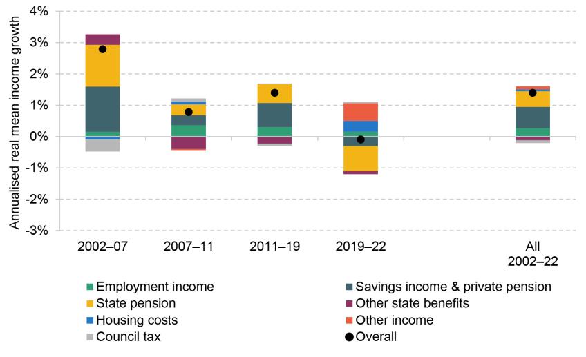
Note: The graph shows the contribution to the growth in mean household AHC income over the relevant period that comes from each of the components of income. ‘Pensioners’ are defined as those aged 66 and over. ‘Employment income’ includes income from employee jobs and self-employment earnings. ‘Other income’ includes private benefits, child income, the universal energy rebate, the warm home discount scheme and the Welsh fuel support scheme. Positive growth rates for ‘housing costs’ and ‘council tax’ indicate these costs are falling in real terms. Years refer to financial years.
Source: Authors’ calculations using the Family Resources Survey, various years.
The graph illustrates just how different the drivers of income growth have been in the most recent period compared with the earlier periods. Before the Great Recession, increases in state and private pension incomes, as well as other benefit income (due to the introduction of pension credit), were driving overall income growth among pensioners. During and after the Great Recession, increases in employment income, state pension, and private pensions and savings income were driving overall growth in average pensioner incomes, while the value of other state benefits was falling in real terms.
Since the pandemic, the falls in real income from state and private pensions were offset by the growth in other income (such as the cost-of-living support) and, to some extent, the fall in real housing costs, netting out at an approximately zero overall effect. These trends differ from income trends among working-age households, where the main contribution to both the real-terms increases and decreases in incomes over the same periods comes from employment income (see Figures D.2 and D.3 in Appendix D).
Trends in pensioner income inequality over time
The previous analysis has shown that on average, after two decades of growth, real incomes for pensioners have remained flat since 2019. We now seek to understand how pensioners at different parts of the income distribution have fared. Figure 4.4 shows the growth in real incomes for the 10th, 50th and 90th percentiles of the income distribution, split between pensioners (Panel A) and working-age adults (Panel B).15 The graphs are indexed so that changes in incomes are shown relative to 2002.
Figure 4.4. Growth in real income, by income percentile, for pensioners and working-age adults over time
Panel A. Pensioners
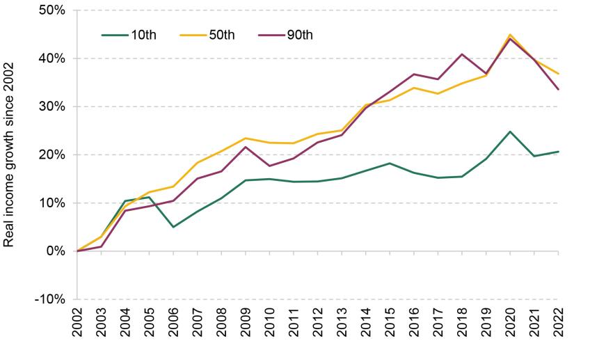
Panel B. Working-age adults
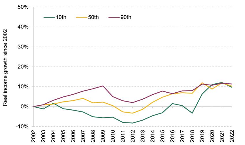
Note: The graph shows real growth in equivalised household income after housing costs since 2002–03 for each year up to 2022–23. Income percentiles are calculated within groups. ‘Pensioners’ refers to those above the age of 66. ‘Working-age adults’ refers to men aged under 65 and women aged under 60. Years refer to financial years.
Source: Authors’ calculations using the Family Resources Survey, 2002–03 to 2022–23.
First looking at the period from 2002–03 to 2011–12 (after which the recovery from the Great Recession began), we can see that working-age incomes especially at the bottom of the income distribution (10th percentile) were falling, while incomes among the poorest pensioners were more protected, rising by 14% over this period. Incomes in the middle (50th percentile) and top (90th percentile) of the income distribution were also growing faster among pensioners (by 22% and 19% respectively) than among working-age adults over this period.
In the period since the Great Recession (2011–12 to 2019–20), growth in pensioner incomes was faster among middle- and higher-income pensioners than among lower-income pensioners. This is due to the fact that income from private pensions was growing quickly over this period, and these gains are concentrated in the top half of the income distribution. The picture for working-age households was broadly the reverse, with stronger growth in real incomes at the bottom of the income distribution. This was largely due to a rise in employment income for low-income households compared with middle- and high-income households, driven by a fall in worklessness (Cribb et al., 2021), and to the fact that earnings growth was comparatively better for low earners than for high earners over this period (Cribb and Johnson, 2019). Together this means that over the 2010s, income inequality among pensioners was increasing and income inequality among working-age households was decreasing.
These patterns look different for the period from 2019–20 to 2022–23. Average growth in real incomes over this period was negligible or even slightly negative for both pensioners and working-age individuals. However, the profile of growth across the pensioner income distribution is reversed compared with the preceding period. From 2019–20 to 2022–23, it was lower-income pensioners who fared slightly better, as they received greater support from the cost-of-living payments. In contrast, pensioners in the middle and upper parts of the income distribution, who have a much larger proportion of income coming from private pensions compared with low-income pensioners, saw falls in real income over the post-pandemic period, as private pension and savings income fell in real terms. Overall, however, despite the better trends for poorer pensioners since 2019–20, it is still the case that pensioner incomes at the 10th percentile only rose by 5% from 2011–12 to 2022–23.
In conclusion, over the last two decades, pensioner incomes at the middle and top of the income distribution have been growing at similar rates. However, inequality between these middle- and high-income pensioners and low-income pensioners has increased, as growth in incomes for the poorest pensioners has stalled since the early 2010s. In order to shed more light on how low-income pensioners fared over this period, we now turn to understanding trends in the living standards of low-income pensioners.
Incomes of poor pensioners
The key sources of income for poorer pensioners are the state pension and other pensioner benefits (see Figure D.4 in Appendix D), in contrast to high-income pensioners for whom private pensions and savings income (and, to a lesser extent, employment income) are more important (see Figure D.5). Figure 4.5 below shows how the components of income have contributed to overall real income growth for the bottom third of the pensioner income distribution (the equivalent graph for high-income pensioners is Figure D.6).
Between 2011–12 and 2019–20, real state pension growth boosted the incomes of low-income pensioners by 7.9%. However, as state pensions have risen, the amount of other benefits lower-income pensioners receive has declined. From 2011–12 to 2019–20, for poor pensioners, state pension income rose by £23 (9%), but total income from the state rose by only £17 (5%). Inflation has eroded the value of benefits in recent years, meaning that from 2011–12 to 2022–23 state pension income rose by 6% but total benefit income rose by only 1%. This trend will be discussed in more detail in Section 4.3.
Figure 4.5 highlights two reasons for rising income inequality between pensioners at the middle and bottom of the income distribution. Low-income pensioners are less likely to have significant private pension wealth, and so have not benefited from the increases in average private pension income since the Great Recession. Low-income pensioners also face higher and rising real housing costs, which suppressed the AHC incomes of poorer pensioners between 2011–12 and 2019–20. The rise in housing costs for low-income pensioners over this period is driven by a real-terms increase in private and social rents.
Figure 4.5. Contribution of different income sources to mean real income growth for low-income pensioners (lowest-income third of pensioners)

Note: The graph shows the contribution of the growth in mean household AHC income over the relevant period that comes from each of the components of income. ‘Employment income’ includes income from employee jobs and self-employment earnings. ‘Other income’ includes private benefits, child income, the universal energy rebate, the warm home discount scheme and the Welsh fuel support scheme. Positive growth rates for ‘housing costs’ and ‘council tax’ indicate these costs are falling in real terms. Years refer to financial years.
Source: Authors’ calculations using the Family Resources Survey, various years.
The trends since 2019–20 have been markedly different for poor pensioners. The reliance on the state pension, and its (temporary) decline in real value in April 2022, pushed down poorer pensioners’ real incomes. Between 2019–20 and 2022–23, the real-terms fall in the state pension reduced real household incomes of low-income households by 3.1%. However, since the pandemic, low-income pensioners have benefited more from the fall in real housing costs (given the higher likelihood of paying private rents which did not keep up with inflation over this period) and the additional cost-of-living support, with the fall in housing costs and the increase in other income each pushing up real incomes by 3.6%. Similarly, low-income pensioners were also less exposed to the falls in earnings from employment and real-terms falls in private pensions and savings income over this period, as these are a smaller proportion of total income for this group. This has led to the positive, albeit fairly modest, growth in incomes for low-income pensioners between 2019–20 and 2022–23, compared with falling incomes for higher-income pensioners.
Changes in pensioner living standards over time
Given the trends in incomes for pensioners at different parts of the income distribution shown above, this subsection discusses the consequence of these trends for pensioner poverty rates and deprivation. Figure 4.6 shows relative poverty rates (AHC) for pensioners and for working-age adults. Relative poverty rates indicate the proportion of individuals with household income below 60% of the contemporaneous median income (among the whole population).
Figure 4.6. Relative poverty rates (AHC) for pensioners and working-age adults
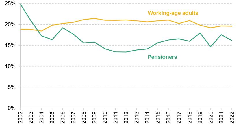
Note: Relative poverty is defined as 60% of contemporaneous median income. ‘Pensioners’ refers to those aged 66 and over. ‘Working-age adults’ refers to men aged under 65 and women aged under 60. Years refer to financial years.
Source: Authors’ calculations using the Family Resources Survey, 2002–03 to 2022–23.
Relative poverty among pensioners has generally followed a ‘U-shaped’ pattern from 2002–03 to 2022–23, with relative poverty for pensioners falling from 2002–03 to 2008–09, staying relatively flat for a few years, and then rising slightly from 2012–13 up until the onset of the COVID-19 pandemic. The sharp fall in the pensioner poverty rate between 2002–03 and 2004–05 likely reflects the introduction of pension credit in October 2003. Compared with its predecessor (income support for people aged 60 or over), more households were entitled to pension credit and the reform led to higher average awards.16
This pattern is different from the flatter profile of relative income poverty among the working-age population over this period. For example, after the 2008 financial crisis, relative poverty rates fell for pensioners but rose for working-age individuals. This is because real earnings fell significantly in the aftermath of the Great Recession for working-age individuals, whereas pensioners were largely insulated from these effects.
In contrast, as the economy recovered from the Great Recession and real earnings rose in the mid 2010s, this boosted incomes for working-age people more than for low-income pensioners, leading to small rises in pensioner poverty in the mid 2010s. Despite some fluctuations in relative poverty during the COVID-19 pandemic for the pensioner group, relative poverty rates for pensioners are currently around the same position they were in 2018–19. This implies that the pandemic did not lead to dramatic changes in relative poverty rates among pensioners.
To understand better how living standards have evolved, we look beyond income-based measures of living standards to indicators of material deprivation. Material deprivation measures whether households can afford a range of basic items and activities. A household is classed as materially deprived if it is unable to afford a certain number of these basic items, with more weight being given to items that more families report being able to afford. Looking at a measure of material deprivation is particularly important in recent years, as measures of real household incomes, by construction, assume that all people face the same inflation rates. This has not been true during the cost-of-living crisis as higher gas, electricity and food prices have disproportionately affected lower-income people, as shown in Chapter 3 of this report.
Figure 4.7 shows the share of people who are materially deprived over time. The list of items and the threshold that needs to be crossed for a family to be classed as being in material deprivation are different for pensioners and working-age individuals, so the two series are not directly comparable in magnitude. However, it is informative to compare the trends over time.
Figure 4.7. Share of pensioners (and working-age adults) in material deprivation

Note: The graph shows the shares of pensioners and working-age adults who surpass their respective material deprivation thresholds. A pensioner is said to be in material deprivation if they have a pensioner material deprivation score greater than 20. A working-age adult is said to be in material deprivation if they have an adult material deprivation score greater than 30. Years refer to financial years.
Source: Authors’ calculations using the Family Resources Survey, 2010–11 to 2022–23.
Figure 4.7 shows that the rates of material deprivation for pensioners and for working-age adults fell steadily after 2013. These falls point to a considerably more positive picture over the 2010s than that shown by measures of relative income poverty. However, these falls in the level of material deprivation among pensioners (and to a lesser extent working-age people) have been undone within the two years following the COVID-19 pandemic, with the proportion of pensioners who are materially deprived now at a similar level to that in 2013–14, and the proportion for working-age people now at 2015–16 levels. It is important to note that these deprivation indices should be treated with care during the pandemic period, as lockdowns and social distancing measures prevented people from living their normal lives. Some of the activities mentioned in the material deprivation questionnaire, such as eating out, were heavily restricted during lockdowns, making it more difficult to interpret people’s responses to whether they can afford these activities. But we see a continued and substantial increase in the share of people in material deprivation in 2022–23 compared with the previous two years, reflecting the impact of the cost-of-living crisis.
To understand what is driving this rise in material deprivation, we can look at the items that make up the material deprivation score. Figure 4.8 uses a selection of material deprivation items for pensioners, showing the fraction that cannot afford these items. Fifteen items are included in the index, and we show seven of them to aid legibility. We exclude activities that were most affected by social distancing and lockdowns as they would have been heavily restricted for some of the pandemic period: seeing friends and family; getting regular haircuts; going on holiday; going out once a month; having access to a car or taxi. We also do not include three items that have not shown significant change over time: being able to replace your cooker; having access to a telephone; keeping home in a good state of repair.
Figure 4.8. Components of material deprivation: share of pensioners who cannot afford certain items
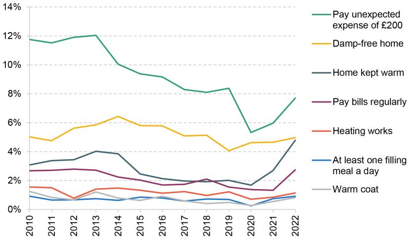
Note: A selection of pensioner material deprivation items are shown. Years refer to financial years.
Source: Authors’ calculations using the Family Resources Survey, 2010–11 to 2022–23.
Figure 4.8 shows that the increase in the rate of material deprivation since 2020–21 is not being driven by one component of material deprivation, but rather by a range of factors. In particular, the share of pensioner households being unable to keep their home warm rose sharply from 1.7% to 4.8% during the cost-of-living crisis (between 2020–21 and 2022–23). The share of pensioners saying they are not able to afford to pay bills regularly rose from 1.4% to 2.7% over the same period. The prevalence of being unable to pay an unexpected expense of £200 has risen too, although this appears to be simply returning to around its pre-COVID level.
Ultimately, this means that although average incomes among pensioners have not fallen significantly since the onset of the COVID-19 pandemic, the ability of pensioners to afford basic items – in particular, their ability to keep their home warm – has declined markedly during the cost-of-living crisis. Despite this, it is notable that the overall material deprivation index, and many of the components shown in Figure 4.8, were in 2022–23 at levels similar to or lower than what they were in 2010–11. In other words, while the cost-of-living crisis reversed the recent falls in material deprivation, the rates of material deprivation are still either the same as or lower than they were during the Great Recession.
Summary
Average pensioner incomes have been increasing since the early 2000s, driven by increases in state pension and private pensions (and to lesser extent employment income). Up until around 2011, this growth was much faster than growth in average incomes for working-age adults (due in part to the large falls for working-age adults during the Great Recession). Since 2011, the recovery in employment income for working-age adults means that median pensioner and working-age incomes have grown at similar rates.
The trends for poor pensioners are quite different. Strong income growth throughout the 2000s meant falling relative poverty, down to 13% in 2011 from 25% as recently as 2002. But since 2011, the trends are much less favourable to poorer pensioners, with their incomes rising by only 5% between 2011 and 2022, and relative pensioner poverty rising to 16% by 2022. Poorer pensioners did not benefit from rising employment and private pension incomes that benefited middle-income people (of working-age or pensioners respectively). And increased state pension incomes – for lower-income pensioners – have been significantly offset by reduced eligibility for means-tested benefits.
Looking at the trends since the pandemic in particular, average pensioner incomes in 2022–23 were at the same level in real terms as in 2019–20. This is driven by real falls in state pension incomes, as well as in private pension incomes. These falls were mostly offset by additional cost-of-living support from the government and falls in real housing costs. For state pensions, these recent real falls were purely the effect of uprating using a lagged measure of inflation and therefore will be temporary as large cash increases in 2023 and 2024 have pushed the real value of the state pension back up relative to prices as inflation has fallen back.
While pensioner poverty has – if anything – fallen since 2019, there was a significant rise in material deprivation. This was driven particularly by an increase in the share of pensioners saying they cannot heat their home. Taken together, this illustrates that while incomes of poor pensioners were to a large extent protected since the pandemic, this was not enough to protect all pensioners form the effects of rapidly increasing gas, electricity and food prices.
4.3 How has state support for pensioners changed over time?
The previous section highlighted how important income from the state is for pensioners, most notably the state pension, but also other state benefits. This section examines in more detail how pensioner incomes from the state have changed over time.
In this section and in Section 4.4, we split pensioners by age group. We do this because the experiences that shape the economic outcomes of today’s pensioners vary based on when they were born, working and retiring. For example, at any given point in time, pensioners of different ages faced different state pension rules and have had different work histories due to the economic and labour market conditions they faced during their working life.
We therefore begin this section by looking at the level and breakdown of the components of household income (before housing costs) by age group, in 2002–03 and 2022–23, as shown in Figure 4.9. This graph shows that younger pensioners have higher real incomes in both years, and that incomes have risen in real terms over the last two decades, by between 27% and 30% among all age groups. It also shows that the higher incomes amongst younger pensioners are largely driven by higher employment income. Income from the state pension makes up over 40% of BHC household income for all age groups in both 2002–03 and 2022–23. It is consistently, over time and across age groups, the largest component of income. Therefore understanding state pension income patterns is vital for explaining overall trends in pensioner incomes – the issue to which we now turn.17
Figure 4.9. Components of household income by age group over time, with percentage figures indicating the share of each component in total income (the white dots)
Note: The graph shows mean household income before housing costs of individuals within the specified age groups. All incomes are in 2022–23 prices and are equivalised and expressed as the equivalent for a childless couple. ‘Employment income’ includes income from employee jobs and self-employment earnings. ‘Other income’ includes deductions from income, most notably council tax. Years refer to financial years.
Source: Authors’ calculations using the Family Resources Survey, 2002–03 and 2022–23.
Impact of state pension reforms on pensioners
Since the introduction of the new state pension in 2016, people have not earned the right to additional earnings-related state pensions. These changes to the earnings-related state pension mean that average state pension income is lower among younger cohorts than among the older groups. However, other state pension reforms that took place in recent decades have benefited groups that previously had a lower state pension entitlement. In particular, the state pension ‘crediting’ arrangements for years not in paid work but doing certain activities – for example, caring for children – have become more comprehensive over time, in particular benefiting married women. In this subsection, we look at how these changes affected female pensioners’ average incomes.
Figure 4.10 shows median state pension income and median household income for men and for women born in different years. Looking at Panel A first, we can see that the gap in individual state pension incomes between men and women is much larger among older generations than among younger generations of pensioners. For example, women born between 1940 and 1944 would expect to receive, on average, less than 80% of the state pension income that men in that cohort were receiving, while women born between 1950 and 1952 can expect to receive around 90% of the state pension income of men born at the same time. By the 1953–54 cohort, women are receiving almost as much as men. Put another way, women born in 1953 and 1954 had state pensions that were 21% higher than for those born in the late 1940s (1945–49). For men, the increase was only 5%.
Figure 4.10. Median individual real state pension income and household income by birth cohort, sex and age
Panel A. Median individual state pension income
Panel B. Median equivalised household income
Note: The graph shows the median state pension income received by individuals and the total household income for an individual within the specified birth cohort over different ages. Birth cohorts are defined over financial year of birth. Incomes are presented in 2022–23 prices. Household incomes are equivalised and expressed as the equivalent for a childless couple.
Source: Authors’ calculations using the Family Resources Survey, 2002–03 to 2022–23.
The gap between men and women has closed for a couple of reasons. First, women born more recently had greater labour market attachment during their working lives, which increases state pension entitlement due to the earnings-related part of the state pension (especially for the older cohorts, who faced the old state pension system) and to a higher number of qualifying years which build state pension entitlement.
Another reason for the gap closing is the reforms that took place over this period. People reaching the state pension age since 2010 (for women, those born since April 1950) were able to qualify for more comprehensive credits for time spent not in paid work but caring for children, increasing the number of qualifying years women with children receive. People reaching the state pension age since 2016 (for women, those born since April 1953) are eligible to the new state pension, which appears to have reduced the gender gap in state pension incomes further.
Given these large reductions in the gender gap in individual state pension incomes, it is also interesting to consider to what extent these state pension reforms feed through to household incomes. Panel B of Figure 4.10 shows the median household income (after housing costs) for men and women from different birth cohorts by age. Focusing on the differences in incomes for women by cohort, similar to the pattern we saw with individual state pension incomes, younger generations of women have higher household incomes than the preceding cohort did at the same age. In fact, generation-on-generation growth in household income is larger than the growth in state pension income. This is due to both women’s private sources of income and (potential) spouses’ incomes being higher for the younger cohorts.
So far, we have focused on median state and household incomes. However, a key feature of some of the state pension reforms in recent decades was increases in state pension incomes for some individuals who would otherwise have very low – or no – state pension income. In particular, women who spent long periods out of the labour market caring for children, who would have previously had a very low state pension, were since 2010 (i.e. for women born in 1950 and later) able to receive a higher state pension entitlement in recognition of the caring activities.
As a result, we want to understand to what extent the increases in the state pension entitlement of women have resulted in changes to poverty rates among female birth cohorts. Figure 4.11 shows, among the same cohorts of women as above, the rate of relative income poverty (after housing costs) by age.
Figure 4.11. Women’s relative income poverty rates (AHC) by birth cohorts and age
Note: The graph shows the relative poverty rate by birth cohort over different ages for women only. Relative poverty is defined as 60% of contemporaneous median income. Birth cohorts are defined over financial year of birth.
Source: Authors’ calculations using the Family Resources Survey, 2002–03 to 2022–23.
Interestingly, we do not see differences in women’s relative income poverty rates between different generations. Recall that relative poverty rates indicate the proportion of people who have an income of less than 60% of the contemporaneous median. The fact that we see relative poverty remaining stable indicates that cohort-on-cohort growth in average incomes, driven by a range of factors including the previously discussed state pension reforms, improved the incomes of lower-income pensioners, but only at a similar rate as median incomes were rising (therefore not leading to cohort-on-cohort falls in relative poverty). In other words, the incomes of low-income new pensioners have improved against a fixed benchmark, but their incomes relative to other parts of the income distribution have not changed.
It is worth noting that poverty rates are a household measure to capture the prevalence of low-income households. Other important changes may be happening within households. The women who were more likely to benefit from the improved crediting for years not in paid work are married women, as they are more likely to have spent time out of the labour market caring for young children. Indeed, as shown in Figure 4.12, the split of pension income between men and women in couples has changed in line with the reforms – the fraction of household pension income coming from women (as opposed to men) has been rising for recent generations of new pensioners.
Figure 4.12. Share of total pension income in a benefit unit (BU) contributed by women in couples by birth cohorts and age
Note: The graph shows the share of total benefit unit state and private pension income in couples that is contributed by women by particular birth cohorts over different ages. Birth cohorts are defined over financial year of birth.
Source: Authors’ calculations using the Family Resources Survey, 2002–03 to 2022–23.
For the 1953–54 generation in their late 60s, on average 32% of household pension income comes from women; this is up from 27% for those born in 1945–49. Together these findings suggest that most of the reforms that increased women’s state pension incomes benefited women who already had higher household incomes, as these reforms were aimed at those who had cared for children earlier on in life, rather than at low-income households. It is likely that many of the women whose incomes are below the poverty line are living in single-person households and may never have had children, and thus would not have benefited from the changes to crediting rules. This can help explain why the 2010 and 2016 reforms do not seem to have had an effect on relative poverty rates among the affected generations of women.
In addition to the changes in how looking after children was credited for building up state pension, there were other ways in which the reforms affected entitlement. The 2010 reform also reduced the required number of ‘qualifying years’ for individuals to receive the full basic state pension; these are the years during working-age with activities that build up entitlement to the state pension. The 2010 reform reduced the number of qualifying years required for a full pension from 44 for men and 39 for women, to 30 years for both men and women. This was then increased back to 35 in the 2016 reforms. Another key change was that while, previously, self-employed workers could not build up entitlement to the earnings-related state pension, since 2016 self-employment does build entitlement to the new state pension.
These changes are likely to benefit other groups who historically may have had lower entitlement to the state pension, such as immigrants who had not spent their whole working life in the UK, and the long-term self-employed (who are disproportionately likely to be from ethnic minorities, specifically people from Pakistani and Bangladeshi backgrounds (Office for National Statistics, 2023b)).
Indeed, Cribb et al. (2023) have looked at how immigration and ethnicity gaps in state pension incomes have changed over time as a result of these reforms. Their analysis shows that before the 2016 reforms, there was an ethnicity gap in state pension incomes that could not be explained by immigration status alone, but after 2016 – once we control for immigration status – the ethnicity gap for pensioners is no longer statistically significant. In other words, among those born in the UK, there is no longer evidence of a gap in state pension incomes between those in the white majority and those in other ethnic groups. Cribb et al. also show that after 2010, gaps in state pension entitlements between immigrants and natives were driven by those who arrived in the UK after age 30, meaning that they will not have had enough time to build full entitlement to the state pension in the UK (although they will have had more time to build entitlements elsewhere).
Trends in other pensioner benefits over time
As shown earlier, other benefits (excluding state pensions) have in general become a smaller proportion of pensioner household incomes over time. Figure 4.13 shows that this trend holds across the various age groups, although income from other benefits has fallen most among the oldest age group, particularly since the financial crisis.18
Figure 4.13. Mean state benefit income (excluding the state pension), by age group over time
Note: The graph shows mean household state benefit income (excluding state pension) of individuals within the specified age group. All incomes are presented in 2022–23 prices and are equivalised and expressed as the equivalent for a childless couple. Years refer to financial years.
Source: Authors’ calculations using the Family Resources Survey, 2002–03 to 2022–23.
In order to understand the trend of falling pensioner benefits and how it interacts with changes in other incomes, Figure 4.14 shows the mean income that a household receives from state benefits (other than the state pension), where the sample is split into five groups based on their annual (after housing costs) income, excluding the other benefit income. We show the average amounts in 2002–03, 2011–12, 2019–20 and 2022–23.
Figure 4.14. Household income from state benefits (excluding the state pension), split by total household income (excluding other state benefits), over time
Note: The graph shows mean state benefits (excluding state pension) for those in various income groups. Income groups are defined over the real income from state pensions, employment, private pensions and savings summed. All incomes are presented in 2022–23 prices and are equivalised and expressed as the equivalent for a childless couple. Years refer to financial years.
Source: Authors’ calculations using the Family Resources Survey, 2002–03, 2011–12, 2019–20 and 2022–23.
The graph shows that, conditional on the level of income, the average income received from other benefits by pensioner households in 2022¬–23 was very similar to, if not higher than, the level they received in 2002–03.19 However, the proportions of pensioners in each of these income brackets have changed more dramatically. In 2002–03, 13% of pensioners were in the first income bracket (with an annual income of £5,000 or less) and 18% in the top income bracket (with an annual income of more than £30,000). In 2019–20, before the pandemic, the equivalent numbers were 10% in the lowest bracket and 35% in the highest.
The implication of this analysis is that the fall in mean pensioner benefits (excluding the state pension) among pensioners over time is driven by pensioners being better off now than two decades ago. In fact, if shares of people in each of these income brackets had remained constant at the 2002–03 levels, instead of the £10 per week (2022–23 prices) fall in average income from other benefits between 2002–03 and 2019–20, we would have seen a £21 increase. Looking at a different period, if shares of people in each of these income brackets had remained constant at the 2011–12 levels, instead of the £12 per week (2022–23 prices) fall in average income from other benefits between 2011–12 and 2022–23, we would have only seen a £3 decrease.
The fact that pensioners are on average better off now than in the past also explains why the prevalence of pension credit, the main means-tested benefit for pensioners, has fallen over time (as shown in Figure D.7 in Appendix D). This trend is predicted to continue in the future as the full new state pension – which is available to those with at least 35 qualifying years – is now worth more than the standard rate of pension credit. In other words, among those receiving a full new state pension, only those eligible for a higher award of pension credit – due to having a dependent child or eligibility for a disability premium – would be able to receive pension credit.
While the prevalence of pension credit is falling, it is still an important benefit to the lowest-income pensioners. A policy issue for the government – as it was for the previous government – is to increase take-up of pension credit, as DWP estimates show that only six out of ten of those entitled to pension credit claimed the benefit in 2021–22 (Department for Work and Pensions, 2024a). Pension credit is well targeted towards the poorest pensioners in the country, and increasing take-up would help boost their incomes.
Summary
Younger pensioners have higher total incomes, reflecting the fact that they are, on average, better off than previous generations of pensioners. State pension is the most important source of income for all pensioners, but even more so for older pensioners, who tend to have less income from private sources (private pensions and employment). There have been a number of reforms to the state pension, many of which have led to increases in the state pension entitlements of groups who previously had low state pension incomes. Indeed, we can see that women reaching their state pension age later have state pension incomes much closer to those of men, compared with previous generations. Along with other trends, those reforms seem to have pushed up the incomes of more recent generations of female pensioners compared with older cohorts.
However, as these reforms have benefited individuals with lower state pension incomes, some of whom would already have been part of higher-income households, we do not see consequent generation-on-generation decreases in relative income poverty rates for women, despite higher state pension incomes on average. Although these reforms have benefited low-income pensioners, they have not led to their incomes growing faster than those of the population as a whole.
In addition, many households that previously would have been receiving means-tested benefits to protect them from poverty, now receive more of their state support in the form of the state pension instead. This is one reason why rising state pension incomes have not fed through as dramatically to lower pensioner poverty.
4.4 Trends in private pensions and employment income for pensioners
In this section, we examine private sources of income among pensioners and how these have evolved over time. In particular, we focus on private pension incomes, as well as income from employment. As shown in Section 4.2, these sources of income are important in driving aggregate incomes for pensioners, particularly for middle- and high-income households, and therefore will also have consequences for income inequality among pensioners.
Private pension income over time
After the state pension, income from private pensions and savings is the second-largest component of pensioner incomes on average, and it is growing in importance over time. Panel A of Figure 4.15 shows the proportion of individuals in different age groups with any private pension income, and Panel B shows the median weekly income over time from private pensions among those with any private pension income.
Figure 4.15. Prevalence and amounts of private pension income for individuals, by age group over time
Panel A. Share with positive private pension income
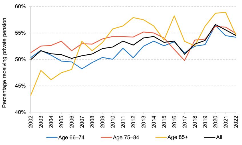
Panel B. Median amount of private pension income among those with positive private pension income
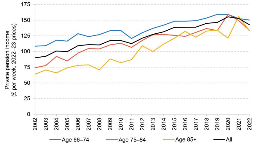
Note: All incomes are presented in 2022–23 prices and are equivalised and expressed as the equivalent for a childless couple. Years refer to financial years.
Source: Authors’ calculations using the Family Resources Survey, 2002–03 to 2022–23.
Panel A shows that the proportion of pensioners receiving a private pension has been slowly increasing since the early 2000s. Over the last decade, this is particularly true for the youngest age group, which is consistent with the introduction of automatic enrolment – the statutory requirement of employers to enrol most employees into a workplace pension – having pushed many more people into private pension saving since it started to be rolled out nationwide from 2012.
While private pension coverage is generally fairly high, Figure 4.15 also shows that about two-fifths of individuals do not receive any income from a private pension (in contrast to the state pension, which is received by nearly the whole pensioner population, especially at older ages).
Looking at Panel B, we can see that throughout the period from the early 2000s to 2022–23, younger pensioners’ private pension incomes are higher than those of older groups. This to a large extent reflects differences in labour market experiences of these age groups – the younger groups on average had higher incomes during their working lives, which translate into higher private pension incomes in retirement.
Interestingly, the gaps in the average amount of private pension received by pensioners of different ages have narrowed over time. The larger gap in earlier years is likely due to the fact that in the past, most pensioners were receiving private pension income through defined benefit (DB) schemes (so-called final salary schemes, which typically received higher employer contributions and therefore tend to provide higher incomes in retirement than defined contribution (DC) pensions). Younger cohorts then tended to have stronger labour market histories, leading to higher entitlement. In more recent years, younger generations of pensioners are less likely to have a DB pension and more likely to have a less generous DC pension, which simply provides individuals with a savings pot.
Private pension incomes among all of the age groups have fallen since the pandemic. As described in the first subsection of Section 4.2, this is likely to reflect DB pension incomes growing at a rate lower than inflation and people putting off drawing an income from their DC pension during economic turmoil.
In the previous section, we saw that reforms to the state pension have reduced the gender gap in state pension income over time. We can now see how the private pension gender gap has been changing over time. Figure 4.16 shows the mean private pension income for different birth cohorts of men and women, by age.
Figure 4.16. Mean private pension income by birth cohort, sex and age
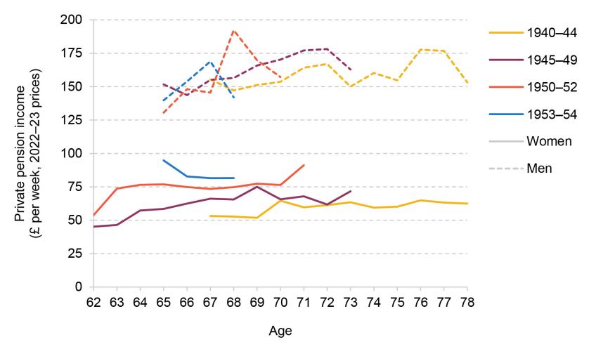
Note: The graph shows mean private pension income received by particular birth cohorts at different ages. Birth cohorts are defined over financial year of birth. Private pension income is winsorised at the 99th percentile, presented in 2022–23 prices, and equivalised and expressed as the equivalent for a childless couple.
Source: Authors’ calculations using the Family Resources Survey, 2002–03 to 2022–23.
It is immediately clear that while there are small generation-on-generation increases in the private pension incomes of women, there is still a large gender gap in private pension incomes even for the youngest cohort. The gap is narrowing – for example, women born between 1940 and 1944 can expect to receive, on average, 38% of the private pension income that men born at the same time received; for the cohort born between 1950 and 1952, women can expect to earn, on average, 48% of men’s private pension income; and by the 1953–54 birth cohort, this number is 56%. But this narrowing is happening at a much slower rate than for the state pension.
It is not surprising that the gender gap in private pension incomes is more persistent. The current gaps in private pensions reflect decades of past differences in labour market experiences between men and women, both in terms of number of years in work and in terms of earnings. Even if recent years had no gender gaps in hourly wages and labour market participation rates, it would be many decades before this filtered through into no gender gap in private pension incomes. Unlike with the state pension reforms, these cumulative differences are not easy to address once these individuals are already in retirement.
Employment around the state pension age
Another source of income for pensioners is income from employment. Employment above the state pension age is not possible for all, especially due to ill health and caring responsibilities but also due to availability of paid work. But for those pensioners who are able and willing to work, employment can act as a flexible source of income. In this subsection, we look at the changing importance of work for pensioners over time.
Figure 4.17 shows the rate of employment among different age groups for men and women separately. As expected, younger age groups – both men and women – generally have higher rates of employment, with 43% of men and 39% of women in their early 60s in paid work in the most recent year of data, compared with 15% of men and 14% of women in their late 60s, and 7% of men and 6% of women in their early 70s. Over this period, women were affected by the rise in the female state pension age from 60 to 65 (between 2010 and 2019), and both men and women were affected by the rise of the universal state pension age from 65 to 66 (between 2019 and 2020). Evidence shows that increases in the state pension age lead to increases in employment rates (Cribb, Emmerson and O’Brien, 2022), but we also see increases in employment rates among these groups in periods when the state pension age was not rising.
Figure 4.17. Employment rates of people aged 60–74, by age group and sex, over time
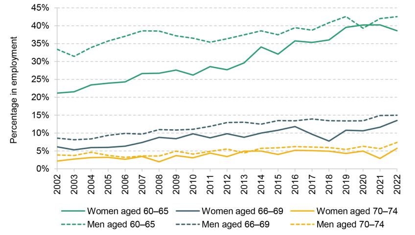
Note: The graph shows the percentage of people who report being in either full-time or part-time employment or self-employment in each year by age group and sex. Years refer to financial years.
Source: Authors’ calculations using the Family Resources Survey, 2002–03 to 2022–23.
In addition to the younger age groups being more likely to work, they are also more likely to work more hours, as shown in Figure D.8 in Appendix D. This then translates to higher earnings, as shown in Figure 4.18. While the earnings of workers are increasing over time among all of these age groups, the fastest growth has been among those in the 66–69 age group. Figure 4.19 shows that the proportion of total income coming from employment income among working households is increasing over time. Together these trends illustrate that employment among pensioners is becoming increasingly prevalent over time and that, among those who are in employment at older ages, employment income is becoming a more important source of income.
Figure 4.18. Median employment income for working individuals over time

Note: The graph shows the median earnings from employment and self-employment amongst those with strictly positive earnings each year by age group. All incomes are presented in 2022–23 prices and are equivalised and expressed as the equivalent for a childless couple. Years refer to financial years.
Source: Authors’ calculations using the Family Resources Survey, 2002–03 to 2022–23.
Figure 4.19. Net household income from employment as a percentage of total household net income amongst working households, by age, over time
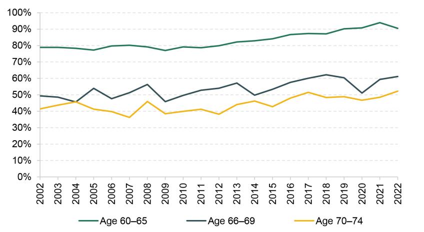
Note: The graph shows the ratio of household earnings from employment and self-employment summed over all employed individuals within the specified age groups to total household income summed over all employed individuals within the specified age groups in a given year. Years refer to financial years.
Source: Authors’ calculations using the Family Resources Survey, 2002–03 to 2022–23.
It should be noted that while higher employment rates boost the incomes of older groups, it is not always clear that they are ‘better off’ in a broader sense. If people are staying in work because of increasing ability to work at older ages – for example, due to the nation’s health being better or there being less age discrimination over time – the higher rates of employment among pensioners could be seen as a positive trend. However, if people feel forced to work because they do not have enough resources otherwise, this may have negative consequences.
Summary
Income from private pensions and savings is on average the second most important source of income for pensioners (after the state pension), although about two-fifths of individual pensioners receive no private pension income. Given that private pension incomes today reflect decades of differences in labour market experiences of different groups, the gaps in private pension incomes between men and women are much wider than the gender gaps in state pension income and they will take much longer to close as there are still large differences in the labour market experiences of men and women on average.
Employment rates among pensioners are low, but rising, and employment income is increasing in importance particularly among younger pensioners. And while only a minority of pensioners are in paid work, employment income makes up an increasing share of total income for those who are.
4.5 Conclusion
As pensioners constitute about a quarter of the adult population, trends in pensioner incomes significantly influence the overall distribution of living standards in the UK. Unlike the working-age population, whose incomes are primarily made up of employment income, pensioner incomes largely depend on pensions, from both state and private sources. Policy reforms and historical employment patterns greatly impact these pension incomes. The benefit system is more generous for pensioners in low-income households than for low-income working-age households, although benefit take-up remains a challenge. Housing tenure patterns also differ, with the majority of pensioners owning their homes outright, leading to generally lower housing costs compared with the working-age population.
Recent decades have seen an increase in average pensioner incomes, primarily driven by state and private pensions and, to a lesser extent, employment income. Prior to 2011, average pensioner incomes were catching up with working-age incomes – due to strong growth before the financial crisis and pensioners not experiencing the large falls in incomes that working-age adults experienced during the Great Recession. This good income growth extended to poor pensioners too – with relative pensioner poverty falling from 25% in 2002–03 to 13% in 2011–12.
Since 2011, the trends have been quite different. Growth in employment income boosted average working-age incomes and growth in private pension incomes and state pensions boosted average pensioner incomes. But this did not extend to poor pensioners – who benefited from neither increases in employment income nor increases in private pension incomes. And growth in state pension incomes for poor pensioners has been largely cancelled out by lower eligibility for means-tested benefits. All this means very poor income growth for pensioners since 2011, with relative pensioner poverty, at 16% in 2022–23, markedly higher than in 2011–12.
As average pensioner incomes were rising in the decade before the onset of the COVID-19 pandemic, income inequality among pensioners was also rising, with the gap between lower- and middle-income pensioners particularly widening as the latter saw larger increases in average incomes from private sources. At the same time, reforms to the state pension have particularly benefited groups with historically lower pension incomes, such as married women, resulting in higher average individual state pension incomes for more recent cohorts of female pensioners. However, these reforms have not significantly reduced relative poverty rates, as they were not particularly aimed at low-income households but rather at women who had been caring for young children during working life. In addition to this, increased state pension incomes may not change the overall state support available to households as rising state pension income may also coincide with reduced eligibility for means-tested benefits.
Appendix A. Data sources
Households Below Average Income (HBAI)
Income as a measure of living standards
Most people would agree that well-being consists of more than a simple measure of material circumstances. However, even if we wanted to, it would be extremely hard to define an objective index of well-being, let alone to measure it. The main approach to measuring living standards taken in the government’s HBAI document is to focus solely on material circumstances and to use household income as a proxy for those.
Even as a measure of material living standards, the HBAI income measure has some important limitations. There is some evidence of under-reporting of income in the HBAI data, particularly among those households with extremely low reported incomes (Brewer, Etheridge and O’Dea, 2017). Even for those households whose income is measured correctly, HBAI provides a ‘snapshot’ measure – reflecting actual, or in some cases ‘usual’, income at around the time of the Family Resources Survey interview. Measuring income in this way means the HBAI income statistics capture both temporary and permanent variation in income between individuals, but the latter would generally be regarded as a better measure of their relative welfare. For example, having a temporarily low income is unlikely to have severe consequences for current material living standards if individuals are able to draw on previously accumulated wealth. Statistics based upon households’ current incomes ignore savings, other assets they have and how much they spend. Consumption would arguably make a better measure of material well-being, but reliable data can be harder and more expensive to collect. Using consumption as the measure of well-being can change our interpretation of who is ‘poor’ and how rates of poverty have changed over time (Brewer, Goodman and Leicester, 2006; Brewer and O’Dea, 2012; Brewer, Etheridge and O’Dea, 2017; Office for National Statistics, 2018).
The treatment of housing costs
The government’s HBAI publication provides information on two measures of income. One measure captures income before housing costs are deducted (BHC) and the other is a measure after housing costs have been deducted (AHC). The key housing costs captured in the HBAI data are rent payments and mortgage interest payments, but they also include water rates, community water charges, council water charges, structural insurance premiums for owner-occupiers, and ground rents and service charges. Mortgage capital repayments are not included, on the basis that these represent the accumulation of an asset (they increase net housing wealth) and are therefore better thought of as a form of saving than as a cost of housing. Costs such as maintenance, repairs and contents insurance are also not included.
When looking at changes in average living standards across the population as a whole, there is usually a strong case for focusing on income measured BHC. This is because most individuals exercise a considerable degree of choice over housing cost and quality, at least in the medium and long term, and for those individuals housing should be treated as a consumption good like any other (i.e. the amount that households choose to spend on it should not be deducted from income). For instance, consider two households with the same BHC income, one of which decides to spend a larger fraction of that income on a larger house in a better neighbourhood, while the other has different preferences and chooses to spend the difference on other things. On an AHC basis, the former household would be considered poorer, but their living standards may be comparable.
There are, however, a number of reasons to focus on income measured AHC in certain circumstances.
First, income measured AHC may provide a better indicator of the living standards of those who do not face genuine choices over their housing, particularly if housing cost differentials do not accurately reflect differences in housing quality. This is likely to be the case for many in the social rented sector, where individuals tend to have little choice over their housing and where rents have often been set with little reference to housing quality or the prevailing market rents.
Second, the existence of housing benefit means that measuring income AHC has an advantage over BHC as a measure of living standards for housing benefit recipients. This is because housing benefit reimburses individuals specifically for their rent. Consider a household with no private income whose rent increases by £10 per week. This might trigger a £10 increase in housing benefit entitlement to cover the rent increase. Hence, AHC income would remain unchanged but BHC income would increase by £10 per week. Therefore, where rent changes do not reflect changes in housing quality – for example, when they simply reflect changes in the rules governing social rents – the subsequent changes in BHC (but not AHC) income can give a misleading impression of the change in living standards of households on housing benefit.
Third, measuring income AHC may be more appropriate than BHC when comparing households that own their home outright (and so pay no rent or mortgage interest costs) with households that do not. On a BHC basis, an individual who owns their house outright will be treated as being as well off as an otherwise-identical individual who is still paying off a mortgage; an AHC measure, though, would indicate that the former was better off.20 This is particularly important when comparing incomes across age groups – pensioners are much more likely to own their homes outright than working-age adults.
Fourth, comparing changes in AHC incomes may provide better information about relative changes in living standards when some households have seen large changes in their housing costs that are unrelated to changes in housing quality. This is particularly relevant when looking at the period between 2007–08 and 2009–10, as rapid falls in mortgage interest rates reduced the housing costs of those with a mortgage significantly, while the housing costs of those who rent their homes (or own them outright) were not directly affected. When incomes are measured BHC, changes over time in the incomes of all households are adjusted for inflation using a price index that accounts only for average housing costs. This will understate the effect of falling housing costs on living standards for those with a mortgage and overstate it for those without a mortgage. Changes in income measured AHC do not suffer from this issue, since changes in housing costs are accounted for by subtracting each household’s actual housing costs from its income. This difference is important to bear in mind when looking at changes in poverty and inequality. Those towards the bottom of the income distribution (around the poverty line), as well as the youngest and oldest adults, are less likely than average to have a mortgage.
Income sharing
To the extent that income sharing takes place within households, the welfare of any one individual in a household will depend not only on their own income, but also on the incomes of other household members. By measuring income at the household level, the HBAI statistics implicitly assume that all individuals within the household are equally well off and therefore occupy the same position in the income distribution. For many households, this assumption provides a reasonable approximation – for example, many couples benefit roughly equally from income coming into the household, no matter who the income is paid to. For others, it is unlikely to be appropriate. Students sharing a house are one probable example. Perfect income sharing is by no means the only ‘reasonable’ assumption that one could make: for example, one could effectively assume that there is complete income sharing within the different benefit units21 of a household but not between them, by measuring incomes at the benefit unit level rather than at the household level (and making an assumption about how housing costs are split across benefit units). However, given the data available, perfect income sharing is one of the least arbitrary and most transparent assumptions that could be made.
Comparing incomes across households
Controlling for household size and structure is important when comparing living standards across households. If two households, one composed of a single adult and the other composed of a couple with two children, both have the same total income, the living standard of the couple with children will usually be significantly lower than that of the single adult, as the larger household normally has a greater need for material resources. Therefore, if household income is to reflect the standard of living that household members experience, and if we are to compare these incomes across different household types, then some method is required to adjust incomes for the different needs that different households face.
The official HBAI income statistics currently use the modified OECD equivalence scale for BHC incomes, and an AHC variant from the Department for Work and Pensions (DWP), shown in Table A.1. These equivalence scales are used to adjust incomes on the basis of household size and composition. For example, when income is measured before housing costs, the OECD scale implies that a single person would require 67% of the income that a childless couple would require to attain the same standard of living. So, to get the equivalent income of that single person, we divide their actual income by 0.67. This process is referred to as ‘income equivalisation’. Having equivalised household incomes, cash income figures are expressed as the equivalents for a childless couple, i.e. a household’s income is expressed as the amount that a childless couple would require to enjoy the same standard of living as that household.
Table A.1. Modified OECD equivalence scales

The modified OECD scale only takes into account the ages and number of individuals in the household, but there may be other characteristics affecting a household’s needs. An important example of these would be the disability or health status of household members. The conventional methodology in HBAI would place a household receiving disability benefits higher up the income distribution than an otherwise-equivalent household without such benefits. But if this higher level of income only compensates the household for the greater needs it has or the extra costs it faces, then the standard of living of this household may be no higher.22
Sample weighting, and adjusting the incomes of the ‘very rich’
The incomes analysed in Chapters 2, 3 and 4 of this report are mostly derived from the Family Resources Survey (FRS) and, prior to 1994–95, the Family Expenditure Survey (FES). These surveys are designed to provide a broadly representative sample of households in Great Britain until 2001–02 (i.e. not including Northern Ireland) and in the whole United Kingdom from 2002–03 onwards. However, because they are voluntary surveys, there is inevitably a problem of households not answering them, and such non-response may differ according to family type and according to income. This ‘non-response bias’ is dealt with in two ways. First, weights are applied to the data to ensure that the composition of the sample (in terms of age, sex, partnership status, region and a number of other variables) reflects the true UK population (Department for Work and Pensions, 2024c). For example, if there are proportionately fewer lone parents in the sample than there are in the population, then relatively more weight must be placed upon the data from those lone parents who actually do respond.
Second, a special adjustment is applied to correct for the particular problems in obtaining high response rates from individuals with very high incomes and for the volatility in their reported incomes. This adjustment uses projected data from HMRC’s Survey of Personal Incomes (SPI) – a more reliable source of data for the richest individuals based on income tax returns.23 Individuals with an income above a very high threshold are assigned an income level derived from the SPI, which is an estimate of the average income for people above that threshold in the population (the threshold and the replacement income value are set separately for pensioners and non-pensioners). Note that this procedure will therefore not capture the inequality within the very richest section of the population. The weights referred to above are also adjusted to ensure that the number of households containing very-high-income individuals in the weighted data is correct. There is no corresponding correction for non-response, or for misreporting of incomes, at the lower end of the income distribution, meaning caution should be used when considering people with the very lowest incomes.
Adjusting for inflation
All of the description of the HBAI methodology so far sets out how we, following the government’s HBAI methodology, measure living standards in any one year. However, because of inflation, the same cash incomes do not bring the same purchasing power over time. It is therefore necessary to adjust for inflation and express all figures in real terms, which we do in the prices of the latest year of data (2022–23 in this report unless otherwise stated).
Unless otherwise stated, we account for inflation using variants of the Consumer Prices Index. For comparing BHC measures of income over time, we use a variant of the standard CPI that includes owner-occupiers’ housing costs (mortgage interest payments, and insurance and ground rent for owner-occupiers); for AHC measures, we use a variant of the CPI that excludes all housing costs (including rent and water costs, which are part of the standard CPI). These variants are available from the Office for National Statistics back to 1996 and 2000 respectively. Before that, we use an approximation to those indices generated by combining RPI-based indices that are available back to 1961 with an estimate of the historical ‘formula effect’ (the amount by which the Retail Prices Index overstates inflation).24
The income measure summarised
In the analysis in Chapters 2, 3 and 4, our main measure of living standards is equivalised household income after deducting taxes and adding benefits and tax credits, expressed as the equivalent income for a couple with no dependent children and in average 2022–23 prices. For brevity, we often use this term interchangeably with ‘income’.
Appendix B. Additional figures for Chapter 2
Figure B.1. 90:50 and 50:10 ratios for disposable household income (before deducting housing costs)
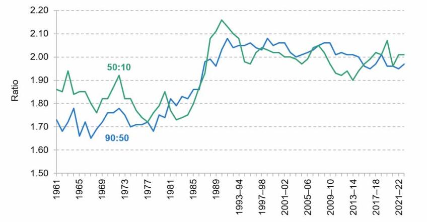
Note: Incomes have been measured net of taxes and benefits. All incomes have been equivalised using the modified OECD equivalence scale.
Source: Authors’ calculations using the Family Expenditure Survey, 1961 to 1993–94, and the Family Resources Survey, 1994–95 to 2022–23.
Figure B.2. Gini coefficient for disposable household income (before deducting housing costs)
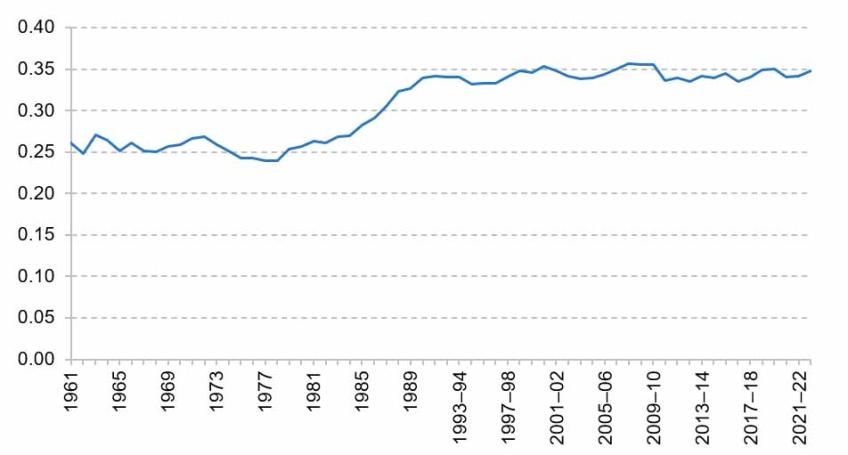
Note: Incomes have been measured net of taxes and benefits. All incomes have been equivalised using the modified OECD equivalence scale.
Source: Authors’ calculations using the Family Expenditure Survey, 1961 to 1993–94, and the Family Resources Survey, 1994–95 to 2022–23.
Appendix C. Additional table for Chapter 3
Table C.1. Poverty rates in 2022–23, under alternative interest rate assumptions

Note: Poverty rates based on incomes measured after housing costs are deducted.
Source: Authors’ calculations using the Family Resources Survey 2022–23, Freedom of Information request to FCA FOI11359 and Bank of England series CFMHSDE.
Appendix D. Additional figures for Chapter 4
Figure D.1. Real median household income over time: those above state pension age (SPA) and pensioners, before and after housing costs

Note: This graph shows real median household income of pensioners, referring to those aged 66 and over, and individuals above their state pension age. All incomes are expressed in 2022–23 prices and are equivalised and expressed as equivalent for a childless couple. Years refer to financial years.
Source: Authors’ calculations using the Family Resources Survey, 2002–03 to 2022–23.
Figure D.2. Components of mean household income for working-age individuals

Note: All incomes are presented in 2022–23 prices and are equivalised and expressed as the equivalent for a childless couple. ‘Employment income’ includes income from employee jobs and self-employment earnings. ‘Other income’ includes private benefits, child income, the universal energy rebate, the warm home discount scheme and the Welsh fuel support scheme. Years refer to financial years.
Source: Authors’ calculations using the Family Resources Survey, 2002–03 to 2022–23.
Figure D.3. Contribution of different income sources to mean real income growth for working-age individuals
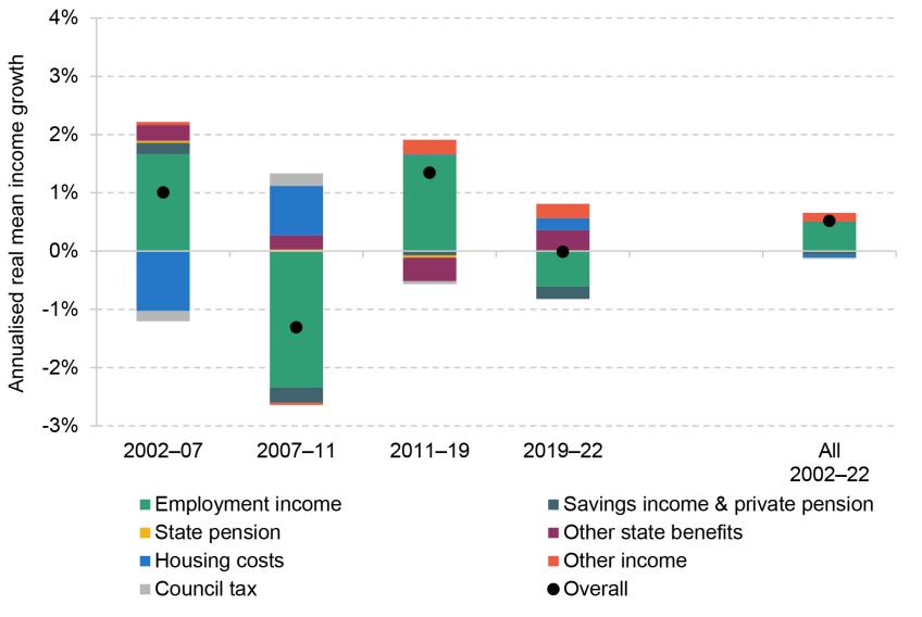
Note: The graph shows the contribution to the growth in mean household AHC income over the relevant period that comes from each of the components of income. ‘Employment income’ includes income from employee jobs and self-employment earnings. ‘Other income’ includes private benefits, child income, the universal energy rebate, the warm home discount scheme and the Welsh fuel support scheme. Housing costs and council tax are deductions from income. Positive growth rates for ‘housing costs’ and ‘council tax’ indicate these costs are falling in real terms. Years refer to financial years.
Source: Authors’ calculations using the Family Resources Survey, various years.
Figure D.4. Components of mean household income for low-income pensioners (lowest-income third of pensioners)
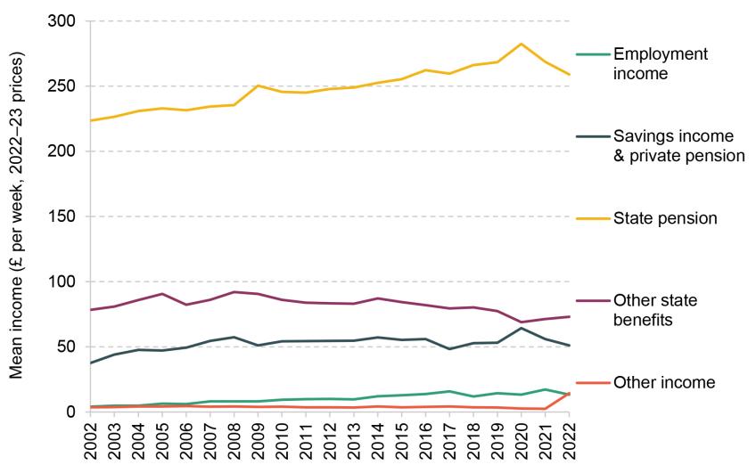
Note: All incomes are presented in 2022–23 prices and are equivalised and expressed as the equivalent for a childless couple. ‘Pensioners’ are defined as those aged 66 and over. ‘Low-income’ is defined as having equivalised household AHC income in the bottom third of pensioners in a given year. ‘Employment income’ includes income from employee jobs and self-employment earnings. ‘Other income’ includes private benefits, child income, the universal energy rebate, the warm home discount scheme and the Welsh fuel support scheme. Years refer to financial years.
Source: Authors’ calculations using the Family Resources Survey, 2002–03 to 2022–23.
Figure D.5. Components of mean household income for high-income pensioners (highest-income third of pensioners)
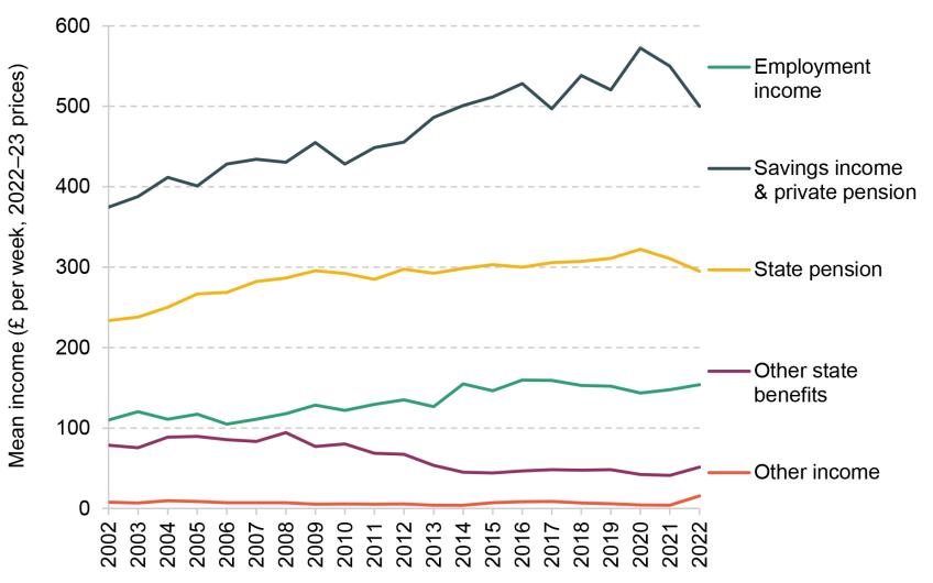
Note: All incomes are presented in 2022–23 prices and are equivalised and expressed as the equivalent for a childless couple. ‘Pensioners’ are defined as those aged 66 and over. ‘High-income’ is defined as having equivalised household AHC income in the top third of pensioners in a given year. ‘Employment income’ includes income from employee jobs and self-employment earnings. ‘Other income’ includes private benefits, child income, the universal energy rebate, the warm home discount scheme and the Welsh fuel support scheme. Years refer to financial years.
Source: Authors’ calculations using the Family Resources Survey, 2002–03 to 2022–23.
Figure D.6. Contribution to mean real income growth for high-income pensioners (highest-income third of pensioners)
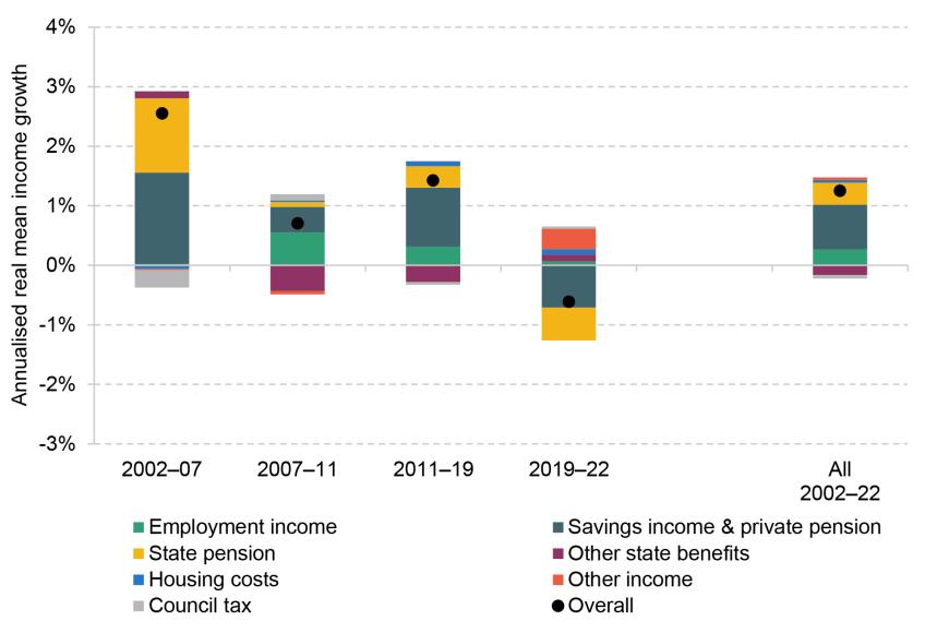
Note: The graph shows the contribution to the growth in mean household AHC income over the relevant period that comes from each of the components of income. ‘Pensioners’ are defined as those aged 66 and over. ‘High-income’ is defined as having equivalised household AHC income in the top third of pensioners in a given year. ‘Employment income’ includes income from employment and self-employment earnings. ‘Other income’ includes private benefits, child income, the universal energy rebate, the warm home discount scheme and the Welsh fuel support scheme. Housing costs and council tax are deductions from income. Positive growth rates for ‘housing costs’ and ‘council tax’ indicate these costs are falling in real terms. Years refer to financial years.
Source: Authors’ calculations using the Family Resources Survey, various years.
Figure D.7. Share of people receiving pension credit by age group
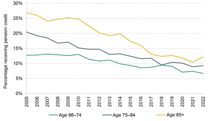
Note: The graph shows the share of people receiving pension credit each year within the specified age groups. Years refer to financial years.
Source: Authors’ calculations using the Family Resources Survey, 2005–06 to 2022–23.
Figure D.8. Mean hours worked (for workers), by age
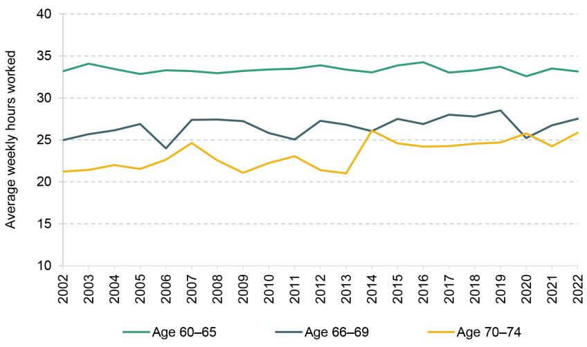
Note: The graph shows the mean hours worked amongst those who report strictly positive hours worked in each year by age group. Years refer to financial years.
Source: Authors’ calculations using the Family Resources Survey, 2002–03 to 2022–23.
References
Bozio, A., Crawford, R. and Tetlow, G., 2010. The history of state pensions in the UK: 1948 to 2010. IFS Report BN105, https://ifs.org.uk/publications/history-state-pensions-uk-1948-2010.
Brewer, M., Etheridge, B. and O’Dea, C., 2017. Why are households that report the lowest incomes so well-off? Economic Journal, 127(605), F24–49, https://doi.org/10.1111/ecoj.12334.
Brewer, M., Goodman, A. and Leicester, A., 2006. Household Spending in Britain: What Can It Teach Us about Poverty? Bristol: Policy Press. https://www.jrf.org.uk/care/poverty-in-britain-what-can-we-learn-from-household-spending.
Brewer, M., Muriel, A., Phillips, D. and Sibieta, L., 2008. Poverty and inequality in the UK: 2008. IFS Report comm105, https://ifs.org.uk/publications/poverty-and-inequality-uk-2008.
Brewer, M. and O’Dea, C., 2012. Measuring living standards with income and consumption: evidence from the UK. IFS Working Paper W12/12, https://ifs.org.uk/publications/measuring-living-standards-income-and-consumption-evidence-uk-1.
Burkhauser, R., Hérault, N., Jenkins, S. and Wilkins, R., 2018. Top incomes and inequality in the UK: reconciling estimates from household survey and tax return data. Oxford Economic Papers, 70(2), 301–26, https://doi.org/10.1093/oep/gpx041.
Codreanu, M. A. and Waters, T., 2023. Do work search requirements work? Evidence from a UK reform targeting single parents. IFS Working Paper 23/02, https://ifs.org.uk/publications/do-work-search-requirements-work-evidence-uk-reform-targeting-single-parents.
Cribb, J. and Emmerson, C., 2019. Can’t wait to get my pension: the effect of raising the female early retirement age on income, poverty and deprivation. Journal of Pension Economics and Finance, 18, 450–72, https://doi.org/10.1017/S1474747218000057.
Cribb, J., Emmerson, C., Johnson, P. and Karjalainen, H., 2023. The future of the state pension. IFS Report 291, https://ifs.org.uk/publications/future-state-pension.
Cribb, J., Emmerson, C. and O’Brien, L., 2022. The effect of increasing the state pension age to 66 on labour market activity. IFS Working Paper 22/07, https://ifs.org.uk/publications/effect-increasing-state-pension-age-66-labour-market-activity.
Cribb, J., Hood, A., Joyce, R. and Phillips, D., 2013. Living standards, poverty and inequality in the UK: 2013. IFS Report R81, https://ifs.org.uk/publications/living-standards-poverty-and-inequality-uk-2013.
Cribb, J. and Johnson, P., 2019. Employees’ earnings since the Great Recession: the latest picture. IFS Report BN256, https://ifs.org.uk/publications/employees-earnings-great-recession-latest-picture.
Cribb, J., Karjalainen, H. and O’Brien, L., 2024. Pensions: five key decisions for the next government. IFS Report R319, https://ifs.org.uk/publications/pensions-five-key-decisions-next-government.
Cribb, J. and O’Brien, L., 2022. How did increasing the state pension age from 65 to 66 affect household incomes? IFS Report R211, https://ifs.org.uk/publications/how-did-increasing-state-pension-age-65-66-affect-household-incomes.
Cribb., J. and Waters, T., 2024. Seven key facts about UK living standards. IFS, Report R315, https://ifs.org.uk/publications/seven-key-facts-about-uk-living-standards.
Cribb, J., Waters, T., Wernham, T. and Xu, X., 2021. Living standards, poverty and inequality in the UK: 2021. IFS Report R194, https://ifs.org.uk/publications/living-standards-poverty-and-inequality-uk-2021-0.
Cribb, J., Waters, T., Wernham, T. and Xu, X., 2022. Living standards, poverty and inequality in the UK: 2022. IFS Report R215, https://ifs.org.uk/publications/living-standards-poverty-and-inequality-uk-2022.
Department for Work and Pensions, 2024a. Income related benefits: estimates of take-up: financial year ending 2022. https://www.gov.uk/government/statistics/income-related-benefits-estimates-of-take-up-financial-year-ending-2022/income-related-benefits-estimates-of-take-up-financial-year-ending-2022.
Department for Work and Pensions, 2024b. Pensioners’ incomes: financial years ending 1995 to 2023. https://www.gov.uk/government/statistics/pensioners-incomes-financial-years-ending-1995-to-2023/pensioners-incomes-financial-years-ending-1995-to-2023.
Department for Work and Pensions, 2024c. Households Below Average Income series: quality and methodology information report FYE 2023. https://www.gov.uk/government/statistics/households-below-average-income-for-financial-years-ending-1995-to-2023/households-below-average-income-series-quality-and-methodology-information-report-fye-2023.
Financial Conduct Authority, 2024a. Mortgage lending statistics – June 2024. https://www.fca.org.uk/data/mortgage-lending-statistics.
Financial Conduct Authority, 2024b. Retirement income market data 2022/23. https://www.fca.org.uk/data/retirement-income-market-data-2022-23.
HM Revenue & Customs, 2021. Flexible payments from pensions. April 2021 Official Statistics, https://www.gov.uk/government/statistics/flexible-payments-from-pensions/flexible-payments-from-pensions.
Latimer, E. and Waters, T., 2024. The two-child limit: poverty, incentives and cost. IFS Comment, https://ifs.org.uk/articles/two-child-limit-poverty-incentives-and-cost.
Mirza-Davies, J., 2023. Occupational pension increases. House of Commons Library, Research Briefing 5656, https://commonslibrary.parliament.uk/research-briefings/sn05656/.
Office for National Statistics, 2018. An expenditure-based approach to poverty in the UK: financial year ending 2017. https://www.ons.gov.uk/peoplepopulationandcommunity/personalandhouseholdfinances/incomeandwealth/articles/anexpenditurebasedapproachtopovertyintheuk/financialyearending2017.
Office for National Statistics, 2023a. How increases in housing costs impact households. https://www.ons.gov.uk/peoplepopulationandcommunity/housing/articles/howincreasesinhousingcostsimpacthouseholds/2023-01-09.
Office for National Statistics, 2023b. Self-employment. https://www.ethnicity-facts-figures.service.gov.uk/work-pay-and-benefits/employment/self-employment/latest/.
Office for National Statistics, 2024. Household Costs Indices for UK household groups: January to March 2024. https://www.ons.gov.uk/economy/inflationandpriceindices/bulletins/householdcostsindicesforukhouseholdgroups/januarytomarch2024.
Ray-Chaudhuri, S. and Waters, T. 2024. Recent trends in and the outlook for health-related benefits. IFS Report R311, https://ifs.org.uk/publications/recent-trends-and-outlook-health-related-benefits.
Ray-Chaudhuri, S., Waters, T. and Wernham, T., 2024. Living standards since the last election. IFS Report R304, https://ifs.org.uk/publications/living-standards-last-election.
Ray-Chaudhuri, S., Waters, T. and Xu, X., 2023. Recent changes to universal credit have much smaller effect on poverty than £20 uplift. IFS Comment, https://ifs.org.uk/articles/recent-changes-universal-credit-have-much-smaller-effect-poverty.
Data
Department for Work and Pensions. (2024). Family Resources Survey, 2022-2023. [data collection]. UK Data Service. SN: 9252, DOI: http://doi.org/10.5255/UKDA-SN-9252-1.
Office for National Statistics. (2019). Family Expenditure Survey. [data series]. 3rd Release. UK Data Service. SN: 200016, DOI: http://doi.org/10.5255/UKDA-Series-200016.
Office for National Statistics. (2024). Living Costs and Food Survey. [data series]. 4th Release. UK Data Service. SN: 2000028, DOI: http://doi.org/10.5255/UKDA-Series-2000028.
University of Essex, Institute for Social and Economic Research. (2023). Understanding Society. [data series]. 11th Release. UK Data Service. SN: 2000053, DOI: http://doi.org/10.5255/UKDA-Series-2000053.
Endnotes
Authors

Jonathan Cribb
Jonathan joined IFS in 2011. His research areas includes: pensions, ageing and demographic change, public sector pay, housing, and inequalities.


Heidi Karjalainen
Heidi is a Senior Research Economist in the Retirement, Saving & Ageing sector. Her current research is on pensions and saving for retirement.

Sam Ray-Chaudhuri
Sam joined the IFS in 2022 and works as a research economist in the Income, Work and Welfare sector.

Tom Waters
Tom is an Associate Director at the IFS and Head of the Income, Work and Welfare sector.

Tom Wernham
Tom's main research areas are living standards and poverty, the benefits system, and its interactions with the labour market.
More from IFS
Understand this issue


Policy analysis


Academic research


