
Downloads
Download the report as a PDF
PDF | 534.75 KB
Executive summary
The risk of a worker falling into unemployment represents one of the most important threats to the stability of households’ finances – both in terms of lower spending (and hence living standards) and in terms of a greater degree of financial distress (such as the accumulation of unmanageable debt or missed bill payments). Providing households with some degree of insurance against these risks is a crucial function of benefit systems. However, relatively little is known about how spending and financial distress evolve following job loss in the UK and the role played by the benefit system – which, by international standards, provides comparatively little protection against unemployment, on average.
Drawing on a dataset of anonymised bank account transactions, this report provides new evidence on how workers’ finances respond to unemployment. Using a sample of more than 10,000 job losses occurring between 2018 and 2023, we trace changes to spending, credit usage and financial distress during unemployment, exploring how these responses vary according to the amount of support afforded by the benefit system.
Key findings
1. On average, newly unemployed people claiming unemployment benefits had previously been earning around £1,800 per month (after tax) while in work. When earnings disappear at job loss, total benefits rise by around £600 per month, implying a total income decline of about £1,200. In response, the newly unemployed reduce their spending by around £550 per month. Spending (and hence, presumably, the living standards of households) declines rapidly following job loss, even during spells of unemployment that last only a few months. However, that the average fall in spending is only around half as large as the average reduction in income implies that the recently unemployed are able to draw on other resources to prevent their spendings from falling by more.
2. Spending declines across several categories of goods. There are declines not only in ‘discretionary’ spending (such as on leisure activities), but also in spending more likely to be associated with ‘basic’ goods. Supermarket spending falls on average by 16% during unemployment, while spending on bills falls by 13%.
3. After six months of unemployment, the share of people making rental payments has fallen by 16% while the share making an energy bill payment has fallen by 8%. Missed bill payments of this kind suggest that, for at least some households, unemployment represents a period of acute financial distress.
4. Evidence on the use of credit by the recently unemployed is mixed. The share of people incurring overdraft charges increases by around 4% (from 16.0% to 16.6%) during unemployment, while the number registering a negative current account balance increases by 8% (from 22.1% to 23.8%), both indicative of financial distress. On the other hand, credit card interest payments and new payday loans fall during unemployment, possibly reflecting reduced access to or willingness to use credit.
5. The design of unemployment benefits in the UK means that replacement rates (the share of in-work income that a worker receives out of work) can vary drastically between individuals. For the third of our sample with the lowest replacement rates, total income (including both earnings and benefits) falls by around 90% and spending by 26%. For the third of our sample with the highest replacement rates, income falls by around 30% and spending by just 6%.
6. Those with the lowest replacement rates run down their savings more heavily and for longer in the early months of unemployment. Missed bill payments are also significantly more common for them, with the share making an energy bill payment falling to about 20% below its pre-job-loss level. That compares with just 3% for the third of our sample where the benefit system provides the highest replacement rates.
1. Introduction
The risk of a worker losing their job represents one of the most important threats to the stability of households’ finances – both in terms of lower spending (and hence living standards) and in terms of a greater degree of financial distress (such as the accumulation of unmanageable debt or missed bill payments). Providing households with some degree of insurance against these risks is a crucial function of benefit systems. Despite this, in the UK, there has been relatively little detailed evidence on how spending and financial distress evolve in the weeks or months around job loss, and the role the benefit system plays in mitigating its costs. This report brings newly available data derived from anonymised banking transactions to bear on these issues, allowing us to describe responses to unemployment with unprecedented fidelity.
This follows similar research in other countries which has in recent years drawn upon newly available bank transaction and other similar data to track how spending and financial distress respond to job loss, and the role played by the benefit system. Recent examples include published studies from the United States (Ganong and Noel, 2019), Brazil (Gerard and Naritomi, 2021), Denmark (Andersen et al., 2023) and France (Bonnet et al., 2024). This report is the first to do a similar exercise for the UK.1
One reason why it is particularly valuable to study how households in the UK respond to job loss – rather than relying solely on evidence from other advanced economies – is that the extent and character of the support afforded to those in unemployment vary substantially across countries. Indeed, the UK’s approach to unemployment benefits is particularly unusual compared with most other developed economies.
By far the most common means by which the benefit system insures UK households against the risk of income loss from unemployment is through universal credit (UC). This is a means-tested benefit that, broadly speaking, provides monthly payments to working-age households with low levels of income and liquid savings.2 It is designed to support households both when they are in work and out of work, with the maximum amount that can be received depending on the characteristics of the household (e.g. higher amounts of UC are provided to households with children and to those living in rented accommodation). This amount is then steadily withdrawn as earnings rise. In consequence, support rises when earnings fall (as at job loss) and recedes as earnings recover. As of September 2025, there were 8.1 million adults in Great Britain living in a family that receives UC (around a fifth of the working-age population) of whom 5.5 million were not in employment.3
The second means by which the benefit system insures individuals against unemployment is through ‘new-style’ jobseeker’s allowance (JSA). Unlike UC, JSA is only available to those who are unemployed4 but is not means-tested. To qualify for JSA, claimants must have been in work (or undertaking certain other qualifying activities such as caring) in the two preceding years, and claims can last no longer than six months. JSA is paid at a flat rate, with claimants receiving £92.05 per week (or £72.90 if they are under 25) in 2025–26 – the same amount that is available through UC for a typical single unemployed person with no children or housing costs. JSA is far less widespread than UC, with 86,000 claimants as of May 2025.5
This arrangement differs from what is common in most developed nations in two ways: the vast majority of support is means-tested (UC), and in neither UC nor JSA does the level of the benefit relate to pre-job-loss earnings. Most other developed economies operate both a safety net benefit (similar to UC) aimed at supporting low-income families and the long-term unemployed and an ‘unemployment insurance’ benefit which is usually tied to previous earnings and can be received for a time-limited period when moving into unemployment. As a consequence, income falls at job loss are often higher in the UK than elsewhere: Mikloš and Xu (2025) find that a single homeowner without children on an average wage who loses their job in the UK sees an immediate 88% fall in income; across the OECD, the average is 45%.
Of course, not all those who become unemployed will receive UC or JSA. Some will not qualify for either benefit, while for higher-income households in particular the hassle associated with applying for unemployment benefits and complying with job-search requirements may be too great. In this report, however, our focus is on those who do claim either UC or JSA during unemployment – a group likely to have lower income than the recently unemployed as a whole.
The remainder of this report proceeds as follows. Section 2 describes the data upon which we carry out our analysis and sets out the statistical approach underpinning the results presented in the subsequent sections. Section 3 documents how households adjust spending after job loss – both in aggregate and across spending categories. Section 4 examines saving behaviour and other forms of self-insurance, and considers markers of financial distress among unemployed households. Section 5 turns to the interface with policy, showing how responses vary with replacement rates under the UK benefit system. Finally, Section 6 offers conclusions and suggests some of the ways in which the evidence set out in this report might be applied to the design of future policy.
2. Data and methods
Data
Accurately recording how spending responds to job loss requires data with two essential features: (1) they must be recorded at a sufficiently high frequency to account for the fact that many unemployment spells may last only a few weeks or months (this severely limits the usefulness of data captured at an annual level, for example); and (2) they must capture detailed information regarding both the income and spending side of household finances. Uniting these attributes has proven challenging. Administrative tax records, for example, increasingly provide high-frequency information regarding earnings but offer no insight into spending. Household surveys, on the other hand, do in some cases elicit detailed information about both income and spending but generally do so at an annual frequency.
To overcome these challenges, we make use of data derived from the bank account transactions of more than a million individuals. These data allow us to observe both inflows (e.g. income) and outflows (e.g. spending) from individuals’ bank accounts at the transaction level – recording how household finances evolve at daily intervals. Specifically, the data used for this analysis are the Exact.One Transactional Dataset, containing bank transaction data from ClearScore, a free credit rating app. Users of the app link in their bank accounts and credit cards to provide information about their financial circumstances, which may help improve the deals on credit products they are offered. ClearScore retrieves the historical transactions associated with these accounts, generally up to the previous three years. These data are then anonymised to construct the Exact.One dataset. For each transaction, we see the date it occurred, the amount, and usually the firm it was paid to or from and the category of spending (e.g. groceries, fuel, earnings). The scale of the data is large, capturing more than 7 billion transactions made by 1.6 million ClearScore users between January 2018 and December 2023.
To measure our key variables, we mostly rely on ClearScore’s automatic categorisation of transactions in the data into one of over 150 categories. In order to make analysis more manageable, we create a number of aggregate spending categories, more detail on which is provided in Section 3. Benefit payment transactions are labelled to reflect the type of benefit paid (UC, JSA, etc.). The earnings we observe are those paid into the bank account – and so are measured after tax, pension contributions and any other deductions.
While the majority of transactions are automatically categorised by ClearScore, a substantial number are not. In describing patterns in total spending, we make use of all debits that are not expressly categorised as being either transfers, business expenses, or saving – including those that ClearScore is unable to categorise. The inclusion of unclassified debits will result in an overestimate of spending (just as the exclusion of uncategorised transactions would result in an underestimate) as some of these transactions will in fact be transfers from one bank account to another. For our main sample, we find that during employment our measure of spending exceeds measured income by around 30%, likely reflecting this overestimate (note that when spending is measured using only categorised debits, it falls below the measured income by a similar amount). While the choice of spending measure has an impact on the cash declines in spending we observe at job loss, in proportional terms spending dynamics are similar.
For the purposes of this report, we identify a subsample of users who experience a job loss. In order to qualify for inclusion in the subsample, users must:
- be in work in each of the four months preceding job loss (earning at least what a minimum-wage worker would earn working 16 hours per week in each of those months);
- have a period of at least two months following job loss in which they receive no earnings; and
- begin receiving (or, in the case of in-work UC recipients, continue receiving)6 UC or JSA within three months of job loss. This is an important restriction, because it means that we focus our attention on those who receive benefits in unemployment. Of course, many workers experience unemployment spells without interacting with the benefit system.
In addition, we exclude from our sample job losses that occur between January 2020 and August 2021 due to the various COVID-19-related restrictions in force in the UK during that period. This leaves us with a final analysis sample of 10,760 users.
These data bring considerable advantages, providing insights into job loss with a high degree of granularity. However, their limitations should also be acknowledged. One potential issue is that a ClearScore user may have a separate bank account from their partner and only link in their own account, meaning we only see a partial picture of the household. This risk is somewhat mitigated by the fact that 83% of UC recipient households are single adults with or without children.7 Nonetheless, we refer to the unit of observation as a ‘user’ rather than a ‘household’ for this reason. Another concern is that those who appear in the data are not chosen at random from the population. Figure 1 studies this issue by comparing the composition of our sample across a number of observable characteristics with that of respondents to the Family Resources Survey (a representative survey of the finances of UK households conducted by the Office for National Statistics) who are observed between 2018–19 and 2023–24 (excluding 2020–21), are in receipt of UC or JSA, are out of work and have stopped working within the last six months at the time of the survey.
Figure 1. ClearScore sample composition compared with Family Resources Survey (FRS)

Source: Authors’ calculations using Exact.One dataset and Family Resources Survey 2018–19 to 2023–24 (excluding 2020–21).
On both geography and the distribution of post-job-loss benefit income, our sample aligns closely with the Family Resources Survey (FRS). However, as Figure 1 makes clear, the age distribution of our sample skews younger than that of the FRS, with those over 50 years old particularly underrepresented. Given that Exact.One data are ultimately derived from users of a mobile app, this is perhaps unsurprising. Nevertheless, readers should bear in mind that our estimates may be less informative about the responses of older workers.
Another potential concern with the data is that while we can observe job loss, we cannot directly distinguish between its voluntary and involuntary forms. Voluntary job quits are likely to be associated with very different dynamics from redundancies. We confirm that voluntary quits are not driving our results by examining two subgroups of our sample: those who receive severance pay (measured as those for whom earnings in the final month of employment are at least 40% higher than in either of the two previous months) and those who receive JSA. Severance pay is not paid to those who resign from a job, and individuals are not generally eligible for JSA for at least three months if they leave a job voluntarily (although note that JSA can be claimed upon expiry of a fixed-term contract, so long as the other qualifying criteria are met).8 Among these two subgroups, we see similar dynamics to those among the whole sample.
Methods
Our central approach in analysing ClearScore users’ response to job loss is an ‘event-study’ regression design. In simple terms, this lets us measure how much, on average, a user’s outcome (e.g. their spending) changes in each month before and after they lose their job. We compare users who lose their job with similar users who do not in order to strip out changes that affect everyone in a given month – for example, if spending is unusually high in December for all users.9
Formally, the specification estimated is
where is the outcome of interest for individual i in month t; is an individual fixed effect; is a calendar-month fixed effect; and k indexes months relative to job loss (with being the first month in which no earnings are received); is an indicator equal to 1 if individual i is unemployed in month k, and 0 otherwise; and indicates individuals who experience job loss. The reference period is . The sequence of are the coefficients of interest, specifying how the outcome changes in the run-up to and following unemployment.
Prior to estimating equation 1 for any monetary variable, is adjusted by monthly Consumer Prices Index (CPI) inflation, allowing all estimated parameters to be expressed in September 2025 prices.
3. Spending responses to unemployment
In this section, we describe how users’ incomes and spending evolve around the point of job loss.
Figure 2 provides a high-level picture of this process, showing the average change in earnings, spending, UC/JSA income and total income (i.e. earnings plus income from universal credit and jobseeker’s allowance) in the four months prior to and seven months following unemployment – i.e. estimates of the terms from equation 1. In order to isolate the impact of remaining out of work, we run our analysis using only those months in which individuals remain in unemployment. Results are shown in ‘event time’, where month 0 is the first month of unemployment, month 1 is the second and so on.
Figure 2. Change in monthly income and spending following job loss
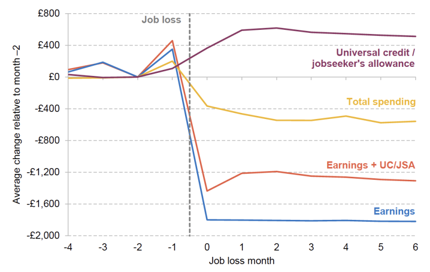
Note: Chart shows estimated coefficients from equation 1. In all cases, is winsorised at the 0.1% level prior to estimation. Standard errors are not shown but are generally small (across all estimated coefficients shown, the 95% confidence interval extends on average £12 from the point estimate). Consequently, all estimated coefficients from event month 0 onwards are statistically significant at the 1% level. All values are given in September 2025 prices.
In broad terms, the picture that emerges from Figure 2 is as follows:
- Earnings: On average, our sample of recently unemployed workers receive earnings of around £1,800 a month prior to entering unemployment. By definition, this falls to zero in the first month of unemployment, remaining at that level for the remainder of the unemployment spell.10 It is also notable that earnings increase significantly (on average by around £350) in the month immediately prior to job loss – a fact that is likely explained by the receipt of severance pay.
- Benefits income: UC/JSA income increases by around £350 in the first month of unemployment (from a baseline of around £100 per month two months prior to job loss), before increasing by around a further £250 in the second month of unemployment and (broadly) plateauing for the remainder of the unemployment spell. On average, therefore, unemployment benefits replace around a third of lost earnings. The lower amounts of benefit income observed in the first month of unemployment reflect the facts that new applicants typically face a waiting period of up to five weeks between applying for UC and receiving their first payment, and that it takes over a month for existing UC claimants to see their UC adjusted upwards following job loss.
- Spending: Spending falls by around £350 in the first month of unemployment and then falls further over the next two months, stabilising at a level around £550 lower, on average, than in the period prior to job loss – equivalent to a reduction of just over 20% compared with the average pre-job-loss level.11
Two significant implications stem from these dynamics. The first is that unemployment leads to rapid and significant declines in spending. This occurs even for short spells of unemployment – a point that can be seen explicitly in Figure 3, which shows the evolution of spending by spell length. Those who experience a short spell of unemployment see similar declines in spending, during that unemployment spell, to those whose spell ends up being considerably longer. When they re-enter employment, their spending largely recovers.
Figure 3. Change in monthly spending, by unemployment spell length
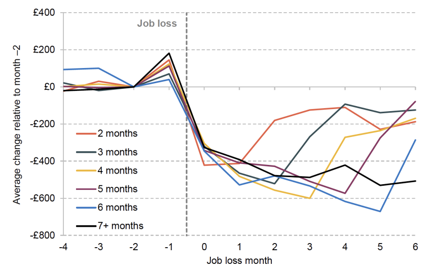
Note: Chart shows estimated coefficients from equation 1. In all cases, is winsorised at the 0.1% level prior to estimation. Standard errors are excluded for visual clarity. Across all estimated coefficients shown, the 95% confidence interval extends on average £66 from the point estimate. All estimated coefficients from event month 0 onwards are statistically significant at the 5% level. All values are given in September 2025 prices.
A note of caution is required in interpreting these spending declines. Some costs (such as childcare and commuting costs) may fall during unemployment, meaning that not all reduced spending will result in reduced living standards. That said, as set out in Figure 4 later, falls in spending occur across a broad range of categories and do not seem to be particularly concentrated in work-related costs. For instance, falls in transport spending represent only around 5% of the average spending reduction we observe. It therefore seems likely that spending reductions do primarily reflect lower living standards as opposed to reduced costs.
The fact that spending proves to be so sensitive to income changes even for unemployment spells lasting only a few months suggests either that users face considerable uncertainty as to how long they will remain in unemployment (and therefore adjust their spending downwards in preparation for a potentially long spell out of work) or that they are constrained in their ability to ‘smooth’ their spending by borrowing or drawing on savings – for example, because they have limited access to credit or a lack of savings available.
The second significant feature of the response to unemployment shown in Figure 2 is that spending falls by significantly less than income. In very rough terms, our sample of recently unemployed workers appear to absorb around one-third of the income loss they experience through lower spending, and a further third through higher benefit income. This implies that, over and above the insurance provided by the benefit system, households appear to be able to substantially cushion the degree to which they are forced to reduce spending. The specific channels through which they do this are examined in more detail in the next section.
Given the substantial income reductions that we see in Figure 2, a natural question to ask is whether some categories of spending are more responsive to income reductions than others. Figure 4 shows the absolute and percentage declines in spending across seven categories: leisure spending (a category encompassing spending on hospitality, holidays and entertainment), bills (including utilities, housing costs and insurance premiums), cash withdrawals, clothing, supermarket purchases, spending on durables (such as purchases of electronics and household appliances) and transport (including both public transport fares and fuel purchases).
Figure 4. Change in average monthly spending, by category

Note: Chart shows the mean of estimated coefficients across the first six months of unemployment () from equation 1. In all cases, is winsorised at the 0.1% level prior to estimation. All values are given in September 2025 prices.
The largest absolute fall in spending following unemployment is in ‘leisure’ spending, where users spend an average of £88 less per month across the first six months of unemployment than prior to job loss (a 20% reduction). Cash withdrawals and spending on clothing see similar percentage reductions (although from a lower base), with spending falling by 22% and 21% respectively. Supermarket spending declines by less (16% on average), as does spending on durables (which falls by 18%) and transport (which falls by 17%) – meaning that these expenditures form a larger share of users’ total budgets following job loss. Perhaps unsurprisingly, the category of spending that is least responsive to unemployment is bill payments, although even here spending falls by 13% on average across the first six months of unemployment; we investigate the frequency of missed bill payments in further detail below. The dynamics of these spending reductions largely follow those of total spending (see Figure 2), although transport spending declines more quickly and is more stable throughout the unemployment period – likely reflecting the reduced costs of commuting.
4. Saving behaviour and financial distress
In the previous section, we documented spending responses to unemployment that are both large – around one-third of the total loss of earnings – and heterogeneous across spending categories. In this section, we widen our lens to examine how households self-insure against unemployment and we assess potential indicators of financial distress among unemployed households.
We noted in the previous section that, on average, recently unemployed workers see earnings fall by around £1,800 a month upon moving into unemployment. Increased receipt of universal credit and jobseeker’s allowance results in total income declining by approximately £1,200 per month. But spending falls by ‘only’ £550, implying that households are able to tap into additional resources from sources other than UC and JSA in order to ensure that their spending falls by less than their income. Figure 5 seeks to shed light on the nature of these additional resources by unpacking the reduction in income experienced by households that is not covered by spending reductions into the following three categories and an ‘other’ category (red bars):
- Net saving (navy bars): These bars show the total increase or decrease in balances in the bank accounts linked to ClearScore that we observe. On average, households appear to accumulate savings of just under £350 in the month immediately preceding job loss (a fact likely driven, at least partially, by elevated earnings in that month arising from severance pay), before running down those savings in their entirety in the first month of unemployment (when income is particularly low as a result of waiting periods associated with new applications to JSA/UC). Thereafter, the drawdown of savings (at least from bank accounts observed in our data) appears to play no further role in cushioning the household finances during unemployment.
- Net outward transfers (yellow bars): These bars show the net flow of transfers to and from external accounts (which could, for example, be transfers to family and friends or to savings accounts owned by the user that they have not linked into ClearScore). A significant portion (in most months around £250) of the gap between observed falls in spending and observed falls in income can be accounted for by a net reduction in outward transfer payments. That response is driven by the fact that those experiencing unemployment see a substantial reduction in outward transfers (as opposed to an increase in inward transfers). There are a number of possible explanations for this. One is that certain outward transfers effectively represent spending. Rental payments paid directly into the bank account of a private landlord, for example, would fall into this category, as would repaying a friend for one’s share of a restaurant bill. In these cases, a fall in outward transfers in fact represents a fall in spending. A second possibility is that while ClearScore users are able to (and frequently do) link in multiple bank accounts to the app – allowing us to observe a more complete picture of their finances – there will nevertheless be cases where some bank accounts remain unlinked. A reduction in the number of transfers made to unlinked accounts (e.g. as a result of ceasing to make payments into a savings account) would in this case be measured as a reduction in outward transfers. A third interpretation is that outward transfers may represent payments made to family and friends, with unemployment associated with a reduction in such payments.
- Inward payments (purple bars): These bars represent the increase or decrease in inward payments (other than earnings and UC/JSA payments, and excluding transfers between bank accounts). In most months of unemployment, the single largest component of the ‘gap’ between reduced income and reduced spending is an increase in inward payments not identified by ClearScore as being earnings or benefit payments. On average, such payments increase by around £400 per month during unemployment. The lack of information afforded by our data makes it difficult to draw firm conclusions about how these payments should be interpreted. However, there are a number of plausible possibilities that are worthy of mention. The first is that inward payments of this kind represent unidentified transfers and should therefore be interpreted accordingly as (for example) either gifts from family and friends or savings drawn down from unlinked accounts. Another is that they represent streams of income – for example, from the sale of possessions or even casual cash-in-hand work.
Figure 5. Non-spending responses to job loss (monthly)

Note: Chart shows estimated coefficients from equation 1. In all cases, is winsorised at the 0.1% level prior to estimation. All values are given in September 2025 prices.
Given the large decline in income, a natural question is whether job loss also feeds through to financial distress. One possible indicator of distress is missed bill payments. As discussed above (see Figure 4), unemployment is associated with a significant reduction in spending on bills. On the one hand, it is possible that this represents a consumption adjustment (e.g. using less heating in response to reduced income). On the other, recently unemployed workers may be failing to make scheduled payments as a result of their reduced incomes – resulting in an accumulation of arrears and possible legal sanctions (such as eviction). To investigate this question further, Figure 6 plots the change in the share of our sample making a bill payment of any amount across three different categories: rent, energy and insurance. While we would ideally also include mortgage payments in our analysis, we observe less than 3% of our sample making such payments prior to job loss, making meaningful statistical inference challenging.12
Figure 6. Change in share of recently unemployed workers making a bill payment

Note: Chart shows estimated coefficients from equation 1. Error bars show 95% confidence intervals. In all cases, is winsorised at the 0.1% level prior to estimation.
The share of recently unemployed workers making rental payments falls by 17% in the first month following job loss (remaining at around that level for the remainder of the unemployment period). While this may be a marker of financial distress, caution is required in its interpretation. The fact that the fall is so immediate points to the possibility that at least some individuals may be entering unemployment because they are ceasing to make rental payments (e.g. because they are moving to another part of the country) rather than the other way around. In contrast, the share of recently unemployed workers making energy and insurance bill payments declines more gradually across the course of the unemployment spell – a pattern more consistent with building financial pressure becoming increasingly acute the longer that unemployment persists. After six months of unemployment, the share making an energy bill payment falls to 8% below its pre-job-loss level (from 32.0% to 29.5%) while the share making an insurance payment falls by 13% (from 40.3% to 34.8%).13
Another potential indicator of financial distress is debt. Figure 7 shows the change in the share of individuals incurring overdraft charges, incurring credit card interest payments, taking out a payday loan, and registering a negative current account balance in the months prior to and during unemployment.14 The picture that emerges is a mixed one.
Figure 7. Change in share of recently unemployed workers with indicators of financial distress

Note: Chart shows estimated coefficients from equation 1. Error bars show 95% confidence intervals. In all cases, is winsorised at the 0.1% level prior to estimation.
On the one hand, the share of users taking out payday loans or incurring credit card interest charges declines substantially following job loss. While this certainly does not indicate an increase in financial distress, it may relate to reduced opportunities or willingness to access and use credit. Payday loan lenders, for example, generally require proof of income in order for loans to be approved, and those with credit cards may be more reluctant to use them if their expectations about the trajectory of their future income are altered by an unexpected job loss.
On the other hand, we see rises in both overdraft charges and negative account balances. The share of ClearScore users incurring overdraft charges increases by around 4% after four months (from 16.0% to 16.6%). This is significant, because overdrafts represent an expensive form of credit (often with effective annual interest rates of up to 40%), suggesting a meaningful increase in real financial distress.15 These dynamics differ significantly from those seen for the share of users registering a negative current account balance. While related to overdraft charges, this measure differs in that many accounts permit an ‘arranged’ overdraft of some level that can be used without triggering a charge. From the second month of unemployment, we observe an 8% increase (from 22.1% to 23.8%) in the share of recently unemployed workers recording a negative current account balance. From the fourth month of unemployment onwards, however, the share of recently unemployed workers registering a negative balance begins to fall and is only 4% above its pre-unemployment level after six months. One possible explanation consistent with this pattern is that recently unemployed workers may initially make use of arranged overdrafts in order to mitigate falls in income but then have their arranged overdraft access reduced by their bank as a result of their altered financial circumstances if unemployment persists.
5. Relationship to the benefit system
As discussed in the introduction, the UK benefit system is unusual internationally in that levels of unemployment benefit are not tied to the prior earnings of the claimant, and are generally strongly linked to family circumstances (number of children, amount of rent). As a result, the decline in total income one sees upon job loss varies considerably between individuals. In this section, we describe how responses to unemployment differ between individuals experiencing different income declines. We quantify income declines using the ‘replacement rate’ – an individual’s out-of-work income divided by their in-work income.16 Those with higher replacement rates see smaller hits to their income when they lose their job.
It should be emphasised from the outset that the results presented in this section do not identify the causal impact of reduced replacement rates. Replacement rates are a function of the prior income of claimants and their household’s characteristics (such as number of children and rent). All these factors could plausibly lead responses to unemployment to differ in ways that cannot be disentangled from the impact of replacement rates themselves. Instead, these results should be seen as showing the total amount of insurance against job loss – from benefits and elsewhere – enjoyed by those who the benefit system protects more strongly versus less strongly.
We partition our sample into three groups of roughly equal size based on the replacement rate observed at job loss.17 Table 1 summarises the characteristics of these three groups immediately prior to entering unemployment. On average, recently unemployed workers with higher replacement rates tend to have had lower earnings prior to entering unemployment and have been in receipt of higher levels of in-work benefits. Higher replacement rates are also associated with considerably larger cash increases in benefits upon entering unemployment. In other words, high replacement rates reflect both earnings making up a smaller share of income prior to job loss (meaning that the loss of those earnings has a smaller effect on total income) and larger increases in benefits. As we have already alluded to, those with high and low replacement rates also have very different personal characteristics. Those with higher replacement rates are significantly more likely to be female, tend to be (slightly) older, are more likely to be in receipt of disability benefits prior to job loss and have more children than those experiencing lower replacement rates.
Table 1. Characteristics of replacement rate groups (2025 prices)

Note: All values relate to month –2, except benefit increase at job loss which is the mean increase in total benefit income between months –2 and month +1 (or month +2 in cases where this is the first month in which UC/JSA is received). Number of children refers to the number of children with respect to whom the user is in receipt of child benefit. Where no child benefit is observed, we assume the number of children to be zero. Benefit income in the second and third rows refers to all benefits, including UC, JSA, child benefit and disability benefits. All values are given in September 2025 prices.
Figure 8 presents a broad set of descriptive evidence regarding how individuals with different replacement rates respond when moving into unemployment. The most obvious (indeed, largely mechanical) difference between the three groups (shown in Panel A) is that earnings plus UC/JSA falls by less as replacement rates increase. The highest replacement rate group sees income fall by around 30% following unemployment while for the lowest replacement rate group the fall is around 90%. As shown in Panel B, these differences in the impact of job loss on income are also associated with very different spending responses. The third of our sample with the highest replacement rates reduce spending by around 6% on average in the first three months of employment. By contrast, the equivalent figure for the third of our sample with the lowest replacement rates is 26%. We see this even for supermarket spending, which declines by 33% for the low replacement rate group after six months, compared with just 11% for the high replacement rate group (not shown on the graph).
Figure 8. Responses to job loss, by replacement rate

Note: Chart shows estimated coefficients from equation 1. Error bars show 95% confidence intervals. In all cases, is winsorised at the 0.1% level prior to estimation. All panels show response as a share of outcome variable mean level in month –2. All values are estimated in September 2025 prices before being converted into percentage changes.
As previously outlined in Figure 5, those moving into unemployment typically accumulate savings in the final month of employment, before drawing them down in the first month of unemployment. Panel C of Figure 8 reports saving and dissaving – as a share of pre-job-loss average income – across each of our three replacement rate groups. While all three groups follow the same broad pattern as the overall sample, the relative magnitudes of the saving and dissaving responses that occur in the two months adjoining job loss differ substantially. In their final month of employment, all three groups save similar amounts (18–21% of their income in the previous month). In the first month of unemployment, however, those with lower replacement rates run down savings considerably more than those with higher rates – the lowest replacement rate group runs down savings worth 29% of pre-job-loss income in this month compared with just 17% for the highest replacement rate group. In contrast to those with higher replacement rates, the lowest replacement rate group also continues drawing down savings (albeit to a more muted degree) in each of the three subsequent months. There are a number of possible explanations for this. One is that those with lower replacement rates have greater capacity to accumulate savings in the months prior to becoming unemployment, thanks to their higher levels of income. Another is that those with lower replacement rates (who experience the most precipitous falls in income) may fall further below what they consider to be their ‘permanent’ level of income (i.e. the level of income they broadly expect to be able to maintain across their lives) and are therefore prepared to draw down on savings more aggressively in order to achieve a smoother path of consumption.
Despite drawing down more strongly on savings, Panel D of Figure 8 indicates that, at least for some, low replacement rates may be associated with more acute signs of financial distress. The graph shows the change in the share of recently unemployed workers making an energy bill payment, broken down by replacement rate. Among those with the lowest replacement rates, the share making a payment falls to 17% below its pre-job-loss level after three months of unemployment. Declines are substantially smaller for the medium and high replacement groups (7% and 3% respectively). This differential pattern is consistent with greater financial pressure where income replacement is low – particularly for unemployment spells lasting more than a few months. We observe similarly differential patterns in bill payments of other kinds. The share of recently unemployed workers paying rent (not shown in Figure 8) falls by 20% after three months of unemployment for the lowest replacement rate group compared with 12% for the middle group. Meanwhile, our highest replacement rate group sees no statistically significant reduction in rental payments at all. Insurance payments tell a similar story, with the share of the low and middle replacement rate groups making insurance payments falling by 29% and 25% respectively after six months of unemployment, compared with just 15% for the highest replacement rate group.
Panel E of Figure 8 shows that the share of recently unemployed workers recording a negative balance in their current account increases by substantially more for the low replacement rate group (peaking at 15% compared with 6% and 9% for the middle and high replacement rate groups respectively). The elevated share of those seeing negative balances also persists for longer for the low replacement rate group, only starting to abate in the sixth month of unemployment; the middle and high replacement rate groups both see negative balances peak in the second month of unemployment. This again points to lower replacement rates being associated with a greater degree of financial strain. That said, it should be noted that evidence on overdraft charges (not shown in Figure 8) is less clear, with a similar response recorded across all three groups.
Given the substantial differences in the three groups’ underlying characteristics, it is hard to come to definitive conclusions about the causal impact of differing replacement rates on recently unemployed workers. Nevertheless, Figure 8 does provide suggestive evidence that the unusually broad dispersion of replacement rates that the design of the UK benefit system generates translates into sharp differences in the cost of unemployment. Despite some evidence that those with lower replacement rates may have a greater ability to cushion the impact of job loss by drawing on savings (at least for short spells of unemployment), lower rates of replacement remain associated with a substantially greater fall in consumption. This implies that unemployment is significantly more painful for recently unemployed workers with low replacement rates. That conclusion is compounded by the fact that those with low replacement rates see both far larger increases in missed energy bill payments (particularly over longer unemployment spells) and larger increases in the likelihood of recording negative current account balances.
6. Conclusions and policy implications
Summarising our results, we find that those who lose their job and receive benefits in unemployment see their spending fall by a little over 20%, including declines in goods more likely to be ‘basic’ such as supermarket purchases as well as more ‘discretionary’ items. There is evidence of individuals becoming more likely to stop making bill payments; arrears resulting from these non-payments may have lasting effects on their financial health. They are also more likely to go into their overdraft or have a negative current account balance, though less likely to run up credit card interest payments – possibly due to a decreased ability or willingness to use credit. Our results also highlight the importance of cash flow, or liquidity, in driving outcomes. Spending falls immediately following job loss, and recovers very quickly following re-employment – even for those whose time out of the labour market is quite short. This indicates that many lack the capacity to ‘smooth’ spending by drawing on other sources such as savings or borrowing.
We find that those whose income is more protected through the benefit system see considerably smaller effects on these margins. Again these differences cannot be interpreted as causal, since those who are more protected by the benefit system differ from those less protected by it in other ways too. That said, our results do provide compelling evidence that those who are afforded the least insurance by the benefit system are able to only partially offset this fact by drawing on other forms of support.
We turn now to the lessons of our results for policy. The provision of unemployment benefits entails a fundamental trade-off. On the one hand, these benefits have the potential to mitigate at least some of the decline in living standards entailed by job loss. On the other, by making unemployment more tolerable, such benefits reduce the incentive to remain in a job while in employment and to return to work following unemployment. The trade-off is most favourable when the government can get extra cash to those who are in the greatest need while having the least impact on work incentives.
This report does not discuss the work incentive side of the equation (see Le Barbanchon, Schmieder and Weber (2024) for a review of the empirical evidence). Instead, we focus on the degree to which the existing benefit system protects living standards. We find that under the existing system of unemployment benefits, many people do experience substantial spending declines when entering unemployment, while re-employment is associated with spending increases (Figure 3). This is true even for very short unemployment spells and is most acute for those who receive less support from the benefit system (Figure 8).18 Taken together, this evidence is consistent with spending being sensitive to current income, or cash flow (something that echoes evidence from other countries; see Ganong and Noel (2019), for example).
Taking this together, we draw three implications for policy.
First, one reason why unemployment causes a decline in living standards is that the kind of sharp spending falls we see may be difficult to adjust to. This is partly because of ‘committed consumption’ – spending commitments that are difficult to change in the short run. Housing costs are the key example here. The fact that they cannot be quickly changed means that individuals losing their job need to either go into arrears (as we find some evidence for in the case of rent), with long-term implications for their finances, or concentrate their spending cuts on a subset of their budget. This period could therefore be one where extra support is particularly valuable. One option would be to provide higher levels of support for a time-limited period at the beginning of an unemployment spell, as is common in most developed countries. This could even be done in a cost-neutral fashion, by rebalancing support towards the recently unemployed and away from the long-term unemployed. The government’s recently proposed unemployment insurance benefit is precisely a move in this direction, increasing benefit entitlements for those who are not entitled to (much) universal credit from £92.05 to £140.55 per week for a (as yet undecided) period following job loss.19 Another option would be to link support to the degree of housing costs, as the primary committed aspect of expenditure. UC does provide support for rent, albeit in a form that has become much less generous in recent years (Michael and Wernham, 2025). The support for mortgages is in the form of a loan, known as support for mortgage interest. However, this is only available to those who have been claiming UC for at least three months, limiting its usefulness in addressing short-run cash-flow problems. The government could consider making support for housing costs more generous especially at the start of an unemployment spell, to help those whose substantial housing commitments cause difficulties in the wake of unemployment.
Second, a rather different direction to go in would be for the government to provide loans at the start of an unemployment spell; for this to be useful to the claimant, the loans would have to be either at lower interest rates or on more generous repayment terms than those available in the private market. As with higher benefits at the start of a spell, this would help solve the problem of limited cash flow following unemployment, which seems to cause a sharp decline in expenditure. However, compared with providing extra benefits, loans would cost the exchequer considerably less and also have less of an impact on work incentives, since spending more time unemployed collecting the loan would imply greater repayments in the future. There are already some loans present in the benefit system, so this would not be without precedent. As discussed above, the government provides loans for some UC claimants with mortgages. New claimants to UC can also receive an ‘advance’, which amounts to a loan paid during the five weeks’ wait for their UC claim to be assessed. The details of how such loans would work and be repaid would not be straightforward, but one advantage the government has in providing loans (relative to private providers) is the possibility of recouping some of the loan through lower in-work UC payments – indeed, this is the main route by which UC ‘advances’ are repaid.
Finally, our results are relevant for thinking about the degree of protection against job loss that the benefit system provides to different workers. As we highlight, those who receive relatively little support through the benefit system make deeper cuts to their spending and see greater increases in signs of financial distress. This suggests that, should the government want to strengthen the total amount of insurance workers enjoy, those whose existing state support is most limited may be the most natural group to look to first. The government’s proposed unemployment insurance benefit (which would be paid at the same rate to all claimants) and plans to raise the basic UC element available to all claimants by around 5% are both moves in this direction. This increases insurance most significantly for those whose existing support is lowest.20
References
Andersen, A. L., Jensen, A. S., Johannesen, N., Kreiner, C. T., Leth-Petersen, S. and Sheridan, A., 2023. How do households respond to job loss? Lessons from multiple high-frequency datasets. American Economic Journal: Applied Economics, 15(4), 1–29, https://doi.org/10.1257/app.20210206.
Bogiatzis-Gibbons, D. and O’Brien, E., 2024. Employment shocks and financial difficulty: understanding how leaving paid employment affects ability to meet credit repayments. Financial Conduct Authority research note, https://www.fca.org.uk/publication/research-notes/employment-shocks-financial-difficulty-paid-employment-credit-repayments.pdf.
Bonnet, O., Boutin, S., Loisel, T. and Olivia, T., 2024. The consumption response to unemployment: evidence from French bank account data. Insee, Working Paper 2024-23, https://www.bnsp.insee.fr/ark:/12148/bc6p098r9s2/f1.pdf.
Ganong, P. and Noel, P., 2019. Consumer spending during unemployment: positive and normative implications. American Economic Review, 109(7), 2383–424, https://doi.org/10.1257/aer.20170537.
Gerard, F. and Naritomi, J., 2021. Job displacement insurance and (the lack of) consumption-smoothing. American Economic Review, 111(3), 899–942, https://doi.org/10.1257/aer.20190388.
Latimer, E., Oulton, M. and Waters, T., 2025. The government’s proposed reforms to health-related benefits: incomes, insurance and incentives. IFS report, https://ifs.org.uk/publications/governments-proposed-reforms-health-related-benefits-incomes-insurance-and-incentives.
Le Barbanchon, T., Schmieder, J. and Weber, A., 2024. Job search, unemployment insurance, and active labor market policies. In C. Dustmann and T. Lemieux (eds), Handbook of Labor Economics, volume 5, Elsevier, https://doi.org/10.1016/bs.heslab.2024.11.006.
Michael, J. and Wernham, T., 2025. Freezes in housing support once again widen geographic disparities for low-income renters. IFS comment, https://ifs.org.uk/articles/freezes-housing-support-once-again-widen-geographic-disparities-low-income-renters.
Mikloš, M. and Xu, X., 2025. Options for unemployment insurance. In C. Emmerson, K. Ogden and B. Zaranko (eds), The IFS Green Budget 2025, https://ifs.org.uk/publications/options-unemployment-insurance.
Data
Department for Work and Pensions, NatCen Social Research. (2021). Family Resources Survey. [data series]. 4th Release. UK Data Service. SN: 200017, DOI: http://doi.org/10.5255/UKDA-Series-200017
Acknowledgements
Funding from the ESRC grant ‘Consumption dynamics and the insurance value of benefits’ (grant number ES/W005891/1) and the ESRC Centre for the Microeconomic Analysis of Public Policy (ES/Z504634/1) is gratefully acknowledged. The authors thank Helen Miller and Martin O’Connell for feedback on this work. All opinions and any errors and omissions are the responsibility of the authors alone.
Endnotes
Authors

Isaac Delestre
Isaac is a Senior Research Economist in the Taxation sector, focusing on the taxation of high-income individuals and closely-held corporate entities.

Tom Waters
Tom is an Associate Director at the IFS and Head of the Income, Work and Welfare sector.
More from IFS
Understand this issue


Policy analysis


Academic research


