Key findings
1. The overall absolute poverty rate fell in the first year of the pandemic (2020–21) and was little changed in 2021–22, leaving it nearly 1 percentage point (ppt) or 480,000 people lower than its pre-pandemic level. This is largely due to changes in benefits policy, in particular the (temporary) £20 universal credit uplift and (permanent) changes to the universal credit taper rate and work allowances, which allow workers to keep more of the benefit as their earnings rise.
2. The £20 uplift reduced absolute poverty rates by 0.3ppts during the six months it was in place in 2021–22, or by 0.6ppts in annualised terms (379,000 people). The changes to work allowances and the taper rate that succeeded it had a much more muted impact on poverty. Their annualised effect is only 0.2ppts (133,000 people) – a third of the impact of the uplift. Even on a per-pound basis, the £20 uplift had a 40% larger effect on poverty. This is because changes to work allowances and the taper rate mainly benefit somewhat higher-earning households further up the income distribution and do not affect out-of-work households at all.
3. The first instalment of the cost of living payments to households receiving means-tested benefits – £326 paid in July 2022 – substantially boosted spending. Discretionary spending was £33 a week (12%) higher for recipient households on average in the four weeks after the payment than in the four weeks before, and remained somewhat elevated up to 15 weeks after the initial payment. The rise in discretionary spending was driven by an increase in cash withdrawals, spending on groceries, and spending on entertainment (e.g. restaurants, streaming services), which accounted for 17%, 15% and 28% of the total increase in discretionary spending respectively. That recipients responded strongly to the payment suggests that, prior to the payment, many had limited savings or means of borrowing available to them, and wanted to spend more than they were able to. That a substantial fraction of the cost of living payment went on basic goods such as groceries, but also on more discretionary goods such as entertainment, indicates a variety of levels of ‘need’ among recipient households.
4. Recipients with lower earnings increased their spending by more immediately after receiving the cost of living payment, which may indicate higher cash constraints in the lead-up to the payment. However, the distribution of extra spending across categories (groceries, entertainment etc.) was similar across recipients with different levels of earnings.
This chapter examines trends in household poverty, particularly looking at changes since the beginning of the COVID-19 pandemic in March 2020.
We start by describing trends in poverty rates in the UK for the latest two years of data, for the whole population as well as subgroups including children and pensioners, to assess the extent to which the pandemic and the policy response affected the number of households on low incomes. We then estimate the effects on poverty of two key reforms introduced during the pandemic: the £20 per week uplift to universal credit (UC) and the reduction in the UC taper rate. Finally, we use bank transaction data to look at how the cost of living payment in July 2022 affected spending patterns for recipients, to examine how beneficiaries spent this payment and how important it might have been in poverty alleviation.
The majority of analysis in this chapter is based on the Households Below Average Income data. When we refer to household income, the measure we use is net equivalised household income – income after taxes and benefits and adjusted for household composition – expressed as the equivalent for a childless couple. We measure household incomes after deducting housing costs (AHC). While there is clearly an element of choice in many people’s spending on housing, variation in housing costs may not reflect differences in housing quality, especially for low-income households. Further, incomes before housing costs include housing benefit as income. An increase in rent covered by housing benefit therefore shows up as an increase in ‘before-housing-costs’ income, which makes households appear better off even though their disposable income (after housing costs) remains unchanged.
Section 3.3 uses bank transaction data from ClearScore. We offer a full description of those data at the beginning of that section.
3.1 Poverty rate trends
We begin by documenting changes in poverty rates, focusing on the period since the beginning of the pandemic. Figure 3.1 shows absolute poverty rates for various groups since 2002–03, defined as the share of individuals whose household income (adjusted for inflation) is below 60% of the median income in 2010–11. During the first year of the pandemic, 2020–21, absolute poverty among the whole population fell by around 1 percentage point (ppt) from 17.9% to 16.8%. In 2021–22, it rose back slightly, but at 17.1% it was still 0.7ppts (479,000 people) below the pre-pandemic level. As we show later, a key driver in this change was the increased generosity of benefits – in particular, the £20 per week uplift to UC entitlements and the changes to the UC work allowances and taper.
Figure 3.1. Absolute poverty (AHC), overall and for different groups
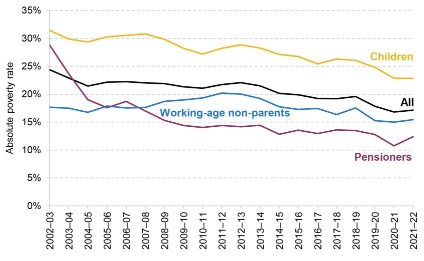
Note: Incomes have been measured net of taxes and benefits, with housing costs deducted. All incomes have been equivalised using the modified OECD equivalence scale. The absolute poverty measure gives the percentage living in a household with less than 60% of the 2010–11 median income, adjusted for inflation.
Source: Authors’ calculations using the Family Resources Survey, 2002–03 to 2021–22.
The fall in absolute poverty over the two latest years has been driven by a decline in the proportion of children living in poverty. Prior to the pandemic, 25% of children were living in a household with income below the absolute poverty line. This fell to 23% in 2020–21, and remained at that level in 2021–22. This is consistent with the fact that families with children are more likely to be receiving UC than pensioners or those without children, and so their outcomes are more sensitive to UC policy.
Figure 3.2 shows the evolution of relative poverty rates. These compare household incomes with a poverty line that changes over time, equal to 60% of the contemporaneous median income in each year. A consequence of this is that relative poverty rates are affected by changes in the middle of the income of the distribution: all else equal, an increase in median income would lead to a rise in relative poverty.
Figure 3.2. Relative poverty (AHC), overall and for different groups
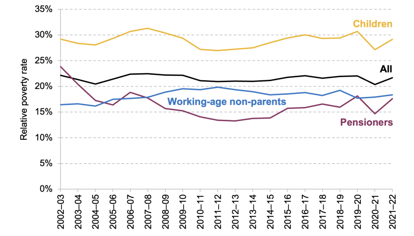
Note: Incomes have been measured net of taxes and benefits, with housing costs deducted. All incomes have been equivalised using the modified OECD equivalence scale. The relative poverty measure gives the percentage living in a household with less than 60% of the contemporaneous median income.
Source: Authors’ calculations using the Family Resources Survey, 2002–03 to 2021–22.
Across the population, relative poverty fell by 1.7ppts between 2019–20 and 2020–21. This was larger than the decline in absolute poverty, as the labour market disruption at the start of the pandemic caused median income to fall. The subsequent recovery meant that median income rebounded, and as such relative poverty rates returned to close to their pre-pandemic level in 2021–22.
3.2 Effects of reforms to the benefit system
We now investigate the role of reforms to the benefit system in changes to absolute poverty since the pandemic. As discussed in the pre-released chapter on living standards (Ray-Chaudhuri and Xu, 2023), low-income households saw larger declines in their employment incomes between 2019–20 and 2021–22, but these were more than offset by increases in working-age benefit incomes. In particular, two key policies introduced since the beginning of the pandemic bolstered the incomes of low-income households. First, a £20 a week uplift to UC was introduced in March 2020 – meaning that the vast majority of UC recipients saw an increase in entitlement of that amount.[1],[2] This remained in place until October 2021 (covering six months of the 2021–22 financial year). Second, work allowances in UC – the earnings thresholds above which benefit entitlements are gradually reduced – were raised by £500 a year, and the rate at which benefits are reduced above this point (the ‘taper rate’) was reduced from 63% to 55%. This change took place towards the end of November 2021, so was in place for the last four months of the 2021–22 financial year.
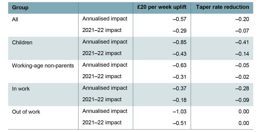
In this section, we estimate the impact of these two policies on absolute poverty using TAXBEN, the IFS tax and benefit microsimulation model. For brevity, we refer to the combined change in the UC work allowances and taper rate as the ‘taper rate reduction’. We present both the annualised impact of each policy – the effect if each policy were in place for a full year or if they were made permanent – and the impact in 2021–22, taking into account the number of months the policies were actually in place (six months in the case of the £20 uplift and four months in the case of the taper rate reduction).[3] Table 3.1 shows the estimated effects of the two key reforms on absolute poverty rates for various groups, against a baseline without either reform. We assume no behavioural response such as a change in labour supply or take-up of benefits.
Table 3.1. Effects of benefit policy reforms on absolute poverty rates
Note: Shows percentage point change in absolute poverty rate, measured after housing costs are deducted.
Source: Authors’ calculations using TAXBEN, the IFS tax and benefit microsimulation model, and Family Resources Survey 2021–22.
Given that both policies increase support for low-income families, unsurprisingly both reduce poverty. However, our analysis shows that the £20 uplift had a much larger effect on overall poverty rates than the taper rate reduction. The impact of the uplift being in place for six months of 2021–22 was to reduce absolute poverty among the whole population by 0.3ppts, equivalent to 0.6ppts on an annualised basis (379,000 individuals), a result that is comparable to other simulation exercises based on pre-pandemic data.[4] The taper rate reduction had a more muted effect, reducing poverty by 0.1ppts across 2021–22, equivalent to 0.2ppts (133,000 individuals) on an annualised basis.
This is partly due to who the two policies target. The taper rate reduction only benefits working households on UC, with bigger impacts for those with higher levels of earnings. These households tend to be further up the income distribution and often already above the poverty line. In contrast, the £20 uplift applied equally to all UC recipients (except those who were subject to the benefit cap) – therefore boosting incomes for those who were near the poverty line. Another reason that the £20 uplift had a bigger impact on poverty was simply that it was a larger policy, costing around £6 billion for a full year, compared with £3 billion for the taper rate reduction (HM Treasury, 2020 and 2021).[5] Nonetheless, on a per-pound basis, the uplift had a roughly 40% larger impact on poverty than the taper rate reduction.
The two policies also affect different groups quite differently. The annualised impact of the uplift on child poverty is twice that of the taper rate reduction. The poverty rate of working-age non-parents is almost entirely insensitive to the taper rate, reflecting the fact that the nature of the means-tested benefit system results in few non-parents being entitled to benefits if they are working, and the fact that claimants without children are not eligible for work allowances (unless they also have a disability). Those in out-of-work families see a 1ppt fall in poverty from the uplift, and of course are not affected at all by the taper. Even for in-work families, the uplift has a bigger annualised impact on poverty than the taper rate reduction (though not on a per-pound spent basis).
These results suggest that the total impact of the two policies in 2021–22 on poverty was around 0.4ppts. They therefore explain about half the decline in overall poverty between 2019–20 and 2021–22. Looking forward, the taper rate reduction was a permanent reform, while the uplift has expired. We would therefore expect the absolute poverty rate to be 0.16ppts (106,000 people) higher in 2022–23 than in 2021–22 as a result of changes in these two policies.[6]
3.3 Cost of living payments
Benefits are uprated each April using a lagged measure of inflation from the previous September. This leads to temporary, but large, falls in the real value of benefits when inflation is rising quickly. For example, in the first quarter of 2023, real benefit entitlements for out-of-work households were more than 10% below their pre-pandemic value. Indeed, benefits are not set to return to pre-pandemic levels until April 2025 (Cribb et al., 2023).
To protect low-income households from the rising cost of living, in 2022 the government introduced two cost of living payments totalling £650 for households receiving means-tested benefits. The amounts paid – £326 in July and £324 in November – were the same irrespective of a household’s circumstances or the amount of benefits it usually received.
In this section, we use transaction-level data to investigate how the first cost of living payment affected the spending of individuals who received them. In particular, we assess how quickly they spent the cash from this payment, and what type of goods or services they spent it on. The way in which households spent the payment is also informative of their living standards prior to the payment coming through. For example, if households quickly spent the payment on necessities such as groceries or rent, this suggests that households were highly cash-constrained prior to receiving the payment. On the other hand, more spending on luxuries such as eating out could imply that they had enough income to cover their essentials. We also look at whether the timing and categories of spending differed across types of households, differentiating by age and income.
Data and methodology
To conduct this analysis, we use the Exact.One Transactional Dataset, containing bank transaction data from ClearScore, a free credit rating app. Users of the app link in their bank accounts and credit cards to provide information about their financial circumstances, which may help improve the deals on credit products they are offered. ClearScore retrieves the historical transactions associated with these accounts, generally up to the previous three years. These data are then completely anonymised to construct the Exact.One dataset. For each transaction, we see the date it occurred, the amount, and usually the firm it was paid to or from and the category of spending (e.g. groceries, fuel). The spending category is automatically assigned by ClearScore based on the firm to which a payment is made. This means it is an imperfect measure: for example, if an individual bought clothes from a supermarket, the spending would be classed as groceries because it shows up on the bank statement simply as spending at the supermarket. The sample we use contains transactions for more than 900,000 users from the beginning of 2022 until the end of October 2022. To ensure that we have a consistent view of users’ accounts, we keep only users for whom we observe a transaction from all their linked accounts both before and after our window of analysis (20 weeks before to 10 weeks after), leaving us with a sample of just over 500,000 users. Within this, there are 98,000 users who received a cost of living payment in July 2022.
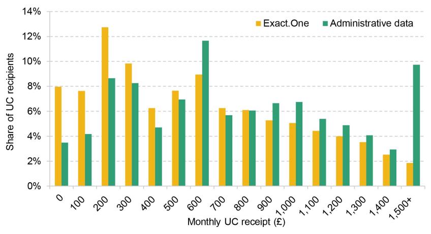
The sample is limited to people who have signed up to ClearScore, and as such may not be representative of the general population of benefit claimants. Figure 3A.1 in the appendix plots the distribution of monthly universal credit receipts among ClearScore users receiving the benefit – who are therefore entitled to cost of living payments – against the distribution of payments in the administrative data. It shows that the Exact.One data somewhat over-represent individuals getting very low benefit amounts (particularly those getting under £300 per month) and under-represent those getting very high amounts (particularly those getting £1,500 or more a month), but are reasonably representative between those points. This may be due to ClearScore users being more likely to be in work or being younger than the population of universal credit recipients. However, we would not expect this to significantly bias our results, as we do not find large differences in estimated spending responses to the cost of living payment by monthly benefit receipt. In particular, we find no systematic differences in the composition of spending across categories by monthly benefit receipt, as shown in Table 3A.3 in the appendix.
As an additional representativeness check, Table 3A.4 in the appendix compares spending prior to the cost of living payment among recipients in the Exact.One data with the spending of households entitled to universal credit in the Living Costs and Food Survey (LCFS).[7] Despite coming from very different sources, average spending in the two datasets line up remarkably well.
We can identify those users who receive a cost of living payment since it is a very specific amount paid within a short time window. All users who receive a payment of exactly £326 into one of their accounts between 14 and 31 July are classified as a recipient. While it is possible that this method could misclassify a user if they happened to receive another payment of that amount at that time, the chances of this seem slim and so misclassification is unlikely to have a meaningful impact on our results. This can be seen in Figure 3A.2 in the appendix, which shows that almost no users receive payments of £326 into their accounts in the other weeks in our sample, while there is a huge spike around the time of the payments.[8]
Our analysis involves looking into the types of spending done by individuals in response to the cost of living payments. We start by considering spending across two broad categories: bills and discretionary spending, where the latter is defined as spending on anything other than bills. We also consider effects on debt repayments. These categories are mutually exclusive, and cover all expenditures except for bank charges, insurance premiums, business expenses, and transactions that ClearScore was unable to categorise automatically. We further break down discretionary spending into spending on groceries, entertainment (such as dining out or streaming services), consumer durables (such as home appliances and furniture) and other categories. A full list of spending categories can be found in Table 3A.1 in the appendix. We list the most important types of spending in each category in Table 3A.2.
For the following results, we show the evolution of various types of spending around the time that individuals received cost of living payments. While this is informative, it is useful to get a sense of how the spending of these individuals might have changed had they not received a cost of living payment. General trends such as inflation could lead to higher spending on items such as bills and groceries, and there may be seasonal trends in spending over the year – for example, on entertainment over school holidays. To help account for these trends, we also show how spending evolved for a ‘control group’ of similar individuals who did not receive a cost of living payment.[9] We select these individuals by matching each individual who received a cost of living payment to another individual who did not receive a cost of living payment but who had similar spending for the category in question and across all discretionary items between April and June.
Broad spending categories
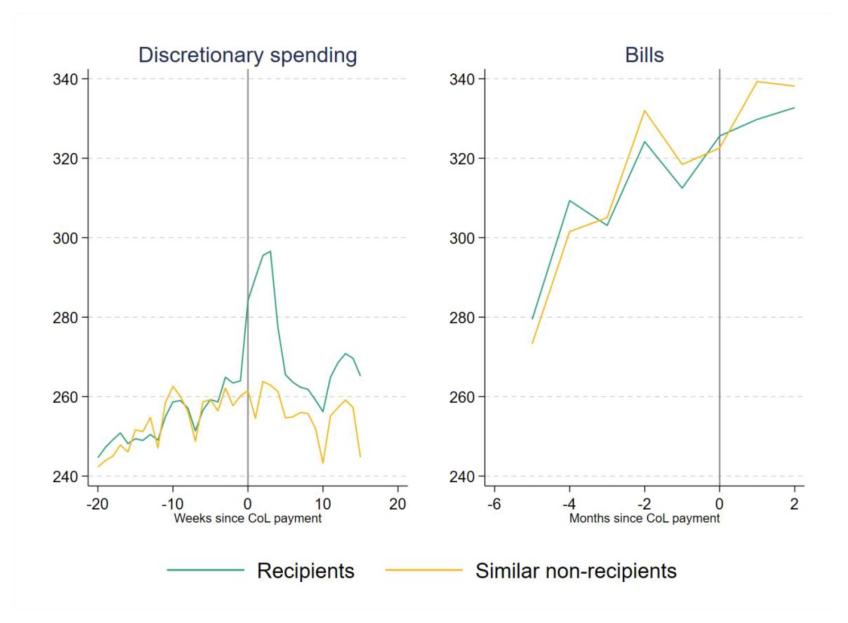
Figure 3.3 shows how spending on discretionary items and bills evolved for individuals around the time they received the cost of living payment, relative to a control group. The left panel shows weekly discretionary spending, smoothed using a backward-looking four-week moving average. The right panel shows spending on bills each month (comprised of mortgage and rent payments, utilities, council tax and childcare costs). To facilitate comparison, the vertical axes use the same scale.
Figure 3.3. Broad spending categories
Note: Backward-looking four-week moving average shown for discretionary spending. CoL is short for cost of living.
Source: Authors’ calculations using the Exact.One Transactional Dataset.
We observe that upon receiving the cost of living payment, individuals substantially increased their discretionary spending. Average discretionary spending in the four weeks after the payment was £33 higher than in the four weeks before, an increase of 12%, and there are signs of small anticipatory increases in spending in the weeks leading up to the payment.[10] For non-recipients, we do not see any big jumps in spending, which implies that the effect is driven by the extra income from the cost of living payment. By contrast, there was very little change in spending on bills in July for recipients compared with non-recipients (notice, though, that the amount spent on bills was rising substantially during the period of our sample). These patterns suggest that, before receiving the payment, individuals were limiting their discretionary spending, but not necessarily falling behind on bills.[11]
That overall spending responded strongly to the cost of living payment suggests that, prior to the payment, many recipients had limited savings or means of borrowing available to them, restricting their capacity to spend (i.e. they were ‘credit-constrained’). The cost of living payment (partially) relaxed those constraints, allowing higher levels of expenditure.
The increase in discretionary spending fell away quickly after the initial jump. Still, 10–14 weeks after the payment, recipients were spending an average of £11 per week more than non-recipients. Adding up the total amount extra spent by recipients compared with non-recipients gives an additional £246 spent over 15 weeks. This indicates that individuals on average had exhausted most, but not all, of the cost of living payment before they received the second instalment in November 2022.
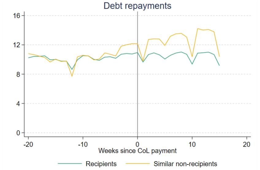
Figure 3.4 investigates the impact of the cost of living payment on debt repayments, a category that includes repayments for personal loans, including high-cost payday loans.[12] Even though 45% of recipients in our sample had made some debt repayments in the few months in advance of the payment, we do not find evidence of any significant increase as a result of the cost of living payment. In fact, recipients appear to make fewer repayments than similar non-recipients after the payment, although this result is difficult to interpret since repayments appear to be increasing among non-recipients shortly before the cost of living payments were sent out. Nonetheless, focusing simply on the trends in the recipient group, we see that repayments remain remarkably stable at around £10 per week throughout our analysis window with very little change when or shortly after the cost of living payment arrives. It is worth noting that since we do not include credit card repayments, we cannot rule out that households responded by paying off credit card debt.
Figure 3.4. Spending on debt repayments
Note: Backward-looking four-week moving average. Does not include repayments to ‘buy now pay later’ firms, nor credit card repayments. CoL is short for cost of living.
Source: Authors’ calculations using the Exact.One Transactional Dataset.
Discretionary spending categories
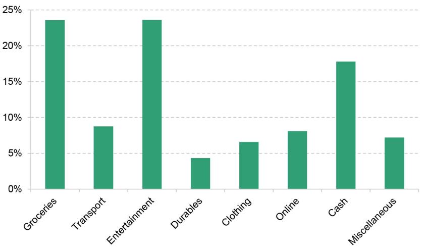
We now break down the changes in discretionary spending in Figure 3.3 into changes across eight narrower categories, to understand the type of goods or services that individuals choose to spend the payments on. Figure 3.5 shows the distribution of weekly spending across these eight categories in the 9–12 weeks before the cost of living payment. Before receiving the cost of living payments, around a quarter (24%) of recipients’ total discretionary spending went on groceries, and around a quarter (24%) on entertainment, a category that includes eating out, streaming services, and other leisure activities. Clothing (and appearance), transport, and durables (which include white goods such as washing machines and fridges) accounted for much smaller shares of discretionary spending – between 4% and 9% each.[13]
Figure 3.5. Share of spending by category, among cost of living payment recipients
Note: Average of spending between 9 and 12 weeks before the July cost of living payment.
Source: Authors’ calculations using the Exact.One Transactional Dataset.
Just under a fifth (18%) of discretionary spending was taken out as cash. We show this as a separate category, as we cannot tell what types of goods or services the cash was spent on. Similarly, we show online spending (PayPal, Amazon and eBay) as a separate category.
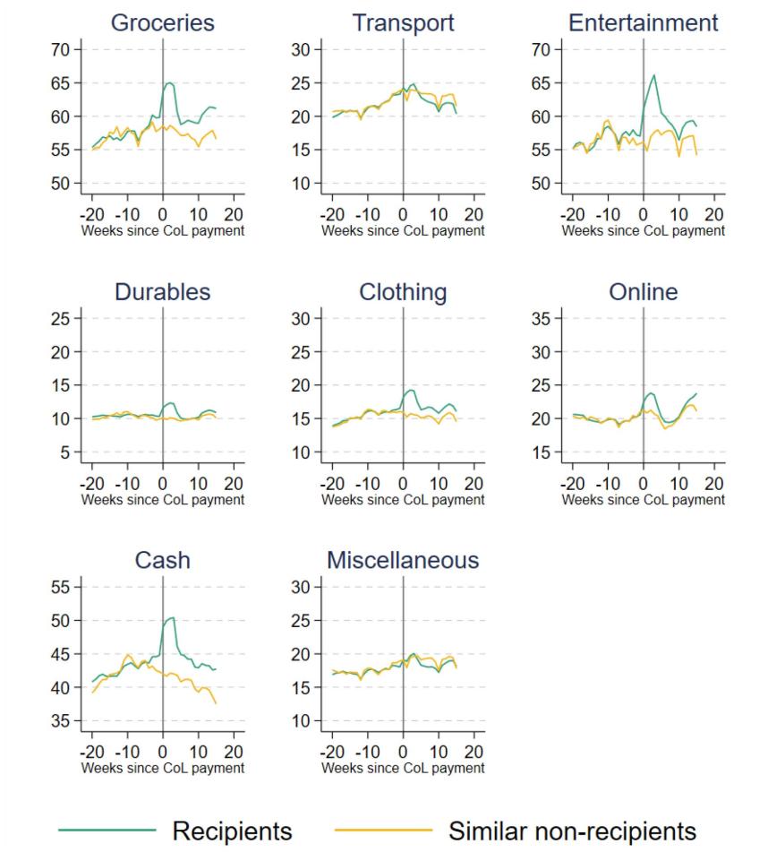
The evolution of spending across these categories, before and after the cost of living payment, is shown in Figure 3.6. For ease of comparison between the categories, each tick point on the vertical axes represents an increase of £5. We see that the biggest increases in spending were on groceries, entertainment and cash. Recipients’ spending on these categories in the four weeks after receiving the payment, relative to the four weeks before, increased by £4.80, £9.10 and £5.60 respectively (8%, 16% and 13% in percentage terms), accounting for 15%, 28% and 17% of the total increase in discretionary spending. Comparing recipients with similar non-recipients, we can also see some evidence of small anticipatory increases in this spending in the weeks immediately before the payment. Recipients continued to spend more on these categories than the control group 15 weeks after the initial payment.
Figure 3.6. Narrow discretionary spending categories
Note: Backward-looking four-week moving average.
Source: Authors’ calculations using the Exact.One Transactional Dataset.
There were smaller increases in spending on clothing, online and on durables, although the percentage increases in these types of spending were still substantial. Transport and miscellaneous items are the only categories where recipients’ spending did not go up after the payment.
Higher spending on groceries persisted beyond the initial increase: 15 weeks after the cost of living payment was made, recipients still spent £3 more a week on average than similar individuals who did not receive the payment. Cash withdrawals and spending on entertainment and clothing also remained elevated for recipients long after the initial payment.
That a substantial fraction of the cost of living payment was spent on basic goods such as groceries, but also on more discretionary goods such as entertainment, indicates a variety of levels of ‘need’ among recipient households. The large response in entertainment spending may also come from how households were behaving prior to receiving the payment. While facing hardship, it seems likely that households would largely cut back on more discretionary spending to preserve levels of essentials. Thus, when receiving a cash increase from the payment, they spend substantially on these more discretionary items as well as essentials in order to restore (or move back towards) their preferred spending composition.
The spike in spending immediately after payment could reflect a number of factors. Standard economic theory would predict that a credit-constrained household would be more likely to purchase durable goods straight after payment, as those goods provide a flow of services for some time into the future. For items that are immediately consumed – which would be true of most entertainment goods and services, for example – it is harder to find a standard economic justification for a rapid, temporary increase in spending straight after payment. This sort of ‘payday’ effect has been found in other settings studying benefit payments (e.g. Stephens, 2003; Mastrobuoni and Weinberg, 2009), perhaps reflecting difficulties in budgeting. Such effects are generally not good for the welfare of recipients, and point to a disadvantage of using occasional large lump sums rather than regular smaller payments (such as the UC uplift).
Differences by individual characteristics
So far, we have considered how average spending changes across all recipients of the cost of living payment. This could conceal differences in spending changes across different types of individuals, who may vary in their preferences and spending needs. In this subsection, we look at how responses differ by age group and self-reported salary.
To summarise the data, we compare each group’s average weekly discretionary spending for the final four weeks before the payment and the first four weeks after. We do not use the control group here, so these differences may be partly driven by wider economic trends or seasonal fluctuations. But assuming that these trends affect all our groups in the same way, we can still compare across groups to understand how changes in spending in response to the cost of living payment differed across groups.
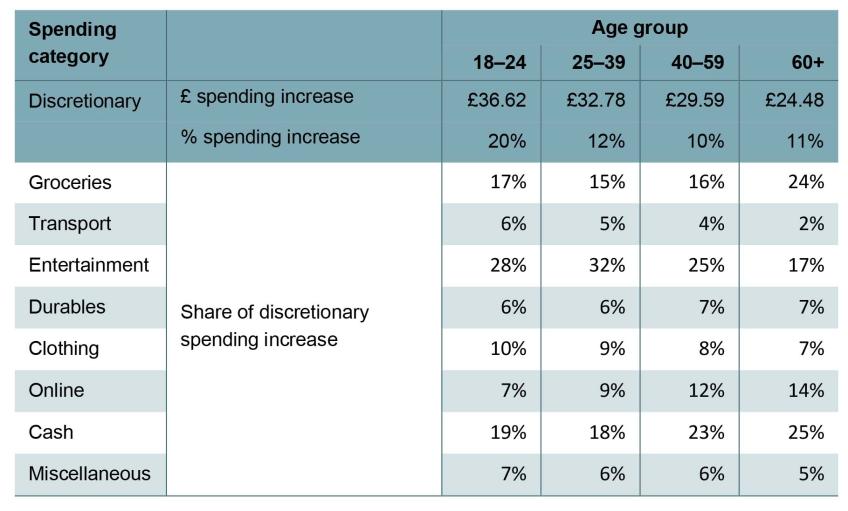
We start by looking at responses for individuals of different ages, which are shown in Table 3.2. We see that young people tended to increase their discretionary spending by more in the first four weeks after the payment: on average, 18- to 24-year-olds increased their spending by £37 a week (20%), compared with £25 (11%) for those aged 60 and over. The initial increase in spending, in both cash and percentage terms, declines with age, which could indicate greater cash constraints among younger low-income individuals. However, the table also shows that younger people spent a higher share of the initial increase in spending on entertainment (the increase was also larger in cash terms). This is likely to reflect differences in preferences across age groups.
Table 3.2. Responses to cost of living payment, by age group
Note: Compares the first four weeks after the cost of living payment with the final four weeks before. Share of recipients in each group: 18–24, 14%; 25–39, 60%; 40–59, 24%; 60+, 2%.
Source: Authors’ calculations using the Exact.One Transactional Dataset.
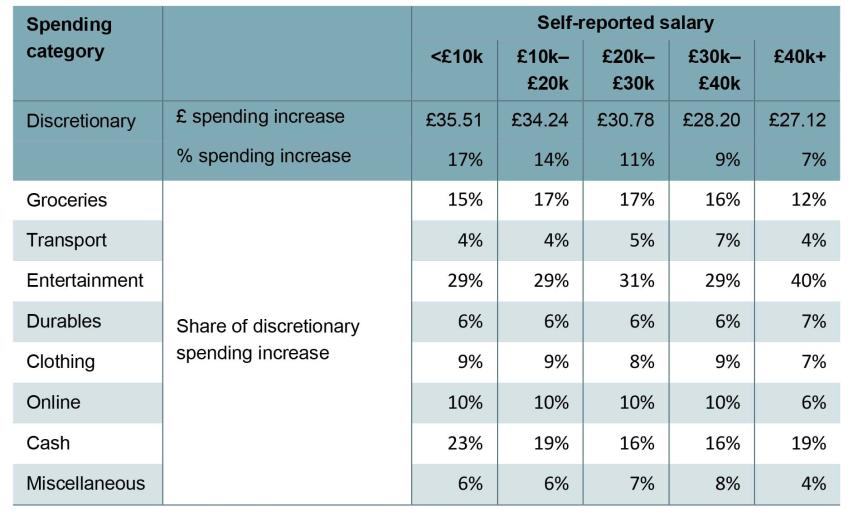
Table 3.3 shows how changes in spending differed by individuals’ self-reported salary (which ClearScore users give when they sign up to the app). The increase in spending immediately after the cost of living payment was larger for low-paid individuals – £36 a week on average for those paid below £10,000 a year, compared with £28 a week for those paid over £30,000 – likely reflecting higher cash constraints for low earners prior to the payment coming through. The composition of the increase in discretionary spending across categories is similar across salary groups.
Table 3.3. Responses to cost of living payment, by self-reported salary
Note: Compares the first four weeks after the cost of living payment with the final four weeks before. Share of recipients in each group: <£10k, 15%; £10k–£20k, 34%; £20k–£30k, 33%; £30k–£40k, 12%; £40k+, 6%.
Source: Authors’ calculations using the Exact.One Transactional Dataset.
3.4 Conclusion
In this chapter, we have focused on changes in household poverty since the beginning of the pandemic. Absolute poverty in the UK population fell from 17.9% to 17.1% between 2019–20 and 2021–22, mainly as a result of a fall in child poverty. This is in stark contrast to the Great Recession, when absolute poverty increased. The fact that this did not happen during the pandemic reflects the extraordinary policy response, which shielded the incomes of the poorest households.
We use microsimulation methods to estimate the effects of the two key benefit reforms: the £20 per week uplift to universal credit entitlements, and the changes to the universal credit work allowances and taper rate. We find that the £20 uplift reduced absolute poverty rates by 0.3 percentage points in 2021–22, or by 0.6 percentage points in annualised terms (had it been in place for the entire year, rather than just the first six months). The changes to work allowances and the taper rate after the withdrawal of the £20 uplift in late 2021 also helped to reduce poverty, but by far less – the annualised effect is only 0.2 percentage points, a third of the effect of the uplift. This is because the taper rate changes mostly benefited low-income households with higher earnings, who tend to be above the poverty line, and because it was a smaller increase in benefit spending.
Since 2022, benefit values have not kept up with inflation. Rather than changing the way in which benefits are uprated or returning to something like the £20 uplift, the government brought in a series of cost of living payments in 2022 and 2023. Using bank transaction data, we show that spending responded strongly to the first cost of living payment immediately after its receipt in July 2022, suggesting that many households were credit-constrained. Spending increased on a range of services, from more basic ones such as groceries to more discretionary ones such as entertainment. This suggests a range of levels of need among recipient households – perhaps not entirely surprising, given that the payments were of equal size for all households on universal credit, regardless of their other circumstances. That we see a temporary spike then fall in spending on immediately consumed goods and services such as entertainment may point to recipients having difficulties in budgeting. In either case, such an effect highlights the downsides of using one-off lump sums rather than simply raising basic benefit amounts as the UC uplift and taper rate reforms did. Another point, which we have not studied here, is how these different approaches to support affect work incentives. Households can become eligible for the Cost of Living Payments by reducing their income in a single qualifying month. Cribb et al. (2023) find that more than 800,000 people could become better off by reducing their income to qualify for one of the 2023–24 lump-sum payments. In addition, even if people do not respond in this way, occasional one-off grants dependent upon UC receipt in certain months introduce an arbitrary unfairness – those who happen to claim UC in the ‘right’ month get the payment, whereas those who become eligible for UC just too ‘late’ do not get it. Such horizontal inequity would not arise if basic UC rates were simply increased.
The outlook for poverty as it stands is complicated. The £20 uplift has now been withdrawn, and the changes to work allowances and the taper rate that succeeded it have a smaller effect on poverty reduction. Inflation remains high and continues to outpace earnings. Local housing allowances, which were raised during the pandemic, are once again frozen in cash terms even as private rents continue to rise (as discussed in the pre-released chapter on housing – Waters and Wernham (2023)), and mortgage payments are sharply increasing. On the other hand, the cost of living payments are sizeable, and will go at least some way to offset these effects, albeit with some of the downsides discussed above.
Of course, those payments are temporary, with three planned in 2023–24 but no more after that. Beyond 2023, the latest forecasts from the Bank of England are for real earnings to rise modestly, reducing absolute poverty. However, housing costs are likely to continue to increase as mortgagors come to the end of their fixed terms and renters the end of their contracts. Without any offsetting benefit support planned, these trends are likely to continue to put upward pressure on poverty rates.
Appendix 3A
Figure 3A.1. Universal credit receipt in Exact.One versus administrative data
Note: Numbers on the horizontal axis show the bottom of £100 bins.
Source: Authors’ calculations using the Exact.One Transactional Dataset and Stat-Xplore.
Figure 3A.2. Number of payments of £326 by week of the year
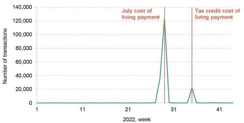
Note: Counts payments into bank accounts only. The second, smaller spike is the week in which recipients of tax credits were given a cost of living payment. We consider only the first payment in our analysis.
Source: Authors’ calculations using the Exact.One Transactional Dataset.
Table 3A.1. Fine spending categories
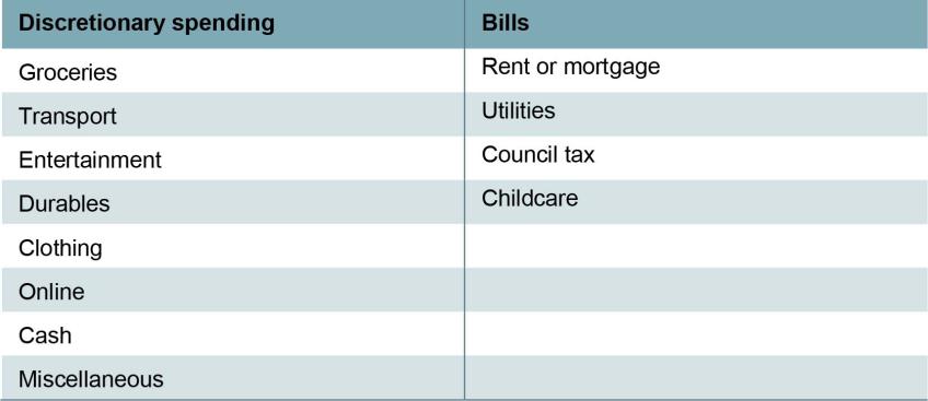
Note: These categories are based on the automatic categorisation in the Exact.One Transactional Dataset, determined by the recipient of the spending.
Table 3A.2. Types of spending in each category
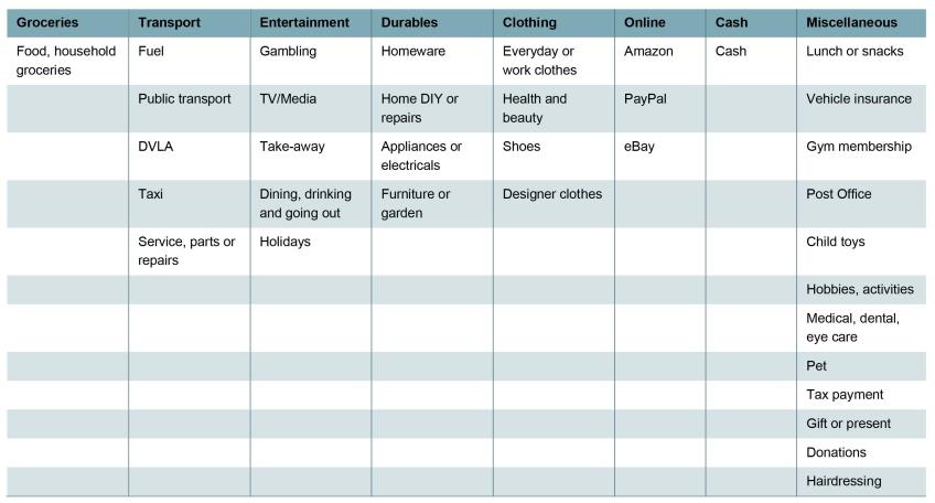
Note: Includes spending types that account for at least 3% of total spending in a category among Exact.One users.
Source: Authors’ calculations using Exact.One Transactional Dataset.
Table 3A.3. Responses to cost of living payment, by UC receipt
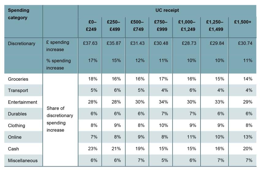
Note: Based on last observed UC payment before the cost of living payment. Compares the first four weeks after the cost of living payment with the final four weeks before. Share of recipients in each group: £0–£249, 13%; £250–£499, 17%; £500–£749, 16%; £750–£999, 13%; £1,000–£1,249, 10%; £1,250–£1,499, 7%; £1,500+: 24%.
Source: Authors’ calculations using the Exact.One Transactional Dataset.
Table 3A.4. Comparison of spending patterns among benefit-receiving households, Exact.One and LCFS
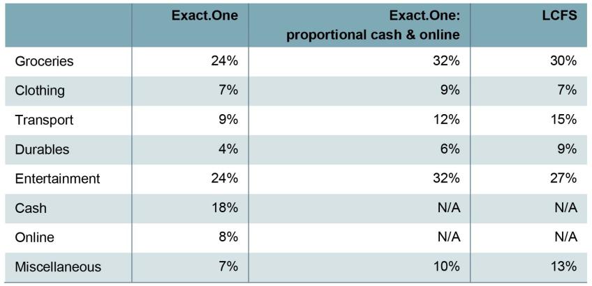
Note: In the Exact.One columns, the sample is those who received the Cost of Living Payment. In the LCFS column, the sample is households entitled to universal credit. For the Exact.One columns, categorisation is based on the automatic categorisation in the Exact.One Transactional Dataset, determined by the recipient of the spending. The “proportional cash & online” column shows what spending patterns would be if cash and online spending was spread across the other categories in proportional to their prevalence.
Source: Authors’ calculations using the Exact.One Transactional Dataset and the Living Costs and Food Survey, 2019–20.
Data
Department for Work and Pensions, NatCen Social Research. (2021). Family Resources Survey. [data series]. 4th Release. UK Data Service. SN: 200017, DOI: http://doi.org/10.5255/UKDA-Series-200017
Office for National Statistics. (2019). Living Costs and Food Survey. [data series]. 3rd Release. UK Data Service. SN: 2000028, DOI: http://doi.org/10.5255/UKDA-Series-2000028
Footnotes
[1] Those who were affected by the benefit cap could see an increase of less than £20 in UC receipt, or no increase at all.
[2] Claimants of working tax credit received an equivalent increase in entitlements; for brevity, we simply refer to UC here.
[3] For example, to model the annualised impact of the £20 uplift, we adjust the incomes of households sampled between October 2021 and March 2022 to remove the effect of the taper rate reduction, and add £20 a week to universal credit entitlements over this period. This is compared with a baseline where neither policy was in place, where we remove the effect of both the £20 uplift in the April–September 2021 data and the taper rate reduction in the December 2021–March 2022 data.
[4] Innes (2020) finds that the uplift was responsible for keeping 500,000 people out of poverty.
[5] We report the long-run cost of the changes to the UC taper rate and work allowances, in 2026–27, when UC will have been fully rolled out. £6 billion is the cost of making the £20 uplift permanent (Waters and Wernham, 2021).
[6] That is: the annualised impact of the taper rate reduction on reducing poverty (0.20ppts) is 0.16ppts below the 2021–22 impact of the two policies together (0.29 + 0.07 = 0.36ppts).
[7] One important difference between the datasets relates to the categorisation of certain sorts of spending. In Exact.One, we do not know what cash withdrawals are spent upon, nor do we know what items have been bought when we see Amazon, PayPal or eBay transactions (which we label ‘online spending’). In the LCFS, the actual item purchased is recorded. In the table, we provide two measures of spending in Exact.One – one split by all spending categories, where we include cash and online as their own categories, and one where we assume that cash and online spending is spent proportionally on the other items.
[8] The second, smaller spike on Figure 3A.2 is the week in which recipients of tax credits were given a cost of living payment. We consider only the first payment to recipients of universal credit in our analysis.
[9] We cannot identify households in the data, so some individuals who live in households that receive the payment may be in the control group.
[10] The increase in the week of the payment alone – i.e. not the four-week average seen in Figure 3.3 – is £70, or 27%.
[11]Earwaker and Johnson-Hunter (2023) find that the £301 cost of living payment in April–May 2023 was used both to purchase food and to pay off debt.
[12] We exclude credit card repayments due to data limitations. We also exclude repayments relating to ‘buy now pay later’ credit, as changes in these are difficult to interpret.
[13] The distribution of spending across categories is similar to the distribution for universal credit recipients in the Living Costs and Food Survey.
