
With public sector pay growth having fallen considerably on average, relative to private sector pay over the last 15 years, there have been increasing concerns about the ability of the public sector to recruit and retain qualified staff.
Evidence on the characteristics of people entering public sector jobs across generations has been limited, mainly due to data constraints. Recent linkages of government databases now make this analysis possible by combining educational records from schools and universities with tax records on earnings and the UK employee register.
This comment summarises analysis, published in our accompanying IFS Working Paper, that uses these linked data and provides new evidence on the probability of entering work in the public sector, how that probability evolved across education groups, and in which areas of the public sector new entrants are likely to work.
The public sector became a less important employer for individuals with lower levels of education over the 2010s
By 2019, individuals with lower levels of education were less likely to begin their careers in the public sector than in the late 2000s. At the same time, the public sector had become a more important employer for the most-educated graduates entering the labour market. This holds across a range of education measures: highest qualification, university rank and degree grade.
Figure 1 shows that, between 2008 and 2019, among those whose highest academic qualification was GCSEs the share entering the public sector halved from 8% to 4%. The share of labour market entrants in a public sector job also fell by around a quarter for those whose highest qualification was A levels. Meanwhile, the share of university graduates entering the public sector initially declined but then recovered.
Figure 1. Share of individuals entering the public sector in their first job after leaving education by highest qualification and year of entry into work
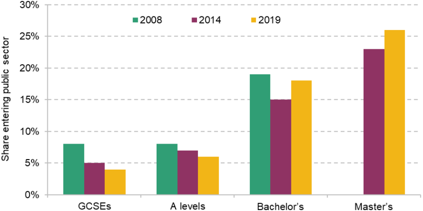
Note: This bar chart shows the public sector share in the first year of work in 2008, 2014 and 2019 for four groups: individuals entering work directly after GCSEs, after A levels, after completing an undergraduate degree and after completing a taught MSc degree. Master’s degrees cannot be traced back as far, as they enter work later.
Source: Authors’ calculations using the Longitudinal Education Outcomes dataset – second iteration.
A closer look at undergraduates shows that there are also differences between lower- and higher-ranked graduates, and between graduates with a first-class degree and those with a lower final degree grade.
Figure 2 shows how the share of labour market entrants joining the public sector varies by university rank, where rank is defined by the average GCSE score of graduates. Entrants from lower-ranked universities are more likely to start out in the public sector than those from higher-ranked institutions. Yet over the 2010s, this relationship shifted: in 2019, fewer graduates from lower-ranked universities entered the public sector than in 2008, whereas the public sector became a more common employer for those from higher-ranked universities.
Figure 2. Share of undergraduates entering the public sector in 2008 and 2019, by university percentile
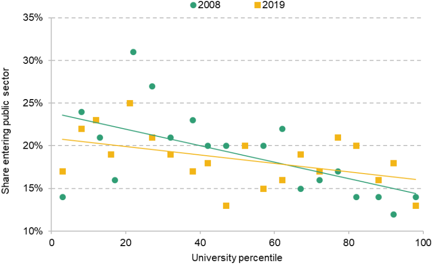
Note: This chart shows the mean public sector share at entry into work (y-axis) by university percentile rank (x-axis) in 2008 (green circles) and 2019 (yellow squares). Universities are ranked by average GCSE scores of prior graduates. Each symbol captures a mean over equal-sized number of universities, weighted by student numbers. Values are rounded.
Source: Figure 3 of von Bismarck-Osten and Nibloe (2025).
The final degree grade is another measure of education. Though it is only loosely related to the university ranking, it shows a similar trend. Figure 3 shows that the proportion of graduates who began their careers in the public sector rose for those with first-class degrees, from 17% in 2009 to 20% in 2019 (with all of the increase occurring in the late 2010s). By contrast, entry into the public sector fell for graduates with upper or lower second-class degrees.
Figure 3. Share of undergraduates entering the public sector by final degree grade
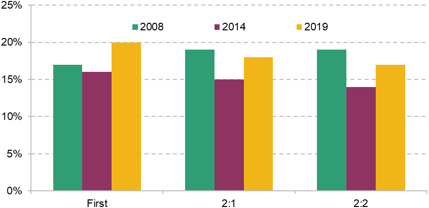
Note: This bar chart shows the public sector share (y-axis) upon labour market entry, for three cohorts of young adults entering the labour market: 2008, 2014 and 2019. Values are rounded.
Source: Authors’ computation, on the basis of figure 5 of von Bismarck-Osten and Nibloe (2025).
In sum, the public sector has become a less common first employment destination for those with lowest levels of education – whether defined by highest qualification, university ranking or final degree grade. At the same time, it has remained a frequent first workplace for the most educated.
Our analysis shows that the decline among lower-educated young adults entering the public sector in the first half of the 2010s is largely due to falling entry into local government. In contrast, we find that there was no decline in public sector entry for those graduates with degrees in either medicine or education. This suggests that public spending cuts during the 2010s – which hit local governments harder in comparison to health and education budgets – could partly explain the observed trends.
What is the link between trends in public sector employment and differences in pay between the public and private sectors?
Pay is an important factor in why people apply for and choose jobs. Given the shifts in public sector entry documented above and the growing gap between average pay in the public and private sectors in England, it is worth asking to what extent the two trends are linked.
Although our study does not provide causal estimates, it does suggest differences in the strength of this relationship across groups. Figure 4 shows the trend in the share of graduates entering the public sector in their first year of work, alongside the evolution of the average public–private pay ‘premium’. A premium of 5% indicates that, in the first year of work, the respective group of graduates earned on average 5% more in the public sector than in the private sector.
Figure 4. Public sector entry premium (percentage difference between public and private sector pay in the year of entry into work, for each group of graduates) and share entering the public sector across entry cohorts
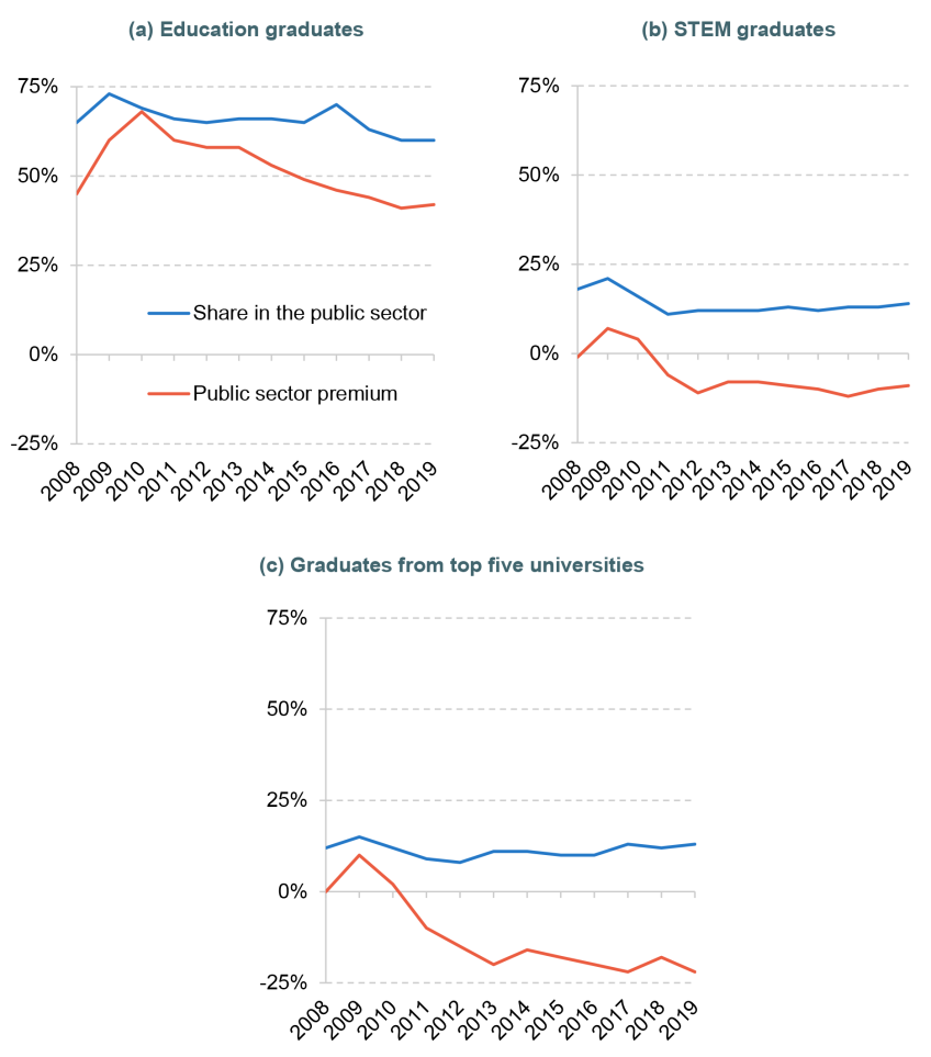
Note: These line plots show the evolution of the public sector share at entry into work and the public sector pay premium (y-axis) from 2008 to 2019 (x-axis). The public sector premium is defined as the percentage difference between average public and private sector pay in the respective year of entry into work and for the respective group. Values are rounded.
Source: Figures 10 and 11 from von Bismarck-Osten and Nibloe (2025).
For graduates with science, engineering, technology and mathematics (STEM) degrees, who often have attractive private sector opportunities, the public sector share appears to move along the entry premium, suggesting that they are likely to be responsive to changes in pay. By contrast, for graduates in fields where the public sector is the dominant employer, such as education and medicine, the relationship between the two lines is weaker; many still enter the public sector even when private sector average pay rises. More surprisingly, graduates from the top five universities show stable entry into the public sector, despite rising private sector pay relative to the public sector.
Summary
Our research shows a decline in the importance of the public sector as an employer for individuals with lower levels of education entering the workforce between 2008 and 2019. During this period, the public sector remained a frequent first destination for many of the highest-educated young adults. This may reflect both rising educational requirements in the public sector and changes in funding for different parts of the public sector.
Authors

Clara von Bismarck-Osten
Clara joined the IFS in 2021 on a scholarship to complete her MRes in Economics at UCL. Her research interests lie in labour and public economics.

Matthew Nibloe
Matthew joined IFS in 2020 as a Research Scholar and between 2024 and 2025 he was a full-time Enrichment Student.
More from IFS
Understand this issue


Policy analysis


Academic research


