
Downloads
Download report PDF
PDF | 891.65 KB
Key findings1
- Income-based measures of living standards do not typically take housing costs into account. However, there are good reasons to deduct housing costs from disposable incomes when measuring poverty and inequality in the lower part of the income distribution. These include the fact that, in the U¬¬K, housing costs of poorer people are often covered by housing benefit, meaning that if housing costs rise then so do benefit incomes. And the living standards of people who own their home outright are underestimated compared with the rest of society if the fact they pay neither rent nor a mortgage is not accounted for. In support of these arguments, disposable incomes measured after deducting housing costs (AHC) are more correlated with non-income-based measures of low living standards – such as material deprivation and food insecurity – than incomes measured before deducting housing costs (BHC).
- Poorer households spend more of their income on housing than do richer households, and this difference has increased over time. In 1968, housing costs constituted 9% of average disposable incomes for households in the poorest quarter of the population; this rose to 26% in 2015 before falling to 21% in 2021. Even after accounting for housing benefit, the poorest households spent 19% of their income on housing in 2016, the latest year for which these data accounting for housing benefit are available. In contrast, for the richest quarter of the population, housing costs constituted just 4% of average income in 1968 and 6% in 2021.
- Housing costs have therefore become increasingly important to the calculation of relative poverty rates. In 2021, the poverty rate was 17% using incomes measured before deducting housing costs, but 22% using incomes measured after deducting housing costs. BHC measures imply a fall in poverty of 1.4 percentage points between 2008 and 2021. In contrast, when measured AHC, poverty fell by just 0.5 percentage points over this period.
- Some of the substantial changes in housing costs over the last few decades result from factors beyond households’ control, rather than from changes in housing quality valued by households. For example, increases in social rents from the mid 1990s to the mid 2010s – as well as the fall between 2015 and 2019 – were the direct result of government policies. Without measuring incomes accounting for housing costs, these rises in social rents would actually appear as an increase in incomes for lower-income households, since increased housing benefit partially paid for them. Previous research has found the rise in private rents from the early 2000s to the mid 2010s also reflected increases in the price of housing rather than improvements in quality. Increases in rents over long periods mainly affected poorer households, who are much more likely to rent: in 2021, 30% of households in the poorest quartile were social renters and 19% were private renters, compared with 3% and 14% respectively in the richest quartile.
- On the other hand, owner-occupiers saw big falls in housing costs as a result of the fall in interest rates since the financial crisis. As a share of income, housing costs for mortgagors fell from 15% in 2008 to 7% in 2021. This mostly benefited households in the richest quarter of the population, of whom 52% owned their home with a mortgage in 2021, compared with 18% in the poorest quarter.
- There is an especially strong case to examine incomes after deducting housing costs when comparing deprivation across different age groups, because of the huge differences in housing tenure seen across these groups, reflecting differential (housing) wealth accumulation for people at different stages of their lives. For example, adults aged 65 and above will tend to face much lower housing costs on average, not because they live in lower-quality homes, but because over three-quarters of them own their homes without a mortgage. Whilst adults aged 65 and over have a poverty rate of 20% when using incomes measured before deducting housing costs – 3 percentage points above the national average – when using incomes measured after deducting housing costs their poverty rate is only 18%, or 3 percentage points below the average.
Introduction
Income-based measures of living standards do not typically take housing costs into account. For example, the OECD’s statistics on income inequality and relative poverty across countries are based on measures of disposable incomes – incomes from earnings, benefits, investments and other sources, net of tax – that do not first deduct housing costs, and similarly with the ‘Canberra Group’ definitions (United Nations, 2011). In this report, we set out the case that there are good reasons, both conceptually and empirically, to consider deducting housing costs from disposable incomes in the measurement of material living standards, particularly when it comes to inequality in lower parts of the income distribution.
Focusing on the UK, we show that housing costs have increased considerably for lower-income households compared with higher-income households in recent decades, leading to a divergence in poverty and inequality measures based on incomes before and after deducting housing costs (BHC and AHC respectively). These trends can be partly explained by changes in housing tenure and by differences in the evolution of housing costs between the tenures, often driven by institutional factors beyond households’ control. Finally, we illustrate how the choice of AHC or BHC income measures has substantial implications for our conception of who is living on a low income, using inequalities by age as a key example. Regional patterns of low income also differ depending on the measure used, though more caution needs to be exercised when interpreting regional incomes after deducting housing costs.
Throughout, we use definitions of income and housing costs consistent with the UK’s Department for Work and Pensions’ national statistics on household incomes (known as the Households Below Average Income statistics). Incomes include earnings, benefits, investment income and income from other sources, net of direct personal taxation. Housing costs measured in UK poverty statistics include rental payments, mortgage interest payments (but not mortgage principal payments) and, where applicable, a few much smaller costs such as service charges and buildings insurance. Mortgage principal payments are excluded because these are akin to saving, allowing households to build up wealth which they can potentially spend later by downsizing or by taking equity release products, or pass on to children as an inheritance. All figures are for the whole UK since 2002–03 but exclude Northern Ireland from 1968 to 2001–02.
Why deduct housing costs?
It is most common to measure disposable incomes as the sum of all income from different sources (labour income, pensions, investment income, state benefits) net of direct taxes including social security contributions (see, for example, the Canberra Group definitions (United Nations, 2011) and the Luxembourg Income Study (2019)). These measures do not include, or take account of, differences in housing costs (or indeed other forms of costs) facing households. In this section, we make the case that when measuring inequality at the lower end of the distribution, it can be important to measure household income after housing costs have been deducted (AHC) rather than before deducting housing costs (BHC).
It is first worth considering why household incomes are not usually considered after deducting housing costs. Different households will choose different bundles of goods and services to consume. Some households will choose to spend more of their income on housing so they can live in properties that are larger, or in a more modern condition, or in a more desirable location (due to proximity to workplaces, transport, schools or other highly valued amenities). Others will choose to spend their income in other ways. If the only reason some households have higher housing costs is that they have chosen to live in more valuable and desirable properties, then it would make little sense to suggest that they have lower living standards as a result.
However, the costs of housing we observe in the data vary for many reasons that are not related to households’ different choices to consume housing of different quality. One reason is that many households, particularly older households, do not pay for their housing out of their current income. Instead, they have paid off a mortgage and therefore do not face direct monetary costs (other than taxes and potentially upkeep to prevent depreciation) for living in a property they own outright. Comparing the welfare of two otherwise equivalent people with the same disposable income, but one who rents a home and their neighbour who owns an equivalent home outright, the latter will likely have higher material living standards, but that is not captured by disposable income.
Most commonly in the UK and elsewhere, people are in an intermediate case of owning their home with a mortgage, in which case we observe them incurring some regular costs through payment of mortgage interest. Since 2008 at least, this cost is generally lower than the private rental value of their home (Cribb, 2019). These costs can vary considerably for reasons unrelated to housing quality – for example, people with mortgages have benefited enormously from the fall in mortgage interest rates after 2008, effectively seeing their incomes increase, but in a way not observed by simply measuring disposable income. Since ownership with a mortgage is more common in the middle and top of the income distribution than the bottom, this has implications for examining how the living standards of the poorest compare with those of the rest over time.
In other words, current income, and the true cost of housing, are mismeasured for homeowners, as they do not include the (imputed) rent that owner-occupiers pay to themselves. One way of dealing with this is of course to add imputed rent to the incomes of homeowners, and many studies have examined the impact on inequality statistics of including the rental income of owner-occupiers (e.g. Frick et al., 2010). But such exercises are demanding, requiring either rental valuations of owner-occupied properties or the statistical imputation of rents, and as such official income statistics rarely include this income source.
An alternative is to deduct observed housing costs for those people who do face direct monetary costs of housing (rental or mortgage interest payments). When comparing people who live in similarly valued housing, but who face different observed costs, deducting housing costs allows us to rank people in the same way as a comprehensive measure of income that included imputed rent. This is particularly important when comparing the incomes of people who are owner-occupiers and renters – or groups that are disproportionately likely to own (especially outright) and those who are disproportionately unlikely to own property (such as comparing pensioners and working-age people).
There are other reasons, besides dealing with owner-occupation, why deducting housing costs can sometimes be informative when measuring living standards.
In many countries, government provides rental accommodation at lower than market rents, often targeted at those on lower incomes. In the UK, tenants of social housing, owned by local government or arm’s-length ‘housing associations’, have rents that bear little relation to housing quality. These rents are set below market rates and have responded not to private rental market conditions but instead to purely political or policy decisions that have been made to either increase social rents (particularly 1997–2010) or cut them (2015–19) – see Wilson (2022a and 2022b). Social renters also have relatively little flexibility to change their housing. They effectively receive a housing subsidy, which is not measured as part of disposable income.2
In some countries, cash subsidies to low-income private renters are also made available. The UK has a system of means-tested housing benefit, a subsidy that can be paid to low-income social or private renters. When simply examining disposable income, different forms of housing subsidy are treated inconsistently – subsidies delivered through sub-market rents are not measured, whereas cash subsidies are. Examining income after deducting housing costs accounts for this issue. A related problem in the UK is that if increases in private or social rents due to factors outside the household’s control lead to higher benefit payments, this makes these households look better off when in fact they are receiving more income from the central government, to then pay back in rent. For example, from 1997 to 2010, there was an over 40% real-terms increase in housing benefit spending as rents rose. This reduced the number in poverty (using income measured BHC) by 11%, even though the living standards of those on low incomes did not improve on average. In contrast, income measured AHC would reflect the fact that increases in rents matched by housing benefit increases come with no change in households’ material circumstances.
Policy decisions can also affect households’ housing tenures and the costs associated with different housing tenures. In the UK, the ‘Right to Buy’ scheme introduced in 1980 led to a large reduction in the stock of social housing, and an increase in homeownership (Wilson, 1999). Rent regulations in the private rental sector were reduced over the 1960s and 1970s, and then eventually scrapped for new lets in 1989 (Wilson, 2022a and 2022b); this was followed by an expansion of private rental supply. More recently, low interest rates after the financial crisis reduced housing costs for homeowners with a mortgage.
Appendix B considers these issues, and other reasons why income after deducting housing costs can sometimes provide a better measure of welfare, in the context of a utility maximisation framework.
There are a couple of reasons why these factors make it especially important to consider housing costs when examining the living standards of those on lower incomes. One is that issues around social housing and rental subsidies are especially relevant for lower-income households. The other is that, as we will see later, households on lower incomes spend a much larger proportion of their incomes on housing costs on average. So in so far as these costs are unrelated to housing quality, all the above factors mean we risk substantially mis-ranking lower-income households in terms of their welfare if we focus purely on disposable income.
Empirical evidence
In support of the theoretical considerations above, we show how incomes measured after deducting housing costs (AHC) are better correlated with measures of living standards that are not based on incomes, especially at the bottom of the distribution. These non-income-based measures align better with other indicators of low living standards, such as low subjective well-being (Main and Bradshaw, 2012).
The first measure we use is the material deprivation rate, as calculated in the UK Department for Work and Pensions’ HBAI publication. The measure gives the share of households that are deprived of a number of essential goods (such as heating the home or fresh fruit and vegetables) because they cannot afford them.3 Figure 1 shows the percentage materially deprived for each ventile (20th) of the income distributions measured BHC and AHC, using data pooled from 2010 to 2019. It shows a stronger relationship between income measured AHC and deprivation than between income measured BHC and deprivation – deprivation rates are 5 percentage points higher for the poorest ventile and 7 percentage points higher for the second-poorest ventile on an AHC than a BHC basis, whilst for the fifth ventile and upwards deprivation rates are lower on an AHC than on a BHC basis. (On both measures, deprivation is lower for the second-poorest than for the poorest. This is largely due to some more affluent people appearing to have very low incomes, in part because of measurement error of incomes, as set out in Brewer, Etheridge and O’Dea (2017).)
Figure 1. Percentage materially deprived, by household income ventile (20th), 2010–11 to 2019–20
Note: Incomes are equivalised using the modified OECD equivalence scale (BHC and AHC versions respectively). The rate of material deprivation refers to the share of individuals who are either in working-age, pensioner or child material deprivation.
Source: Family Resources Survey, 2010–19.
The second measure we use is food insecurity. This measures the share of individuals in households substantially reducing the quality, variety, desirability or quantity of their food because of limited resources. This is an indicator of significant financial distress. It might be driven by low income, as well as other factors such as income volatility, difficulties with financial planning, or the higher costs some households might face in travelling to purchase foods (Xu and Ziliak, 2021). Figure 2 repeats the above analysis on the food security measure. As with material deprivation, it shows that having a low AHC income is more predictive of facing food security than having a low BHC income.
Figure 2. Percentage living in food insecurity, by household income ventile (20th), 2019–20 to 2021–22
Note: Incomes are equivalised using the modified OECD equivalence scale (BHC and AHC versions respectively). Food insecurity is defined as having a food security score of between 3 and 10, as classified in the Family Resources Survey.
Source: Family Resources Survey, 2019–21.
This evidence suggests that, at least when trying to identify the poorest households, there are good reasons to deduct housing costs from income. Having a lower AHC income is a stronger indicator that families and households are facing significant financial distress, lacking the resources needed to afford essential items including food.
Housing costs across the income distribution
We now document how housing costs have changed over time, on average and across the income distribution, and show what this means for the measurement of income poverty and inequality, in particular when examining the living standards of those at the lower end of the income distribution.
To start with, we examine median housing costs in Figure 3. The graph shows that average housing costs increased very substantially in real terms from the 1960s to the 2008 recession, and that they were growing faster than average incomes until the mid 1990s. Of course, there are many reasons why housing costs have increased. In particular, there are very likely to have been considerable quality improvements in housing over such a long period. As a small example, calculations from the Living Costs and Food Survey, and its predecessor surveys, show that the fraction of households with central heating installed rose from 30% in 1970 to around 95% by the mid 2000s, reflecting the choices of households to invest in property improvements. Importantly, therefore, Figure 3 does not show whether the price of housing of a particular size or quality has increased.
Figure 3. Median annual housing costs (2019–20 prices), and as a share of median income before deducting housing costs
Note: Incomes and housing costs are deflated by a variant of the Consumer Prices Index that excludes rent. All figures are for the whole UK since 2002–03 but exclude Northern Ireland prior to that. Since 1994, data are for the financial year beginning in each year.
Source: Family Expenditure Survey, 1968–93; Family Resources Survey, 1994–2021.
But what Figure 3 does show is that understanding housing costs is an issue of first-order importance, to a greater extent than it has been in recent history, and especially in light of the fact that there are many determinants of costs (as measured here) unrelated to housing quality and households’ choices. For example, since 2008, housing costs have fallen by almost a third, from 14% to 9% of median income (measured BHC), even as housing quality has continued to undergo significant improvements on some measures (Department for Levelling Up, Housing & Communities, 2022). With most people living in owner-occupied homes, this is largely driven by low interest rates since the Great Recession. Our data go up to early 2022 and so do not cover some of the large recent increases in mortgage payments for those taking out new mortgages, or rents for those starting new tenancies, which would be expected to result in rising average housing costs over time.
To examine how housing costs shape income inequality and poverty, it is important to examine how housing costs differ across the income distribution. Figure 4 shows the percentage of income spent on housing for the four quartiles of the income distribution. From the early 1990s until the pandemic, the poorest quarter of the income distribution spent about a quarter of their income on housing. By contrast, the richest quarter spent only 7% of their income on housing costs in 2019. Later, we will see that higher rates of renting amongst the poorest quarter of the income distribution meant poorer households benefited less from decreases in interest rates than richer households.
Figure 4. Percentage of income spent on housing costs, by BHC income quartile
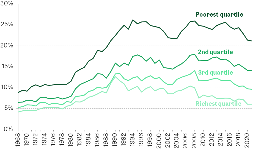
Note: The graph plots mean housing costs as a percentage of mean income. Incomes are equivalised using the modified OECD equivalence scale for BHC incomes for the definition of income quartiles only. All figures are for the whole UK since 2002–03 but exclude Northern Ireland prior to that. Since 1994, data are for the financial year beginning in each year.
Source: Family Expenditure Survey, 1968–93; Family Resources Survey, 1994–2021.
In the UK, many low-income private and social renting households receive cash subsidies to partially or fully cover their rent in the form of housing benefit, or housing support through universal credit. Data constraints limit our ability to observe changes before the mid 1990s or after 2016,4 but as Figure 5 shows, even if we exclude housing benefit from income, and only consider rental costs not covered by housing benefit, lower-income households still spend a considerably higher proportion of their income on housing (though the differences across the distribution are smaller). Further, lower-income households have not seen the decline in housing costs since the Great Recession experienced by richer households; in fact, cuts to working-age benefits acted to push up housing costs net of benefits after 2010.
Figure 5. Percentage of income spent on housing costs (net of housing benefit), by BHC income quartile
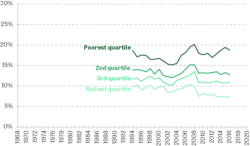
Note: The graph plots mean housing costs (net of housing benefit) as a percentage of mean income (with housing benefit deducted). Incomes are equivalised using the modified OECD equivalence scale for BHC incomes for the definition of income quartiles only. All figures are for the whole UK since 2002–03 but exclude Northern Ireland prior to that. Data are for the financial year beginning in each year.
Source: Family Resources Survey, 1994–2016.
Having shown the evolution of housing costs across the income distribution, we now examine the impact of including housing costs on income poverty and income inequality (in the lower half of the income distribution) statistics. Figure 6 shows two such measures: the 50:10 ratio – the ratio of the median income to the 10th percentile of incomes – and the relative poverty rate, which gives the share of people with household incomes below 60% of the median. These measures are plotted for incomes both before and after deducting housing costs. The graphs show that leading up to the pandemic, relative poverty was 4–5 percentage points higher based on incomes with housing costs deducted, while the 50:10 ratio was 2.5 with housing costs deducted, rather than 2.1. The significant increase in housing costs for poorer people relative to the middle experienced over recent decades means the deduction of housing costs for both these measures makes more of a difference than it used to. And though it is possible that some of this increase in housing costs was due to quality improvements, the fact that low income after housing costs better predicts low living standards on other measures suggests it has become more important to consider these AHC measures.
Figure 6. 50:10 ratio and relative poverty rate for incomes before (dashed lines) and after (solid lines) deducting housing costs
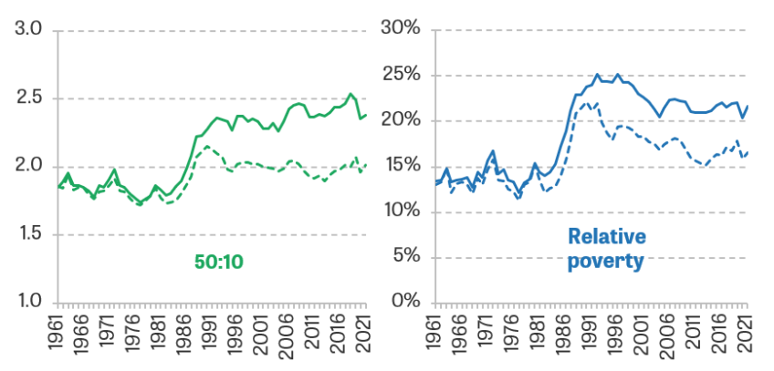
Note: Incomes and housing costs are equivalised using the modified OECD equivalence scale for BHC and AHC incomes. The relative poverty rate gives the percentage with household incomes below 60% of the national median. All figures are for the whole UK since 2002–03 but exclude Northern Ireland prior to that. Since 1994, data are for the financial year beginning in each year.
Source: Family Expenditure Survey, 1961–93; Family Resources Survey, 1994–2021.
Having demonstrated how housing costs have grown in importance when understanding living standards, to different extents for richer and poorer households, we now dig deeper into the drivers and consequences of these trends. First, we consider how changing patterns of housing tenure, and differences in the trends in housing costs between these tenures, can help explain the divergence in housing costs between low- and high-income households. We then move beyond headline measures of inequality, to show how the treatment of housing costs has significant implications for our understanding of who is rich and who is poor.
The role of changing housing tenure
In the UK, there is a variety of housing tenures, and the relative sizes of each have changed over time (see Figure 7). By the end of the 1970s, 56% of people lived in owner-occupied homes, which were on the rise, and one-third were social renters, whilst private renting only accounted for around 8%. Over the course of the 1980s and early 1990s, there was a significant shrinking of the social rented sector, whilst owner-occupation rates increased to fill the gap (reaching almost 70% in the 1990s) and private renting remained a very small tenure. Since the 1990s, the rise in homeownership has stalled and partially reversed, whilst social renting has stabilised, with the private rental sector growing considerably. Now, just short of two in three people live in owner-occupied homes (of whom a little over half own with a mortgage), whilst around 18% are private renters and around 16% are social renters. Over the whole period, there has been consistent growth in the proportions living in a home owned outright, without a mortgage.
Figure 7. Percentage of individuals living in each housing tenure
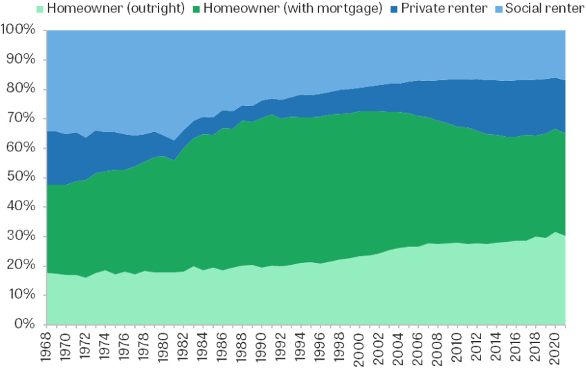
Note: Households in other tenures, such as employer- or government-department-owned accommodation, are excluded. All figures are for the whole UK since 2002–03 but exclude Northern Ireland prior to that. Since 1994, data are for the financial year beginning in each year. Tenure is defined at the household level, so adult children living with owner-occupier parents are classed as owner-occupiers.
Source: Family Expenditure Survey, 1968–93; Family Resources Survey, 1994–2021.
These changes were at least partially driven by government policy. The ‘Right to Buy’ scheme introduced in 1980 led to many homes owned by local authorities being sold to tenants at a significant discount, resulting in a large reduction in the stock of social housing and an increase in homeownership (Wilson, 1999). Over the 1980s, tenant protections and rent controls in the private rental sector were reduced then scrapped (Wilson, 2022a), and this was followed by an expansion of private rental supply.
As Figure 8 shows, the shares of different tenures, and how these have changed over time, differ across the income distribution. Whilst homeownership is common across the income distribution, it is more common amongst higher-income households. The growth in homeownership in the 1970s and 1980s was concentrated among richer households – from 1979 to 1990, rates of homeownership increased from 36% to 42% among the poorest quarter of households, and from 72% to 90% among the richest quarter. Social renting by comparison has declined across the income distribution, and since the mid 1990s very few people in the richest quarter have been social renters, compared with around a fifth before Right to Buy, as the sector has become much more targeted at lower-income households. Private renting has grown in importance in recent years across the income distribution, though rates are slightly higher amongst poorer households, of whom about a fifth are now private renters.
Example heading

Note: Incomes are equivalised using the modified OECD equivalence scale for BHC incomes. Households in other tenures, such as employer- or government-department-owned accommodation, are excluded. All figures are for the whole UK since 2002–03 but exclude Northern Ireland prior to that. Since 1994, data are for the financial year beginning in each year. Tenure is defined at the household level, so adult children living with owner-occupier parents are classed as owner-occupiers.
Source: Family Expenditure Survey, 1968–93; Family Resources Survey, 1994–2021.
The upshot of this is that the housing costs of middle-income and richer households are going to be explained largely by the changing costs for owner-occupiers (driven by mortgage interest rates, and the size of the loans they are taking out), whilst rents, both social and private, are more important in explaining the housing costs of lower-income households.
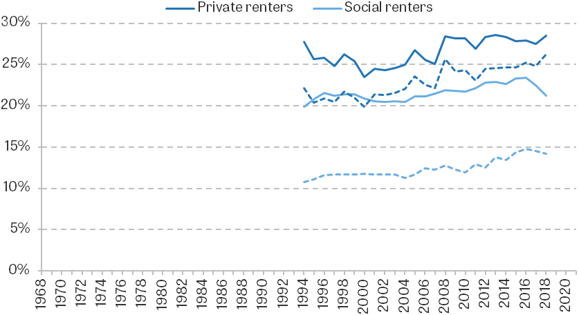
Different housing tenures are associated with very different housing costs on average, and these differences have also opened up over time, as shown in Figure 9. The graph shows housing costs as a share of income5 for private renters, social renters, and owner-occupiers with mortgages. In the late 1970s, households in all three tenures were spending 7–10% of their incomes on housing costs on average. Over the 1980s, this percentage rose for all three tenures by similar amounts. But between the late 1980s and the mid 2000s, owner-occupiers’ costs stabilised as a proportion of their incomes, whilst renters’ costs – in particular private rents – continued to grow as a proportion of income, despite income growth in this period. After the 2008 recession, owner-occupiers’ costs declined as interest rates fell to historically low levels. In contrast, private renters saw little change in housing costs as a share of income, while social renters’ costs as a share of income continued to increase until 2016. Just before the pandemic, private renters were spending 27% of their income on housing on average, whilst social renters were spending 21%. These compare with 8% for owner-occupiers with mortgages. Even after deducting housing benefit, which some renters receive, private renters spend considerably more of their incomes on housing, as shown by Appendix Figure A2.
Figure 9. Percentage of income spent on housing costs, by housing tenure

Note: The graph plots mean housing costs as a percentage of mean income. All figures are for the whole UK since 2002–03 but exclude Northern Ireland prior to that. Since 1994, data are for the financial year beginning in each year.
Source: Family Expenditure Survey, 1968–93; Family Resources Survey, 1994–2021.
These significant differences in trends in housing costs between the tenures are a big part of the reason why housing costs can differ for reasons unrelated to housing quality. For example, changes in social rents reflected government policy decisions rather than changes in the market value of the housing stock (Wilson, 2022b). Social rents rose in real terms between the mid 1990s and the mid 2010s because of a centrally set formula that mandated real increases, and because of a new rent model introduced for some new social tenancies in England from 2011, known as ‘Affordable Rent’, which (despite the name) allows rents to be up to 80% of market levels (Joyce, Mitchell and Norris Keiller, 2017). The government then introduced a policy of reducing social rents for four consecutive years from 2015, before going back to real-terms increases from 2020 (Wilson, 2022b). Rent regulations in the private sector were relaxed over the 1960s and 1970s and eventually scrapped for new lets in 1989 in an attempt to revive the rental market, leading to a rise in private sector rents (Wilson, 2022a and 2022b). Joyce et al. (2017) show that increases in private rents between the early 2000s and the mid 2010s were also mostly explained by the increasing price of housing of a given size and quality, rather than improvements in quality.
Likewise, mortgagors’ decline in housing costs relative to private renters since the 2008 recession was not because renters’ housing quality was increasing more rapidly. On the contrary, owner-occupied housing has seen greater improvements in housing quality than the private rental sector in the last decade (Department for Levelling Up, Housing & Communities, 2022). Instead, the recent cost reductions for owner-occupiers were largely driven by the historically low interest rates seen over this period. These different cost trajectories for the different tenures, which affect different parts of the income distribution to different extents, explain why having a low income after deducting housing costs will in many cases be a better indicator of low living standards than examining incomes before deducting costs.
Different trends in costs between the tenures, and different levels and trends of the different tenures across the distribution, mean the role of tenure in explaining changing housing costs is a complicated one. To summarise the contribution of changing housing tenures and changing costs within each tenure type to the housing costs of households, we perform a decomposition exercise to separate out the effects. For five different time periods, we decompose the average change in costs into ‘incidence’ effects – the contribution of changes in costs from each tenure – and the ‘composition’ effect – the contribution of changes in tenure shares.
The contributions of housing cost changes coming from each tenure s between years t and t+1 are defined as , where is mean housing costs in tenure s at year t, is mean housing costs in the overall population at time t, and is the proportion of the population living in tenure s at year t. In other words, the incidence effects are the weighted change of the housing costs in tenure s as a fraction of mean initial housing costs, where the weight is the average size of the tenure over the period. The composition effect is the change in costs that would have occurred as a result of changing tenure shares if costs had remained constant over time, or , which is the change in costs not explained by the sum of the incidence effects as defined above.
Table 1 presents the results of this decomposition exercise across all households. It shows that the costs of homeowners have generally dominated trends in housing costs overall, given high owner-occupation rates. From 1979 to 1994, the large growth in private and social rents was also a significant driver. Compositional effects have typically played a smaller role in changing housing costs on average, though from 1994 to 2007 the higher proportion of outright owner-occupiers did push down average housing costs to a significant extent. In other periods, small compositional effects on average may mask offsetting effects – for example, from 2007 to 2019, significant increases in rates of private renting would have pushed up costs, but this was largely offset by increases in outright ownership pushing them down. We repeat the decomposition for the poorest quarter only in Appendix Table A1. It shows that, for this group, growing rents have played a bigger role in shaping average housing costs, with rental costs dominating trends from 1979 to 1994.
Table 1. Decomposition of mean annual housing cost changes by tenure (2019–20 prices)
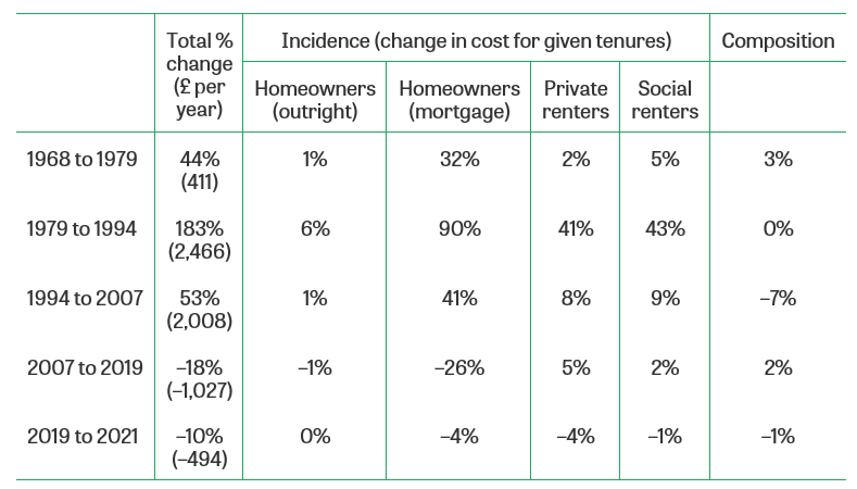
Note: Housing costs are deflated by a variant of the Consumer Prices Index that excludes rent. All figures are for the whole UK since 2002–03 but exclude Northern Ireland prior to that. Since 1994, data are for the financial year beginning in each year.
Source: Family Expenditure Survey, 1968–93; Family Resources Survey, 1994–2021.
Ultimately, the vastly different changes in housing costs between housing tenures explain why lower-income households have seen their housing costs grow more as a share of income. Lower-income households were more exposed to huge increases in rents from 1979 to 2007, and have benefited less from falling interest rates since the 2008 recession. The expansion of owner-occupation over the 1980s did very partially mitigate the substantial rise in rents in that period for lower-income households, but this was a relatively small effect compared with the rise in costs for all three tenures. Of course, over the long time horizons considered here, many of these changes may be due to changes in housing quality, either because of property improvements differing between the tenures or because of compositional change as properties moved tenure type. But, as we have discussed, there are many reasons other than housing quality why trends in costs have differed between the tenures, in a manner which has meant middle- and higher-income households have experienced more of the fall in costs since the 2008 recession.
Housing costs and poverty for different age groups and generations
We have now explored how housing costs have changed across the distribution, and how this is partly explained by the differences in trends between different housing tenures, with consequences for overall inequality and poverty statistics. We now turn to how the inclusion of housing costs affects our conception of who is rich and who is poor. First, we look at how housing costs differ between different age groups and generations, and examine the implications for income inequality and poverty measurement. In the following section, we consider the implications for the measurement of geographical differences in living standards and poverty.
Patterns of housing tenure vary considerably by age group, as shown in Figure 10. All age groups experienced increases in owner-occupation during the 1980s, with households containing working-age adults and children seeing particularly big rises. Today, homeownership rates are much higher for adults in their 40s and over, and a large majority of homeowners aged 65+ own their property outright and therefore have no mortgage. On the other hand, living in social or private rented accommodation is much more common for children and adults under 40. These groups have been particularly affected by the recent decline in homeownership, with private renting filling the gap, though before the pandemic homeownership rates had started to increase again for this age group.
Figure 10. Percentage of individuals living in each housing tenure, by age group
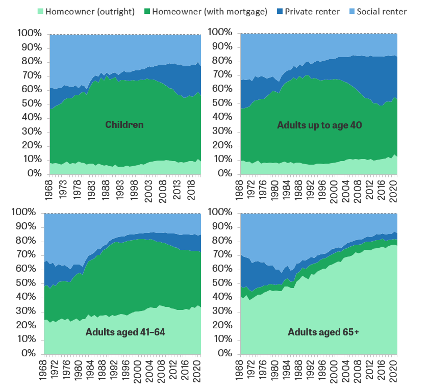
Note: Households in other tenures, such as employer- or government-department-owned accommodation, are excluded. All figures are for the whole UK since 2002–03 but exclude Northern Ireland prior to that. Since 1994, data are for the financial year beginning in each year. Tenure is defined at the household level, so adult children living with owner-occupier parents are classed as owner-occupiers.
Source: Family Expenditure Survey, 1968–93; Family Resources Survey, 1994–2021.
These patterns are important because they help explain why individuals with similar incomes (before deducting housing costs) but of different ages will have, on average, different living standards. Perhaps most notably, more than three-quarters of over-65s now own their home outright and therefore have very low housing costs. Most of that age group who do not own outright live in social housing, generally on sub-market rents, and over 10% of these receive housing benefit to cover at least some of their rent. Younger people are far more likely to face mortgage and private rental payments. And these differences in tenure between the age groups will in many cases not be a result of choice, but a result of younger adults not yet having had enough time to buy a house or pay off the mortgage. So we can already see that there is good reason to examine measures based on incomes after deducting housing costs when comparing people from different age groups.
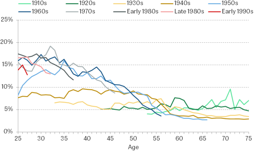
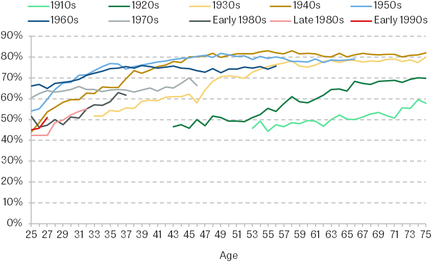
With homeownership having declined and private renting grown since the 1990s, younger adults today are far more likely to be renting than previous generations were at the same age. As seen in Appendix Figures A3 and A4, comparing those born from the 1910s to the 1960s, people tended to be more likely to own their own home than the previous cohort were at a given age. But those born more recently are much less likely to live in an owner-occupied home at a given age, with private renting filling the gap. Fewer than half of those born in the 1980s own a home in their 20s, compared with 60–70% of those born in the 1960s or 1970s.
With renters having the highest costs, and rents having grown the most in recent years, the consequence is that recent cohorts are facing far higher housing costs in early adulthood than previous cohorts did at the same age. Figure 11 shows that those born in the 1980s are facing housing costs well over double what those born in the 1950s faced in their 20s, although Figure 12 shows that income growth up until the great recession meant that as a proportion of income their costs were more similar. Recent declines in costs for homeowners have helped partially reverse the trend of higher housing costs for those born in the early 1990s, though their housing costs are still far greater than the costs of those born in the 1960s were at the same age, and this cohort may find themselves particularly hit by recent increases to mortgage rates (Waters and Wernham, 2023).
Figure 11. Median annual housing costs by age and birth cohort (2019–20 prices)Figure 11. Median annual housing costs by age and birth cohort (2019–20 prices)

Note: Housing costs are deflated by a variant of the Consumer Prices Index that excludes rent. All figures are for the whole UK since 2002–03 but exclude Northern Ireland prior to that.
Source: Family Expenditure Survey, 1968–93; Family Resources Survey, 1994–2021.
Figure 12. Median housing costs as a percentage of median income, by age and birth cohort
Note: Incomes and housing costs are equivalised using the modified OECD equivalence scale for BHC incomes. All figures are for the whole UK since 2002–03 but exclude Northern Ireland prior to that.
Source: Family Expenditure Survey, 1968–93; Family Resources Survey, 1994–2021.
This means that whether incomes are measured after housing costs has important implications for the measurement of living standards and poverty across generations, with different measures giving very different answers. Figure 13 shows that relative poverty rates in 2019 before and after deducting housing costs were 18% and 22% respectively. Adults aged 65 and over have relative poverty rates of 20% based on incomes measured BHC – above the national average – but only 18% when they are measured AHC (below the national average). High rates of outright ownership, and the associated low housing costs, boost the living standards of many low-income older adults compared with the rest of the population. Children have an above-average poverty rate on both measures, but especially when using incomes measured AHC (almost 40% higher than the national average) and in this case we might think it is important to consider housing costs because families with children will be more constrained in their housing choice.
Figure 13. Relative poverty rates by age

Note: Incomes are equivalised using the modified OECD equivalence scale for BHC and AHC incomes. The relative poverty rate gives the percentage with household incomes below 60% of the national median. Figures are for the whole UK in 2019 (actually financial year 2019–20) but exclude Northern Ireland in 1979.
Source: Family Expenditure Survey, 1979; Family Resources Survey, 2019.
Housing costs and poverty in the regions and nations
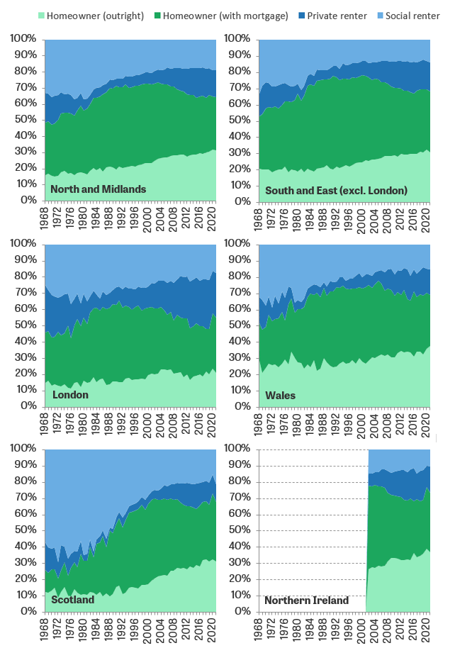
Housing costs vary considerably not just by age, but also by region. Much of this variation might come from differences in the labour market opportunities that are available in different parts of the country and the desirability of the areas more broadly defined. For example, some cities might have higher-valued local amenities, such as transport systems, schools or public parks, as documented by Diamond (2016) in the US. However, it is also the case that patterns of tenure vary between the regions and nations of the UK.
As we can see from Figure 14, London and Scotland stand out from the rest of the UK in terms of the current composition of housing tenure, and the changes experienced over time. London saw a slower rise in homeownership in the 1980s than the UK as a whole, and it experienced a sharper decline after the peak in the 1990s. The private and social rented sectors have historically also been larger in London, and the private rental sector in particular has grown more since the 1990s than in other parts of the country. Scotland stands out in that it had much higher rates of social renting than other regions in the late 1960s (around 60% compared with 30–40% elsewhere) and has seen a much more dramatic reduction in social renting. It also has a much smaller private rental sector than other parts of the UK – 11% in 2021 compared with 15–27% elsewhere.
Figure 14. Percentage of individuals in each housing tenure, by region
Note: Households in other tenures, such as employer- or government-department-owned accommodation, are excluded. Since 1994, data are for the financial year beginning in each year. Tenure is defined at the household level, so adult children living with owner-occupier parents are classed as owner-occupiers.
Source: Family Expenditure Survey, 1968–93; Family Resources Survey, 1994–2021.
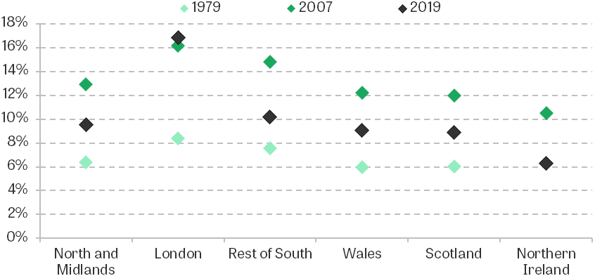
The lower rates of homeownership in London, coupled with the sharper increase in private rents, mean that housing costs increased more in London than in other regions in the decades leading up to the Great Recession. Whilst housing expenditure as a share of income was similar across the regions in 1979, it reached 16% in London by 2007, compared with 13% in the North and Midlands and 12% in Scotland (see Figure 15). This divergence between the regions widened by 2019. Housing costs as a share of income fell back closer to 1979 levels everywhere except London, where they actually increased slightly. Londoners’ lower and falling rates of owner-occupation mean they benefited less from low interest rates pushing down owner-occupiers’ costs, whilst London’s growing private rental sector saw large increases in costs.
Figure 15. Percentage of income spent on housing costs, by region
Note: The graph shows mean housing costs as a percentage of mean income. Data for 2007 and 2019 are for the financial year beginning in each year.
Source: Family Expenditure Survey, 1979; Family Resources Survey, 2007 and 2019.
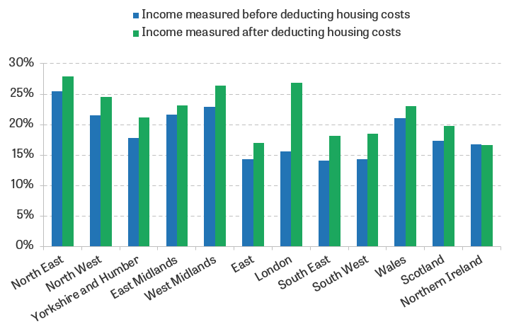
Figure 16 shows there are also significant differences when comparing AHC and BHC poverty rates across regions. London has a below-UK-average BHC poverty rate, but a far higher AHC poverty rate, as higher housing costs mean there are more people with relatively low incomes once these are deducted. By contrast, Scotland is almost at the UK average in terms of BHC poverty, but lower housing costs mean its AHC poverty rate is considerably lower than the average.
Figure 16. Relative poverty rates by region, 2019–20
Note: Incomes are equivalised using the modified OECD equivalence scale for BHC and AHC incomes. The relative poverty rate gives the percentage with household incomes below 60% of the national median.
Source: Family Resources Survey, 2019–20.
This is not to say that AHC incomes are necessarily a better measure of differences in living standards across regions. As noted above, differences in housing costs across regions could be driven by differences in housing quality and the amenities people derive from living there, rather than differences in housing tenure or other factors which do not contribute to residents’ well-being. People have some degree of choice over where they live, so they may willingly trade off higher housing costs for better amenities, in which case incomes measured after deducting housing costs would understate their true living standards. On the other hand, some of the differences in housing costs are related to patterns of tenure and age, and it is a mixed picture when comparing the ability of BHC and AHC incomes to predict deprivation – London does have particularly high material deprivation rates for pensioners and children. At the very least, this example illustrates that whether housing costs are included can make a substantial difference to comparisons of living standards between groups.
Conclusion
Housing costs are an important issue when examining inequalities in material living standards between different people and over time. Different households can face very different housing costs for similar properties, as a result of differences in their housing tenure or the size of their mortgage, or because social rents may not track the market value of housing or local amenities. We make the case that there are compelling reasons to examine incomes both before and after deducting housing costs when we use income as a measure of material standard of living.
Summary statistics of poverty and inequality based on each of these income measures tell us very different things, particularly when focusing on the bottom and middle of the distribution for whom differences in housing costs are particularly pertinent – lower-income households spend far higher shares of their incomes on housing.
This report has shed light on some of the drivers of changes in housing costs over time for different groups. In the past decade or so, low interest rates have helped bring down owner-occupiers’ costs, whilst rental costs remained high – changes that are primarily a result of institutional factors such as social rent policy and interest rates, rather than differential trends in housing quality.
We have also seen that significant differences in housing costs between different age groups, generations and regions mean that examining incomes before and after deducting housing costs can give us different messages about who is rich and who is poor. There are significant differences in housing tenure between different age groups over time which do not arise from different choices, with older people much more likely to own homes outright and younger people in recent times much more likely to be renting. Given these differences, looking at incomes after housing costs is vital for understanding patterns of deprivation across different age groups and generations. Housing costs also differ considerably between the regions, but it is much more difficult to interpret what this means for living standards.
References
Brewer, M., Etheridge, B., and O’Dea, C. (2017), ‘Why Are Households that Report the Lowest Incomes So Well-Off?’, Economic Journal, 127(605), F24–49, https://doi.org/10.1111/ecoj.12334.
Cribb, J. (2019), ‘Intergenerational Differences in Income and Wealth: Evidence from Britain’, Fiscal Studies, 40(3), 275–99, https://doi.org/10.1111/1475-5890.12202.
Department for Levelling Up, Housing & Communities (2022), ‘English Housing Survey: Housing Quality and Condition, 2020’, https://assets.publishing.service.gov.uk/government/uploads/system/uploads/attachment_data/file/1088447/EHS_Housing_quality_and_condition_report_2020.pdf.
Diamond, R. (2016), ‘The Determinants and Welfare Implications of US Workers’ Diverging Location Choices by Skill: 1980-2000’, American Economic Review, 106(3), 479–524, https://doi.org/10.1257/aer.20131706.
Frick, J. R., Grabka, M. M., Smeeding, T. M., and Tsakloglou, P. (2010), ‘Distributional Effects of Imputed Rents in Five European Countries’, Journal of Housing Economics, 19(3), 167–79, https://doi.org/10.1016/j.jhe.2010.06.002.
Joyce, R., Mitchell, M., and Norris Keiller, A. (2017), ‘The Cost of Housing for Low-Income Renters’, IFS Report R132, https://ifs.org.uk/publications/cost-housing-low-income-renters.
Luxembourg Income Study (2019), ‘The LIS User Guide: 2019 Template’, https://www.lisdatacenter.org/wp-content/uploads/files/data-lis-guide.pdf.
Main, G., and Bradshaw, J. (2012), ‘A Child Material Deprivation Index’, Child Indicators Research, 5(3), 503–21, https://doi.org/10.1007/s12187-012-9145-7.
United Nations (2011), ‘Canberra Group Handbook on Household Income Statistics: Second Edition’, https://unstats.un.org/wiki/pages/viewpage.action?pageId=101354171.
Waters, T., and Wernham, T. (2023), ‘Interest Rate Hikes Could See 1.4 Million People Lose 20% of Their Disposable Income’, IFS Comment, https://ifs.org.uk/articles/interest-rate-hikes-could-see-14-million-people-lose-20-their-disposable-income.
Wilson, W. (1999), ‘The Right to Buy’, House of Commons Research Paper 99/36, https://researchbriefings.files.parliament.uk/documents/RP99-36/RP99-36.pdf.
Wilson, W. (2022a), ‘Private Rented Housing: The Rent Control Debate’, House of Commons Library Research Briefing CBP06760, https://researchbriefings.files.parliament.uk/documents/SN06760/SN06760.pdf.
Wilson, W. (2022b), ‘Rent Setting: Social Housing (England)’, House of Commons Research Briefing CBP01090, https://researchbriefings.files.parliament.uk/documents/SN01090/SN01090.pdf.
Xu, X., and Ziliak, J. (2021), ‘Did Food Hardship Increase during the Pandemic?’, Economics Observatory, https://www.economicsobservatory.com/did-food-hardship-increase-during-the-pandemic.
Data
Department for Work and Pensions, NatCen Social Research. (2021). Family Resources Survey. [data series]. 4th Release. UK Data Service. SN: 200017, DOI: http://doi.org/10.5255/UKDA-Series-200017
Office for National Statistics. (2019). Family Expenditure Survey. [data series]. 3rd Release. UK Data Service. SN: 200016, DOI: http://doi.org/10.5255/UKDA-Series-200016
Office for National Statistics. (2019). Living Costs and Food Survey. [data series]. 3rd Release. UK Data Service. SN: 2000028, DOI: http://doi.org/10.5255/UKDA-Series-2000028
Appendix A. Additional figures and tables
Figure A1. Mean expenditure on housing costs (£ per year), by housing tenure

Note: Housing costs are deflated by a variant of the Consumer Prices Index that excludes rent. All figures are for the whole UK since 2002–03 but exclude Northern Ireland prior to that. Since 1994, data are for the financial year beginning in each year.
Source: Family Expenditure Survey, 1968–93; Family Resources Survey, 1994–2021.
Figure A2. Percentage of income spent on housing costs (net of housing benefit dashed) by tenure
Note: The graph plots mean housing costs as a percentage of mean income. Incomes and housing costs are equivalised using the modified OECD equivalence scale for BHC incomes. All figures are for the whole UK since 2002–03 but exclude Northern Ireland prior to that. Data are for the financial year beginning in each year.
Source: Family Resources Survey, 1994–2018.
Table A1. Decomposition of mean annual housing cost changes by tenure: bottom income quartile (2019–20 prices)
| Total % change | Incidence (change in cost for given tenures) | Composition | |||
Homeowners (outright) | Homeowners (mortgage) | Private renters | Social renters |
| ||
1968 to 1979 | 44% | 2% | 13% | 4% | 11% | 0% |
1979 to 1994 | 183% | 9% | 49% | 57% | 89% | 0% |
1994 to 2007 | 53% | 1% | 19% | 8% | 21% | –5% |
2007 to 2019 | –18% | 0% | –14% | 3% | 5% | 2% |
2019 to 2021 | –10% | 0% | –1% | 1% | –3% | –1% |
Note: Housing costs are deflated by a variant of the Consumer Prices Index that excludes rent. All figures are for the whole UK since 2002–03 but exclude Northern Ireland prior to that. Since 1994, data are for the financial year beginning in each year.
Source: Family Expenditure Survey, 1968–93; Family Resources Survey, 1994–2021.
Figure A3. Percentage of homeowners by age and birth cohort
Note: All figures are for the whole UK since 2002–03 but exclude Northern Ireland prior to that.
Source: Family Expenditure Survey, 1968–93; Family Resources Survey, 1994–2021.
Figure A4. Percentage of private renters by age and birth cohort

Note: All figures are for the whole UK since 2002–03 but exclude Northern Ireland prior to that.
Source: Family Expenditure Survey, 1968–93; Family Resources Survey, 1994–2021.
Appendix B. When does income after deducting housing costs provide a better measure of welfare?
We can consider this issue theoretically in a utility maximisation framework. Set in a very simple framework, abstracting from saving, we consider a household maximising utility over consumption c (with the price normalised to 1) and housing goods h (with price ) in each period subject to a budget constraint.
| (1) |
The maximum utility achieved will clearly be increasing in income y. But it will not necessarily be increasing in , the AHC measure of income. Drawing on the points above, when does a change in measure a change in welfare?
Owner-occupiers and subsidised rents
Consider households living in housing of identical quality, with quasi-linear utility . Suppose a private-renting household (household 1) chooses to pay for housing , but that a social-renting household or owner-occupier with a mortgage (household 2) only has to pay for the same level of housing .
Each household i’s welfare is given by . The difference in welfare between the two households is given by , i.e. the difference between their incomes after deducting housing costs.
Committed consumption and adjustment costs
Another reason why might measure a change in welfare is that there are significant costs incurred in moving home, including search costs, legal costs, and stamp duty in the case of home buyers. In a simple model, suppose in a previous period the level of housing goods chosen was , and that to choose a different level of h induces an adjustment cost A. Then the agent will be solving
| (2) |
If adjustment costs A are sufficiently large, and changes in are sufficiently small, then the agent will not change their chosen level of housing consumption in response to a change in housing costs, and utility will be increasing in .
Necessary minimum level of housing
Another scenario in which changes in will at least approximately capture changes in welfare is if the utility function is defined such that there is a necessary minimum level of housing that households must consume, i.e. if individuals have a Stone–Geary utility function with a minimum subsistence level of housing :
| (3) |
Maximising subject to the budget constraint will lead to . So is the proportion of left-over income after purchasing this subsistence level which is spent on consumption.
| (4) |
If households choose to spend most surplus income on consumption, then the impact of housing price differences on welfare will largely be through the impact on left-over income, , which among households with lower incomes will be close to , especially in comparison with higher-income households.
Endnotes
Authors

Jonathan Cribb
Jonathan joined IFS in 2011. His research areas includes: pensions, ageing and demographic change, public sector pay, housing, and inequalities.

Tom Wernham
Tom's main research areas are living standards and poverty, the benefits system, and its interactions with the labour market.

Xiaowei Xu
Xiaowei joined the IFS in 2018 and works in the Income, Work and Welfare sector.
More from IFS
Understand this issue


Policy analysis


Academic research


