
Downloads
Download report here
PDF | 445.26 KB
Executive summary
It has been a tough few years for labour market statistics. The COVID-19 pandemic made the collection and interpretation of data on jobs and pay extremely challenging. Many surveys found it harder to reach respondents. Those that relied on face-to-face interviewing had to switch to telephone or online modes. Different sorts of people or firms seemed to respond to surveys when compared with pre-pandemic times, making it hard to be sure whether the trends these data sources were picking up reflected actual changes in the labour market. More concerningly still, these problems do not appear to have entirely dissipated as the pandemic has passed.
The most publicised consequence of these problems has been for the quality of the Labour Force Survey (LFS), which affects the reliability of official statistics on employment, unemployment and inactivity. Here, the pandemic-related complications above combined with an already declining trend in the response rate to the survey. This led the Office for National Statistics (ONS) to temporarily suspend official statistics based on the LFS. It is developing a new ‘Transformed LFS’, which should redress some of the problems.
It has not gone unnoticed that our key data sources also fail to paint a clear picture of what has happened to earnings levels, or the earnings distribution, since 2019. They are not all in accord. As things stand, it is unclear what we should think has happened. This is a particularly salient issue in the context of weak income growth in the decade leading up to the pandemic (Cribb and Waters, 2024) and the subsequent cost-of-living crisis. There is also the risk – particularly around election time – that very different statistics, plucked from conflicting data sources, get bandied around.
Here we compare earnings trends measured from key data sources. From this, we reach some conclusions about which data are most and least reliable, and hence about what has most likely happened since 2019.
Key findings
- Comparing trends in UK earnings since 2019 as measured by the ONS’ Average Weekly Earnings (AWE) series, HMRC Pay As You Earn (PAYE) data, the Annual Survey of Hours and Earnings (ASHE) and the Family Resources Survey (FRS), the ASHE emerges as the clear outlier. The other data are all in quite close accord. The discrepancy between the ASHE and other data is driven largely by the ASHE painting a far more pessimistic picture of trends in earnings for high earners since 2019. As a result, it seems to significantly understate earnings growth on average, and to significantly overstate falls in earnings inequality, since the pandemic. We argue that this is likely related to the large drop in the rate of response to the ASHE since the pandemic.
- The best evidence (i.e. disregarding the ASHE) suggests that inflation-adjusted earnings are on average now almost 4% higher at the mean and 6% higher at the median than in April 2019. This largely reflects three distinct phases: earnings growth after the loosening of COVID-19 restrictions in 2021; the cost-of-living crisis beginning at the end of 2021, which eroded the value of most of that earnings growth; and the welcome return of real earnings growth since Autumn 2023. Indeed, the last few months account for most of the earnings growth seen overall since 2019 (although only the PAYE data and, at the mean, the AWE data are timely enough to tell us about this latter period).
- Earnings inequality appears no higher, and probably a little lower, than in 2019. At both the 10th and 90th percentiles of earnings, we again see the three recent phases of earnings trends since the pandemic: growth immediately after the worst of the pandemic, which was largely eroded by the cost-of-living crisis, before returning in recent months as inflation has subsided. That uptick in earnings growth over the past few months has, according to PAYE data, been more pronounced at the bottom of the distribution, leaving 10th percentile earnings in March 2024 about 4% above April 2019 levels in real terms, and 90th percentile earnings about 2% above April 2019 levels – both of which are a little lower than the 6% seen for the median earner.
1. What sources of data do we have on earnings?
There are several sources of UK earnings data for employees, all gathered in somewhat different ways and measuring slightly different things. Normally this makes little difference, at least for big picture trends. But at the moment it makes for a confusing picture. In this report, we compare and contrast four data sources: Average Weekly Earnings (AWE), Pay As You Earn (PAYE), the Annual Survey of Hours and Earnings (ASHE) and the Family Resources Survey (FRS). These all differ in how the data are collected and precisely how earnings are defined and measured, as summarised in Box 1.
There is one data issue that is very relevant to the context of this report, and which we do not demote to a box: non-response to surveys. The COVID-19 pandemic had a big impact on the collection of survey data, making it harder to reach certain groups and in some cases changing the mode of collection from face-to-face interviews to telephone or online.
Prior to the pandemic, the ASHE (which surveys employers about a 1% sample of UK employees) successfully collected information on about 60% of the employee jobs that were within scope of the survey. From 2020, the response rate dropped to about 45%, and strikingly it has barely recovered since, remaining comfortably below 50% in 2023 (Forth et al., 2024). The FRS – a survey of households – is also subject to non-response. During the pandemic, its response rate halved from approximately one-half to one-quarter [1] and, like the ASHE, the response rate has so far remained at its new lower level (although the size of the target sample has now been increased so that the absolute sample size is back to around its pre-pandemic level).
The main concern with substantial drops in response rates is that they may not have been spread evenly: certain types of workers may be disproportionately represented among those no longer captured by the surveys who would have been captured pre-pandemic. If true, this would likely distort the measured trends in earnings since the pandemic. Weights are applied to try to ensure that the (weighted) sample does continue to tally with the broader population along various dimensions (e.g. age, sex, region, and so on), and this may or may not solve the problem. (One issue recently has been that the information about what that broader UK population actually looks like also tends to come from other surveys, including the Labour Force Survey (LFS), which has had major problems of its own.) Directly investigating the changing nature of non-response in these surveys, and its implications, is well beyond the scope of this short report. However, we need to bear it in mind as a likely contributor to divergence in data sources, and our analysis should help shine a light on where further investigation on survey representativeness would be most useful.
In contrast, response rates to the Monthly Wages and Salaries Survey (MWSS) – the survey behind the AWE statistics – are relatively high and actually held up well through the pandemic, remaining at around 80% (Haskel, 2023). And our final dataset, from HMRC’s PAYE records, is administrative rather than survey data and so does not suffer from non-response.
Box 1. Overview of sources of earnings data
Average Weekly Earnings (AWE)
The AWE is a high-frequency measure of mean earnings, used in official statistics. It comes from a monthly survey of firms – the MWSS. All firms with 1,000 or more employees are sampled, plus a random sample of firms with 20–999 employees. (To construct the AWE series, ONS supplements this with information about employees in firms with fewer than 20 employees from the ASHE, as described below.) This survey is dispatched to around 9,000 businesses per month; in 2017, these firms employed around 14 million workers (up-to-date figures do not appear to be available).[2] The AWE measure is derived from firm reports of how many employees are on the payroll and their total wage bill. Unlike all the other data we consider, therefore, no individual-level earnings information is collected. This means that only mean earnings (or mean earnings by type of firm), and nothing more about the earnings distribution, are calculable. AWE captures bonuses paid to employees in every month of the year and can be identified separately to regular pay.
PAYE
PAYE data on earnings come from the HMRC’s administrative records. The advantage is that this is therefore not a survey. It does not rely on people choosing to respond; it only relies on them being within the PAYE system, and all those who are in this system – around 30 million employees – should appear in the data. A small number of employees – those who earn below the Lower Earnings Limit (£123 a week) and do not receive any other employee benefits – are not required to be added onto the PAYE system. Like the AWE, it has the advantage of being available at monthly frequency, providing a close-to-real-time earnings measure. Bonuses paid via the PAYE system are included in the data.
Annual Survey of Hours and Earnings (ASHE)
The ASHE is an employer-reported survey of employee earnings. It takes place each April. Throughout this report, we use ASHE earnings measures that ask about the current pay period, which is typically either a month or a week (there is also a retrospective annual earnings question, which we don’t use); it is similar in this sense to AWE and PAYE, but at a lower frequency, with one measure per year. Unlike the two data sources described so far, the ASHE measures hours of work as well as earnings, allowing a derived measure of hourly wages to be computed. The requirement for firms to submit their payroll information has generally been considered to make the earnings measure higher quality than, for example, relying on individual self-reports. Although it is firms who are surveyed, they provide individual-level earnings information, so the whole distribution of individual earnings in the UK can be estimated. The requirement is for firms to submit payroll information about any employees who have certain National Insurance numbers, which correspond to about 1% of all employees (though in practice the achieved sample is less than this due to non-response, as discussed in the main text). Although the ASHE survey is sent to 1% of all employees, around 300,000 individuals, as discussed above, the response rate to the ASHE survey has remained below 50% since the pandemic, meaning the achieved sample size is much lower. The ASHE survey collates information on bonus and incentive payments; however, there are known coverage issues with these data, largely due to the fact bonus and incentive pay information is at times not available to respondents when they complete the ASHE survey.[3]
Family Resources Survey (FRS)
This survey underlies official UK statistics on household incomes, poverty and inequality. As such, it measures all the major components of income, including earnings, which it measures separately for all members of a sampled household. Indeed, part of the benefit of including the FRS in this analysis is that it is relied on heavily for those household income statistics, so it is useful to know how its trends in earnings – the largest household income source on average – measure up. Like the ASHE, it also asks about hours of work, so an hourly pay measure can be derived. Typically, the FRS asks about current earnings, and households are sampled approximately evenly throughout the financial year. It is designed (and in particular weighted) to be representative only at the level of the whole financial year, so we plot one data point per year from the FRS (plotted at the mid-point of the financial year, in October). A limitation of the FRS is that answers are self-reported by people themselves, which likely brings significant measurement error. For example, household surveys of this kind are known to yield an implausible number of people who appear to be paid below the minimum wage (e.g. see Avram and Harkness, 2020). The FRS earnings data we use include bonuses.
2. What has happened to average earnings since 2019?
Figure 1 plots mean earnings, in CPI-adjusted terms, for all four datasets. To make comparisons with 2019 easier, earnings levels are indexed to April 2019 (the last pre-pandemic data point for ASHE), or to October 2019 for the FRS (see Section 1 for details on data frequency and the periodicity of earnings measurement). Figure 2 does the same for median earnings, and hence does not include the AWE series. We do, however, show each series back to 2016 for further context.
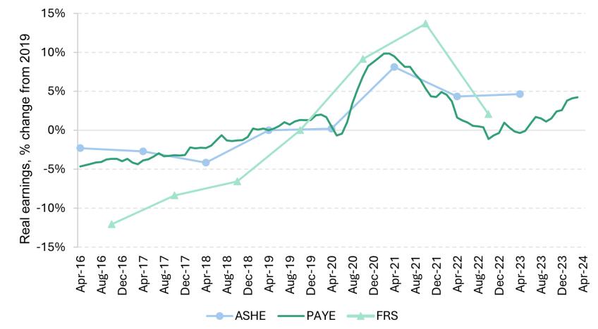
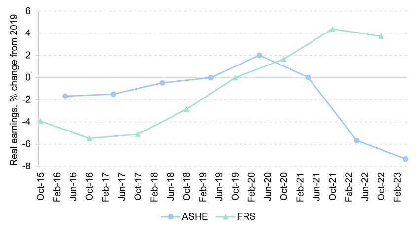
Figure 1. Real mean earnings indexed to 2019, various datasets
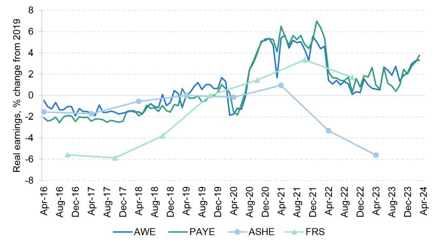
Note: Real earnings are deflated using the CPI. PAYE statistics refer to mean monthly earnings; AWE, ASHE and FRS refer to mean weekly earnings. ASHE, AWE and PAYE are indexed to April 2019; FRS is indexed to October 2019.
Source: Real time information (RTI) PAYE statistics, May 2024; AWE, May 2024, ASHE, November 2023; FRS, 2022/23.
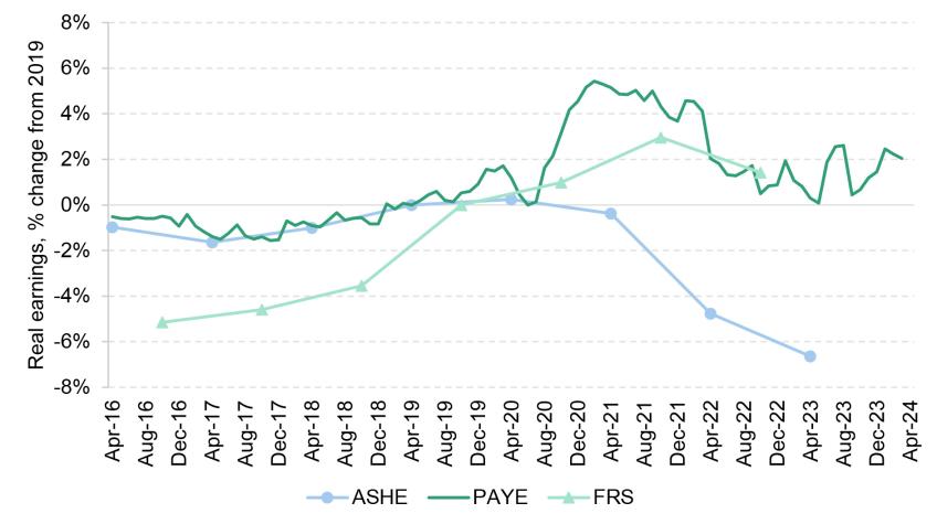
Figure 2. Real median earnings indexed to 2019, various datasets
Note: Real earnings are deflated using the CPI. PAYE statistics refer to median monthly earnings; ASHE and FRS to median weekly earnings. ASHE and PAYE are indexed to April 2019; FRS is indexed to October 2019.
Source: RTI PAYE statistics, May 2024; ASHE, November 2023; FRS, 2022/23.
Focusing on trends since the COVID-19 pandemic, the ASHE is the clear outlier. From April 2022, it paints a far more negative picture of earnings changes than all three other datasets, which actually track each other quite closely. That differential is maintained (though not extended further) in April 2023. The difference is particularly large at the mean. As we shall see, this is because the ASHE is especially out of line with other data at the top of the earnings distribution (further analysis shows that this discrepancy is driven by earnings in the private sector, whereas ASHE corresponds much more closely with the other datasets for the public sector).
On the balance of evidence, what data should we believe? In general, there are minor differences between what all these datasets are trying to measure, as Box 1 sets out. But these differences have not changed materially over time. When it comes to trends since the pandemic, there is an a priori reason to be cautious about the ASHE – a reason why it is plausible that it would be getting trends wrong – in that its response rate has dropped a lot. Conversely, the response rate underlying the AWE series has held up well, and PAYE captures essentially the whole population of employees. The FRS comparison probably adds less to the case against the ASHE than AWE and PAYE do. Household reports may be less reliable than firm reports or administrative records; in the two years prior to the pandemic, the FRS actually showed stronger earnings growth at the mean than the other data; and the FRS too has suffered a drop in the response rate since 2019. Nevertheless, it aligns quite closely with AWE and PAYE since 2019, which does add further to the impression that the primary problem lies with the ASHE.
The datasets other than the ASHE largely concur with each other in the post-pandemic period. If we take them at face value, then what can we say about average earnings since 2019? First, there was a period of significant growth in real earnings upon the economic reopening of 2021. Second, most of this was subsequently undone by the inflation spike during the recent cost-of-living crisis. Third, the datasets that are timely and frequent enough to tell us about very recent trends (namely AWE and PAYE at the mean, and PAYE at the median) reveal the resumption of real earnings growth since Autumn 2023, as inflation has fallen back. That third, recent phase accounts for virtually all of the growth in real average earnings since 2019. In March 2024, these were about 4% higher than in April 2019 at the mean, and about 6% higher at the median.
Figures 3 and 4 repeat the same analysis for hourly wages. Here, the uncertainties are magnified further by the fact that we can only use the ASHE and the FRS, as only they measure hours of work in addition to earnings. This is unfortunate because, as just discussed, the ASHE appears to have been unreliable as a measure of trends since 2019, and the FRS likely comes with more caveats attached than AWE or PAYE. (It is doubly unfortunate in this context that median hourly wages, as measured by the ASHE, have been used to define the targeted path of the National Living Wage.) As these datasets are less timely than AWE and PAYE, it also means that we cannot say anything about trends over the past year, when – as we have seen – real earnings growth has resumed.
With that even greater uncertainty in mind, the trends in mean and median hourly wages in the ASHE and the FRS look similar to those in earnings if compared over similar periods. It is very likely that hourly wages too have bounced back more recently, but we will have to wait for future releases of data to confirm this.
Figure 3. Real mean hourly earnings indexed to 2019, various datasets
Note: Real earnings are deflated using the CPI. ASHE and FRS statistics refer to mean hourly earnings including overtime. ASHE is indexed to April 2019; FRS is indexed to October 2019.
Source: ASHE, November 2023; FRS, 2022/23.
Figure 4. Real median hourly earnings indexed to 2019, various datasets
Note: Real earnings are deflated using the CPI. ASHE and FRS statistics refer to mean hourly earnings including overtime. ASHE is indexed to April 2019; FRS is indexed to October 2019.
Source: ASHE, November 2023; FRS, 2022/23.
3. What has happened to earnings inequality since 2019?
Figures 5 and 6 document earnings changes at the 10th and 90th percentile of the distribution. As with Figure 2, this can be done with all data other than AWE, which only provides means.
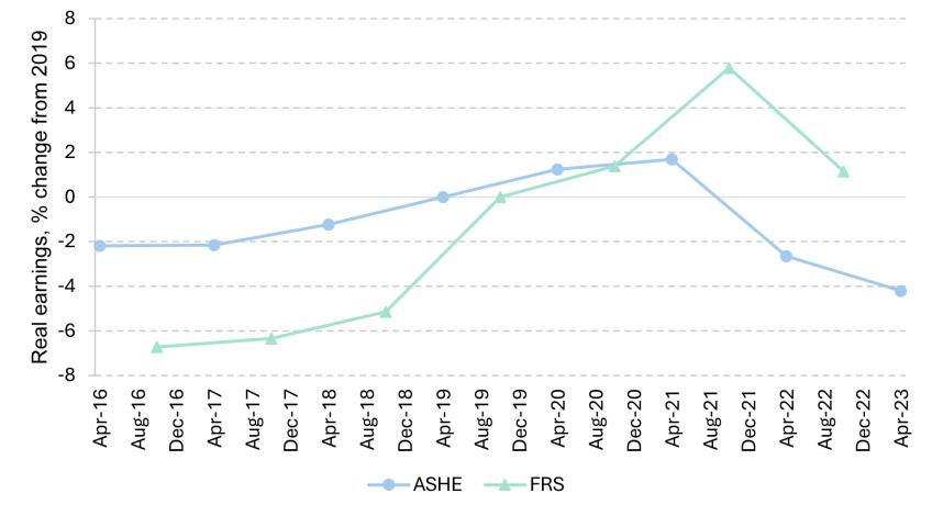
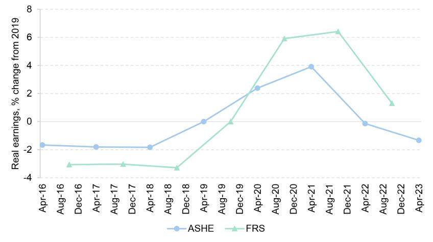
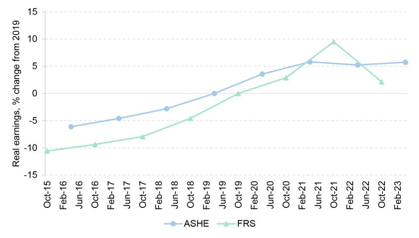
When comparing datasets, the most striking feature of these figures is how the ASHE’s outlier behaviour since 2019–20, documented above, is particularly extreme at the top of the distribution (Figure 6), and not a clear feature at the bottom (Figure 5). In April 2023, which is the most recent ASHE data point, real earnings at the 90th percentile were almost 7% below 2019 levels according to the ASHE, but at least as high as in 2019 according to PAYE and FRS. Once again, the non-ASHE datasets track each other quite closely since the pandemic, although the FRS did record stronger earnings growth than PAYE records in 2018 and 2019.
Figure 5. Real 10th percentile earnings indexed to 2019, various datasets
Note: Real earnings are deflated using the CPI. PAYE statistics refer to monthly earnings; ASHE to weekly earnings and FRS to annual earnings. ASHE and PAYE are indexed to April 2019; FRS is indexed to October 2019.
Source: RTI PAYE statistics, May 2024; ASHE, November 2023; FRS, 2022/23.
Figure 6. Real 90th percentile earnings indexed to 2019, various datasets
Note: Real earnings are deflated using the CPI. PAYE statistics refer to monthly earnings; ASHE to weekly earnings and FRS to annual earnings. ASHE and PAYE are indexed to April 2019; FRS is indexed to October 2019.
Source: RTI PAYE statistics, May 2024; ASHE, November 2023; FRS, 2022/23.
We can therefore reach some conclusions about likely trends in earnings inequality since 2019, on the basis that the key datasets are in approximate accordance with each other at the bottom, and that the ASHE should be disregarded at the top. Earnings at both the 10th and 90th percentiles are above their 2019 levels in real terms, following the same pattern of ‘rise, fall and rise again’ that we documented above for average earnings as the cost-of-living crisis took hold and then faded. For the past year or so, we have to rely only on PAYE data, which suggest that the recent bounce back of real earnings has been somewhat stronger at the bottom than the top of the distribution. Hence, as of March 2024, earnings inequality is probably a little lower than in April 2019, with 10th percentile earnings up about 4% in real terms and 90th percentile earnings up about 2%.
The ASHE records a dramatic fall in earnings inequality – but only because it is so dramatically out of line with other data towards the top of the earnings distribution. Whenever we have computed a statistic that depends on the top of the distribution, and compared the ASHE with other data – whether it be AWE, PAYE or FRS – the ASHE is consistently the one major outlier. As such, when it comes to earnings inequality since the pandemic, it is probably wise to ignore the ASHE.
Finally, Figures 7 and 8 repeat the analysis for hourly earnings. Of all the analysis presented, this is probably the bit we can be least sure about. We can only use the ASHE and the FRS for this; the former seems highly unreliable at measuring post-pandemic trends, as discussed, and the latter is likely to measure hourly wages somewhat noisily for any given worker. Notwithstanding that, the conclusions are again similar to the ones we reached for earnings. Hourly wages are probably higher in real terms at both the 10th percentile and (because we disregard the ASHE) the 90th percentile than before the pandemic. Given the recent trends documented for weekly earnings in Figures 5 and 6, it is likely that hourly wages have continued to grow in recent months, beyond the period covered by the data in Figures 7 and 8.
Figure 7. Real 10th percentile hourly earnings indexed to 2019, various datasets
Note: Real earnings are deflated using the CPI. ASHE and FRS statistics refer to hourly earnings including overtime. The ASHE is indexed to April 2019; the FRS is indexed to October 2019.
Source: ASHE, various years; FRS, 2022/23.
Figure 8. Real 90th percentile hourly earnings indexed to 2019, various datasets
Note: Real earnings are deflated using the CPI. ASHE and FRS statistics refer to hourly earnings including overtime. The ASHE is indexed to April 2019; the FRS is indexed to October 2019.
Source: ASHE, various years; FRS, 2022/23.
4. Conclusions
The main aim of this report has been to clear some of the fog surrounding what has happened to the UK earnings distribution since the pandemic. Our view is that this is actually not so complicated, given that the ASHE consistently emerges as the clear outlier, while other datasets paint a broadly similar picture.
Going forward, it should be a priority to understand why the ASHE has diverged so much from other data sources in measuring earnings trends towards the top of the earnings distribution. The excellent work of the Wage and Employment Dynamics project [4] has already resulted in a set of sensible recommendations for how the weighting of the ASHE could be refined so that it can maintain its representativeness as reliably as possible. Those recommendations were made independently of any particular concerns about its measurement of earnings trends since the pandemic. It is possible that the recent issues documented in this report would call for further refinement, but the first step is to understand their causes.
This is something that should directly concern the government and the ONS, and not only external researchers, not least because the ASHE is a critical dataset in informing the path of minimum wage policy. The ASHE has been used to measure the bite of the minimum wage – its level relative to median wages – which has been the subject of an explicit numerical target (two-thirds of median wages by 2024). It is never ideal to have to rely on a single survey for judging adherence to a precise numerical target. If we are to do that, however, then we need to be very vigilant about the quality of that dataset. If ASHE is under-recording growth in median wages – as seems possible, given the evidence we have presented here – then setting minimum wage policy without adjusting for that fact could result in a minimum wage that is lower than intended. Of course, any adjustments themselves would be inherently uncertain too.
References
Avram, S. and Harkness, S. (2020). The NMW/NLW and progression out of minimum wage jobs in the UK: Final Report. https://assets.publishing.service.gov.uk/media/5fd0d73ee90e07562593f27d/ Avram_Harkness_ISER_Essex_Bristol_Wage_progression_Dec_2020_FINAL.pdf.
Forth, J., Bryson, A., Phan, V., Ritchie, F., Singleton, C., Stokes, L., and Whittard, D. (2024). Revisiting sample bias in ASHE – with implications for estimates of low pay. Presentation at the ESCoE Conference, University of Manchester, 17 May, https://www.wagedynamics.com/wp-content/uploads/2024/05/105_forthetal_escoe_may2024_updated.pdf.
Haskel, J. (2023). Implications of current wage inflation. Speech given at Bank of England Watchers’ Conference, King’s College London, 3 November, https://www.bankofengland.co.uk/speech/2023/ november/jonathan-haskel-panellist-at-the-boe-watchers-conference-labour-market-dynamics.
Footnotes
[1] See Table M.1 in the ‘Methodology and standard error data tables’ from the FRS for financial years 2019–20 (https://www.gov.uk/government/statistics/family-resources-survey-financial-year-2019-to-2020) and 2022–23 (https://www.gov.uk/government/statistics/family-resources-survey-financial-year-2022-to-2023).
[2] https://www.ons.gov.uk/employmentandlabourmarket/peopleinwork/earningsandworkinghours/methodologies/averageweeklyearningsqmi
Authors


More from IFS
Understand this issue


Policy analysis


Academic research


