Introduction
This is a summary of the main findings of the IFS report published today: ‘Living standards, poverty and inequality: 2017’. In this summary, we report our new findings on changes in inequalities between and within regions (Section 1), and what can be learnt about changes in income and the persistence of low income by examining data that follows the same people over time (Section 2). Details of the definitions and concepts used here are given in the main report.
The trends described in this Briefing Note have of course taken place in the wider context of changes in household incomes across the whole of the UK. These were summarised upon the release of the latest household income data, for 2015–16, in a previous IFS Briefing Note.[1] Focussing on the period since the Great Recession, the key facts are as follows:
- Average (median) household income in 2015–16 (the latest data available) was just 3.7% higher than before the recession (2007–08) after adjusting for inflation. This is extremely slow growth by historical standards.
- Income inequality fell during the recession and its immediate aftermath, and has remained broadly unchanged since then. Although it is hard to track how the household incomes of the very richest have been changing, evidence from data on employees’ earnings shows that the earnings of employees towards the very top (99th percentile) have done worse than those at the middle (median).
- Absolute poverty (according to the government’s official measure) has changed little. This lack of progress is historically unusual and reflects the more general lack of real income growth.
1. The geography of inequality
Income inequality remains highest in London, but there have been big falls since the recession
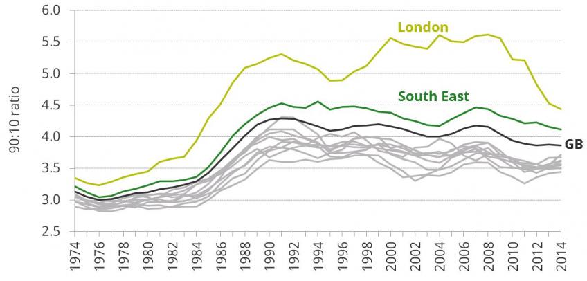
Figure 1. The 90:10 ratio in each region and nation of Great Britain over the last 40 years (BHC) [download data]
Source: Figure 3.11, Cribb et. al. (2017).
Figure 1 shows the trend in income inequality within each region and nation in Great Britain over the last 40 years as measured by the 90:10 ratio.[2] It reveals that while London remains the most unequal part of the country, income inequality in the capital has fallen dramatically since the Great Recession. Incomes at the 10th percentile in London have risen by over 10% since the late 2000s, while incomes at the 90th percentile have fallen by over 10%.
This reflects, at least in part, the fact that an inequality-reducing combination of rising employment and lower real earnings – which has been seen across the UK - has been particularly pronounced in London. The employment rate in London rose by 5.2 percentage points (ppts) between 2007 and 2016 (compared with an average increase across the UK of 1.5ppts), while real median earnings fell by 10.2% over that period (compared with a UK average fall of 5.5%).
There is a 25% income gap between the richest and poorest regions of Britain
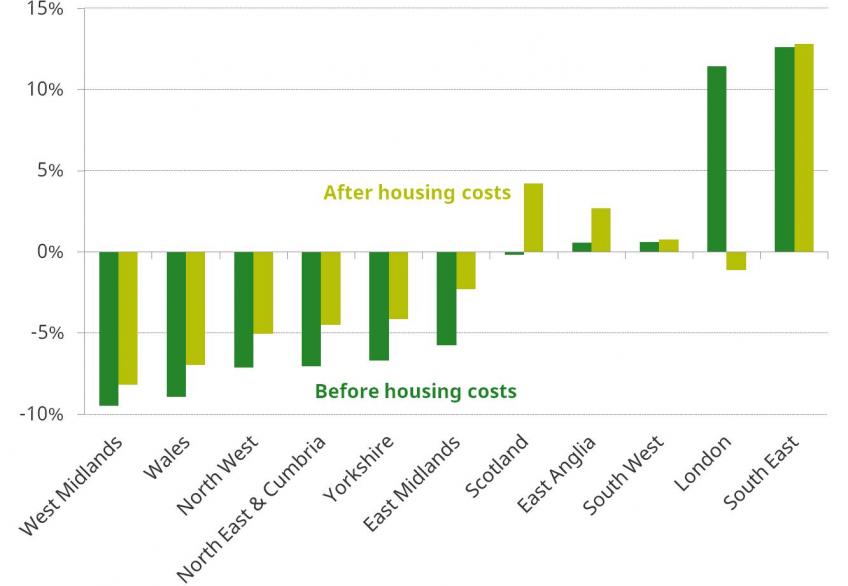
Figure 2. Percentage difference between median income in each region and nation of Great Britain and overall median income, 2013–14 to 2015–16 [download data]
Source: Figure 3.9, Cribb et. al. (2017).
Figure 2 shows the current level of income inequality between regions and nations, as measured by the percentage difference between average (median) income in that region and in Great Britain as a whole. This is done both before and after housing costs are deducted. Average income in the highest-income region of Great Britain (South East) is around 25% higher than that in the poorest region (West Midlands), with the consequence that incomes in the West Midlands (and in fact the East Midlands, Wales and the North of England) are no higher than incomes were in the South East in the late 1990s. It is also notable that while average incomes in London are more than 10% above the GB average when measured before housing costs, they are actually slightly below the GB average if incomes are instead measured after housing costs.
Nearly a quarter of poor children live in the 10% most deprived areas of Britain
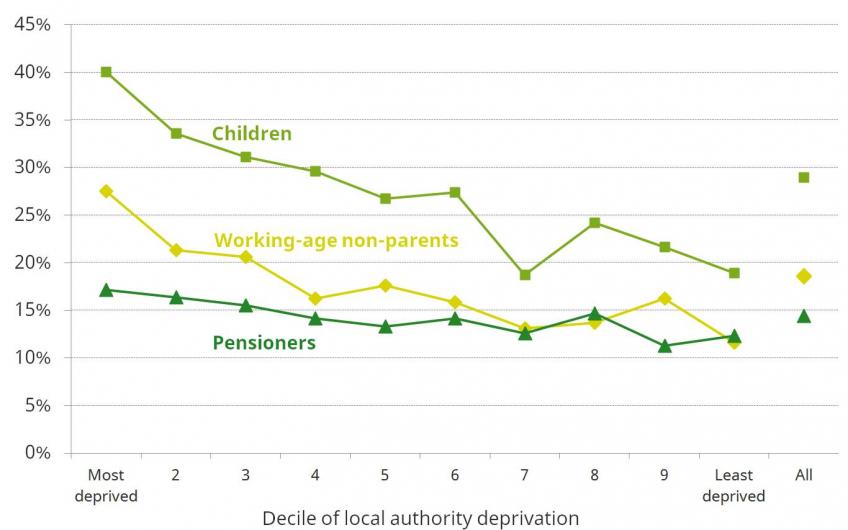
Figure 3. Absolute poverty rates (AHC), 2012–13 to 2015–16 average (GB), by local authority deprivation index decile [download data]
Source: Figure 4.4, Cribb et. al. (2017).
Figure 3 shows how absolute AHC poverty rates for different vary according to how deprived their local area is. For both children and working-age non-parents the poverty rate is twice as high in the most deprived tenth of local areas as in the least deprived tenth – with the result that nearly a quarter of all poor children live in the 10% most deprived areas. By contrast, the difference in pensioner poverty between more and less deprived areas is much less marked – the 10% most deprived areas contain only 13% of all pensioners in poverty.
This difference makes sense given that employment and earnings are a key driver of poverty in the non-pensioner population, and both of these vary markedly across the country. State pensions and pensioner benefits, by contrast, are set at the national level and as these make up a substantial share of pensioner incomes – particularly among low-income pensioners – there is likely to be less variation in the prevalence of low-income pensioners across different areas of Great Britain.
The Midlands have seen the slowest growth in average incomes over the last 40 years
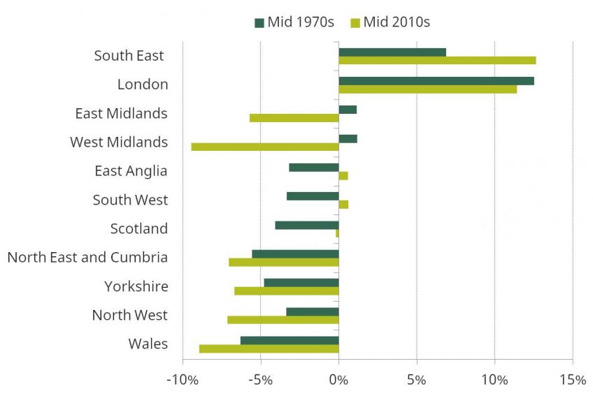
Figure 4. Percentage difference between median income in each region and nation of Great Britain and overall median income, 1972 to 1976 and 2013–14 to 2015–16 (BHC) [download data]
Source: Figure 3.10, Cribb et. al. (2017).
Figure 4 shows how the BHC incomes of regions and nations have evolved over the past 40 years, relative to each other. It compares the difference between median income in each region and the GB median in the mid 2010s (shown in Figure 2) with the differences in the mid 1970s. Perhaps most striking is the relative decline in incomes in the Midlands - median incomes in the Midlands were slightly above average in the mid 1970s (around 1% higher than the GB median) but are now substantially below average (almost 10% below in the case of the West Midlands). Meanwhile incomes in the South of England (excluding London) and Scotland have done better than average, while average incomes in Wales and the North of England have slipped slightly further behind.
2. Income dynamics and the persistence of low income
Over a four-year period, most people experienced substantial change in household incomes
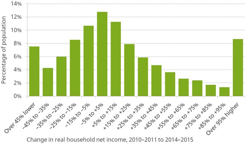
Figure 5. Change in real household net income between 2010–2011 and 2014–2015 [download data]
Source: Figure 2.10, Cribb et. al. (2017).
Over recent years, average income across the entire population has grown modestly. But small changes on average can mask considerable variation. Figure 5 summarises the whole distribution of such changes in household income between 2010-11 and 2014-15. It shows the percentage of the population that experienced an income change within each of the ranges plotted on the horizontal axis. The highest bar shows that 13% of the population saw their real household income fall by less than 5% or rise by less than 5% between 2010–2011 and 2014–2015. This tells us that 87% of people saw their household income change by at least 5%, with 37% experiencing a fall in income of 5% or more and 50% seeing a rise of 5% or more.
The biggest changes in income are often associated with a change in the number of people in the household who are in work. 48% of those whose incomes fell by more than 50% were in households that lost a worker. Similarly, 41% of those whose incomes rose by more than 50% were in households that gained a worker.
Young adults have less stable incomes than older individuals
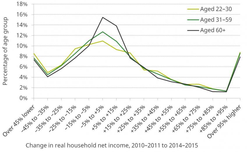
Figure 6. Change in real household net income between 2010–2011 and 2014–2015, by age group in 2010–2011 [download data]
Source: Figure 2.11, Cribb et. al. (2017).
Figure 6 groups people according to their age in 2010-2011, and shows the distribution of income changes over the following four years in each group. It highlights that individuals aged 60 and over are more likely to experience small, positive income changes than younger individuals. The distribution of income changes among young adults, by contrast, is more dispersed, which means this group is more likely to experience both very large falls and very large increases in income. This is perhaps what one should expect: major potential causes of large income changes, such as labour market shocks or family structure changes, are less prevalent among pensioners.
Low income is more likely to be persistent for pensioners than for the rest of the population
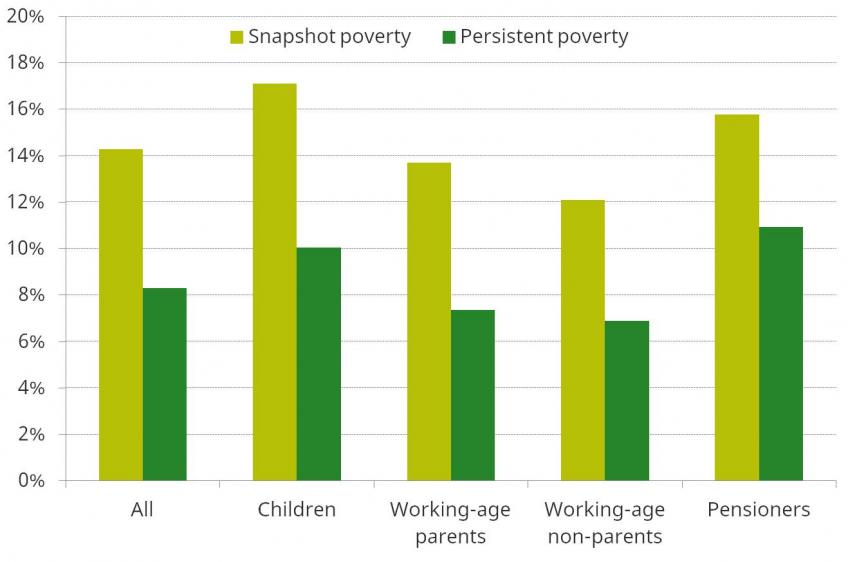
Figure 7. Absolute poverty rates, 2012–2015 (BHC), by demographic group [download data]
Source: Figure 4.9, Cribb et. al. (2017).
Figure 7 shows snapshot and persistent BHC poverty rates for the entire population and for different demographic groups. ‘Snapshot’ poverty is defined as having income below a certain threshold in a single year, while ‘persistent’ poverty is defined as having had low income in at least three of the last four years. The figure shows that, because households’ incomes often fluctuate, markedly fewer households are in persistent poverty than in snapshot poverty. Snapshot poverty across the entire population stood at an average rate of 14% over the most recent four years of data, whereas persistent poverty over the same period (i.e. the proportion of people in poverty for at least three out of those four years) was 6 percentage points lower at 8%.
The figure also shows that the snapshot and persistent poverty rates are somewhat closer together for pensioners. This makes sense, as it is what one would expect from a group whose income fluctuates relatively little from year to year (as shown in Figure 6).
Persistently low parental earnings and persistent parental worklessness are equally important in explaining persistent child poverty
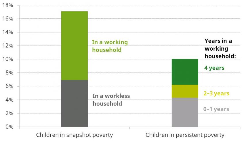
Figure 8. Absolute child poverty rates, 2012–2015 (BHC): household work status composition [download data]
Source: Figure 4.12, Cribb et. al. (2017).
The left bar of Figure 8 shows that the majority of children in snapshot poverty belong to households with someone in work. The right bar shows the composition of the population of persistently poor children. Despite the fact that the rate of persistent poverty for children in households that have had someone in work in each of the last four years is just 5%, they account for around 40% of all children in persistent poverty (because most children live in these consistently working households). On the other hand, children in households that have had no one in work for at least three of the last four years account for slightly over 40%. In other words, persistently low earnings and persistent worklessness explain approximately equal amounts of the persistent child poverty we see in the UK.
Presentations
- Agnes Norris Keiller, Living Standards
- Andrew Hood, Inequality
- Robert Joyce, Poverty
- Jonathan Cribb, In work poverty
Notes
[1] https://www.ifs.org.uk/uploads/publications/bns/BN194.pdf
[2] Data on household incomes in Northern Ireland only exist since 2002-03, which means that we cannot include information on long run changes in Northern Ireland in this Briefing Note.


